A Post-Apocalyptic Spark of Joy
In a world reshaped by uncertainty, JoyEats emerged as a bold expression of hope imagined in a post-apocalyptic reality where joy is a scarce, treasured resource. The concept rethinks fast-food packaging as a form of emotional revival, not just function. Each piece in the JoyEats system is a tribute to the small pleasures in life designed to spark play, curiosity, and optimism in a time when they’re most needed. This isn’t just about wrapping food, it’s about wrapping meaning, humor, and humanity into everyday moments.
Design That Talks, Plays, and Surprises
Every package tells a story. Each box is crafted as a self-contained world of interaction, featuring bold color palettes, layered graphic language, and witty, integrated text. The messaging isn’t random, it’s tailored to the form. Interior flaps reveal clever lines; side panels hide surprises. Whether it’s a pizza box turned into a poster or a burger pack design disguised as a t-shirt, JoyEats makes each unboxing moment a dialogue between brand and customer.
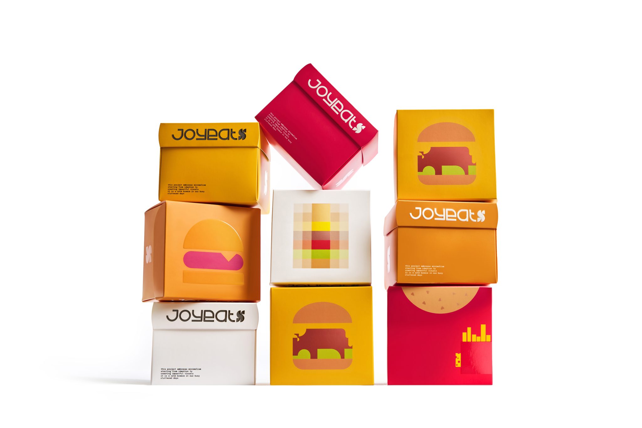
A Visual Language That Breaks the Rules
Stylistically, JoyEats blends multiple visual worlds. The foundation lies in geometric minimalism clean lines, color blocking, and reduced forms, but it’s amplified by pop-art boldness, pixelated graphics, and subtle optical illusions. The visual direction celebrates simplicity while hiding smart layers: a burger patty shaped like a buffalo, a fries pack and bun that form a t-shirt, or overlapping textures that shift perception based on angle. It’s a playground of visual tricks that invites double takes and Instagram-worthy moments. The combined use of retro digital aesthetics with graphic satire creates a distinct ownable design.


