The Goodness Company is a brand that offers artisanal treats with a unique ideology focused on providing high-quality products that are good for both consumers and the planet. The brand promotes healthy eating and sustainability while providing an indulgent experience for its customers. To reflect this ideology, Beyondesign partnered with the brand to create the identity and packaging.
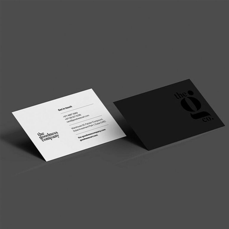
The thought behind The Goodness Company’s logo is to symbolize the brand’s core values while showcasing its passion, stability, and goodness. The logo is minimal and elegant, reflecting the brand’s commitment to simplicity and natural ingredients.
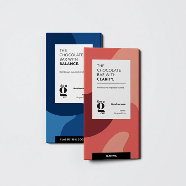
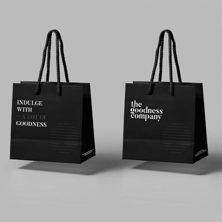
The packaging design for The Goodness Company took a minimalistic approach, creating a striking but not overwhelming design that emphasizes the products’ clean, natural ingredients. The design language used bright colours and clean fonts, combined with minimal design elements. The bold, eye-catching colours create excitement and energy around the brand, while the minimalist design highlights the quality of the products themselves. The fonts used are simple and elegant, reflecting the brand’s commitment to natural, wholesome ingredients.
The overarching thought was all about creating a balance between indulgence and sustainability. The brand offers a range of artisanal treats that are guilt-free and good for the planet, and the minimalistic packaging design reflects this ideology by emphasizing the natural, clean ingredients in the products and creating a visually appealing brand identity that stands out on store shelves.