Agency: Jack Magma
Creative director: Andrea Perato
Location: Italy
Project Type: Produced
Client: ROC
Product Launch Location: Global
Packaging Contents: Food
Packaging Substrate / Materials: Paper, Biodegradable plastic
Printing Process: Silkscreen, Thermoprint
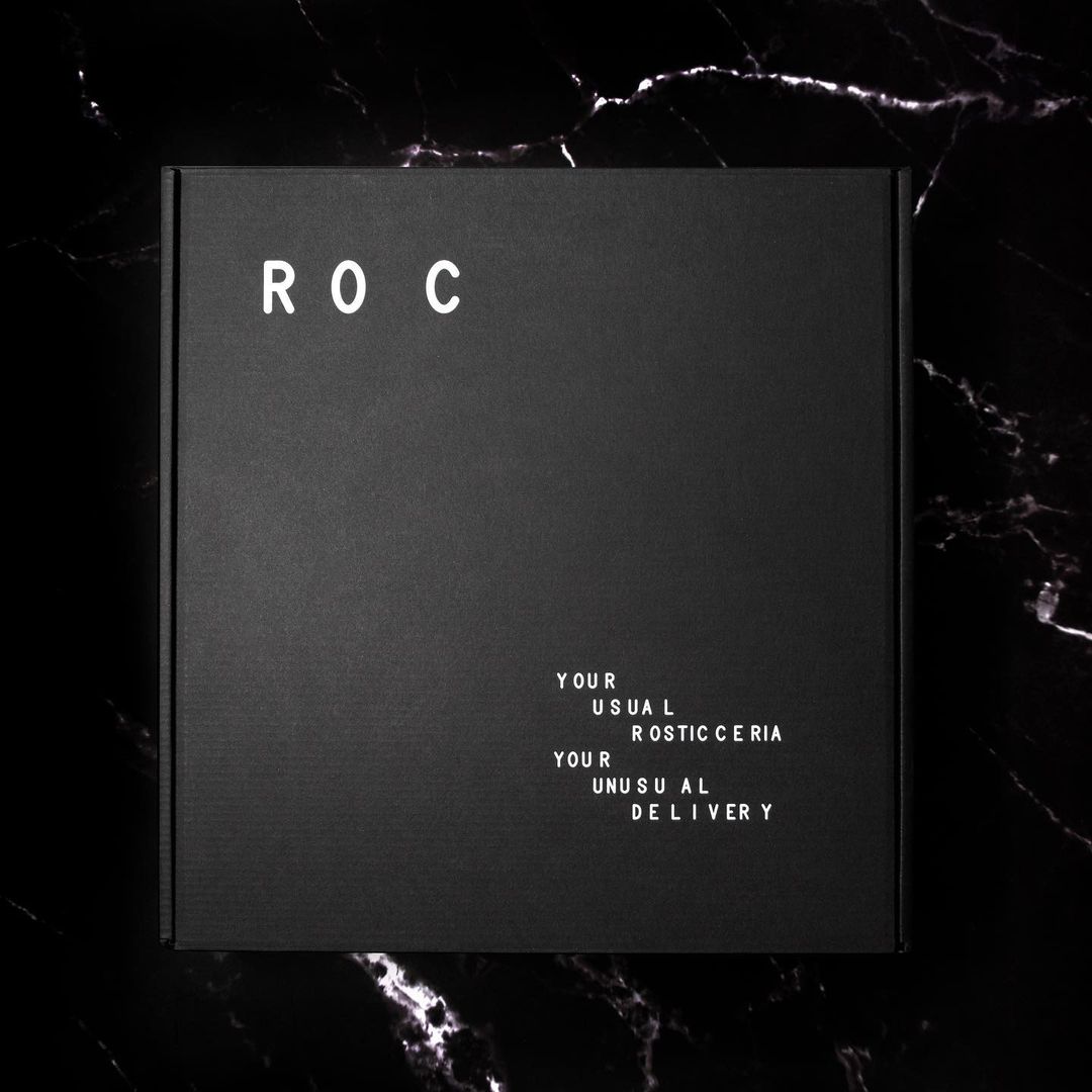
ROC is a delivery service based in Milan and closer to provinces.
ROC is a spinoff from a Michelin Awarded restaurant based in Milan, Contraste. The food is prepared in a dark kitchen and does not have a brick&mortar spot.
Rosticceria in Italian means delicatessen and ROC is the perfect reflection of a century-old shop tradition translated into the modern world.
The whole brand reflects an idea of hand-prepared food, the whole design system is based on a typography glitch typical of the shop menu signs, with all the separate letters that needed to be aligned by the shopowner.
The box is completely recycled and recyclable paper and the food trays are made of biodegradable alimentary paper-like material that can be heated in the oven or the microwave.
The package is designed by Andrea Perato @ Jack Magma and produced by Italian printing excellence Fontegrafica.
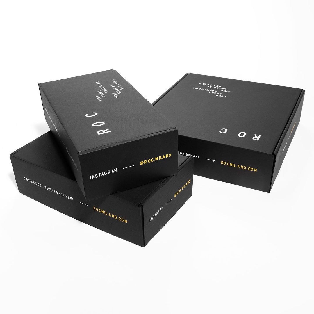
Every food has its own label custom printed right on the spot with a very common thermo printer, this allows the chefs to have complete autonomy in the production process.
The label generation is made through the use a of developed plugin that sets the kerning randomly.