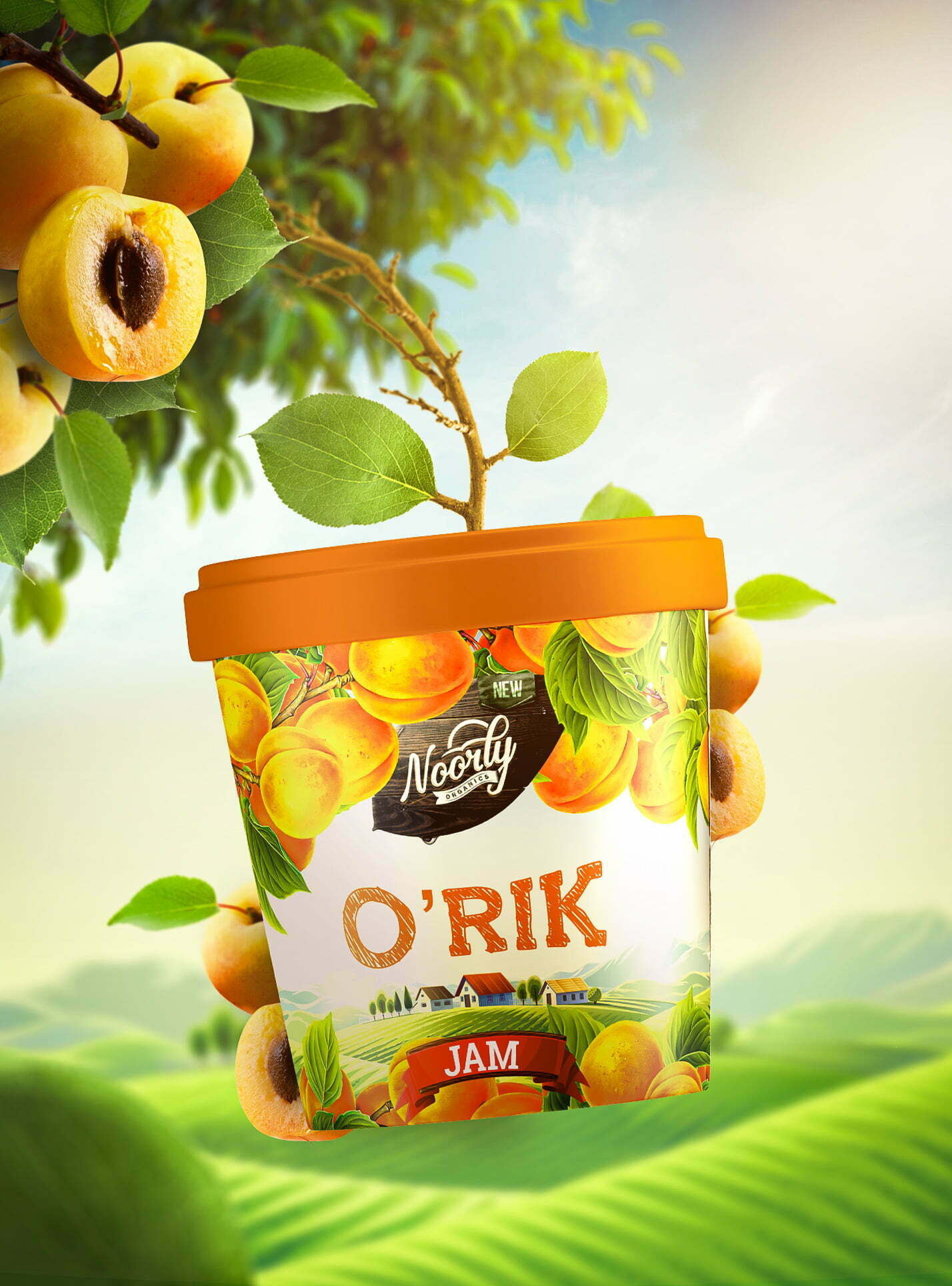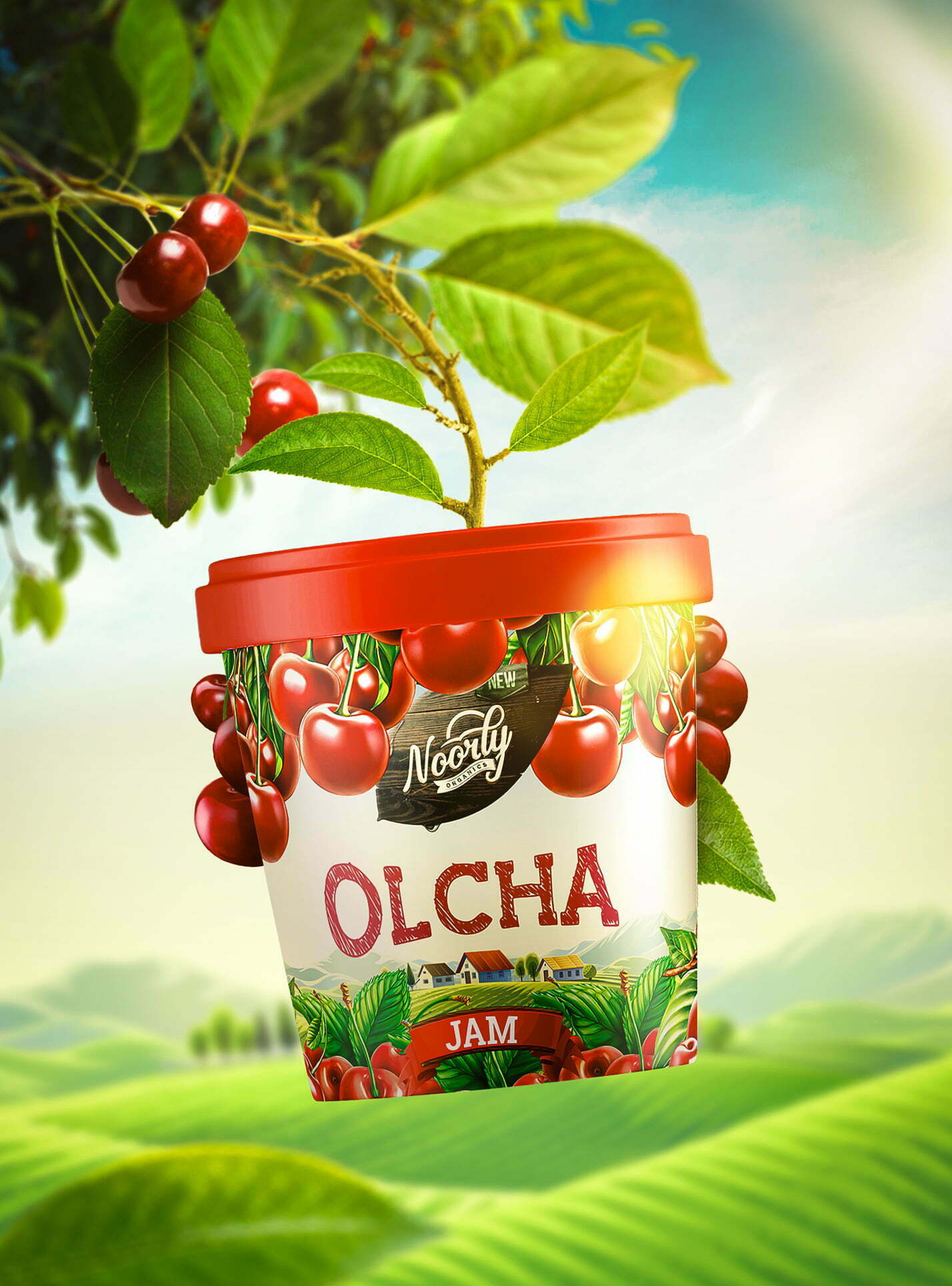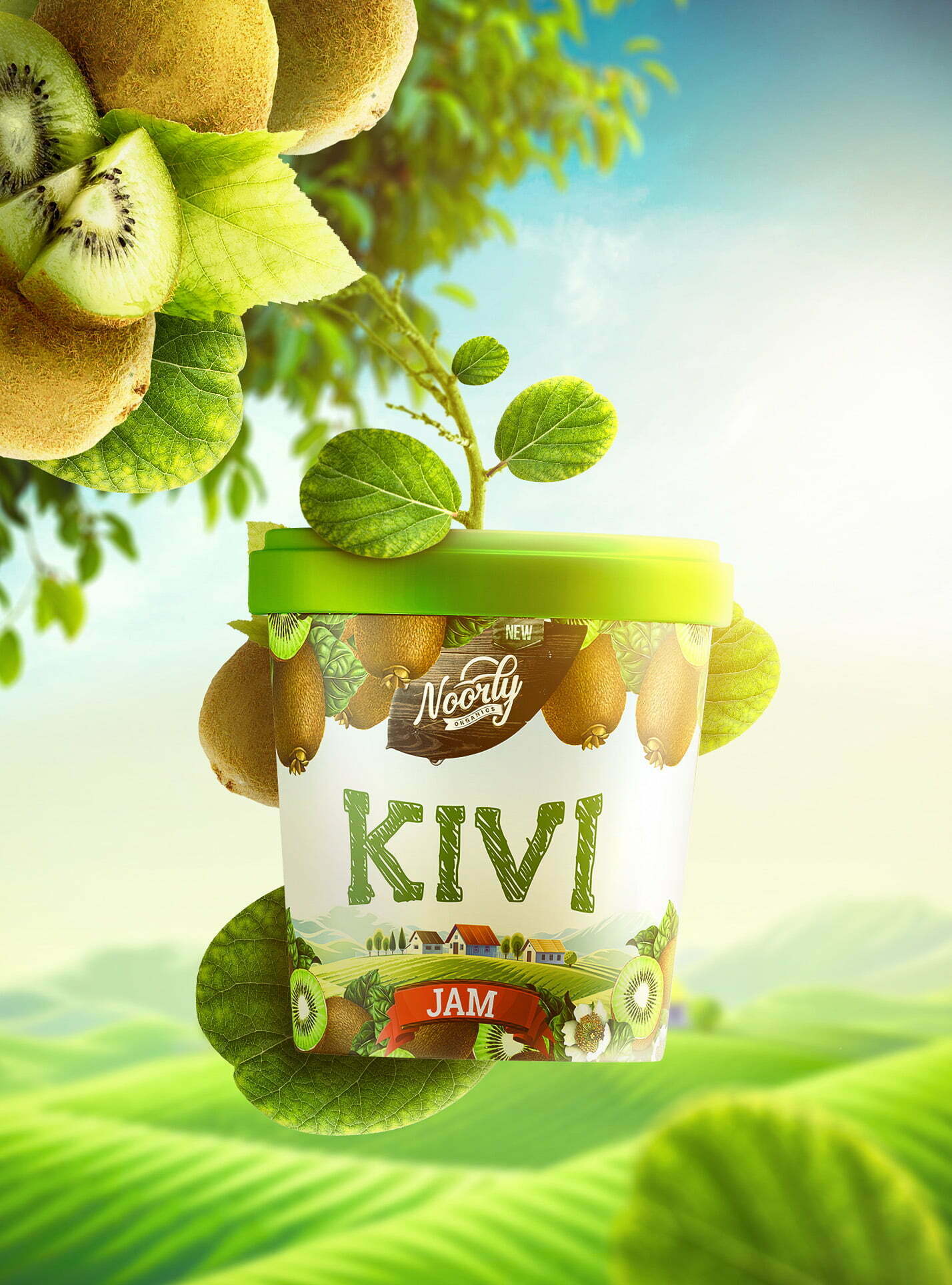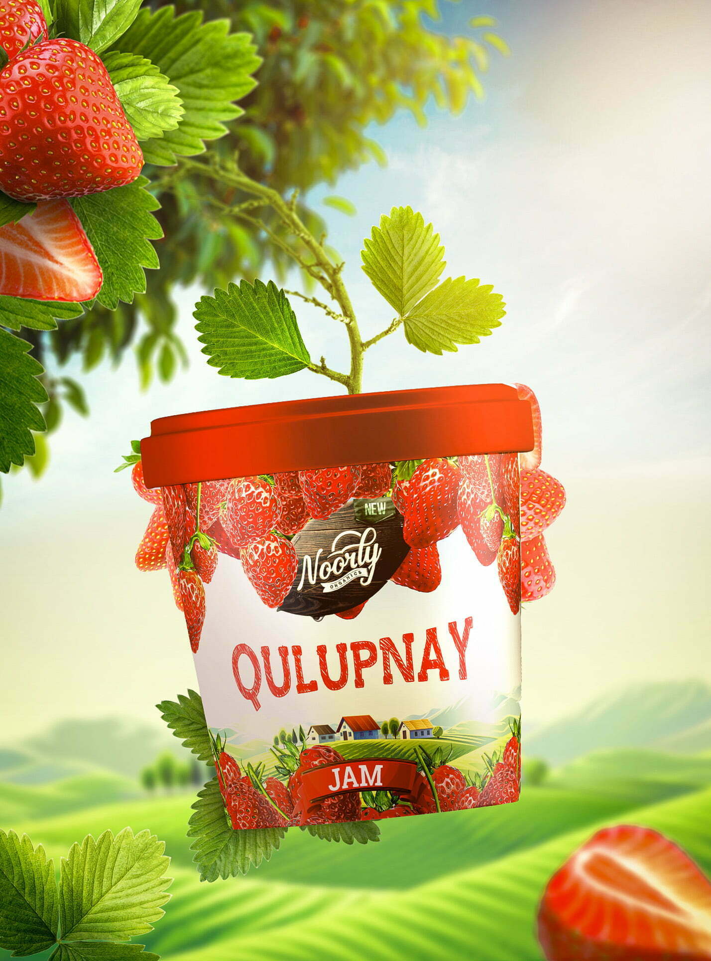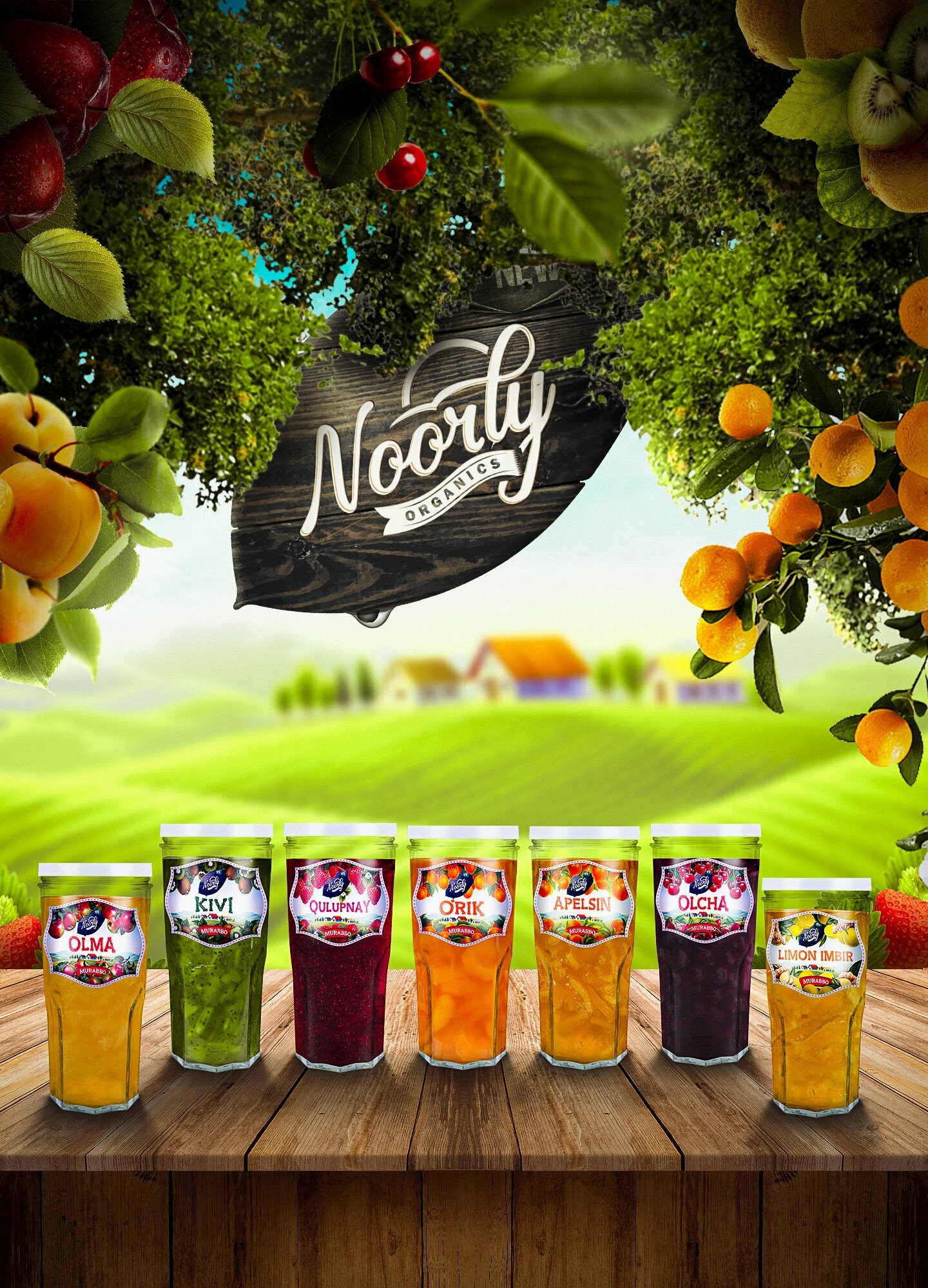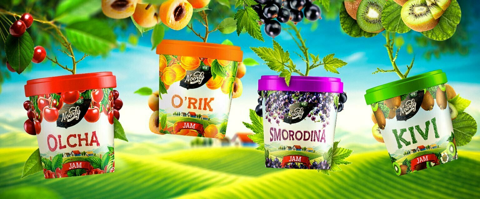
Uzbekistan is well-known for its rich fruit gardens and sunny seasons, that bring a lot of taste and ripeness to local fruits. And when we got an opportunity to create yet another packaging for a local jam producer, it was a great pleasure for all of our team.
First of all, we designed a naming. Noorly, is not just a random word that simply sounds good — it is based on Uzbek word «Nurli» which means «full of light». Main advantage of this name is that it’s quite comfortable, meaningful and melodic for both local and foreign customers. Moreover, it nicely reflects sunshine nature of Uzbekistan, which is literally full of light almost all the year.
When it comes to the packaging, we had to stick to local trends and use a lot of elements, that create colorful and bright image. Customers and businesses here in Uzbekistan now much used to see such packaging design in all fruit products, especially if it’s something sweet like jam.
Some parts of the packaging refer to the rural areas, where mainly fruit like apples, peaches, cherries and other grow. Also we used valley landscapes to underline the natural origin of the product.
A village houses on the background were completely mastered by our illustrators and retouched by graphic designers. Packaging can be adapted to different advertisement canvas like billboards, posters, digital promotion or even brand stickers. As a last but not least detail, we decided to name jam types in modern Uzbek, so that local people could easily identify which product is fit for their tastes.