Agency: Kuudes
Art Director, designer: Tony Eräpuro
Location: Finland
Project Type: Produced
Client: Fazer
Product Launch Location: Europe
Packaging Contents: Confectionery
Packaging Substrate / Materials: Plastic
Printing Process: Flexography
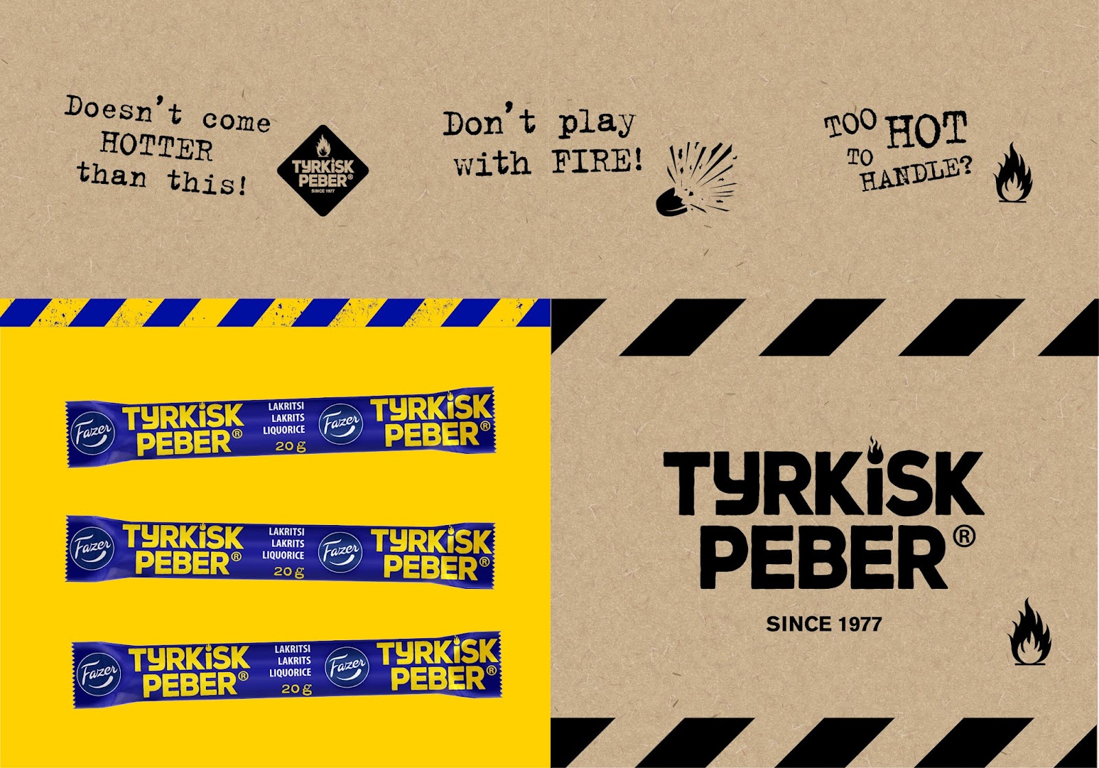
Rebranding an iconic liquorice.
The feisty Tyrkisk Peber has been stealing the hearts of salty liquorice lovers in the Nordics since 1977, but due to increasing competition, it was time to update the identity to reinforce its position as the original #1 product on the market.
In the spirit of the Fazer design philosophy “simplify to amplify“, we gave this classic brand a make-over that honors its heritage but also creates a new striking identity that encapsulates the essence of the proposition.
The new identity has been embraced mutually by avid product fans as well as the trade all over the Nordics. Sales charts are pointing upwards since the re-launch.
What’s Unique?
Strong bold colours in flavour variants. Massive stand out logo in the middle of the packaging for shelf appearance.


