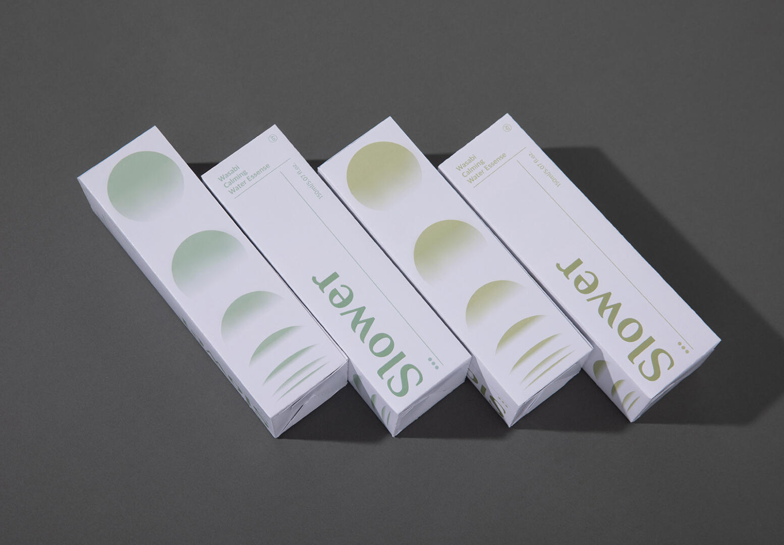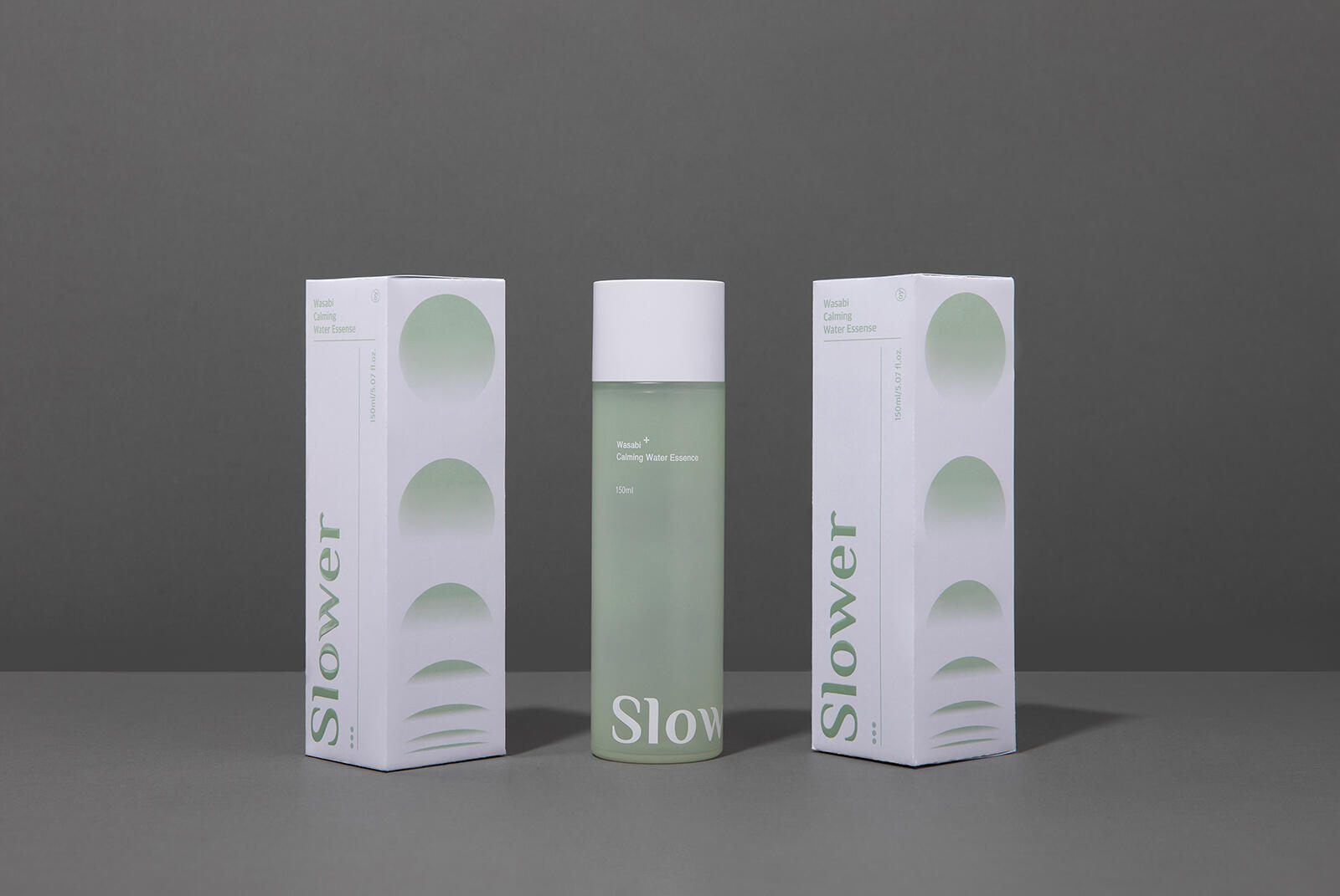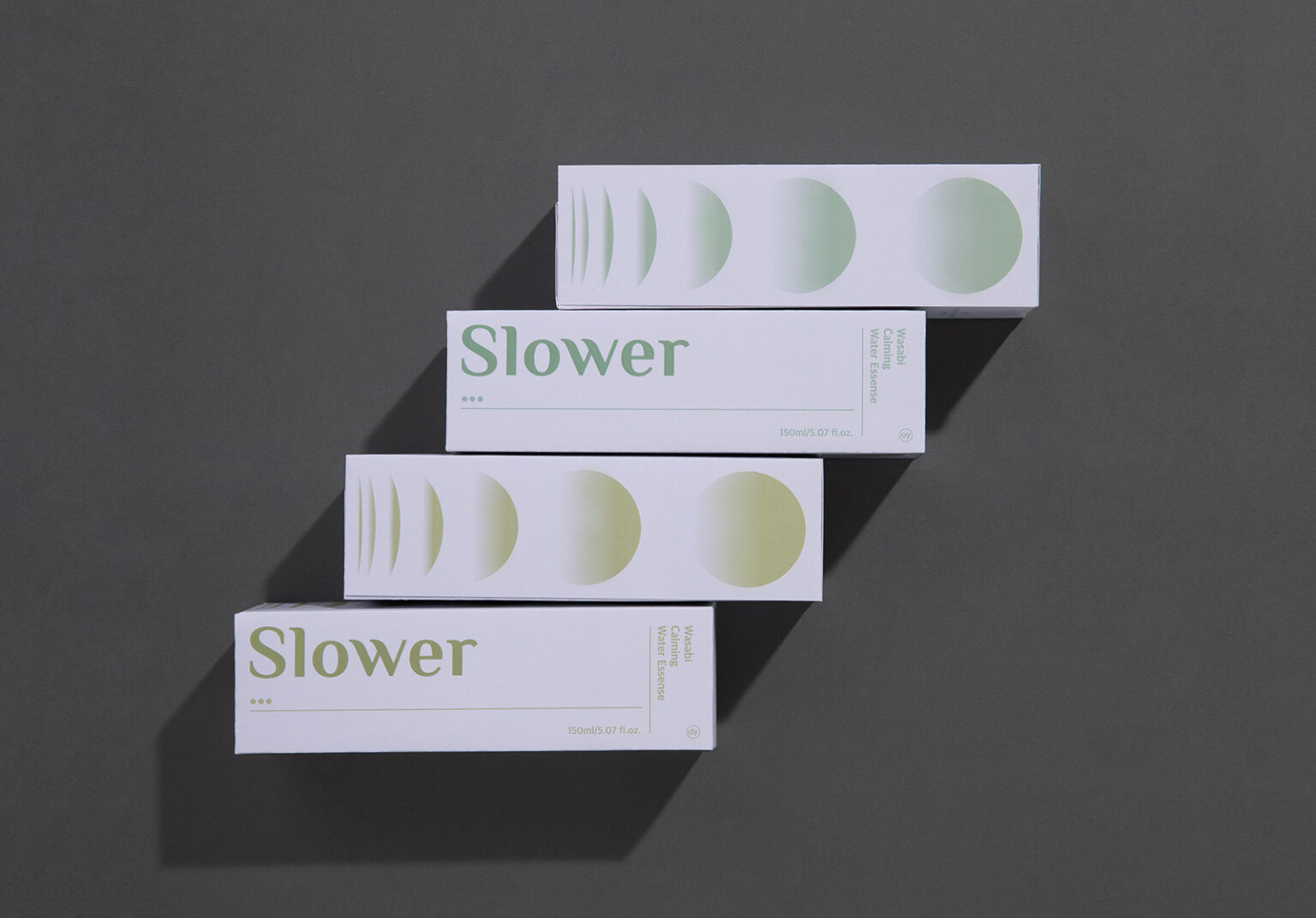
We did brand design and package design of naturalistic cosmetic brand Slower. As you can see intuitively from the naming, we wanted to reveal the brand’s philosophy of slowness with nature. And, there are keywords that show the value of slow down, such as 99% natural materials, animal testing agents, recycling packages, and social contribution. There was a client’s request to reveal them in the brand, and it was also necessary to not lose the efficacy of cosmetics. Gradient graphics that seem to come to mind are the identities that best show the flow of nature. In tone manners, it is a color reminiscent of nature, but overall, it is based on a reliable graphic that can appeal to the efficacy effect. It’s also seen in the brand logo, but it’s a bit of a modern serif, which represents an organic form. So I wanted to strongly reveal the brand through an identity that is soft but has a twist overall. Slower is a modern reinterpretation of the forces of nature.