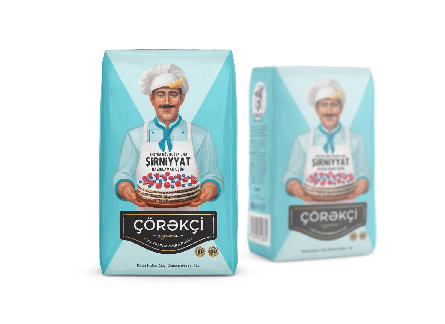
“Çörəkçi” is the bread producer. Despite its name (it means “baker” in Azeri), neither the logo nor the packaging design reflected the spirit of the company. I proposed a rebranding of the logo and the creation of a mascot as part of this work.
The mascot of such a brand, of course, had to be a baker. But the creation of the mascot is just a part of the project, it was also necessary to create a packaging design. It’s not enough just to create a beautiful design, it must also have certain practicality. Therefore, I suggested to the client to divide the products not by flour grades, as all manufacturers do, but by area of use. Indeed, the technologists noted that types of flour have their own field of application. Soon, together with the company’s technologists, 4 types of baking flour were created: for cakes, flour dishes, bread, and pizza. The result of the work was not just a beautiful package, but a functional solution that provides a convenient choice for the consumer.