This project was completed last autumn. A small, local company making dairy products, requested a radical change in design labels of cheese products. The brief stated that the company produces high-quality cheeses based on original Dutch and Italian recipes using natural cow and buffalo milk without using vegetable fats. Due to the use of natural ingredients, the products had a higher price, and compared to imported brands, they had a completely unattractive design. As a result, the products were losing out to low-quality dairy products made from vegetable fats but with a bright, recognizable appearance.
Obviously, the logo and label were created by a designer without specialized education and experience. Essentially, it was clip art with the brand name added to it. Even the brand name itself could hardly be called original. In developing countries, it is fashionable to name brands using simple English words.
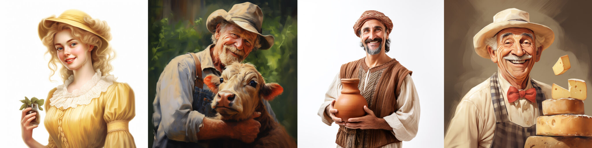
After determining the client’s preferences, I started gathering information. As before, I asked for help from artificial intelligence for ideas on creating the look, color scheme, and features of the face. AI is a unique and indispensable tool in this regard. However, it’s important to recognize its limitations because it’s not actual intelligence and cannot complete the work for you.
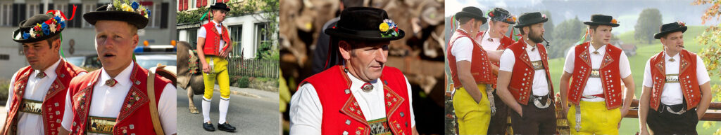
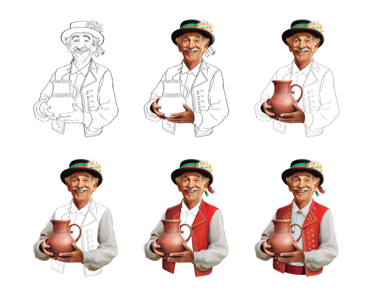
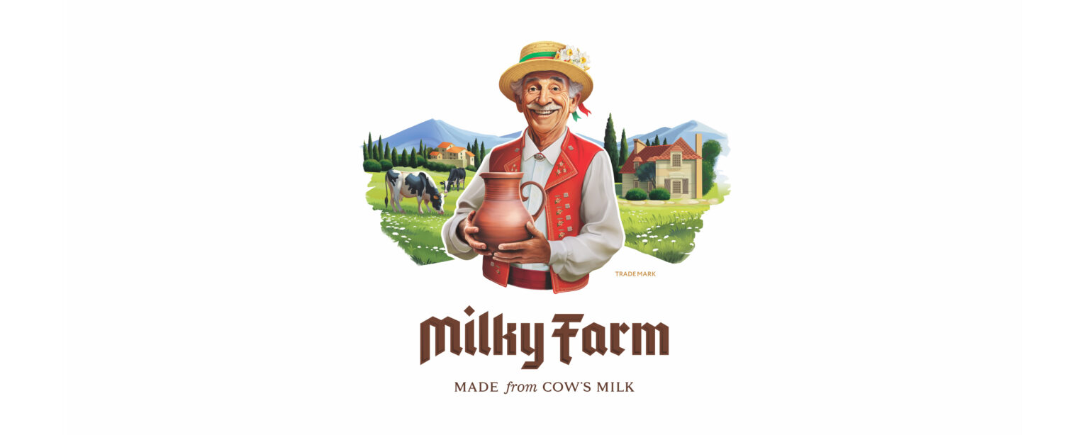
The products were made according to the classic recipes of European countries. Considering this, the client wanted the character to look European and the background to resemble European landscapes. In searching for materials, Swiss national costumes caught my attention the most.
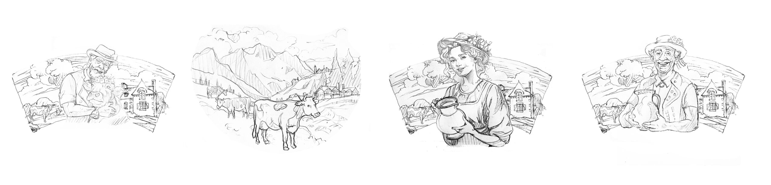
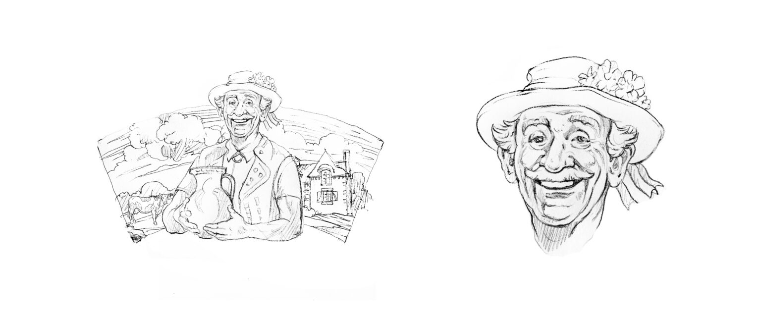
On the “D-day,” I started working. I decided to create 4 different options right away. It took me more time at the sketching stage, but I was confident that the client would be able to choose the optimal option on the first attempt.
While creating unique logos, typography is no less significant. Handwritten lettering has a more unique shape, and more importantly, it integrates better into the environment; it’s easier to “blend” with the main part of the logo.
Four illustration options and three typography options allowed me to create 9 different logo variations. With such a portfolio, I decided to conduct the first stage of the presentation. The goal of this stage was to determine the direction and narrow down the scope of work.
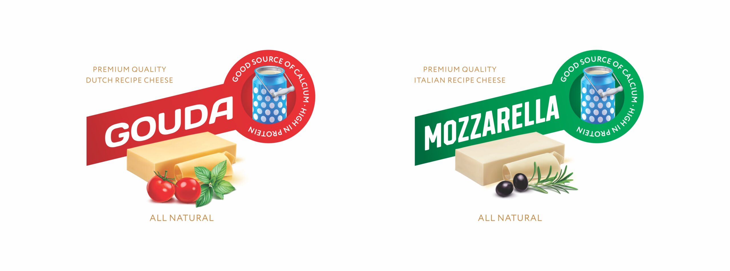
The manufacturer had several types of cheese, and I needed to demonstrate these differences while maintaining a certain sequence. Consumers should understand that although the products are different, they belong to one brand.
By creating a unified style, I also achieved a contrasting difference. Due to this, consumers could easily distinguish between different types of cheese from a distance of several meters.
The project was nearing completion two weeks later, and the new labels were demonstrated to the client. I promised the client that I would create a brand for him with the most premium appearance, overshadowing all renowned brands. Fifteen days ago, my promise brought a smile to his face.
The means of this client were severely limited, and all he could afford was to update the product labels. But sometimes, even this small step for a designer is a huge leap for a small company.