At the beginning of my freelance career, I asked myself, “Why should a logo be simple?” Can a simple form convey the spirit and heritage of a brand? To explore this question, I cited iconic brands like Nike, McDonald’s, Coca-Cola, and Apple as examples. I convinced myself that these famous brands are known for their minimalist designs, but could they be considered successful examples for all, and could minimalism be applied effectively to smaller brands?
Experience shows that minimalism is successful primarily for companies with significant marketing budgets and long-standing reputations. For small brands, however, minimalism can be counterproductive and lacks competitive advantages.
That’s why, in my work, I prefer creating complex logos. To me, a logo is a tool that helps a brand establish a connection with its client. Most brands I work with have minimal budgets, and the logo is often the primary form of communication with the consumer. Therefore, my logos tend to depict specific scenes; this can help the viewer grasp the company’s activities and traditions.
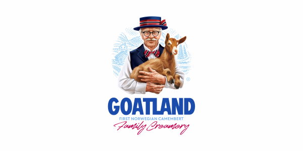
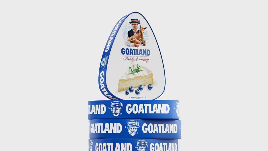
Look at this logo, and you will immediately understand which country this brand is from and it’s form of activity. Now tell me, can a minimalist logo do the same job? I would say no, because in the context of minimalism, no one expects such information from a logo. These functions are handled by other ATL and BTL tools. There’s another important point to mention: minimalism is not a starting point. Many iconic brands initially had quite complex logos. The process of simplifying their logos into minimalist forms was a complex, long-term journey for them.
For me, creating a complex logo is a fascinating process. Every detail can be discussed and adjusted: elements of clothing, colors, body part positioning, facial expressions, and more.
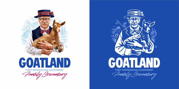
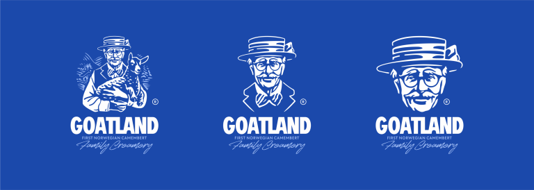
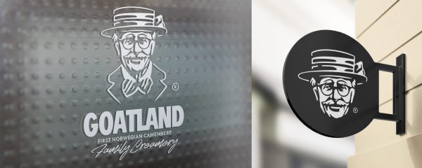
But there’s something about complex logos that will amaze you: the ability to simplify them. Yes, that’s right—they can be made very simple while still remaining recognizable. In the image below, you can see a clear example.
You may logically ask: why create a complex logo and then try to simplify it? Let me explain. In fact, such manipulations have a practical purpose. Imagine you have packaging on which you’d like to place your logo. The surface area, material, and printing method of the packaging allow you to do this easily, but later you need to use the same logo as a social media icon, print it on a small form, or engrave it on wood. In all these cases, using a detailed design becomes impossible. That’s exactly why I also create simplified versions of logos. This approach helps the brand maintain its connection with the customer, regardless of the communication medium.