About the project
Strauss is one of the largest food manufacturers in Israel. Strauss Group specializes in the production of dairy products, coffee, water, snacks, salads and sauces.
A task
The LeCafé brand is the 3rd largest brand in the company’s portfolio in the coffee category. It is retailed in the category of instant coffee only. Since the brand has a history of good sales in the retail, it was decided to relaunch LeCafé with an updated design. And due to the redesign, increase sales, attract customers, and gain additional market share in freeze-dried coffee.
Solution
Сurrent design looked cheap, was oversaturated with details, sent back to the 90s. The coffee shelf, like the coffee industry itself, has changed dramatically, and the LeCafe brand did not respond to the needs of the modern audience.
Although the design was bright enough, it was lost on the shelf compared to other players from the economy segment (Black Card, Jockey, Grand), did not lead to a purchase and was poorly associated with the brand.
The audit according to our “Three Layers of Efficiency” methodology showed low packaging efficiency. The lack of a food zone, the modern look of competitors – did not give the LeCafé brand a chance to succeed on the shelf.
New positioning
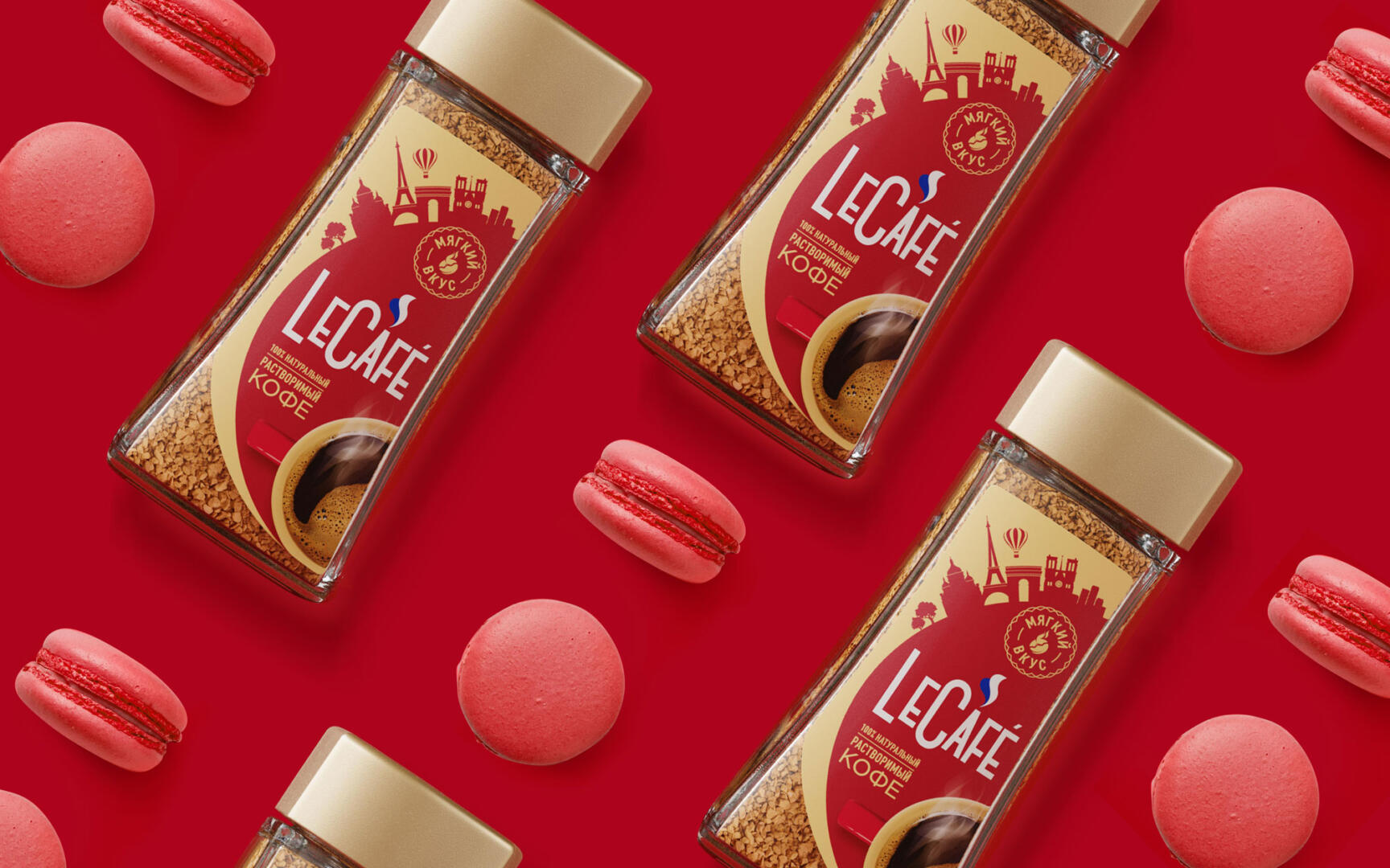
Thanks to its name LeCafé, the brand is located in the zone of belonging to France, to Paris and should create the feeling of a French coffee house.
The second vector of development is pleasure. The pleasure of coffee, its smell, taste. The brand should create the delicious sensation of delicious coffee through food zones, complementary French desserts that people consume with coffee.
“The pleasure of coffee” and “Belonging to France” should be conveyed in the packaging design to communicate the idea of the brand, its positioning.
The design came out bright, optimistic, european. Thanks to the new can shape, we were able to noticeably increase the area of the label. The design is based on a circle that spins multiple stories. The first one shows the sights of Paris, the second one conveys the pleasure of a cup of invigorating aromatic coffee. The powerful contrast of red and gold gives the brand a visual outstanding on the shelf.
We hope that the redesign will help to achieve all the set business goals and attract a new audience, switching it from other inexpensive coffee brands to LeCafé.