About the project
The SoyuzPishcheprom company produces a wide range of products for adherents of a healthy diet, including lactose-free milk: oat, rice, wheat, soy, almond, coconut milk.
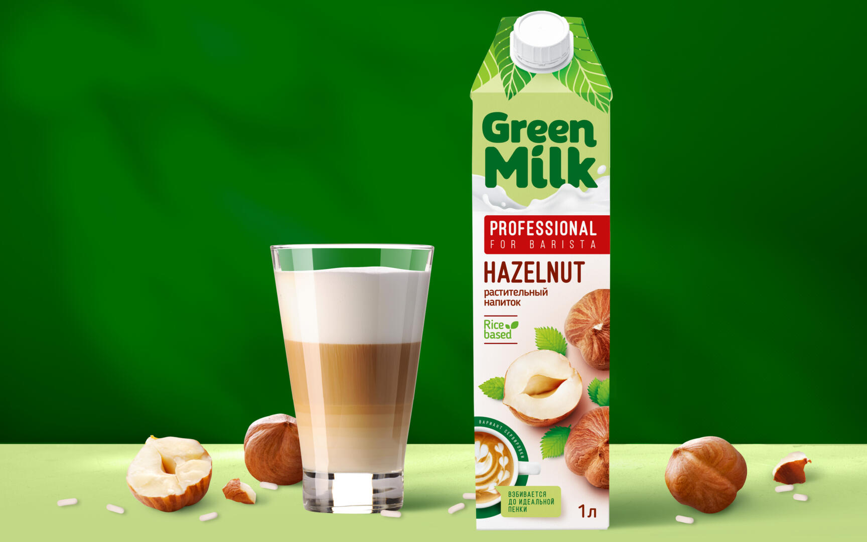
TM Green Milk Barista is designed for the refined taste of baristas, professionals in the field of coffee preparation.
A task
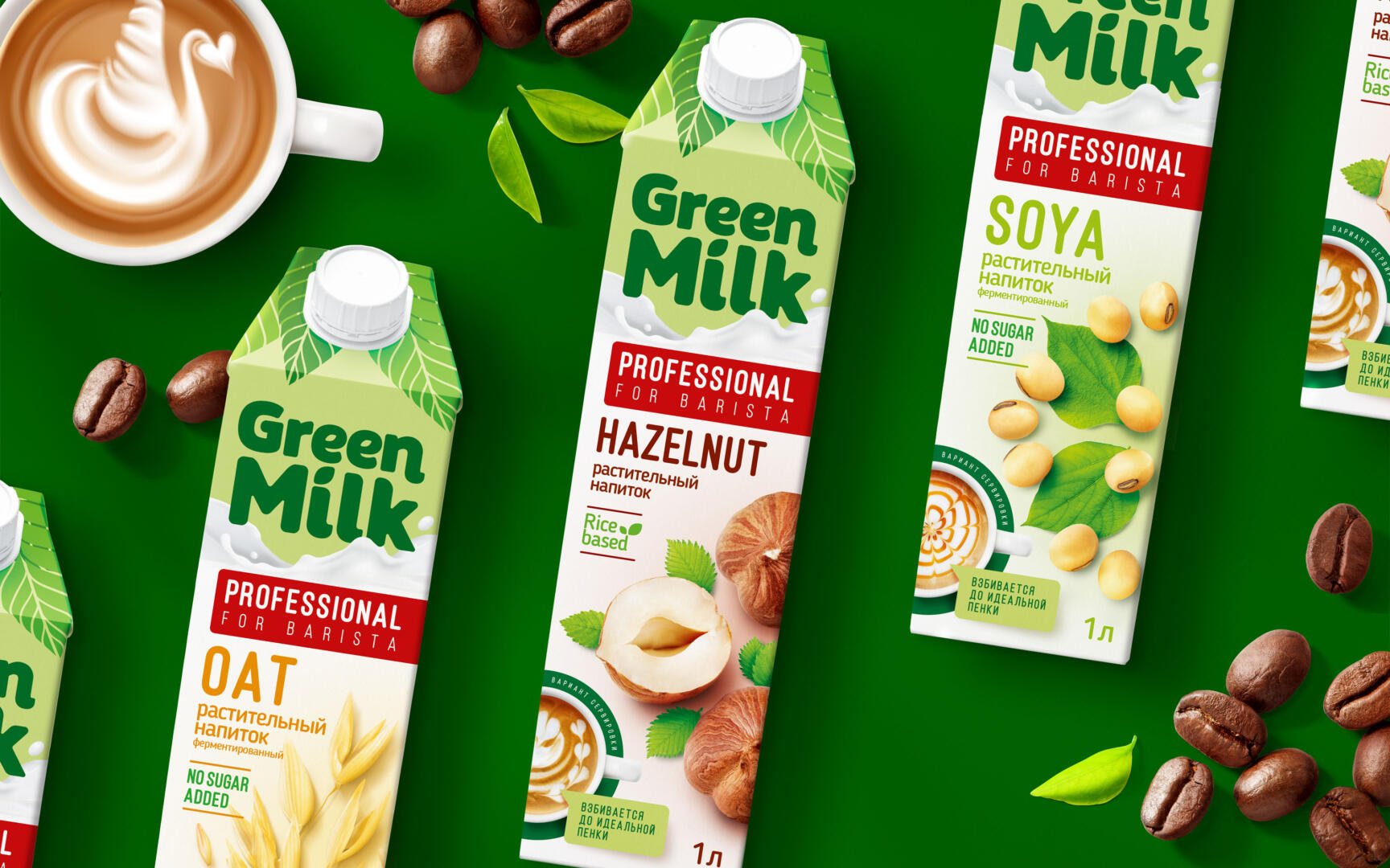
The Green Milk brand entered the market in 2018 and has become one of the leaders in the Plant Milk category. But over time and the appearance of new competitors in the category on the market, a decision was made to redesign, as a result of which the line expanded from four to seven SKU most in demand in coffee shops. New flavors were developed – banana, vanilla and oats, as well as an updated recipe for drinks based on coconut, almonds, soy and hazelnuts.
Solution
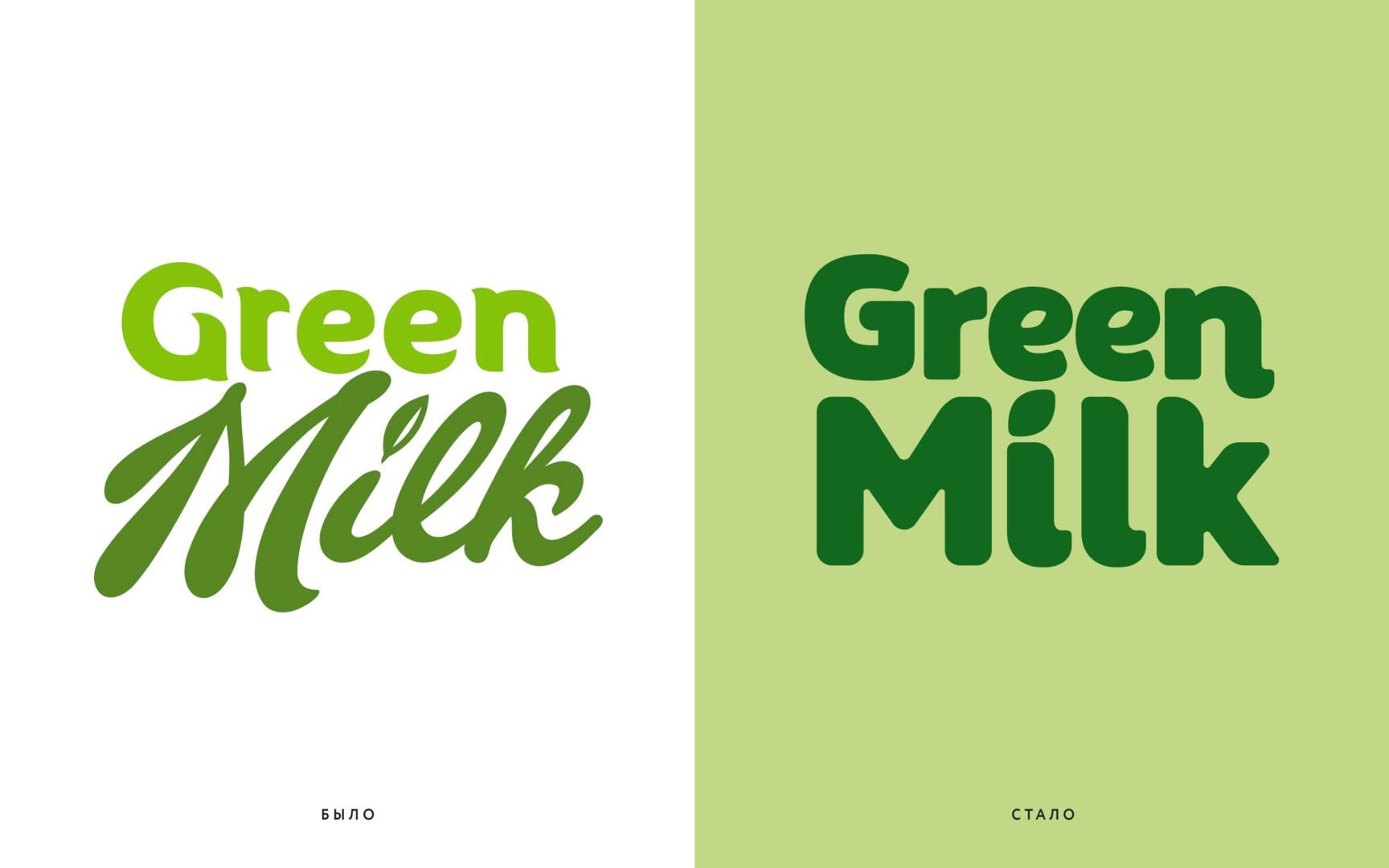
As usual, we started with a shelf audit, as it perfectly shows growth points and weaknesses. As a result of the audit, it became clear that it was necessary to change the logo, as it is poorly readable, and the whole design. In addition, the category leader Alpro has recently restyled, and since Green Milk and Alpro have approximately the same positioning – the basic product for the target audience they are aimed at – it was impossible to lose their positions.
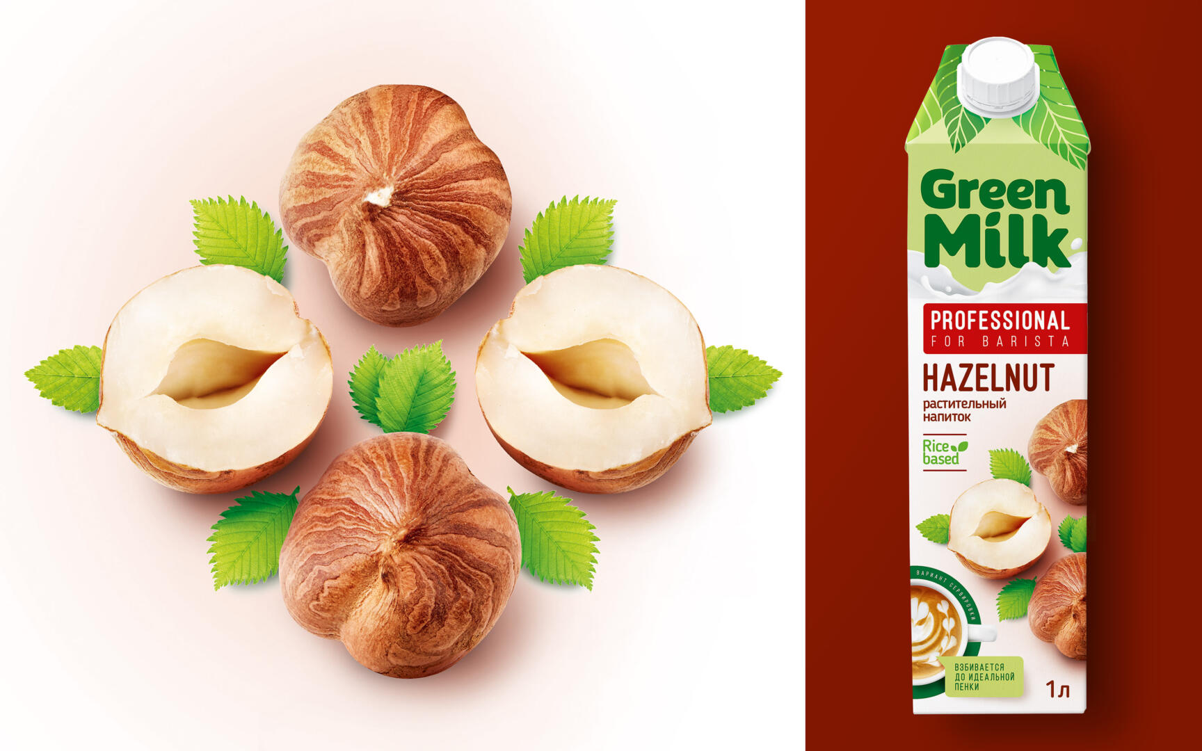
The redesign was supposed to be rather not cardinal, but more successive in order to maintain recognition among its audience. The green color and leaves at the top of the package helped to play up the name Green Milk. The food zone looks like an appetizing kaleidoscope of various products according to taste and is always complemented by a mug of aromatic coffee with foam, taken from the top angle. All this gives a good standout on the shelf.
The brand is designed not only for professional baristas, but also for gourmets who like to make great coffee at home. Therefore, on the side, we made a block with tips for “home baristas”. And on the front part, the category and characteristics of the product were prescribed.
Thanks to a large logo, an appetizing food zone, “European style” and well-developed communication, the brand has significantly increased its effectiveness according to the results of the final audit.
For us, this is the second project with Soyuzpischeprom, we previously updated their TM Tsar.