Baikal is an iconic Russian carbonated drink with natural ingredients and an original taste. The name evokes the breathtaking natural beauty of Lake Baikal. We have developed a new packaging design for this much-loved lemonade-based beverage. The packaging design is aimed towards open-minded young denizens of megacities who live in the present moment and yearn to be in touch with nature. Together with the Chernogolovka team, we relaunched Baikal 1977 by creating a new brand visual image that goes hand in hand with the platform – a natural source of inspiration.
Baikal is both the deepest and the cleanest lake on Earth: its crystal-clear waters flow through the lush landscapes, lending magnificent vigor to a wide variety of unique flora over a thousand years. The non-alcoholic refreshing drinks, named after Lake Baikal, are a perfect fusion of two of nature’s gifts: revitalizing water and beneficial herbs. The packaging design immerses us in the timeless and mysterious world of the natural elements, emphasizing notions of purity and power.
Nature is an indispensable source of inspiration and vitality. We are genuinely in love with the nature of Lake Baikal. We want this beverage to give modern urban residents the taste of an invigorating forest walk and a connection with nature, transporting them away from the stresses and strains of big city life. With this aim in mind, Baikal contains fresh coniferous aroma and natural extracts of Siberian herbs.
“Design brings these natural elements to life. Each element reflects the crispness of the air and the freshness of the forest. This translates the functionality of Baikal drinks, which encourages a mental reset and emotional relaxation. The name Baikal is a cross-cutting theme in the new packaging design, which serves to unite all the visual components. We used natural colors and added a special “green” descriptor to indicate the natural purity of the components. Inspiring plots in the design encourage us to closely examine the packaging.” – Jane Struk, creative director Depot branding agency
The design codes that we used do not match those typically found within the fizzy drinks industry. The vertical brand logo maximizes the presence of the brand on the shelf, demanding the consumer’s attention and evoking the desire to try it. The basic illustration tells us about the unique characteristics of Baikal’s nature, its richness, its depth, and its mystery.
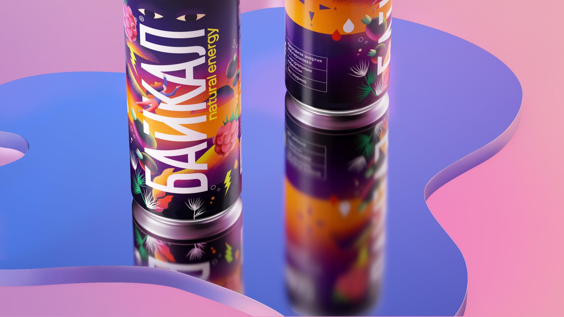
We have developed a packaging design across three formats – glass, jar, and PET. The product is presented in the form of soda (green) and energy drinks (natural energy) with different flavors.
BAIKAL green lemonade is a new generation soda based on an original combination of natural extracts of eleutherococcus and green tea, as well as essential oils of lemon, cardamom and eucalyptus.
BAIKAL natural energy fizzy drinks are new-generation energy drinks with an authentic taste – natural caffeine and eleutherococcus, with a rich and pure taste, free from taurine, and free from preservatives. The unmistakable notes of coffee-lemon will be highly appreciated by coffee lovers, and the raspberry/wild currant notes provide a tastefully tart and tangy taste of mixed berries.