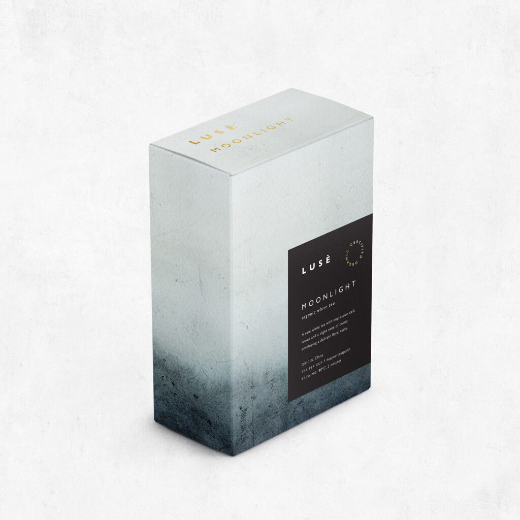
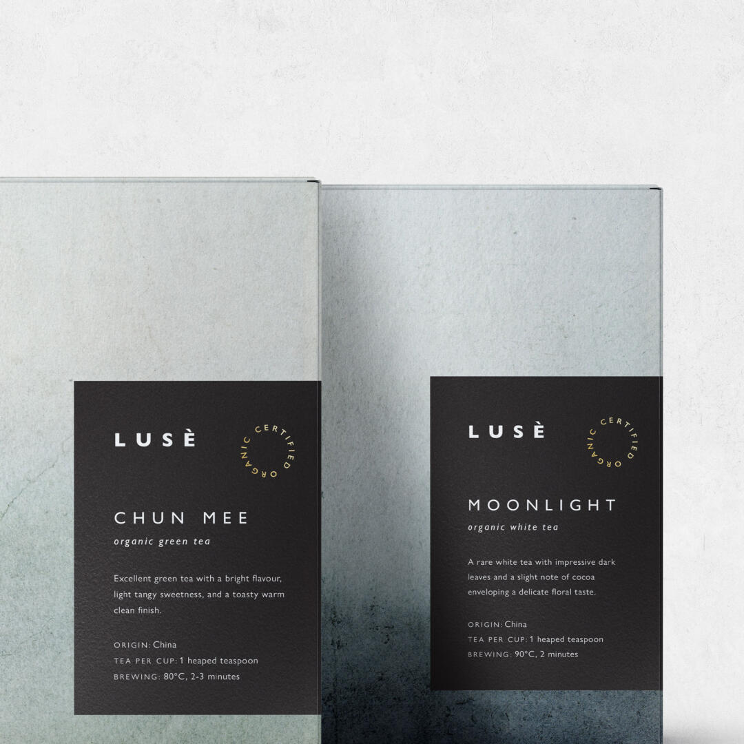
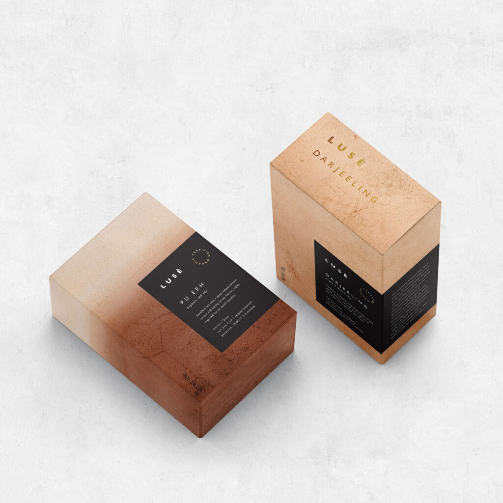
Lusè is a brand of certified organic tea of the highest quality. They needed a stylish brand identity and packaging design for their new range of products. The name Lusè is inspired by the pronunciation of the word “green” in Chinese, reflecting their love of the pure green tea originated in that part of the world. This lovely notion gave rise to the creative direction of the design concept for this brand identity and packaging that is all about colour, elegance and a premium, organic feel.
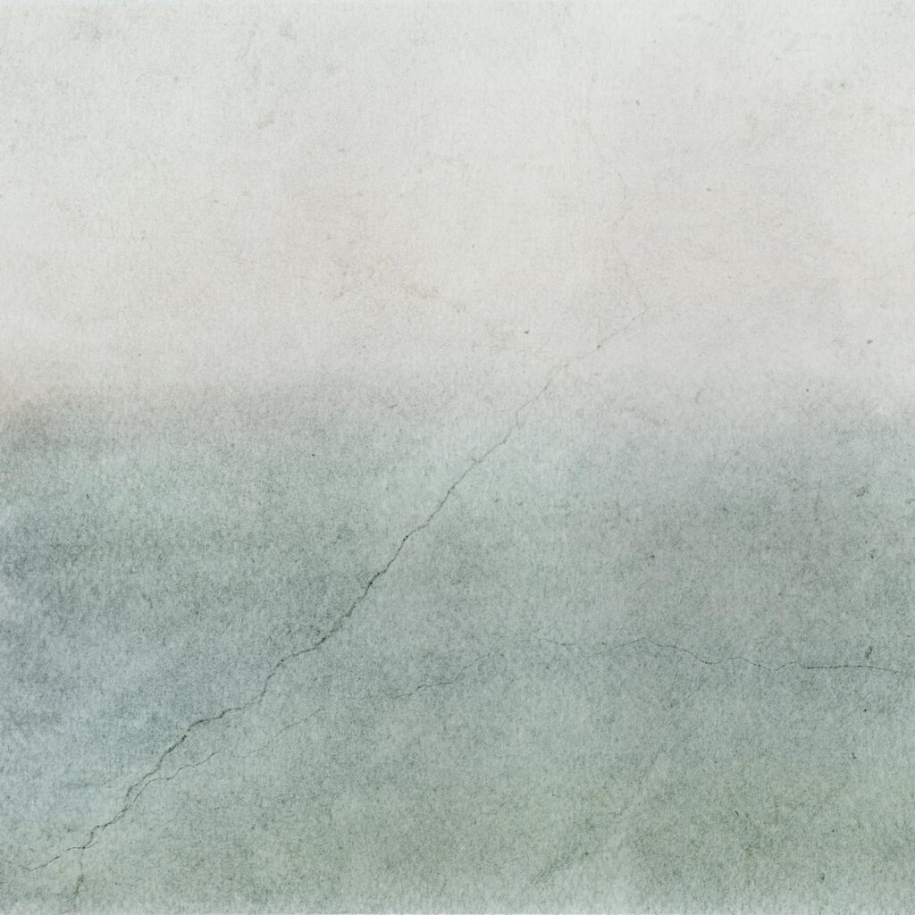
It’s a minimalist interpretation of a simple, natural ingredient producing a beverage of the highest quality. This modern, stylish look was achieved by pairing each of the six flavours of tea with a custom abstract watercolour painting that was inspired by the colours of each variety of tea leaves and their interaction with hot water. These natural paintings provide a raw, earthy look with lots of organic textures, allowing to easily differentiate each flavour and at the same time providing each box with a different, individual character – just like the tea leaves inside.