Buenandanza Extra Virgin Olive Oil
The inspiration comes from the aim to live day by day, making your own way, freeing yourself from preconceived ideas and opening yourself to experience. The idea symbolises serenity, balance and simplicity, all summed up in a unique claim: the lived experiences. The name is a key part in conveying that idea. The characteristics balanced, restrained, modest and intriguing, are qualities which stand out in the design and how it should be perceived.
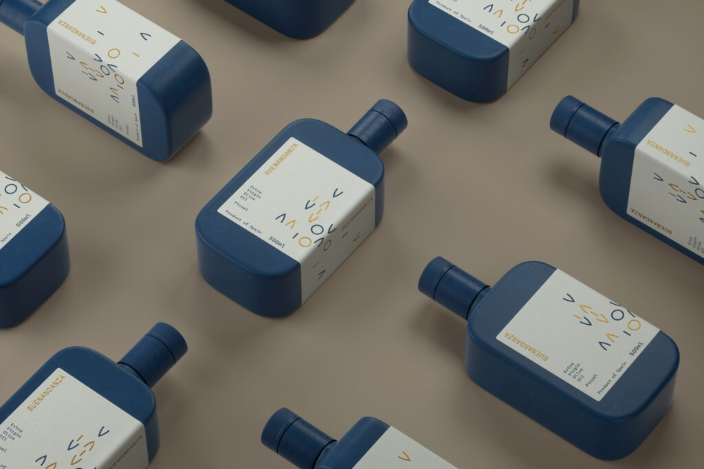
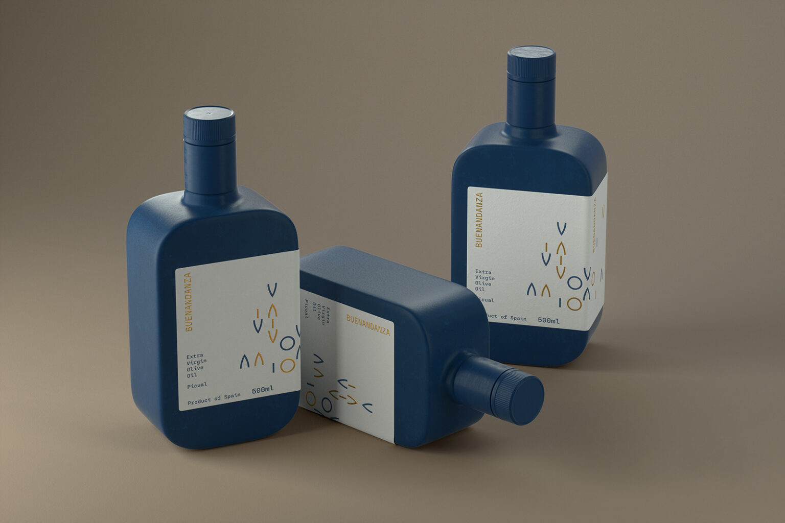
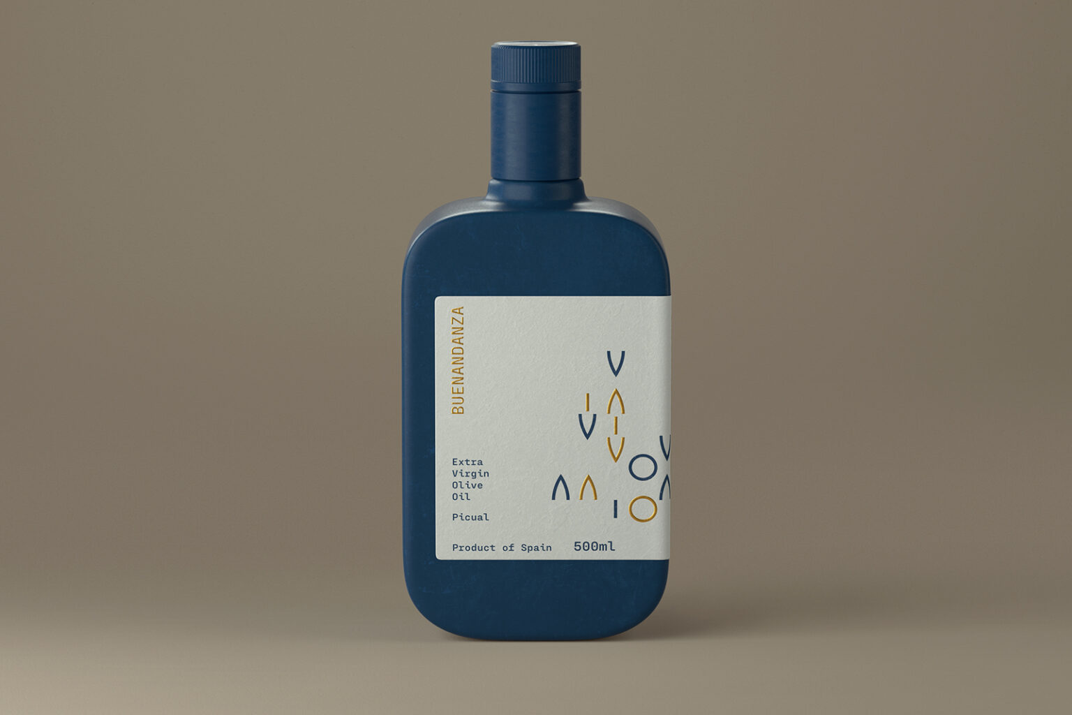
In order to emphasise the concept, a deep dark blue colour was employed, a tone which is associated with serenity. The pourer bottle cap of that same colour is used to lengthen the packaging. The label was designed white to give a more natural look. The symbols represent the possibilities in life that come up when freeing oneself from preconceived ideas. Both the circle and the triangle are inspired by the pointy shape of olive leaves and the oval shape of olives, with a touch of gold to enhance the distinctive character. The muted colour palette, the composition and the label aim to create visual harmony.
The bottle seems to have two skins: the blue colour of the packaging and the white wrap-around label. These finishes provide a pleasant and warm drinking experience. The rounded shapes of the bottle and the thickness convey quality.