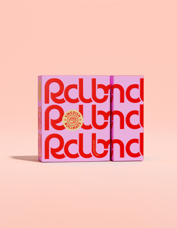
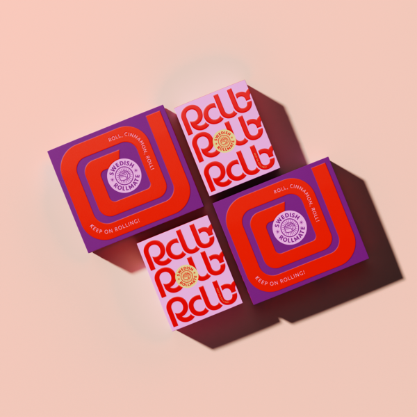
Scandinavian minimalism meets London’s boldness: when two design languages meet, as in the case of our SWEDISH ROLLMATES, something entirely new can be born. In this case it’s a creative exercise in design fusion: the roll of a lifetime.
The SWEDISH ROLLMATES are minimalist, bold and poppy – and thus not only a perfect example of how lifestyle packaging can make even “traditional classics” look modern and metropolitan. It’s also a design case that shows how packaging can work on social media.
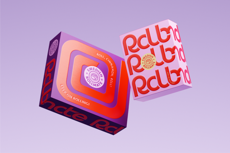
The design for the international favorite from Sweden – the cinnamon roll – is the form-filled combination of two totally different country codes. Scandi-style reduction is paired with a colorful boldness, that is often found in lifestyle packaging in big cities.
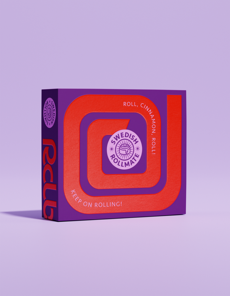
Dominated by powerful purple and orange the SWEDISH ROLLMATES make clear that they are a proud, fun and self-confident interpretation of a classic, that has become popular far beyond Swedish borders. The bold typography is meant to have a rolling effect with flowing, rounded letters.
The form of the bun is referenced by the snail-like design element – however, the focus of the design concept is to create a lifestyle product that sets a fun atmosphere rather than, as often seen, banking on taste appeal.
When working with customers from a wide variety of markets, this question naturally appears sooner or later: “What happens when you mix two completely contrasting design languages?” The SWEDISH ROLLMATES (think Soulmates but sweeter) are cinnamon buns with a new look. They illustrate how different countries shouldn’t always so easily be perceived as separate markets. Rather, they are an opportunity to revive and combine design traditions.
Seeing and knowing the different regional and country codes is an important requirement in our work. If you know the rules of the game, you can move freely within them. Or, if the situation allows, you can skillfully challenge or break boundaries.
Creative Concept made by WIN Creating Images:
Design, Strategy, Trends
Curator’s Insight
The cinnamon roll, with its swirls and curves, bears a resemblance to a snail’s shell, it’s a subtle yet clever visual connection that makes you pause and think. The typography here is bold, flowing, and rounded too, just like the rolling effect of biting into a delicious cinnamon roll.


