When developing a logo for the brand “TanK” – yeast for winemaking, I tried to convey the uniqueness and character of the product itself, as well as give it a memorable image.
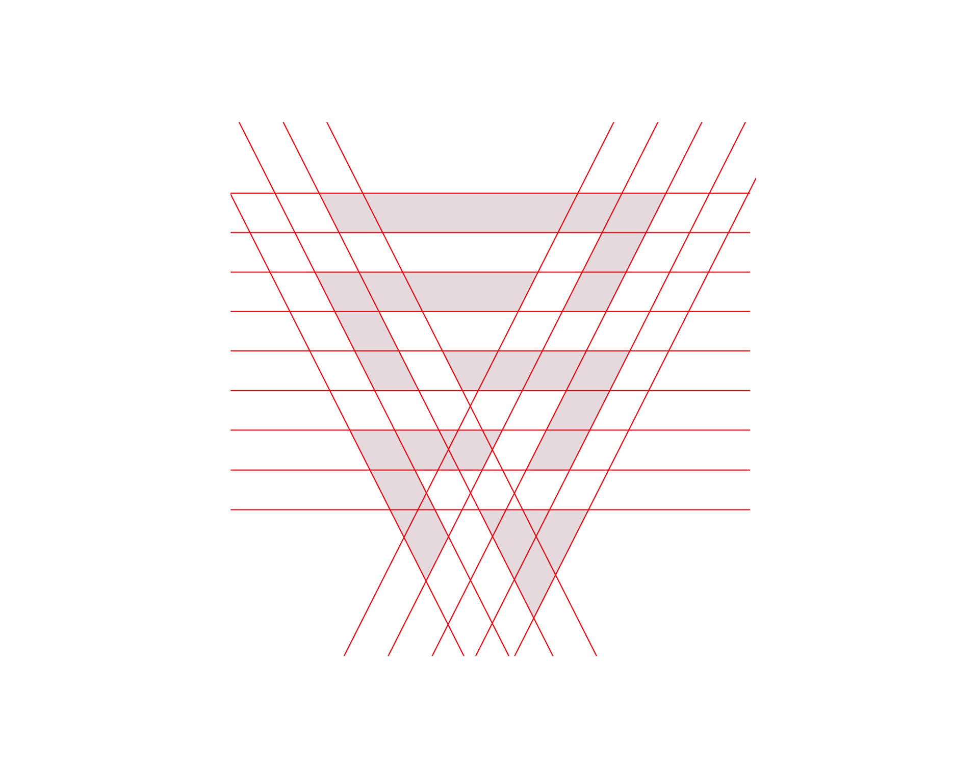
The main element of the logo is intertwined triangles, which symbolize not just a bunch of grapes, but the five main stages of creating quality wine.
The color scheme of the “TanK” logo is based on shades of burgundy and white – these are colors that are associated with the purity, growth and ripeness of grapes. It also helps to make an emotional impression on the consumer and evokes associations with fertility and quality.
The font rendering for the logo has simple geometry to convey clarity and ease of use of the product. Triangular-shaped letters make the logo look more modern and stylish. In general, the developed “TanK” logo stands out from its competitors and attracts attention with its originality.
The effectiveness of its presentation on the market and attracting the attention of potential buyers depend on high-quality and attractive packaging design. My goal is to create packaging that is not only aesthetically attractive but also effectively communicates with the consumer, arouses interest and creates a positive impression of the product. The graphic element of the TANK logo is intertwined triangles that symbolize a bunch of grapes. This shape not only reflects the main ingredient of the product but also indicates the main stages of wine creation. Particular attention is paid to the choice of colors, fonts, and all details so that their combination creates a harmonious and memorable image. This approach allows you to establish emotional contact with the consumer and instill trust in the product, as well as create favorable associations and atmosphere.