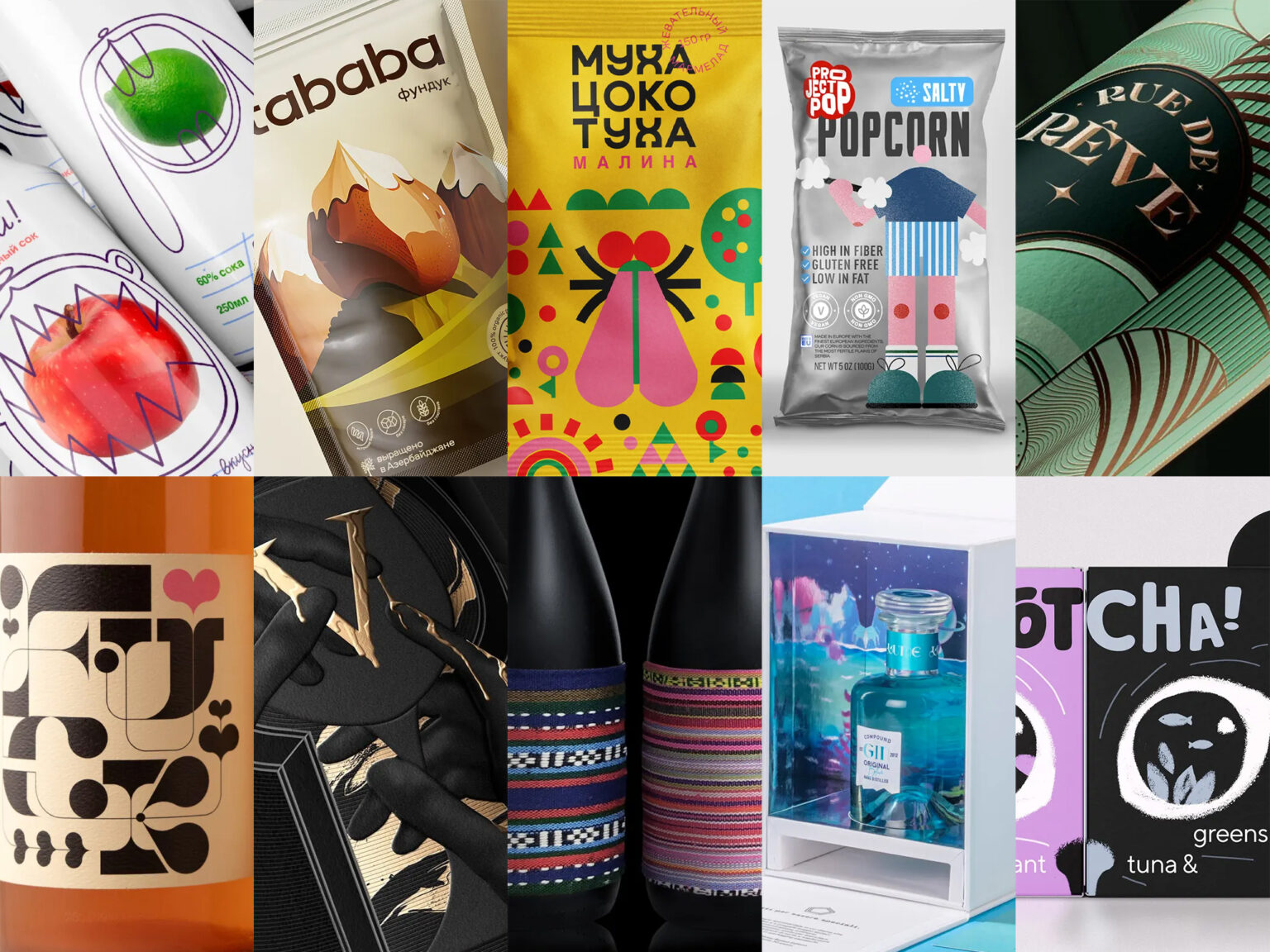
Embark on an exhilarating journey through the latest release of Packaging of the World, Issue #116. Dive into our curated selection of the month’s top 10 posts, a testament to the seamless blend of creativity and engagement that distinguishes them.
These designs, both visually stunning and frequently sparking excitement, have been shared across diverse platforms like Instagram, Facebook, and Pinterest. They serve as profound inspirations, attracting talented artists and enthusiasts from around the world.
Here’s your chance: whether you’re a seasoned contributor or a newcomer, remember to sign in or create an account to share your extraordinary packaging designs with us. Let’s keep the creative energy flowing!
Jelly Candies Mukha Tsokotukha designed by Maria Samokhina
“Mukha Tsokotukha” jelly candies offer more than just sweetness – each package unfolds a fairy tale with insect-shaped treats. The vibrant packaging, adorned with giant insects, creates a joyful ambiance, delighting young sweet enthusiasts. The candies, molded as storybook insects like grasshoppers, flies, ladybugs, and butterflies, boast flavors such as apple, raspberry, strawberry, and blueberry. The naming, candy shapes, and packaging design contribute to a cohesive brand identity, allowing potential expansion with new tastes and insects.
Rue De Rêve Apéritifs designed by Makers & Allies
Female-owned and inspired by the “California Dream Plant,” each varietal blends California wine with native botanicals. The packaging, drawing from contemporary Art Deco and Big Sur’s colors, is a textured, dreamy exploration, capturing the essence of the intersection between France and California.
Thorn & Burrow Wines designed by TRÜF
TRÜF designed Thorn & Burrow Wines in Vancouver, a natural wine brand celebrating uniqueness. Crafting unconventional blends, they sought visually distinct labels. The response: offbeat typography and cutting-edge illustrations, enticing viewers to explore and taste the exclusive contents. Thorn & Burrow Wines stands out, embracing the strange both in its blends and striking visual identity.
Dikiy Sparkling Juice designed by Serafima Degtyareva
Serafima Degtyareva designed Dikiy Sparkling Juice, a concept inspired by the school atmosphere and nostalgic memories. The packaging features a blue line reminiscent of copybooks, handwritten fonts evoking school years, and characters from the fairy tale “Teremok.” Wild and colorful, these characters capture the brand’s informal and rebellious spirit, adding unpredictability and liveliness. Dikiy targets schoolchildren and teenagers, offering a drink that encourages authenticity, quenching their thirst for adventure and youthfulness during school days.
Gotcha! Cat Food designed by Daria Kalenchuk
Daria Kalenchuk designed Gotcha! Cat Food, a series of packaging for healthy dry cat food. Drawing inspiration from cats’ hunting instincts, the brand presents a simple concept: the cat anticipates catching its desired meal, with reflected eyes indicating taste differentiation. The package consists of two boxes for daily and nightly rations, connecting with cats’ wild habits. Adding a playful touch, the paper ears on the food-delivering box resemble a cat’s face, making it both functional and memorable.
Project Pop designed by Kitchen&GoodWolf
Kitchen&GoodWolf designed Project Pop, creating the logo and unique packaging for microwave and ready-to-eat popcorn in three flavors. Catering to the UAE market, where youth face rising weight concerns, the packaging aims to inspire outdoor activities and promote a healthy lifestyle. Playful illustrations contribute to the design, fostering a connection between the brand and the goal of encouraging wellness in the target demographic.
Society V designed by Makers & Allies
Makers & Allies designed Society V, a distinctive bottle for Cooper’s Hawk wine club members. Embracing the unknown, the bottle promises exclusive experiences with each sip, symbolizing luxury and a sense of belonging. The opulent label features gold foil accents, sculpted embossing, debossing, and clear foil embellishments, creating a premium aesthetic. The keyhole incorporated into the design signifies more than mystery—it serves as a gateway to a world of unparalleled experiences, inviting members to join Society V.
Lume – Spirit Of The Abyss designed by Advision
Lume – Spirit of the Abyss transcends the conventional, embodying an experimental space for creative expression without constraints. It’s more than a gin; it’s an immersive experience, an invitation to explore and see the world differently. The packaging, part of the experience, transforms with a smartphone, unveiling a secret world. Inspired by the mysterious abyss, Lume sparks curiosity, symbolizing the courage to push boundaries and discover the unknown.
Atababa – Nuts And Dried Fruits designed by Belozerova Maria
Atababa — an Eastern European fictional brand offering nuts and dried fruits cultivated in sunny Azerbaijan. Tasked with targeting young Muscovites for the retail expansion in Moscow, the design reflects Azerbaijan’s nature through the metaphor of “walnut mountains.” Utilizing generative artificial intelligence, specifically Midjourney, the team created illustrations and a gradient background to represent the brand’s identity. The result showcases the fusion of modern technology and graphic design, bringing to life the vibrant essence of Atababa.
Bouquet Wine designed by Lionpeng Design Studio
Lionpeng Design Studio created Bouquet Wine, a Yunnan, China product made from wild grapes using ancient brewing techniques. Dubbed the “primitive ancient method,” the wine embodies Yunnan’s valleys’ essence. The black opaque glass bottles feature covers made from fabrics crafted by local rural women, supporting their traditional textile work. The vibrant ethnic patterns and colors evoke the flower bouquets strewn across Yunnan’s valleys, preserving the region’s characteristics while preserving the wine’s aroma and allure.


