Dodo Ice Cream and Wafer Company is an old Italian brand. The numerous products of this brand are derived from various types of ice cream in different flavors and shapes.
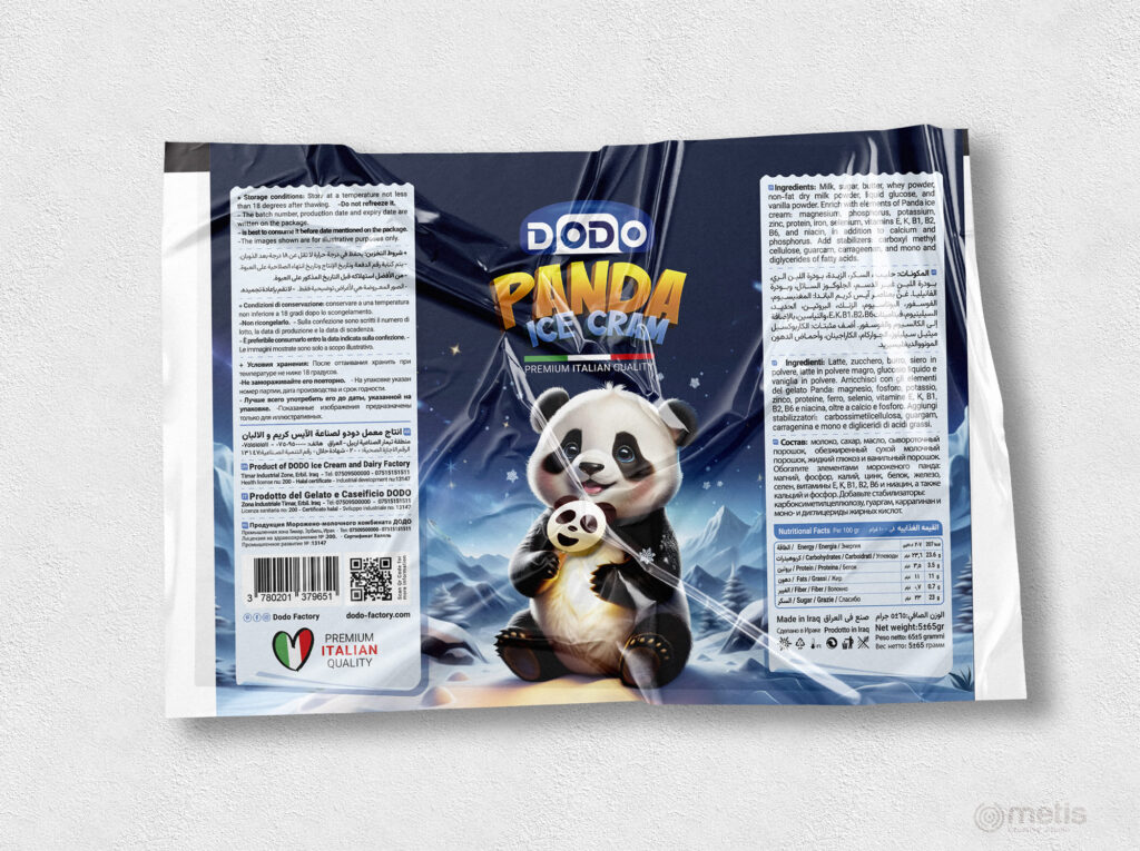
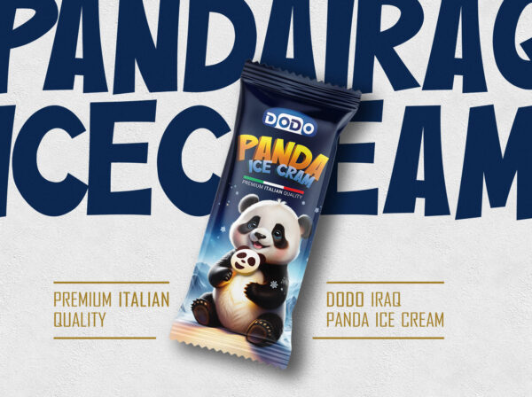
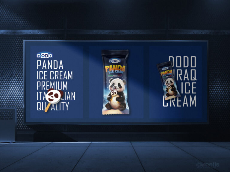
The Dodo brand needed to update the products to improve the quality of packaging and sales, from this the Panda packaging had to be conceptualized and designed in a new style, the initial ideation of Studio Metis was with the main goal of combining Panda’s personality with a completely galactic atmosphere. After the approval of the initial idea, character design and space creation began.
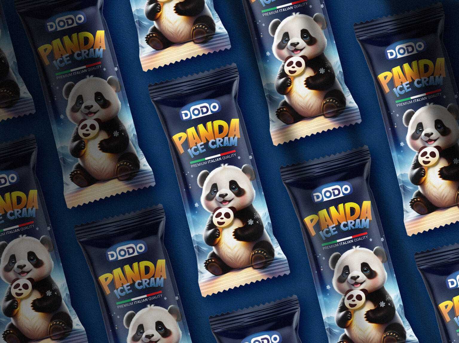
The character design, especially the similarity of the smile to the ice cream product itself, was very important. The combination of navy and white allowed us to create a very attractive visual combination. Finally, typography and pagination were designed and executed according to space creation. The marketing team of Dodo and the team of Metis Studio had the goal in the list that the packaging should be very different from the similar packaging in the product showcase.


