Majo Mezcal: A Modern Tribute to Mexican Heritage
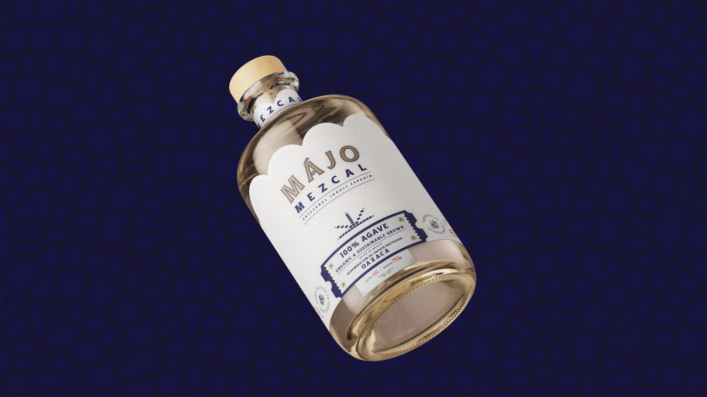
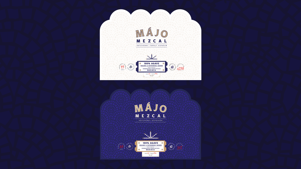
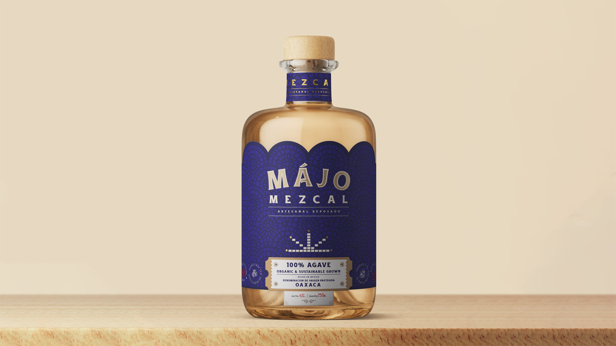
Majo Mezcal is a captivating reinterpretation of traditional Mexican design, seamlessly blending heritage with contemporary aesthetics. The packaging design, with its bold typography, vibrant colors, and intricate details, pays homage to Mexico’s rich cultural tapestry.
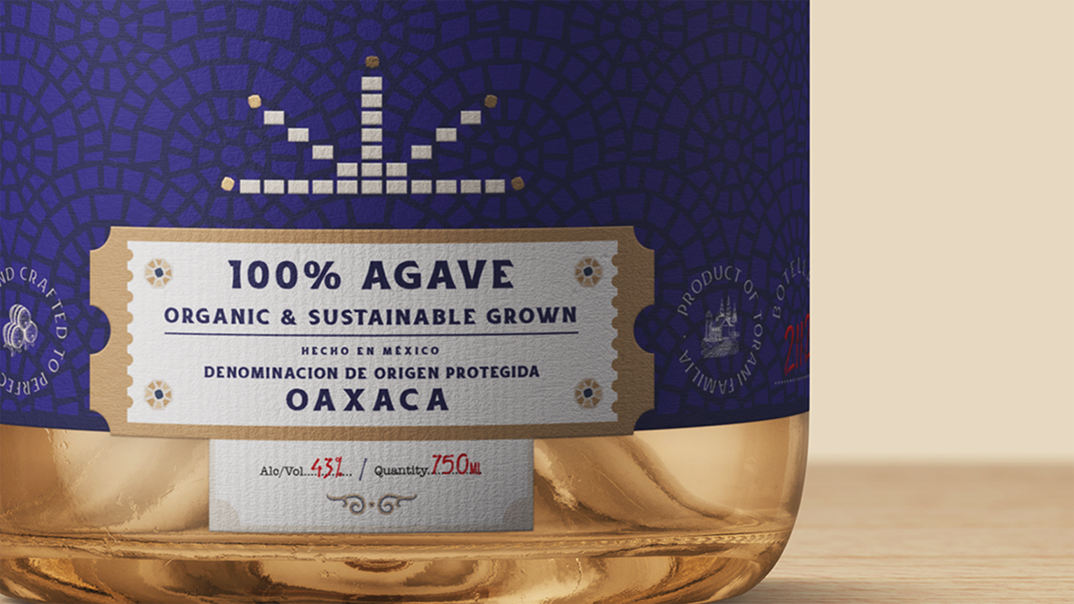
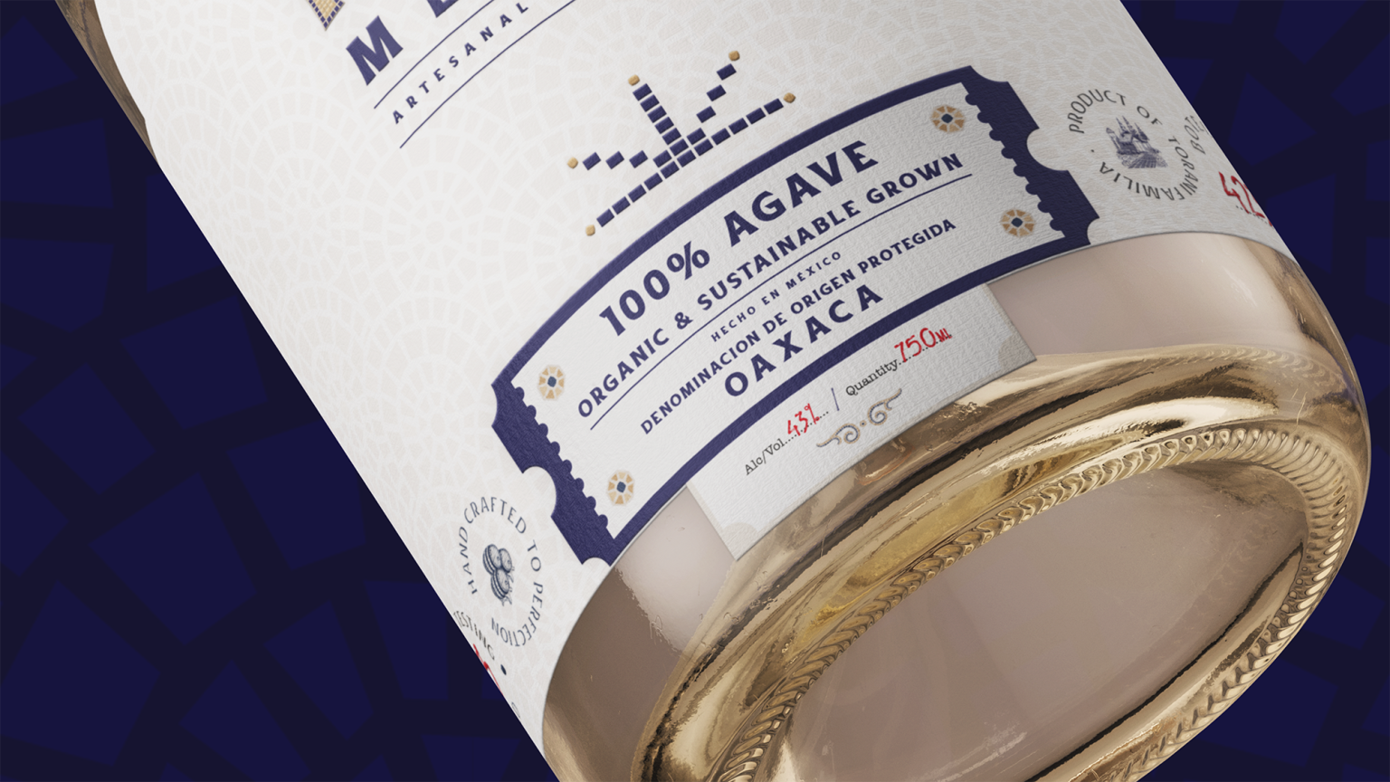
The bottle itself is a work of art, featuring a sleek silhouette and a striking label inspired by vintage Mexican design. The label showcases a captivating illustration of the agave plant, the heart of mezcal production, surrounded by a vibrant polka dot pattern. This playful yet sophisticated design element adds a touch of whimsy to the packaging.
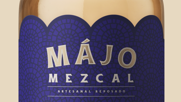
The use of bold typography, reminiscent of classic Mexican signage, further enhances the brand’s connection to its heritage. The typography is paired with a modern sans-serif font, creating a harmonious balance between tradition and innovation.
Majo Mezcal’s packaging design is not just visually appealing but also functional. The bottle is easy to hold and the label is resistant to wear and tear, ensuring the brand’s message remains intact.
Overall, Majo Mezcal’s packaging design is a testament to the brand’s commitment to quality, authenticity, and innovation. It is visually stunning and memorable, capturing the essence of Mexican culture while appealing to a modern audience.
