There is a whole universe of Indian flavours that never made it to a bottle. Kala Khatta from the gola wala on the corner. Aam Panna from a steel glass on a summer afternoon. Kala Jamun crushed into ice on a school holiday. These were not products — they were experiences. Loud, unapologetic, and deeply tied to a particular kind of Indian childhood.
Iconic Pop was built to change that. The brand’s mission is to take India’s most beloved street flavours and reimagine them as bold, carbonated drinks for a generation hungry for something real — something rooted. Not a copy of the West. Not a nostalgia act. But a living, breathing celebration of desi culture, bottled with attitude.
The Brief
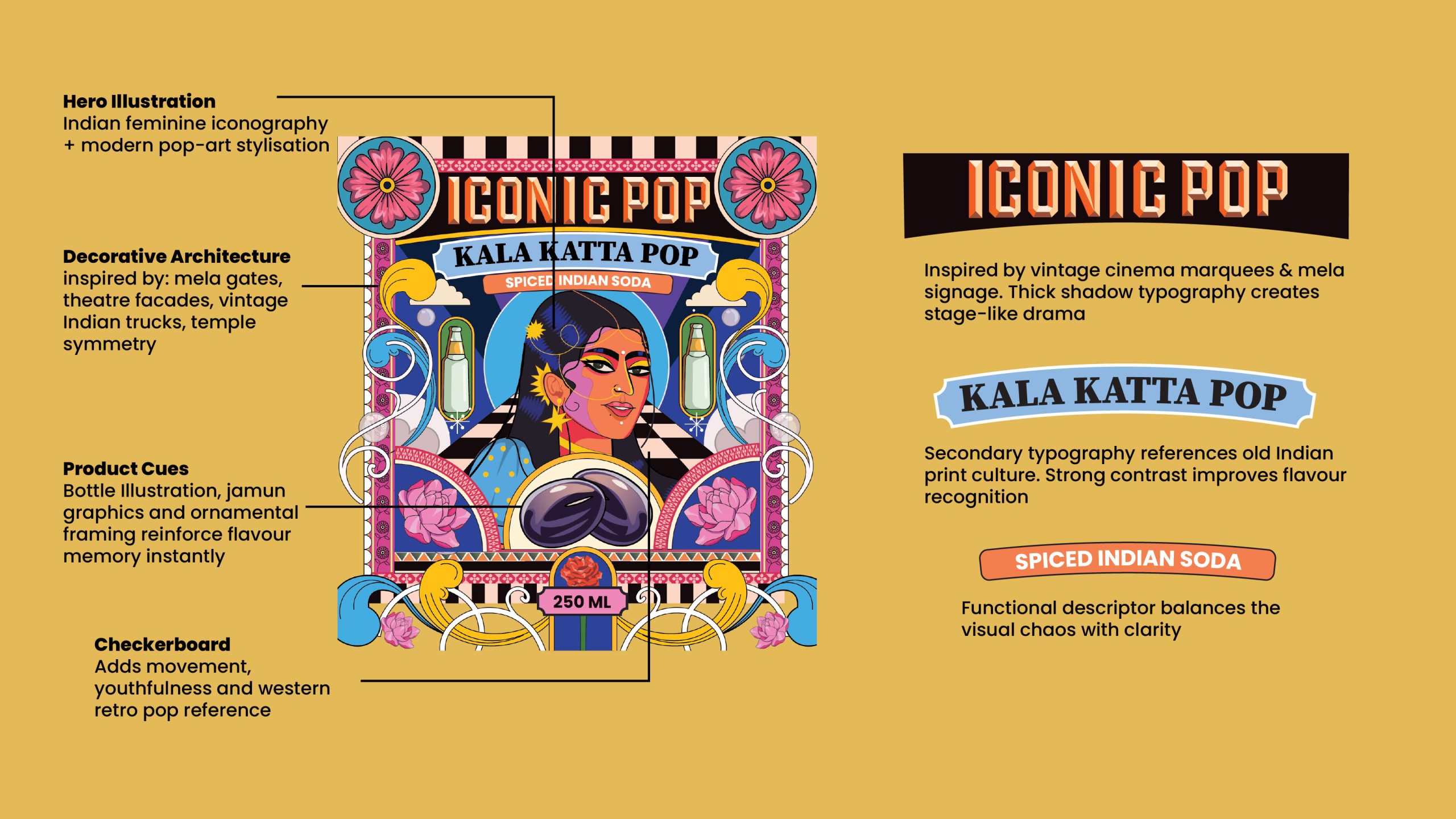
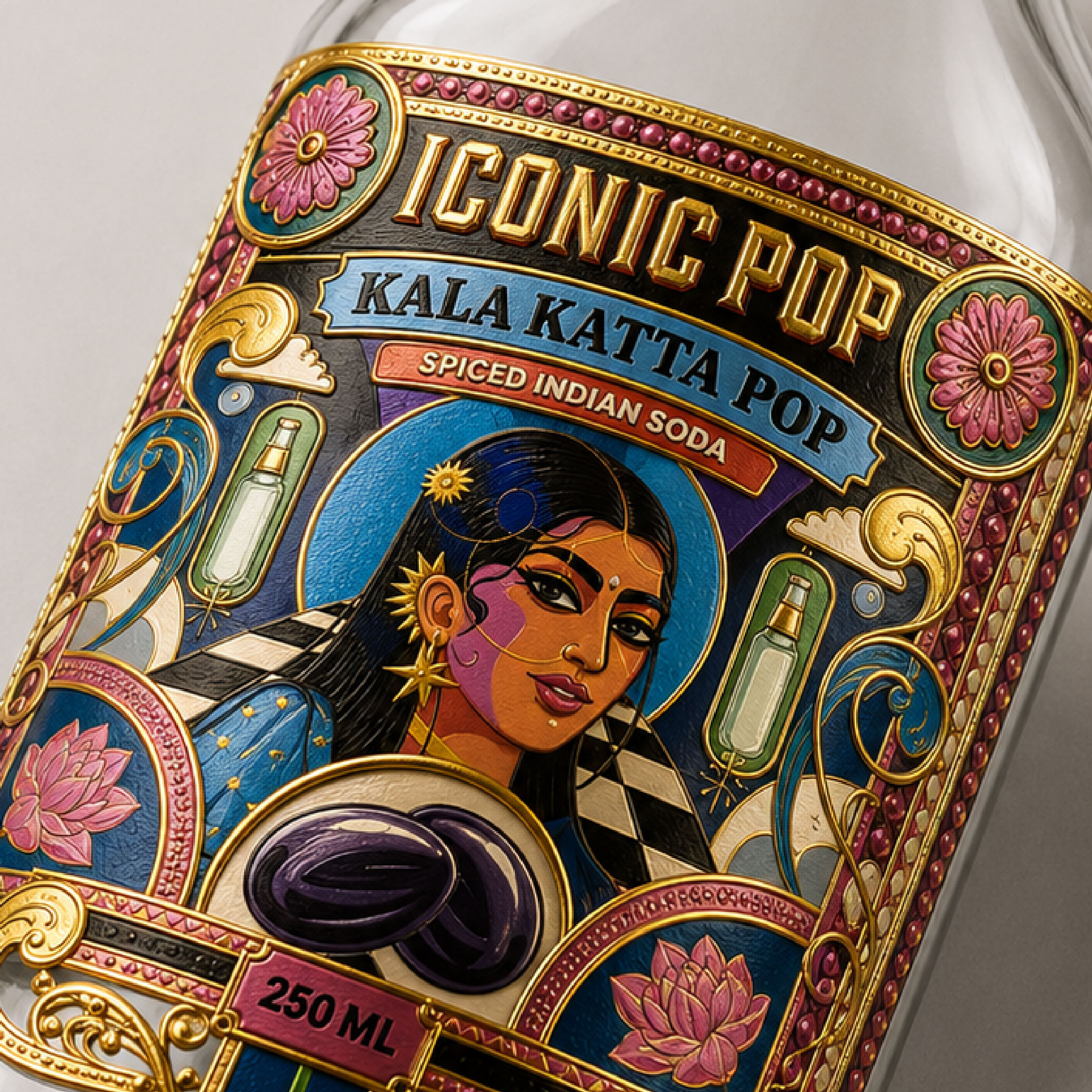
The challenge was to design a label that could carry the full weight of that idea — the streets, the memories, the flavours, the pride — without falling into cliché. The design needed to feel maximalist but considered. Nostalgic but not dated. Distinctly Indian, but with a visual language that a global audience could immediately feel, even if they had never tasted kala khatta in their life.
The Solution
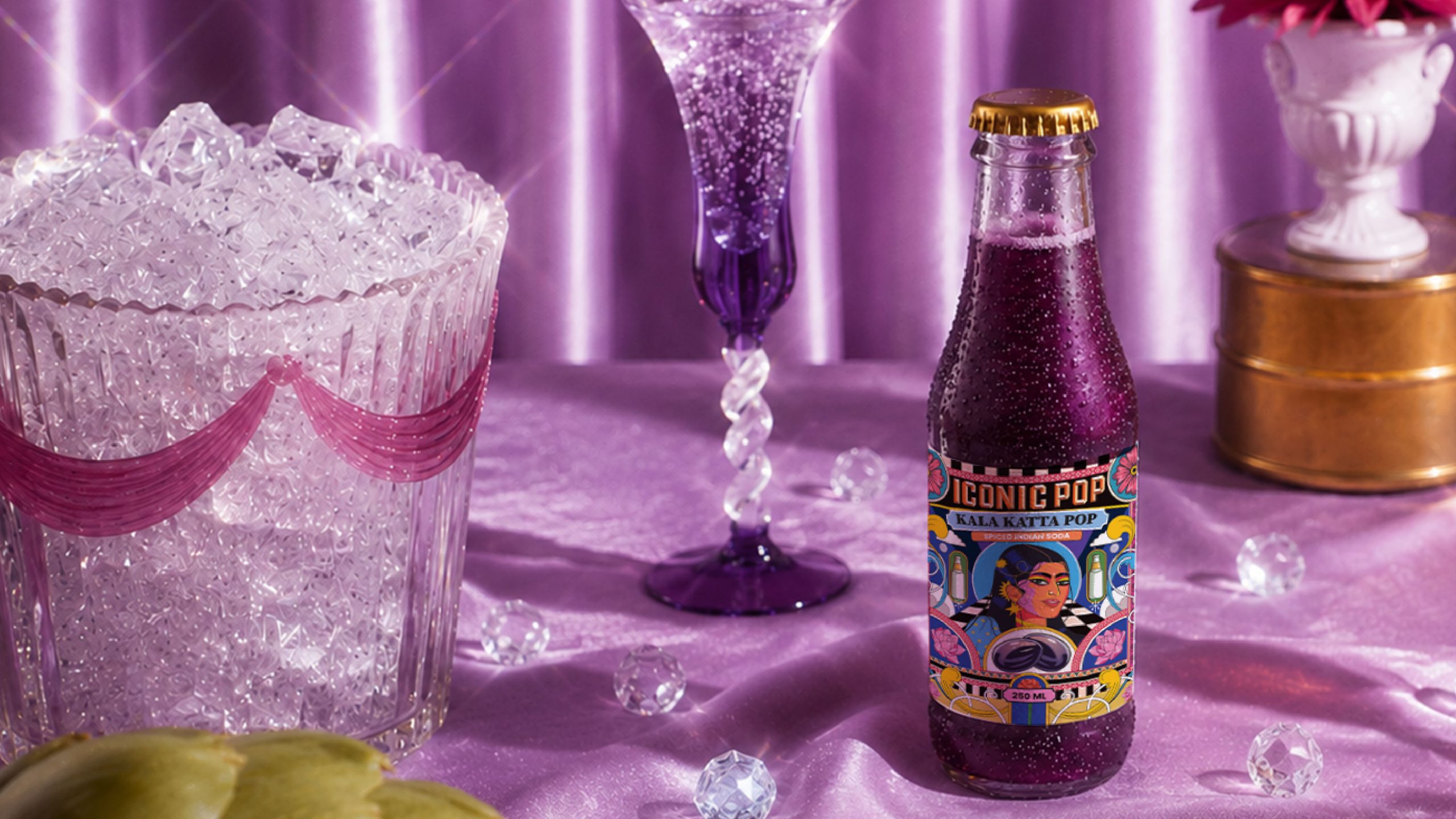
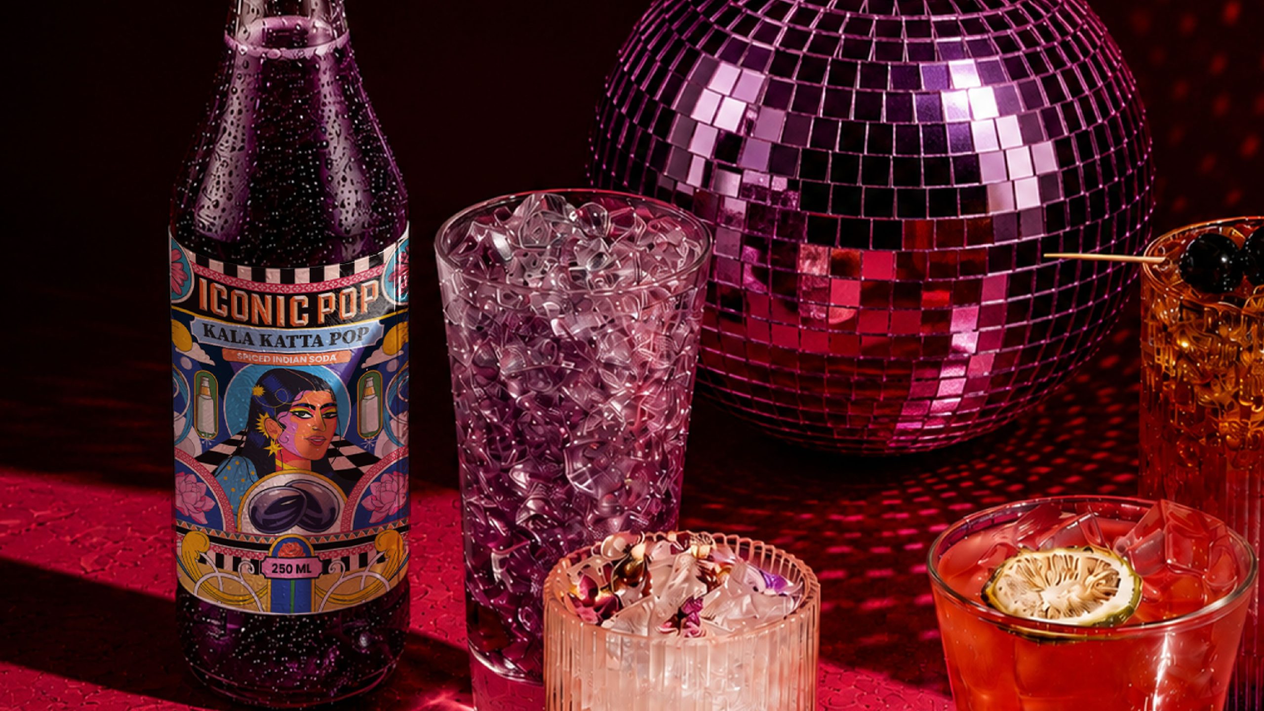
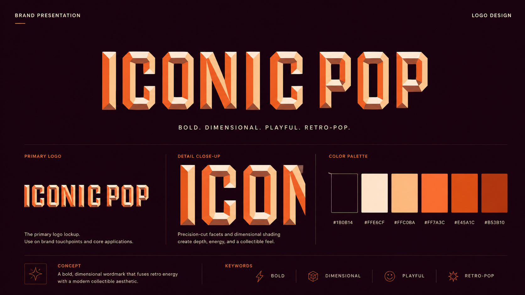
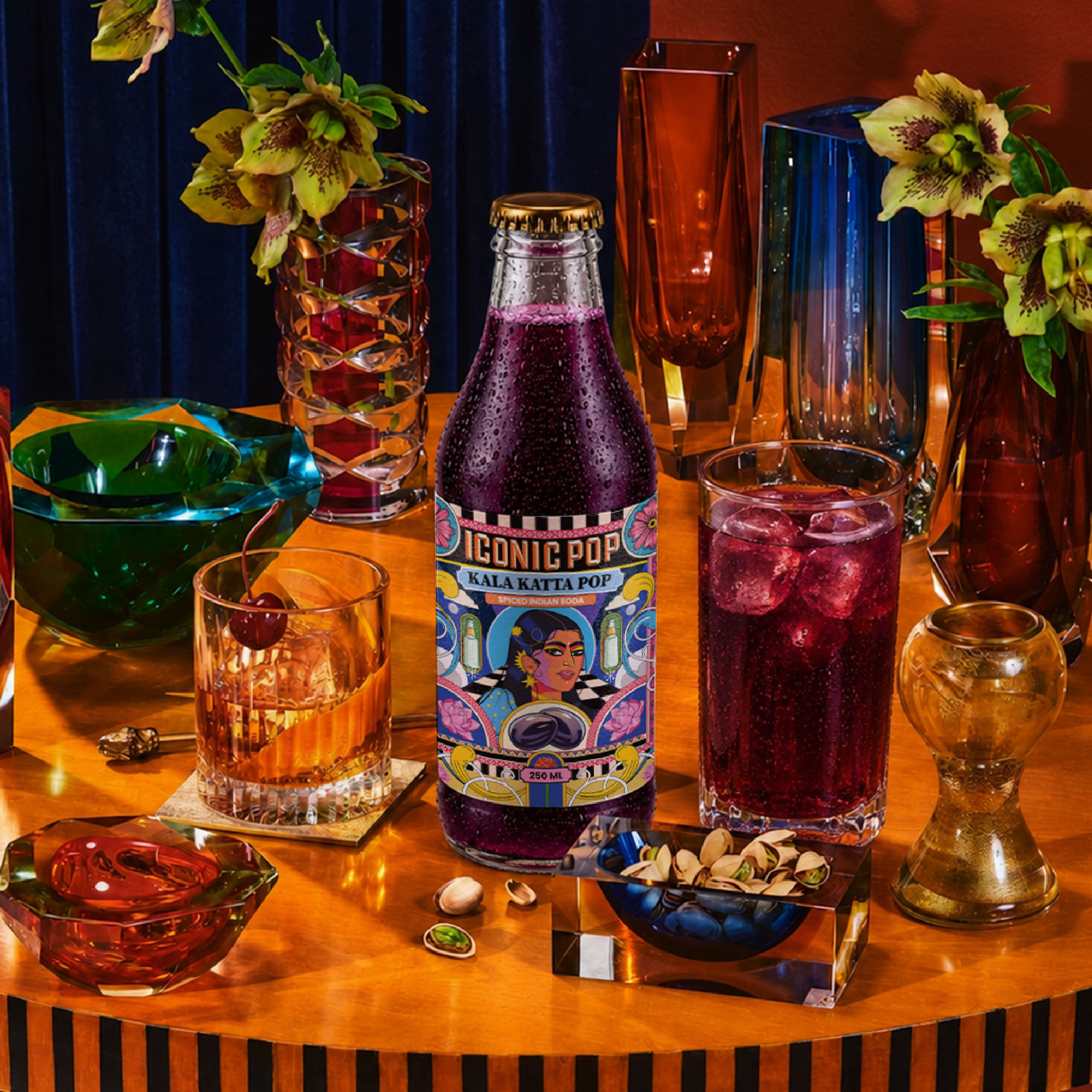
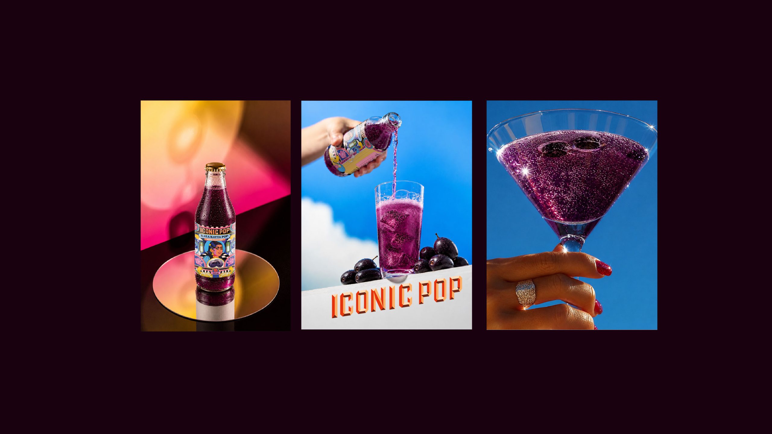
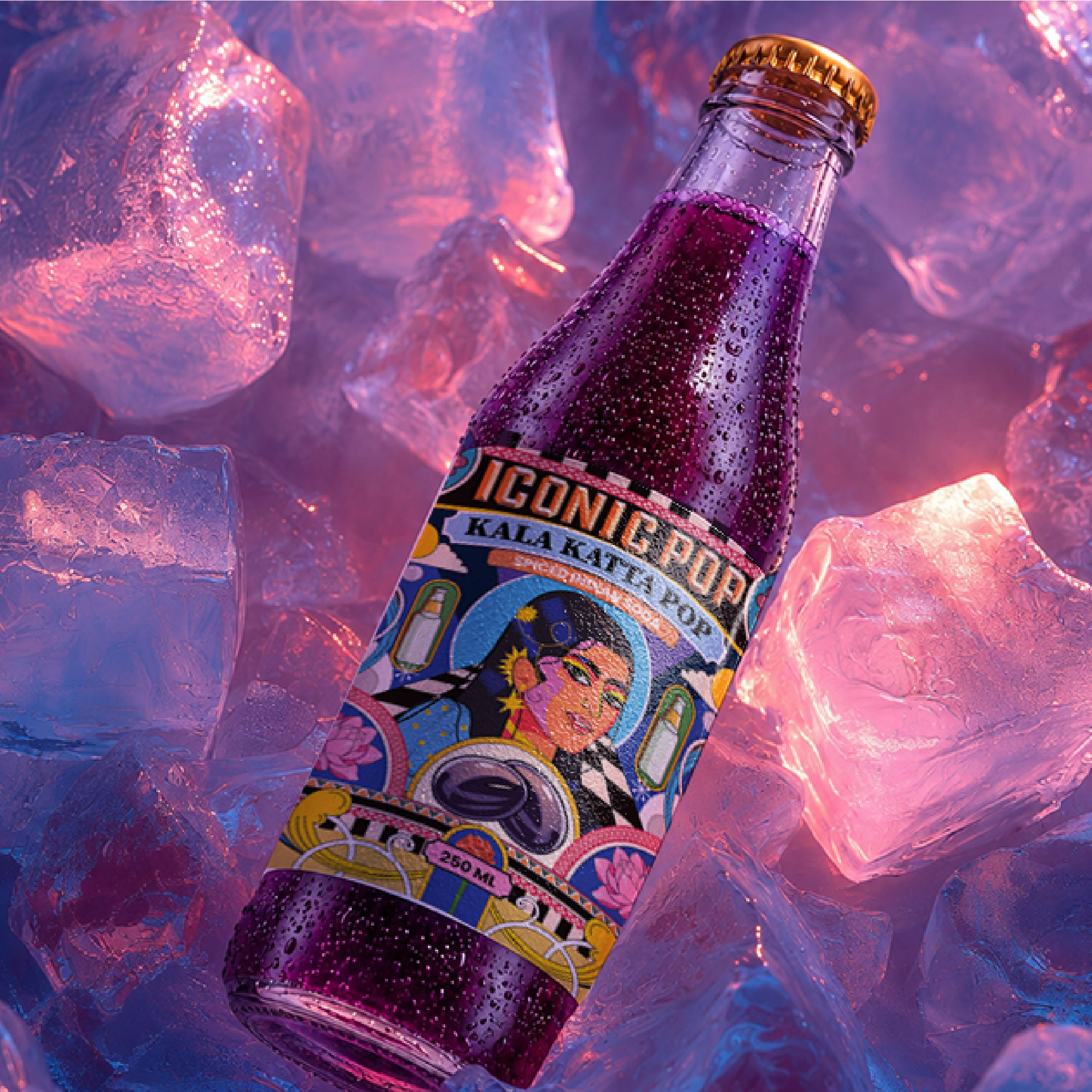
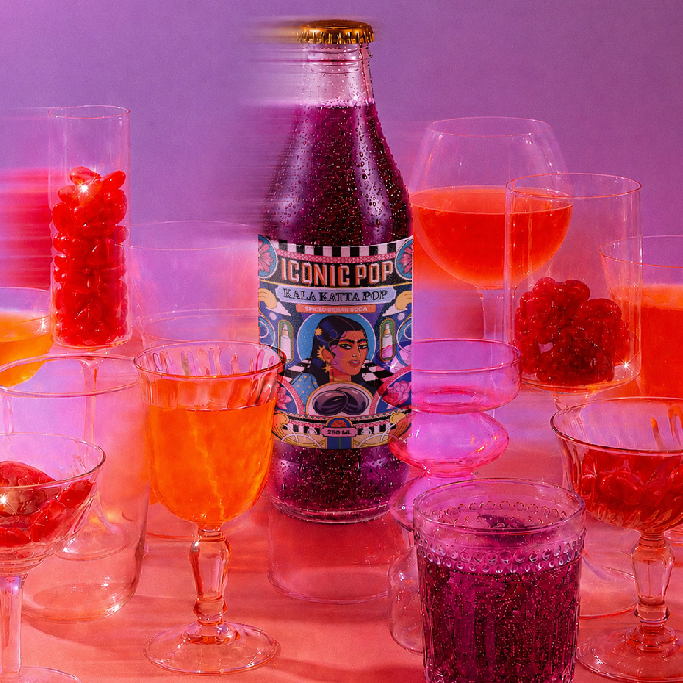
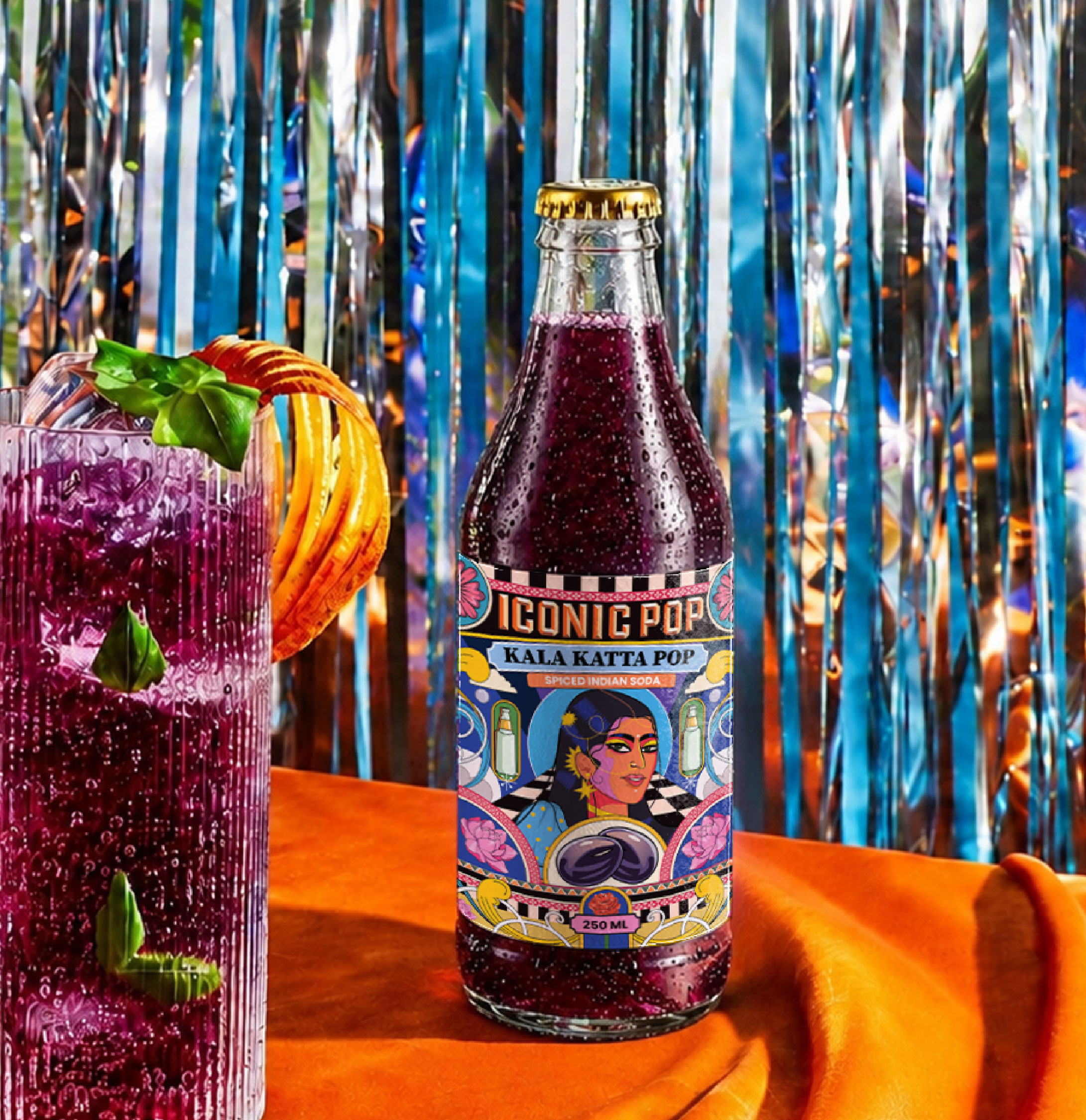
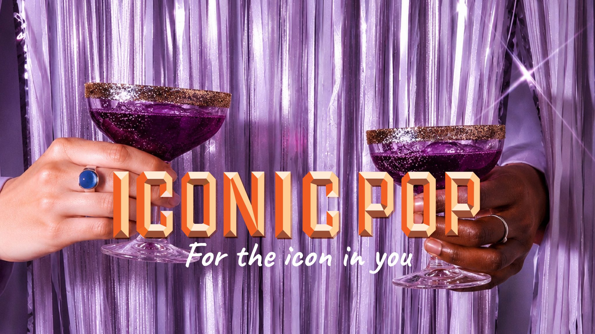
The result is a retro-disco-desi world. A maximalist visual identity inspired by Indian mela graphics, vintage soda signage, and pop-art semiotics — where illustration, typography, and colour come together to make a bottle that does not just sit on a shelf. It commands it.
Credits
Design Studio: Studio Pistache
Location: Gurgaon, India
Curator’s Insight
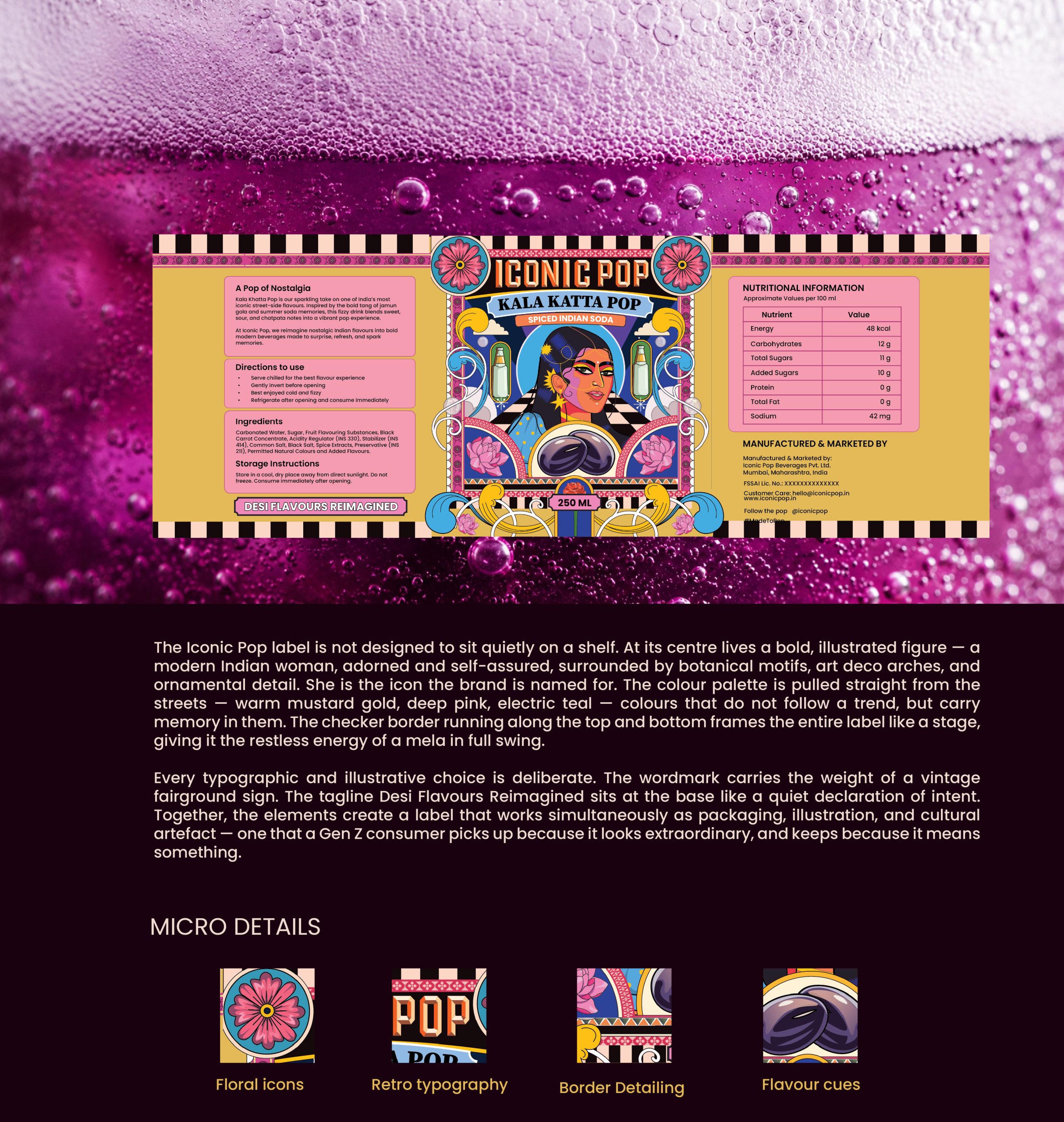
What makes this label work isn’t just the richness of its visual references — it’s the restraint underneath all that maximalism. The illustration has genuine compositional logic: a clear focal hierarchy, a limited palette that reads as opulent rather than chaotic, and ornamental details that reward closer looking without overwhelming the brand name at a glance. There’s also something quietly clever about anchoring a carbonated drink in imagery that’s slow and hand-crafted — the tension between the fizz and the craft is part of the brand’s whole argument. Kala Katta Pop isn’t trying to look premium in the way that word usually gets used. It’s trying to look earned.