K2LTS Premium Anti-Aging Nutritional Supplement Packaging Design | Honglt Design Portfolio
This case study showcases the complete brand packaging and visual identity system created by Honglt Design for K2LTS, a premium American anti-aging nutritional supplement brand.
Brand Overview
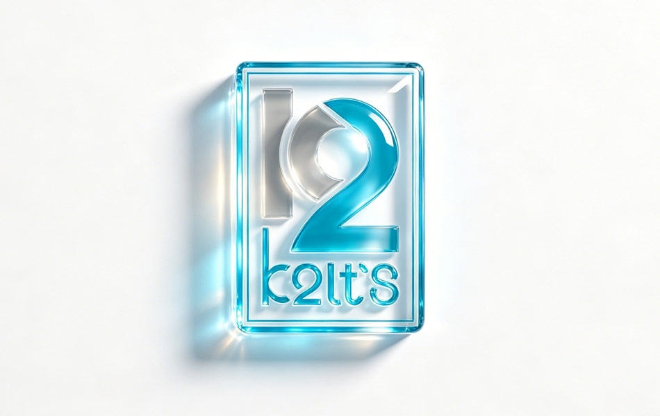
Brand Name: K2LTS
Service Scope: Complete customized brand packaging and visual identity system
Core Product Category: Premium anti-aging dietary supplements
Design Agency: Honglt Design
Applications: Retail counters, cross-border e-commerce platforms, premium gifting, brand marketing campaigns, and international distribution
Project Background
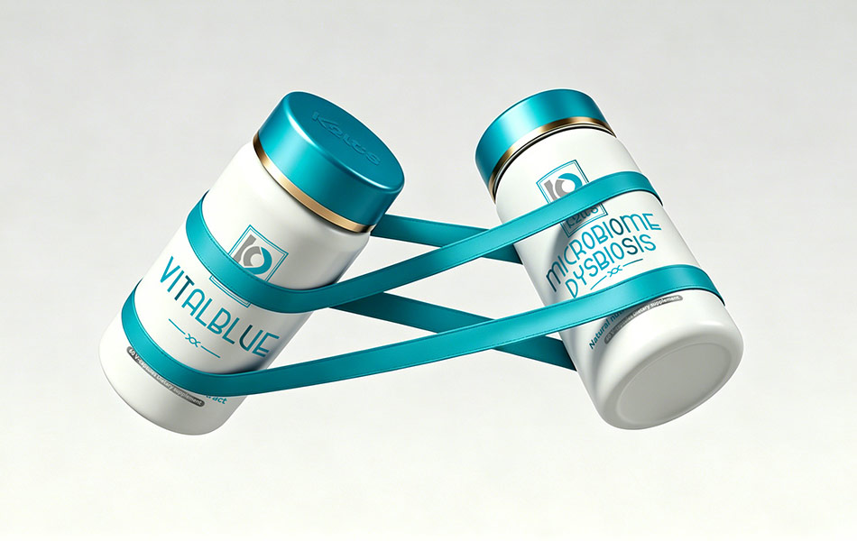
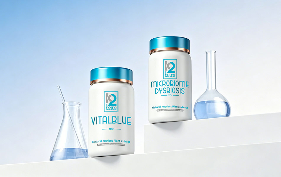
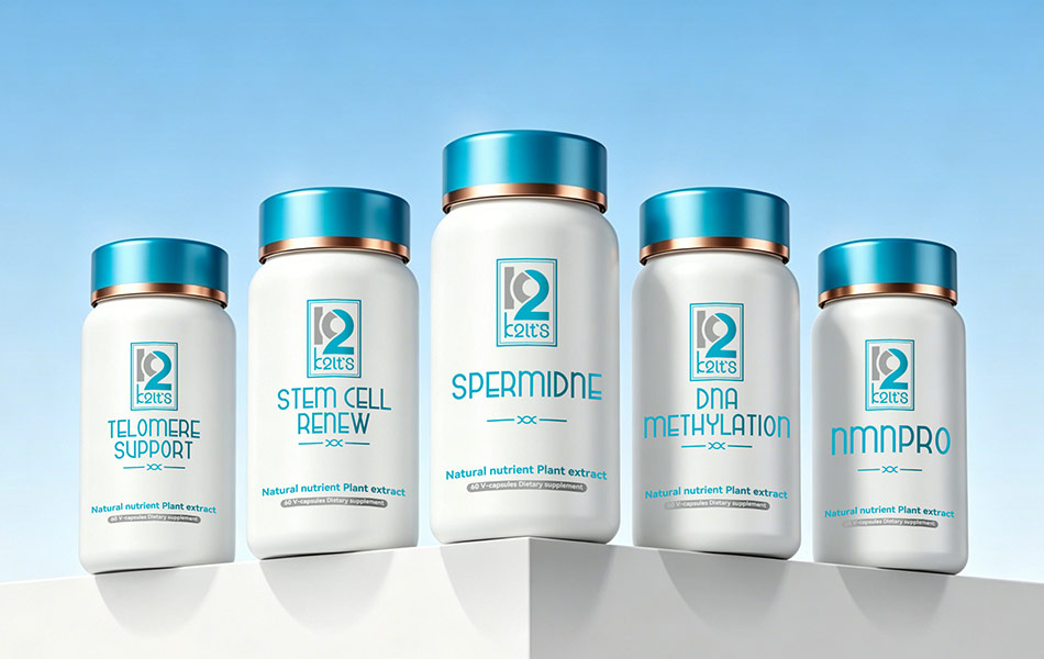
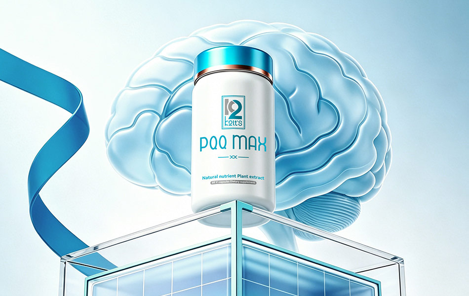
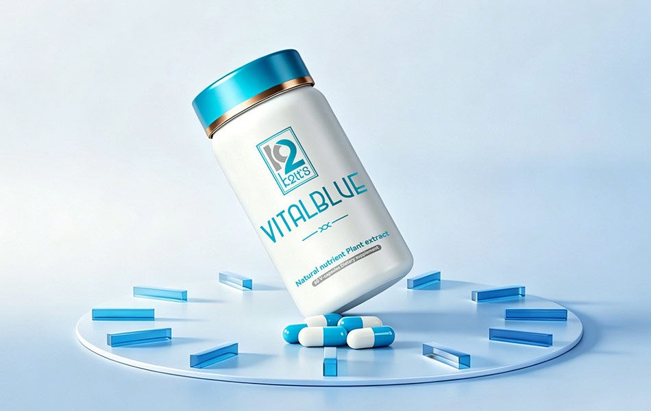
Originating from the United States, K2LTS focuses on developing science-based anti-aging nutritional solutions centered on cellular repair and longevity science. Its product portfolio covers a wide range of specialized anti-aging categories, including NAD+, AMPK, microbiome imbalance, spermidine, stem cell renewal, telomere support, DNA methylation, NMNPRO, chronic inflammation, cellular communication support, and epigenetic changes. Flagship products include VITALBLUE and PQQ MAX.
Targeting health-conscious consumers who value quality and performance, K2LTS sought to move beyond conventional supplement packaging aesthetics. The brand envisioned a visual identity that combines international minimalism, premium luxury, and scientific credibility. To achieve this, K2LTS commissioned Honglt Design to develop a comprehensive packaging system that would establish a distinctive high-end brand image through material selection, craftsmanship, and refined visual design, strengthening its competitiveness and recognition across global markets.
Creative Strategy and Design Philosophy
The design team embraced an American-inspired minimalist luxury aesthetic, focusing on purity, scientific sophistication, and premium refinement. This approach aligns closely with the brand’s core positioning around cellular anti-aging and research-driven wellness.
Rather than relying on excessive decorative elements, the design builds visual depth through carefully balanced color palettes, material contrasts, and precise finishing techniques. Professional anti-aging terminology and product names are seamlessly integrated into the layout, reinforcing the brand’s scientific foundation.
The final solution balances artistic appeal with commercial functionality, appealing to global consumer preferences while clearly communicating the brand’s defining attributes: professionalism, natural ingredients, and exceptional quality. The packaging itself serves as a direct expression of the brand’s philosophy and product value.
Packaging Design and Production Details
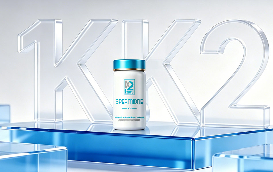
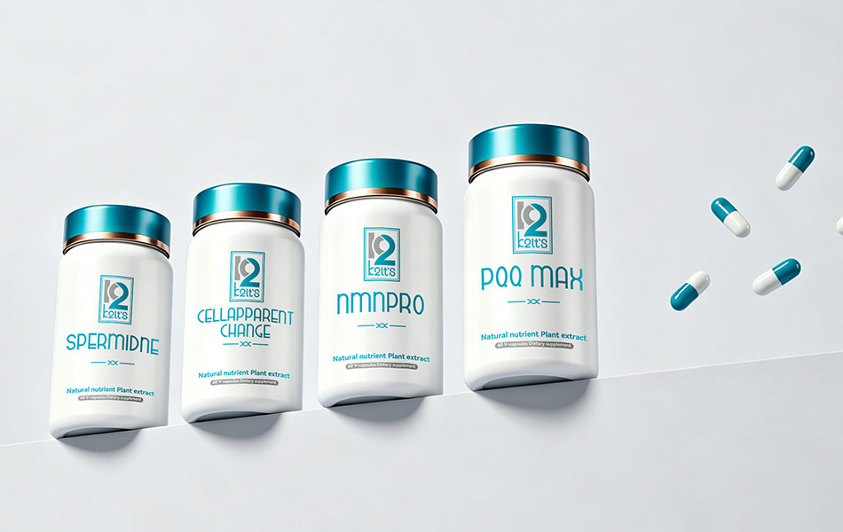
1. Aluminum Bottle Design
The bottles are crafted from premium-grade aluminum and finished with a matte white coating, creating a smooth tactile experience and a sophisticated appearance. The clean white surface symbolizes purity and the natural origins of the ingredients while conveying understated elegance.
Key anti-aging terms such as NAD+, Spermidine, and NMNPRO, alongside product names including VITALBLUE and PQQ MAX, are applied using precision screen-printing techniques. Combined with the brand logo and product specifications, the clean typography and structured layout ensure excellent readability and strong brand recognition.
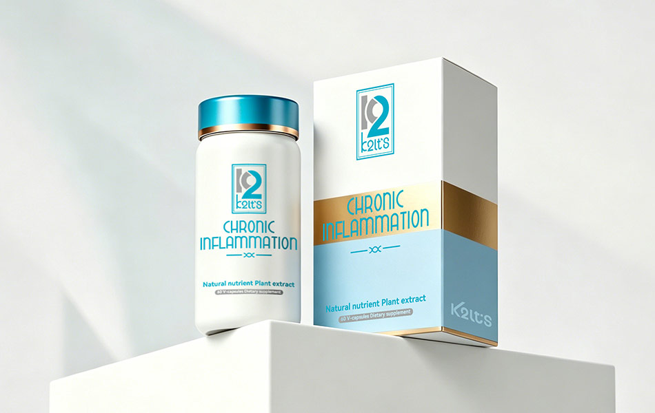
2. Cap Design and Finishing
The bottle caps feature an electroplated metallic finish that contrasts strikingly with the matte body. Premium foil-stamped details add a layer of luxury and elevate the perceived value of the product.
Subtle design elements reference the brand’s focus on advanced anti-aging science, including stem cell regeneration and telomere support. These details reinforce the research-driven nature of the products while serving as distinctive visual highlights.
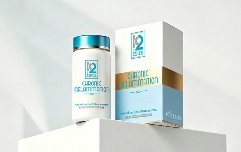
3. Secondary Packaging
The outer cartons follow the same visual system as the bottles, maintaining consistency in color, typography, and overall design language. Scientific concepts such as AMPK, DNA methylation, chronic inflammation, cellular communication support, epigenetic changes, and microbiome balance are prominently featured, helping consumers quickly understand the unique function of each formulation.
The sturdy rectangular box structure protects the product while strengthening the overall brand presentation. The standardized packaging architecture enhances recognition across product lines and adapts effectively to a variety of retail and display environments.
Design Impact and Results
Through the combination of matte white finishes, metallic electroplating, and premium foil stamping, the packaging successfully communicates a distinctly American premium brand image. The clear screen-printed typography effectively conveys the scientific themes and product information, establishing a unique visual language for the brand.
Following launch, the packaging system delivered strong shelf presence, helping the product range stand out in retail environments, online stores, and premium gifting channels. The fusion of scientific credibility and elevated aesthetics strengthened consumer perception of both the brand and its products, supporting increased recognition and global market expansion.
Conclusion
Honglt Design specializes in creating comprehensive brand identities and premium packaging solutions. By deeply understanding brand DNA and market demands, the agency combines product advantages and category characteristics with innovative design thinking and exceptional craftsmanship.
Its work provides brands with distinctive visual solutions that enhance product reputation, strengthen brand positioning, and expand market influence through thoughtful design and refined execution.