

We The Wild — Packaging System Adaptation & Production Artwork
We The Wild is a plant-care brand with a playful, nature-inspired visual language.
The project focused on adapting the existing packaging direction across a multi-SKU DIY craft product line, while keeping the range visually consistent and production-ready.
The goal was to translate the approved visual system into several different packaging formats, establish clear product hierarchy and SKU differentiation, and prepare the final artwork for production.
Scope
- Packaging adaptation
- Multi-SKU packaging system
- Visual hierarchy & SKU differentiation
- Packaging graphics & illustrations
- Product callouts & roundels
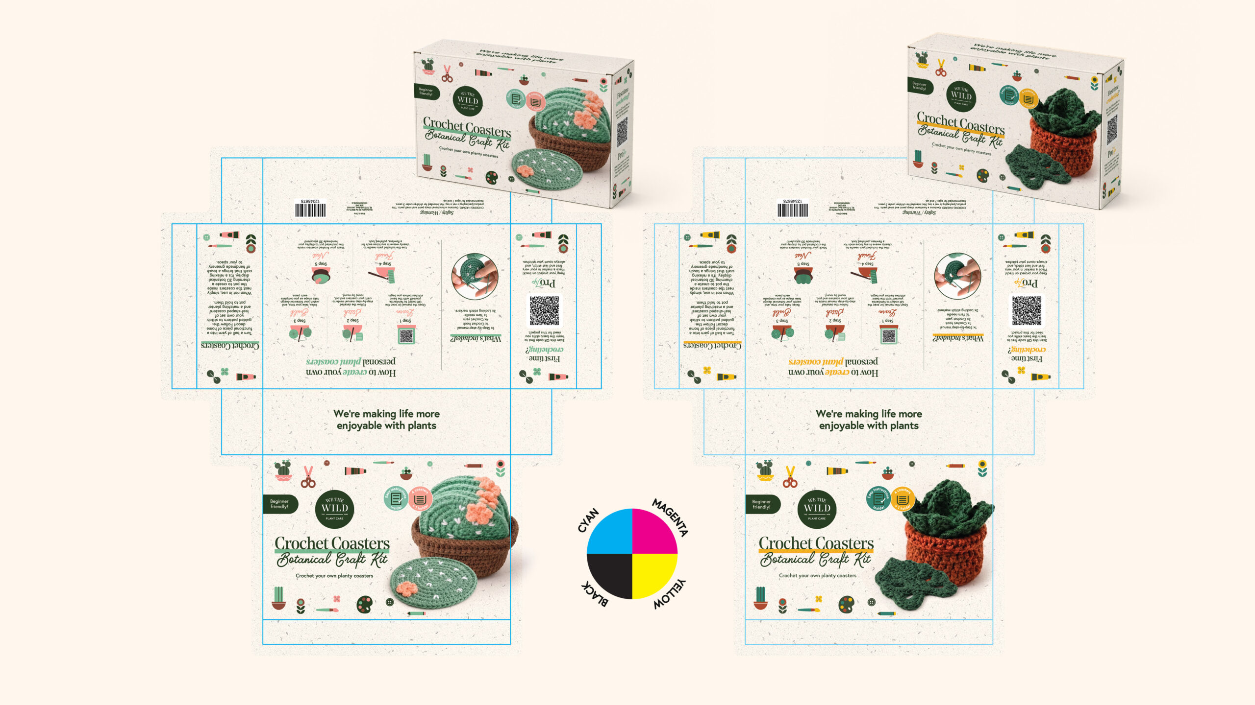
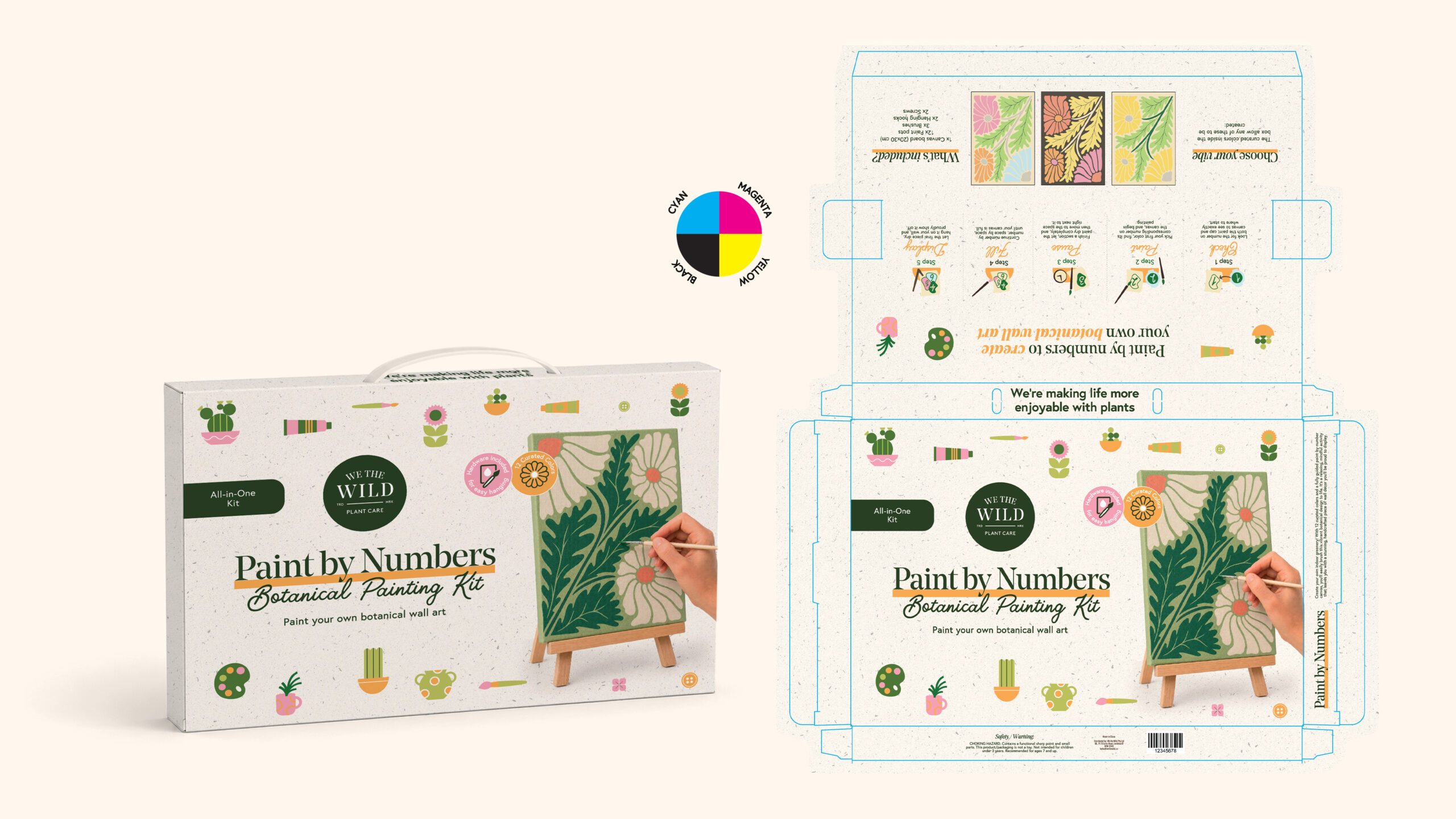
- Dieline adaptation
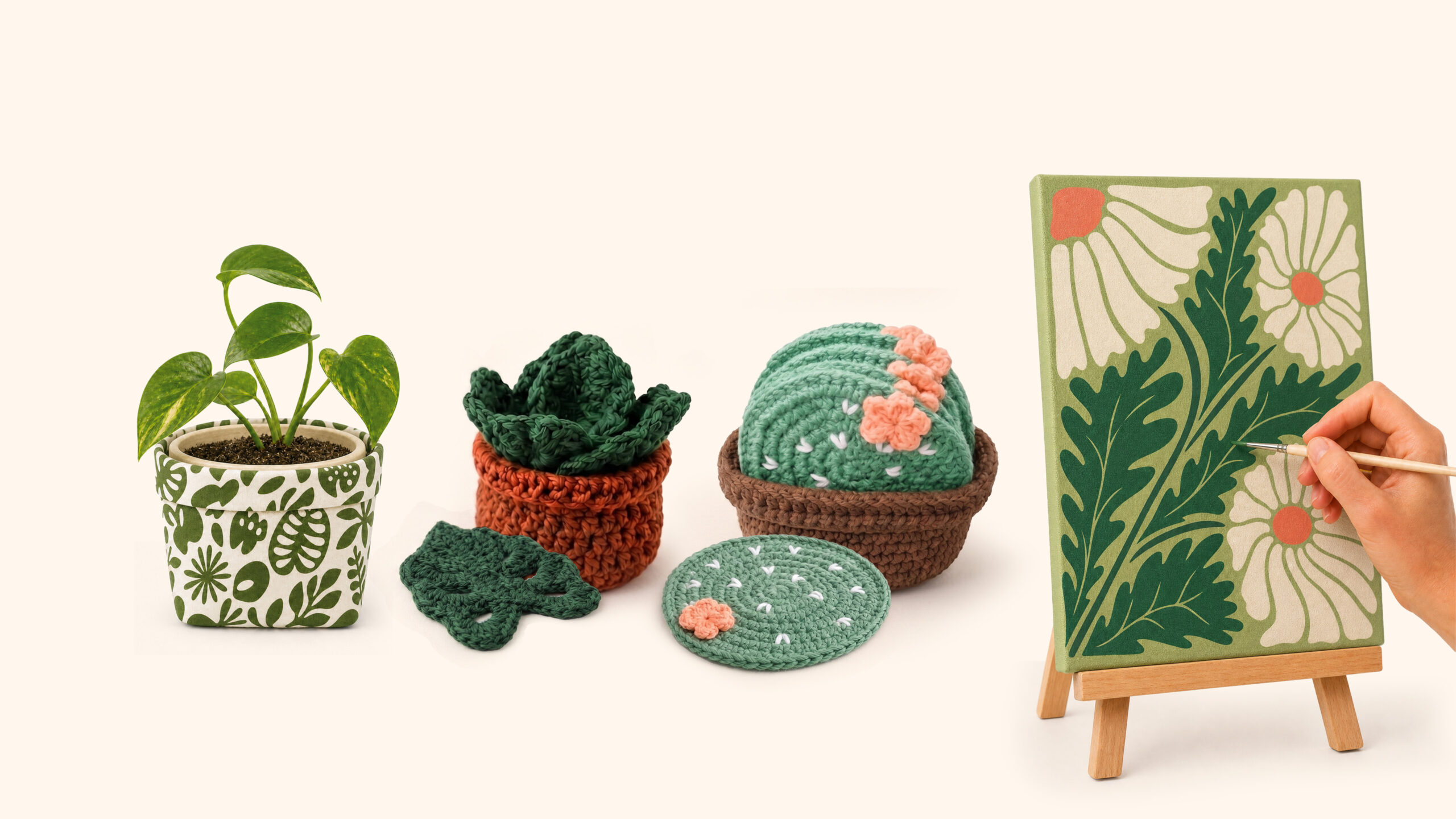
- AI-generated product imagery
- Production-ready artwork
- Prepress
The Challenge
The existing visual direction needed to be translated across several different DIY craft products and packaging structures without losing consistency across the range.
Each SKU had different product imagery, content, structural requirements and information, while the overall line needed to feel like one coherent product family. The challenge was to maintain the established visual language while adapting the layout, hierarchy, graphics and content to each individual package.
Outcome
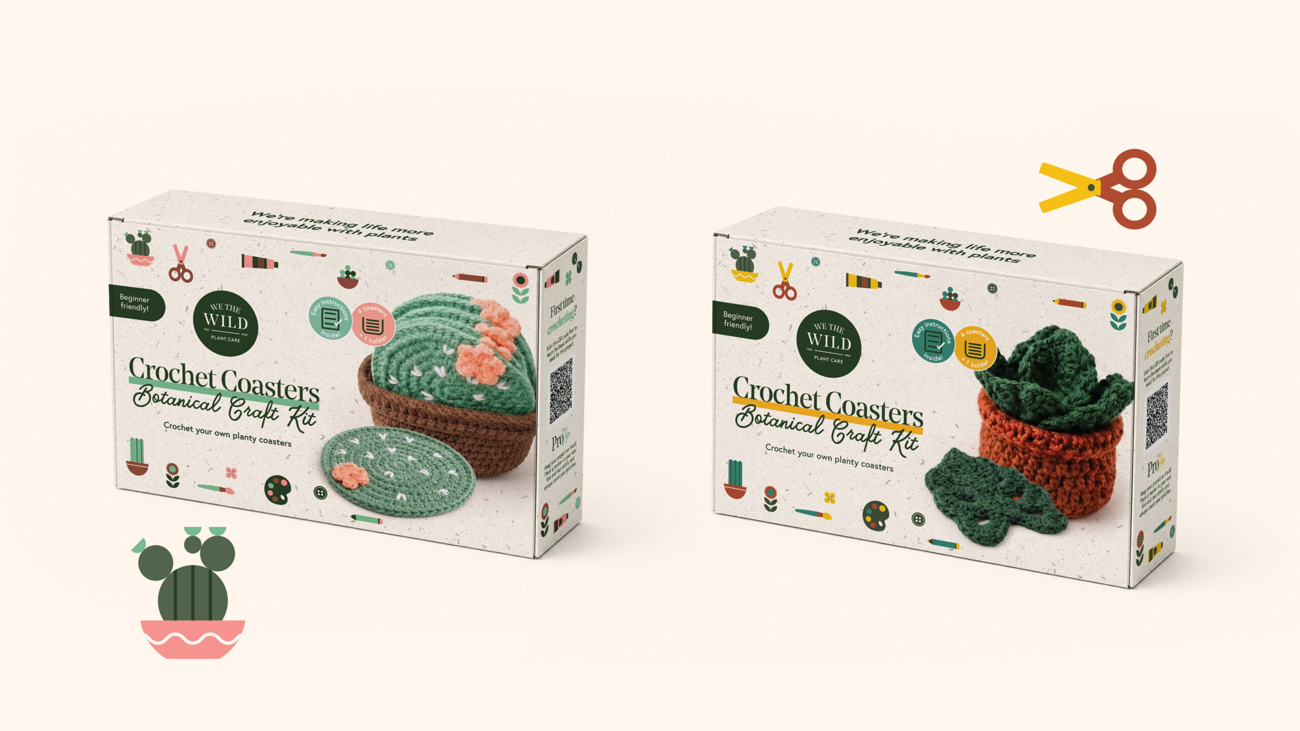
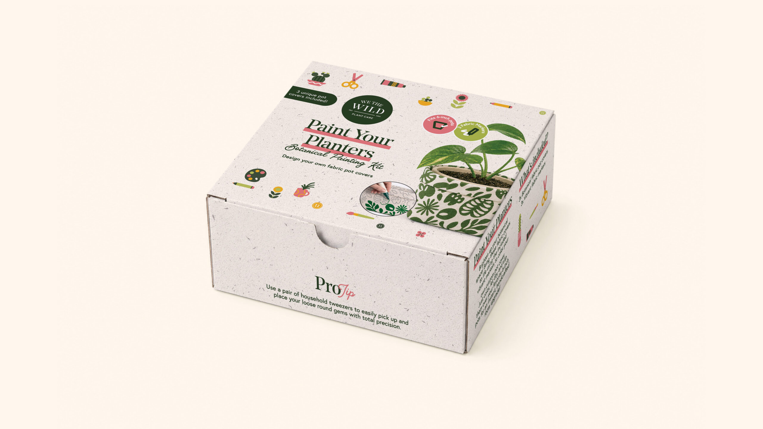
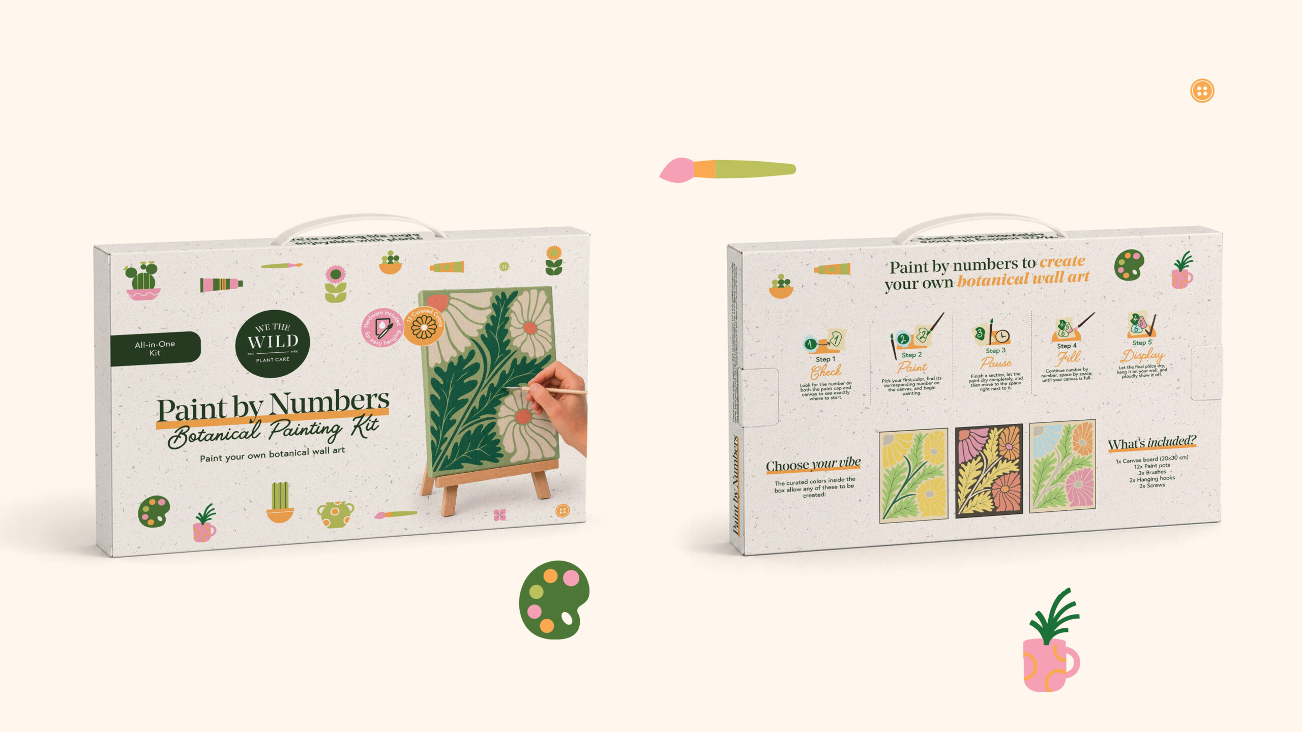
The final packaging system was adapted across multiple SKUs, including Paint by Numbers, Paint Your Planters and Crochet Coasters.
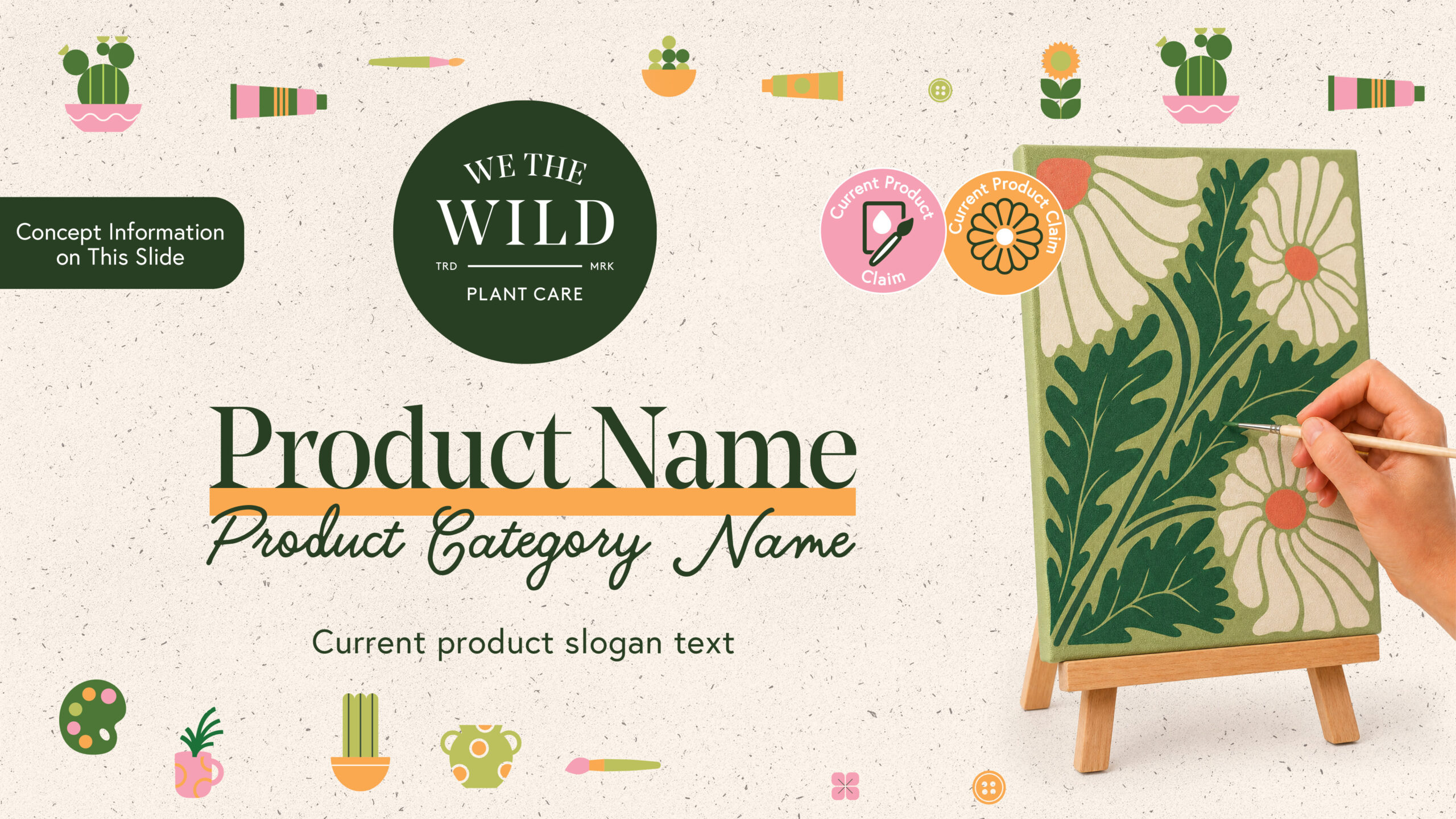
Each SKU was developed with its own product-specific imagery, color coding, claims, instructional content and supporting graphics while maintaining a consistent brand structure across the range.
The final artwork was applied to the supplied dielines and prepared as production-ready files, with supporting 3D mockups and AI-generated product imagery used for visualization and approval.




 Derrick Lin
 VincoStudio
 lisakaplina
 CreativeWise
 alchimistestudioParis
 Adriana Adamo
 tauqueer
 MAISON D'IDÉE Prague
 Pixels Studio
 Atchayaa
 DESIGN CONCEPTS
 hello ocean
 monther al omari
 the Labelmaker
 alamgirbrands
 kat bres
 Vantablack Studio
 GruppoSaida
 studiorevv
 grafisercreative
 Kate Reichel
 UPRISE