Brief
In the U.S., candy with nuts and dried fruits in icing can be found on the table of any home: it’s a traditional treat for the whole family and guests. The question of taste choice, as usual, remains individual. This inspired our client to create a trademark bringing together both audience favorites and new, unusual for the market solutions.
Nutic hails from California, where the candy is shipped nationwide. Developing a design that is comfortable and appealing to consumers was exactly the challenge Fabula Branding faced initially. But by diving deeper into the project, the agency’s team and the client embarked on a comprehensive brand development effort.
Solution
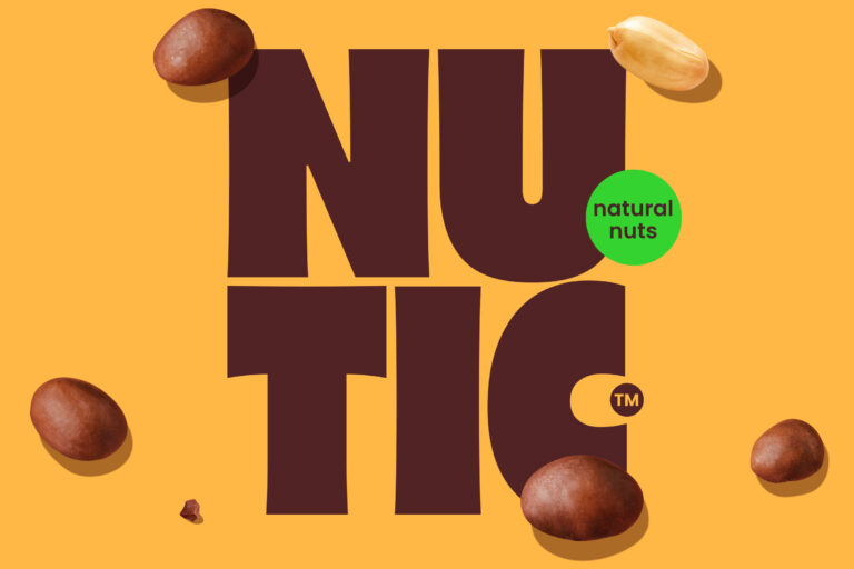
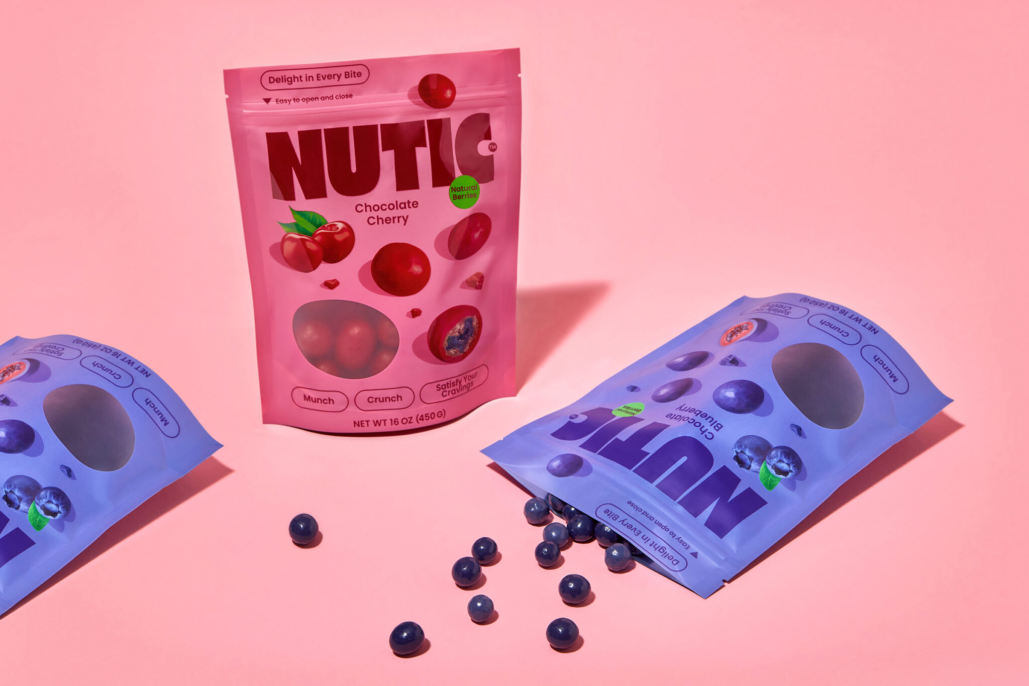
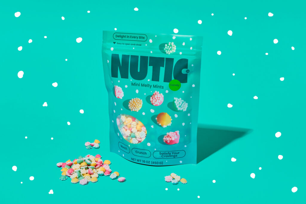
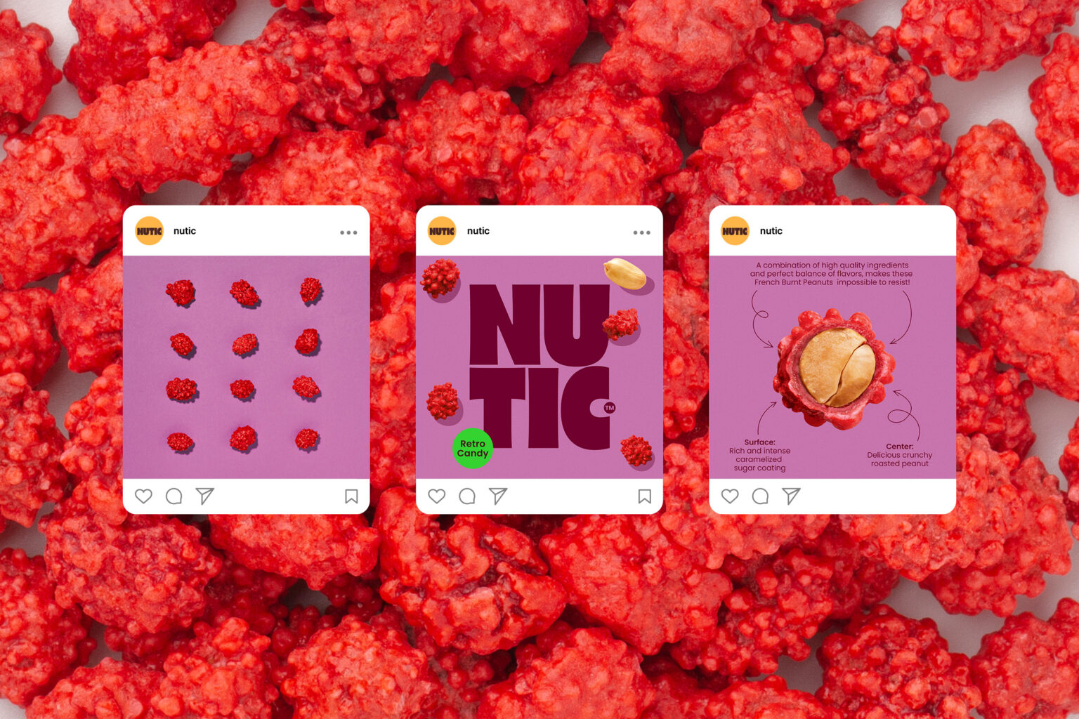
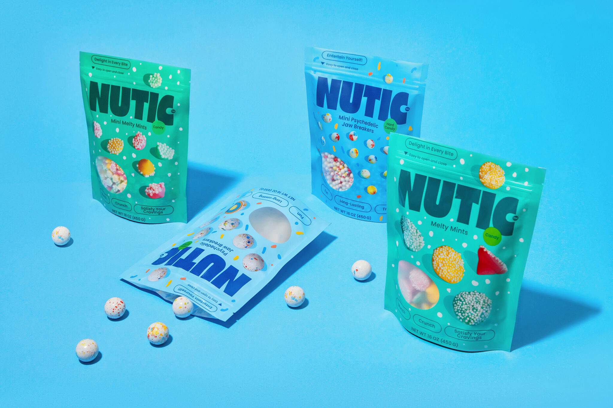
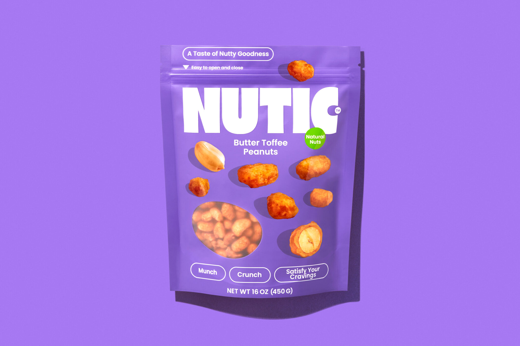
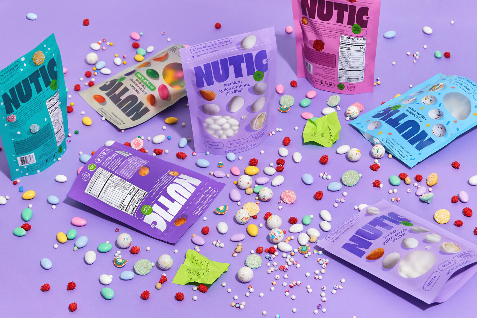
Work on the brand began unconventionally – with a bright design system and packaging design for several items. A massive logo was created, the rounded shapes of which refer to the product, and a corporate style built on a combination of rich, saturated colors. The package design is based on the colorful photos of sweets taken by Fabula Branding’s photographer. And also a knockout window – because such a pretty product is sure to want to show.
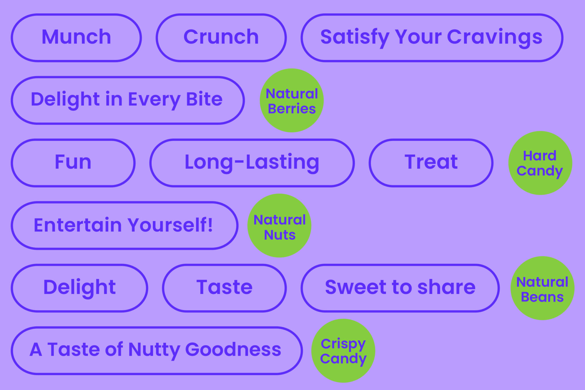
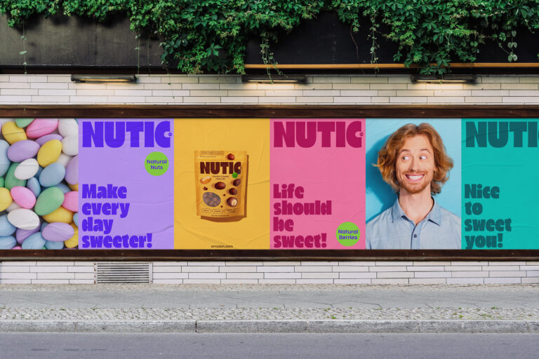
After the introduction, the brand began to actively develop. The territory of delivery was expanding, the client was quickly finding new suppliers. That is why it was decided to support Nutic’s striking design with a strategic base. Marketing experts of the agency conducted market, competitor and consumer research, which resulted in the creation of the positioning “Convenient family format – for the common joy”. This is how we presented the market with a modern brand of sweets in a convenient packaging, ideal for happy moments together with your loved ones. The positioning strengthens the slogan Life should be sweet.
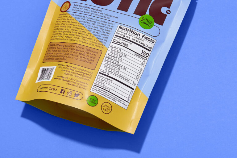
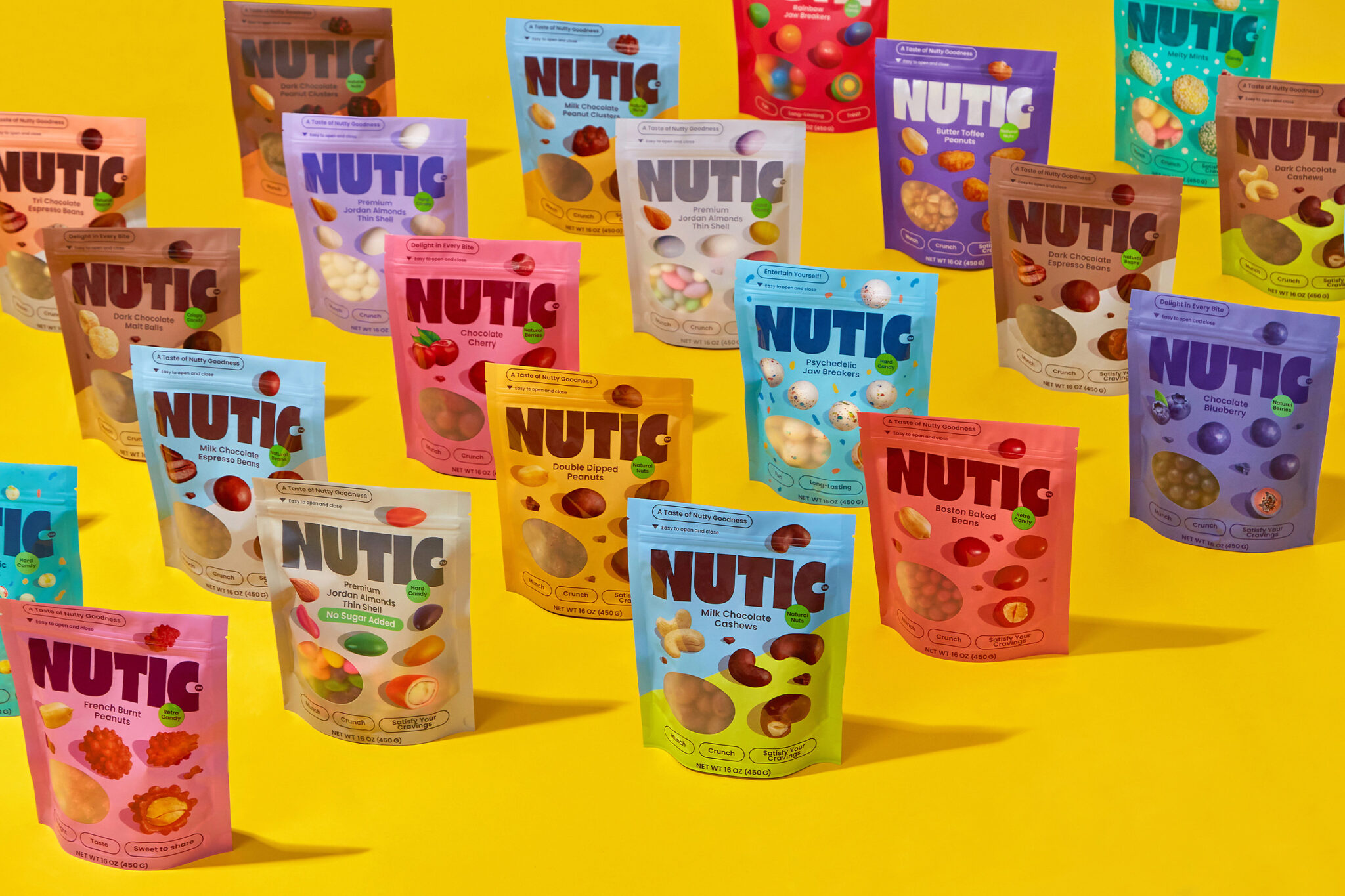
In the course of the work, the agency branded more than 30 positions. Such a complex and interesting work required a thoughtful approach, so the designers created a special system of customization. For example, each type of peanut has its own background color, and for the chocolate-coated positions a division in half is used.
The next step is to design the site and brand the cards for the Amazon platform. For this purpose, the agency conducted another object photo shoot, brightly and confidently presenting each of the positions.
Alexei Karzhanets, Fabula Branding photographer:
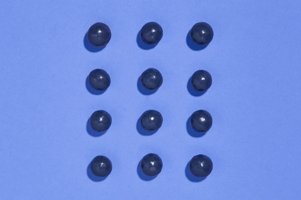
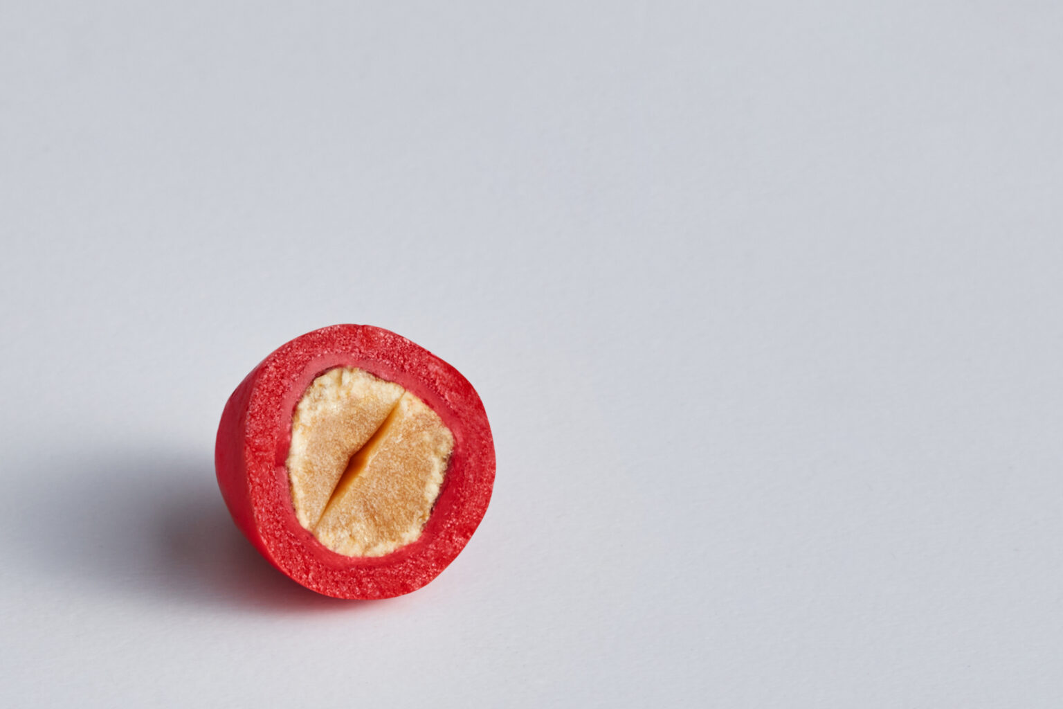
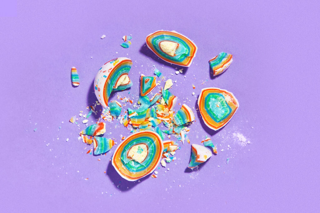
“Nutic is one of the most extensive photography projects in my memory. The work took place in two stages. The first stage was to photograph literally every candy from several angles, completely and in section, in order to choose the most successful options for packaging design together with the designers. At the same time it was important to find a suitable background color to avoid unnecessary reflexes – in general, the work was intensive. The second stage was a photo of the finished packs for different tasks: the site, marketplaces, etc. When the design was implemented, the client gave us a total of 16 kilograms of product for photography. As a result, we gave over 80 carefully retouched photos for further use.
Stanislav Mokhov, UI/UX designer at Fabula Branding:
“We took care to simplify the structure of the site, making it user-friendly. Passed the mood of the brand – the site has become as bright as the packaging. And we offered the client various solutions, but in the end we settled on a laconic implementation of the interface.
Fabula Branding solutions helped the client to enter the market with dignity and get the first positive feedback from consumers.

