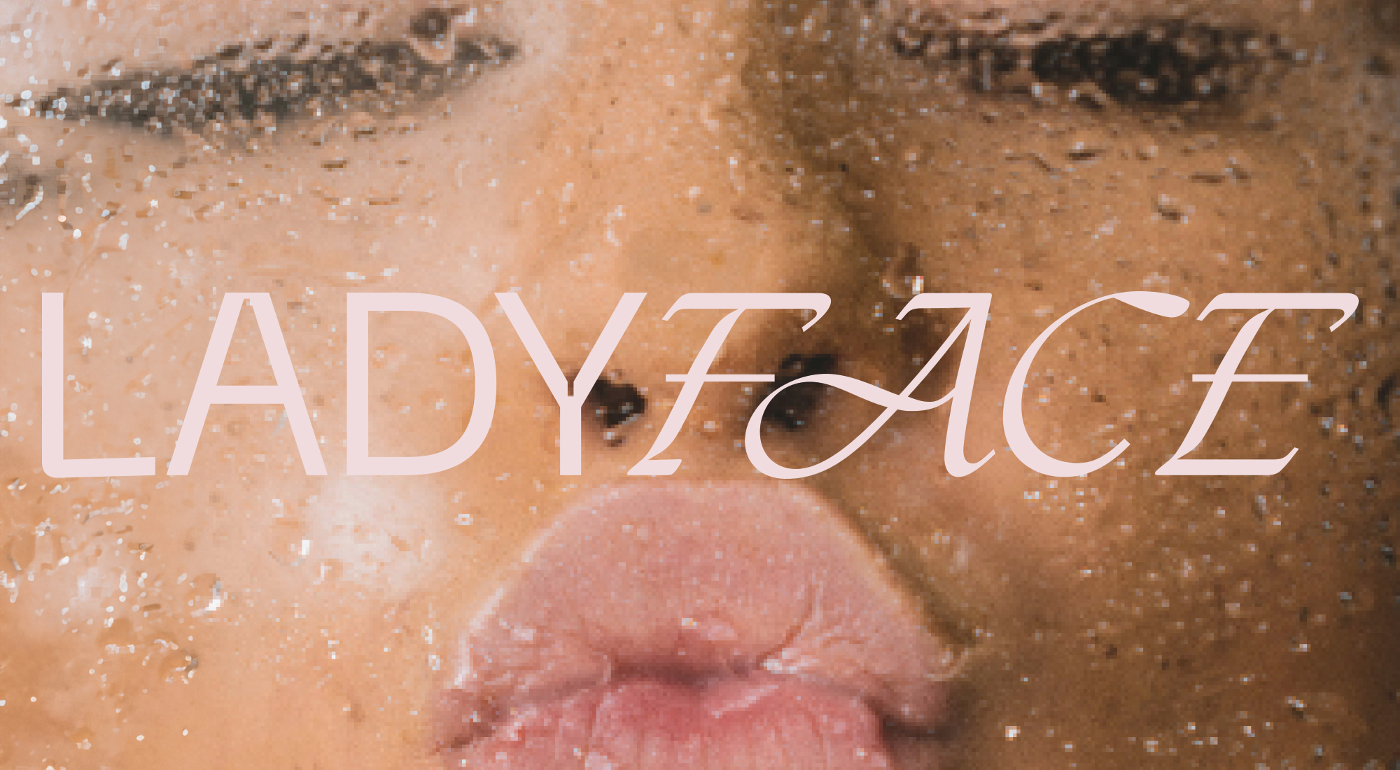
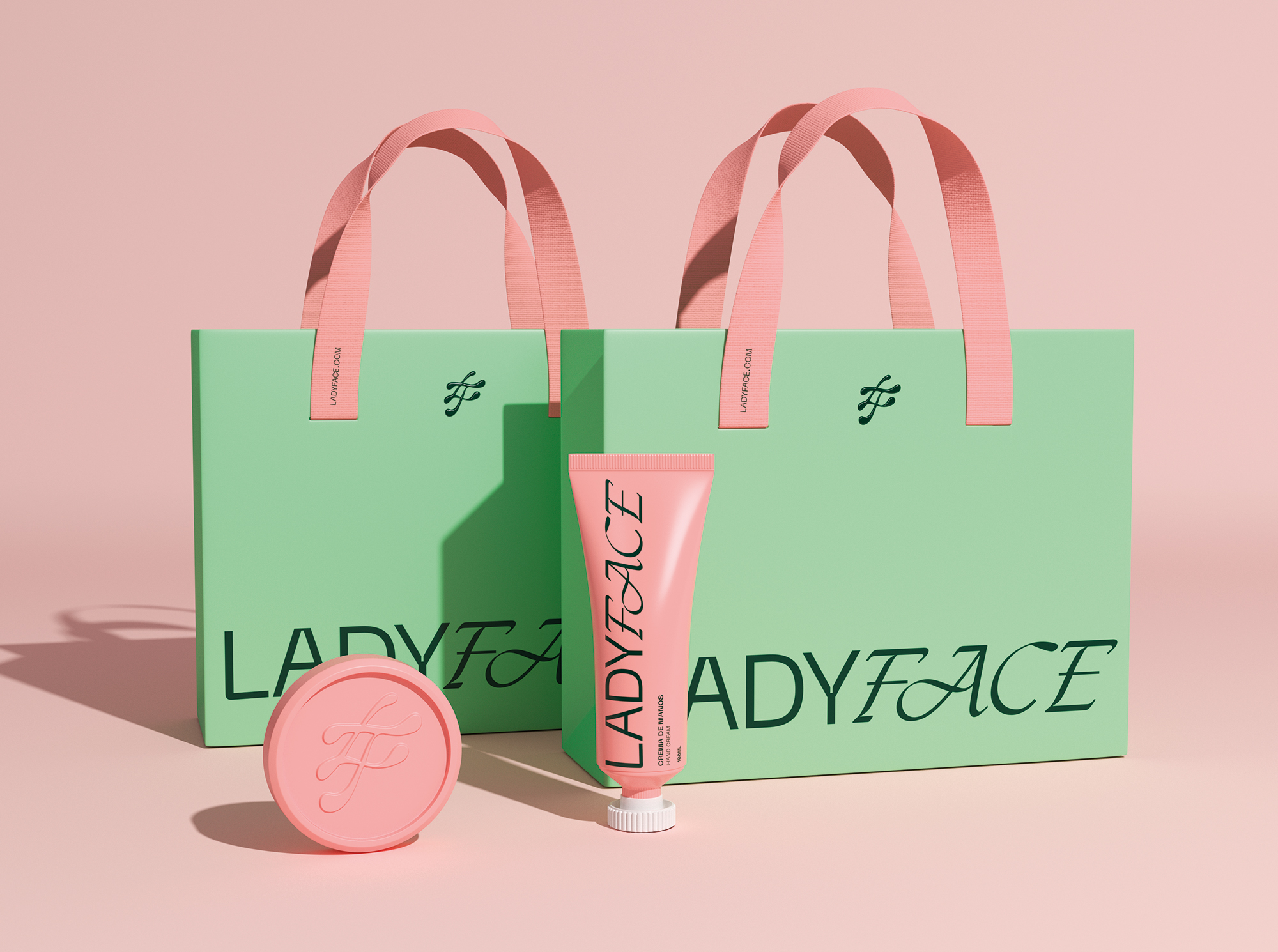
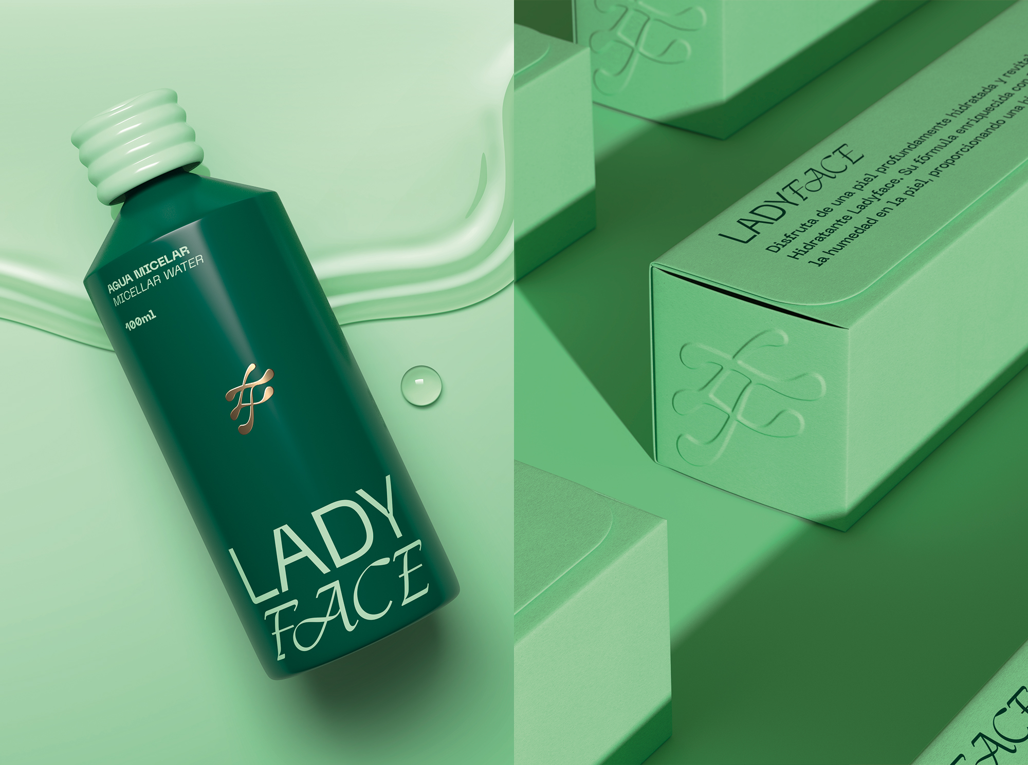
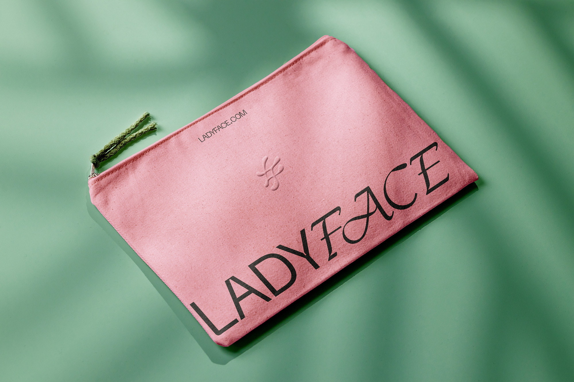
LadyFace is a cosmetics brand focused on dermatological care and health. Its goal is to make women feel good in their own skin, both inside and out. The brand is convinced that beauty is holistic and that self-care is directly linked to self-love. That’s why its products are natural and easy to apply. With this in mind, under the concept “Free to Be”—centered on empowerment, confidence, well-being, and authenticity—a bold, colorful, simple, and highly distinctive packaging system was developed. It reflects the essence of a strong, beautiful woman who embraces her individuality.
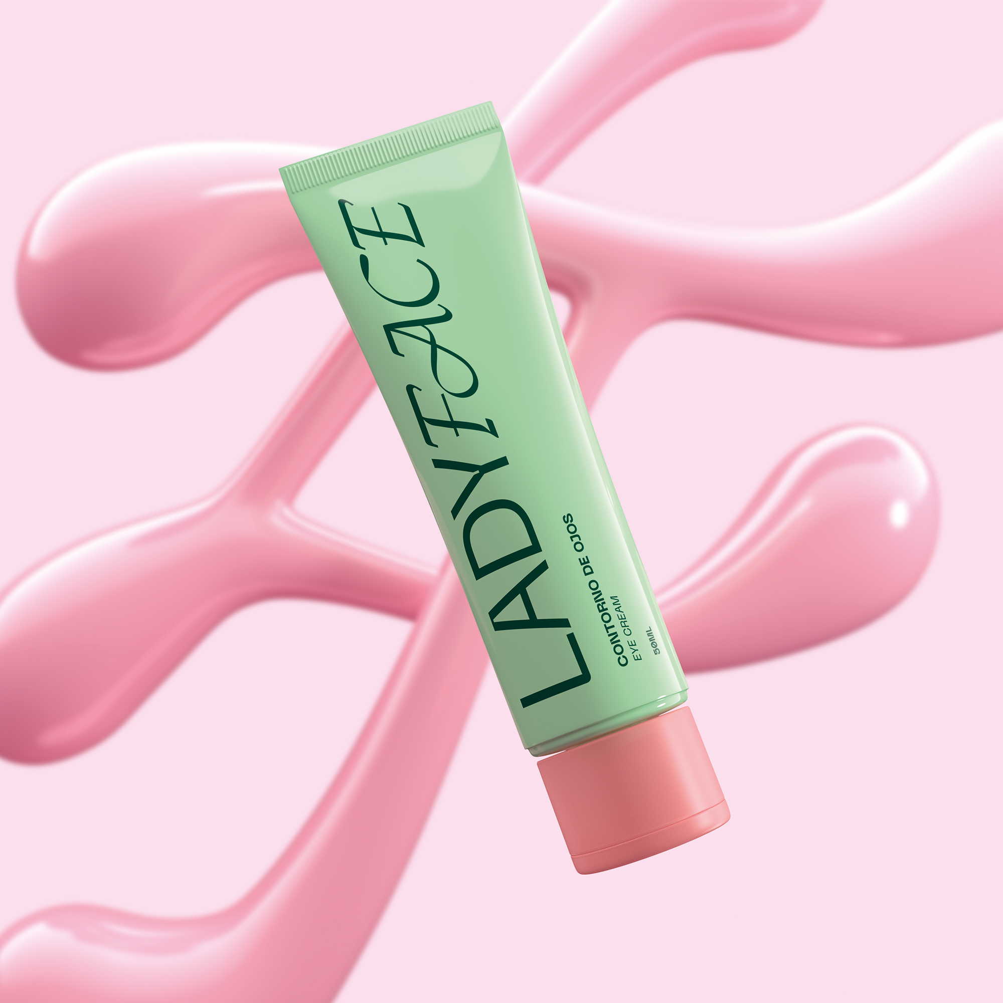
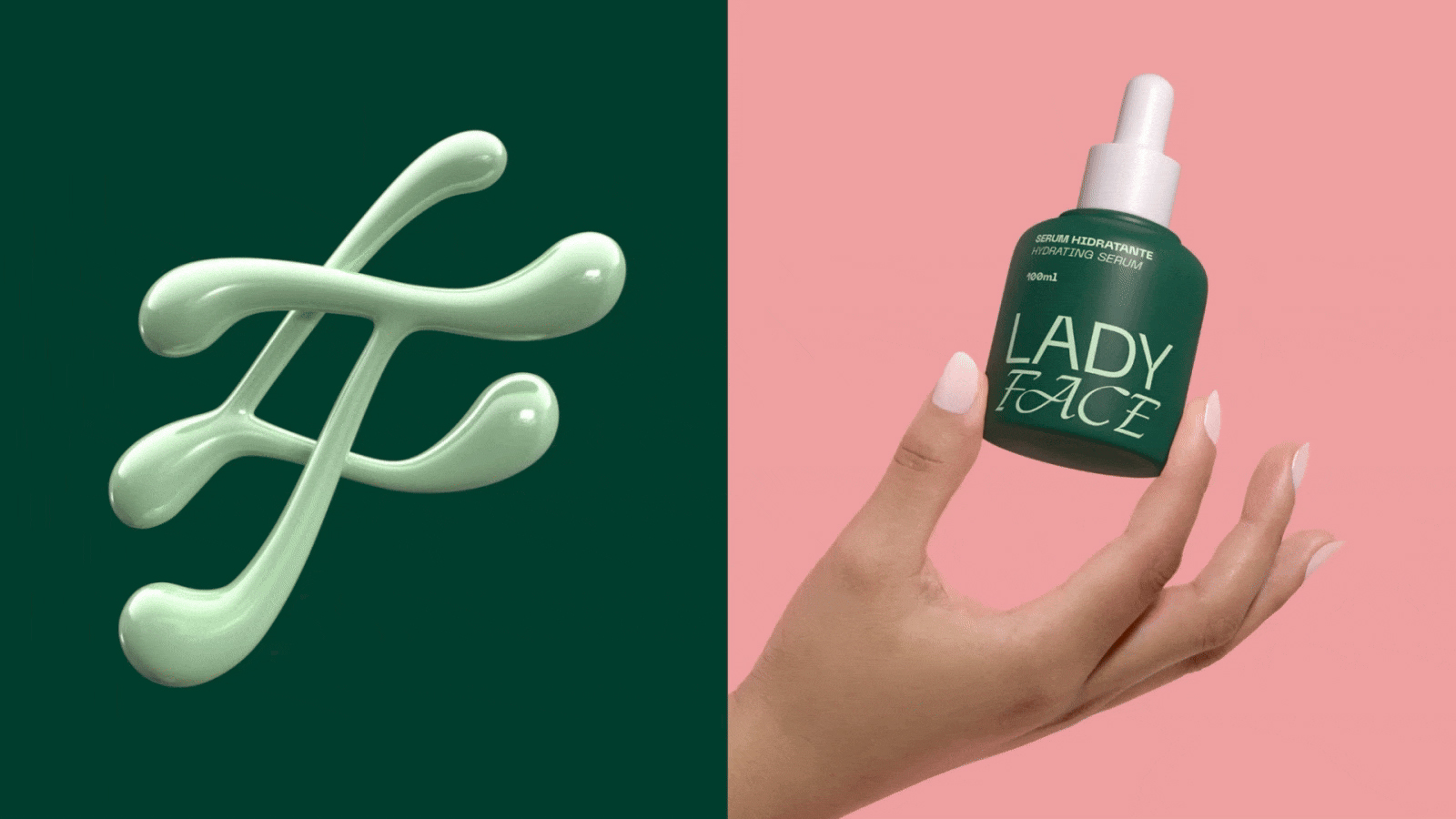
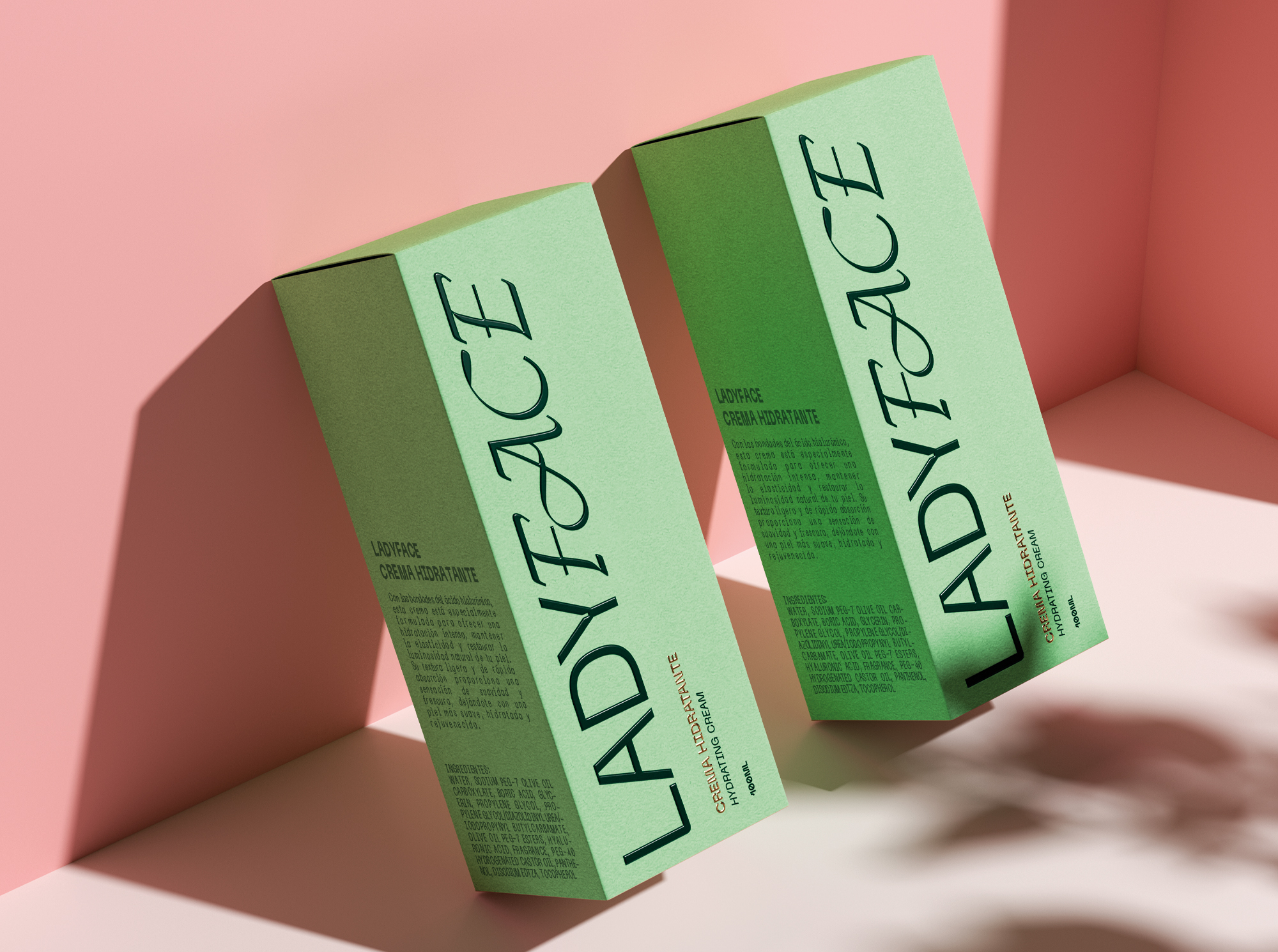
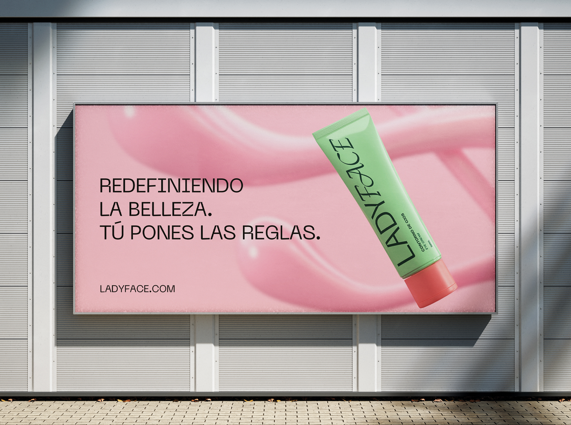
We chose a natural pastel color palette, keeping it quite limited since the brand offers only a few products, reflecting practicality and functionality. We developed a logo that contrasts a strong, bold typeface with another that is much freer, natural, organic, and experimental. Additionally, we created a monogram with the brand’s initials, giving the typography a fluid, watery treatment. This conveys the liquid and creamy nature of the product, as well as the movement and freedom of the concept.We established a photographic language that is natural, authentic, and real. The minimalist design gives the project a clean, clinical, and highly professional cosmetic feel. However, all the elements combined create a cool, youthful, and effortlessly bold atmosphere.