The coffee brand cama cafe was founded in 2006 as a takeaway street shop named after coffee lovers. Brand identity and packaging design also grow together in this process. Through the improvement of this packaging design, the product line that has been used for 15 years has been organized and the brand identity has been organized to provide consumers with a better brand experience.
The core of this redesign is thinking with consumers and sellers as the protagonists, rethinking what kind of design is useful to users, can increase sales, and has also received valuable suggestions from sales staff and consumers. The birth of this kind of packaging design, those elements that have nothing to do with the design are the key to the success or failure of the design work.
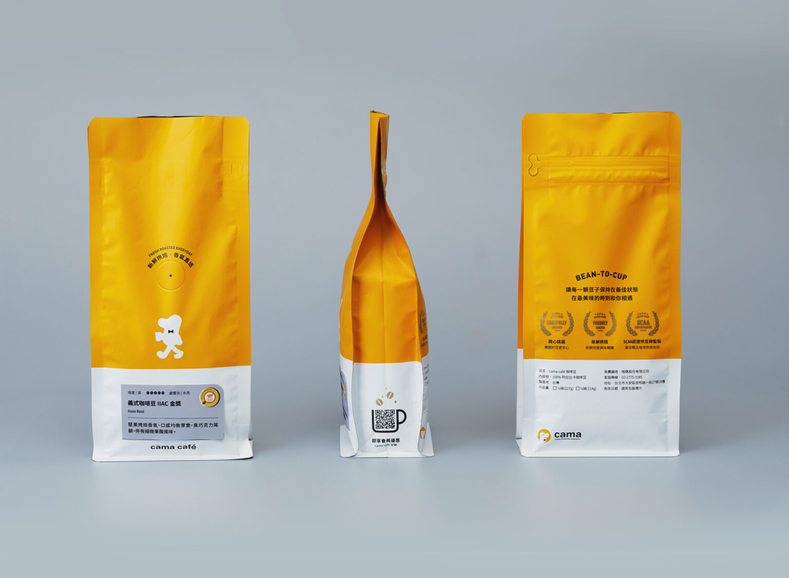
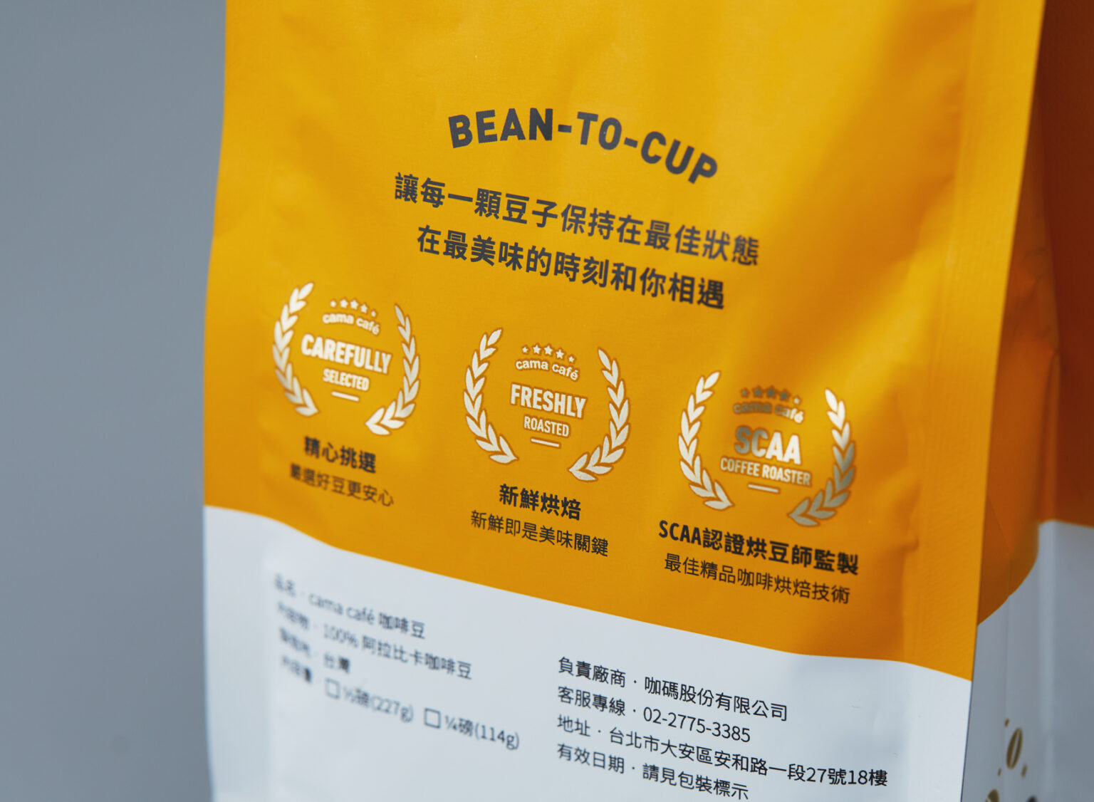
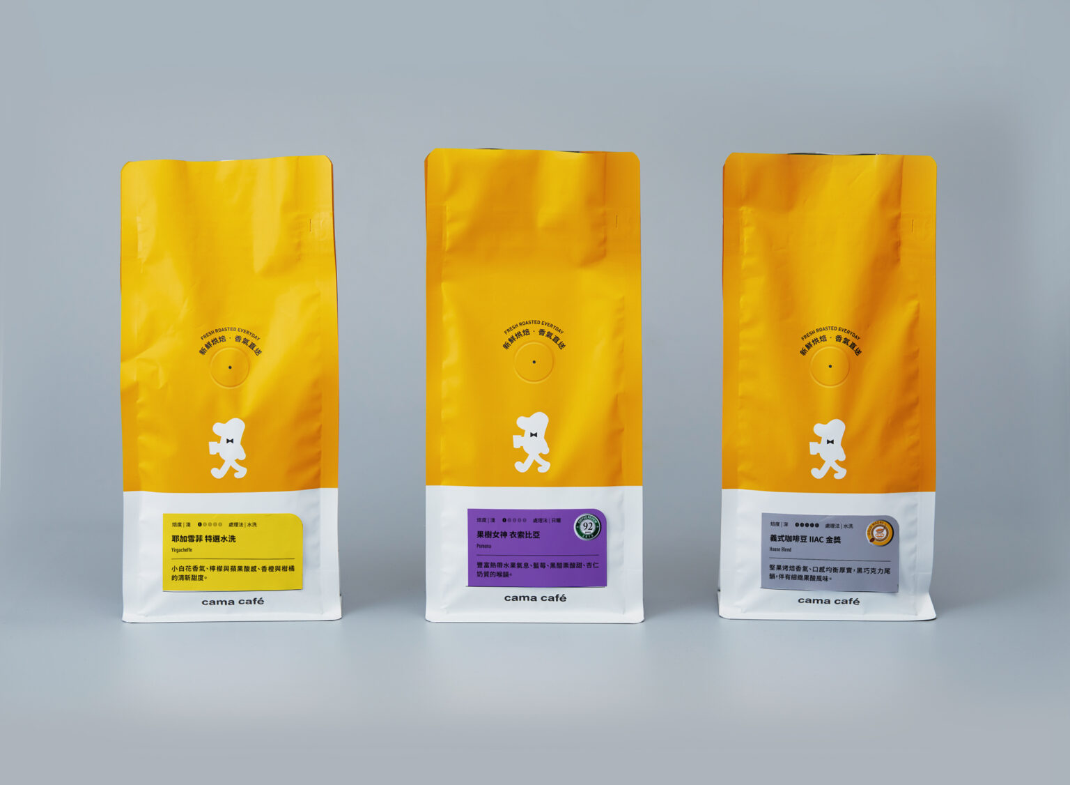
The design strategy focuses on “enhancing professionalism, packaging can be used together, and simplifying brand identity”. The visual design of the cama café coffee bean bag is re-planned, and the product lines of different price points, such as green coffee beans, classics, and boutiques, are distinguished by color. Use stickers to distinguish different coffee flavors and reduce excessive text information, so that consumers can more quickly understand the flavor of coffee beans, roasting degree, coffee bean processing methods, etc., and standardize the paste position in the layout design to improve the consistency of the whole store For visual quality, the style of the coffee bean bag has been re-adjusted to the structural design, so that the coffee bean bag and the filter coffee bag can use the same gift box. In addition to reducing the waste of excessive packaging, it also strengthens the consistency and operability of the packaging design. Using “shared packaging materials” to streamline packaging costs and storage space is also a design ingenuity to reduce waste.
“Creative and interesting” is the brand culture that cama cafe hopes to convey to consumers. The yellow brand logo color and the character Beano are the most vivid images of cama cafe. The new vision simplifies Beano into a visual symbol between cuteness and professionalism. Regain strength and present a more mature and clean brand image.