THE CLIENT
Milksta is a coffee brand that allows mommas to satisfy their coffee cravings and, at the same time, improve their milk production.
THE KEYWORDS
Soft / Vibrant / Timeless / Meaningful / Natural / Bold / Friendly
THE SOLUTION
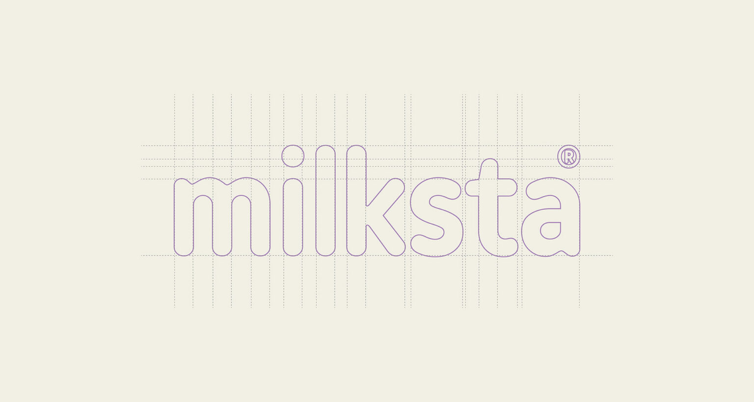
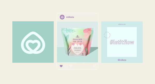
Our initial goal was to create minimal, soft and bold logo, but we came up with an emblem, which will be memorable and associative. The inspiration for the emblem was taken from the milk drop and a heart shape for mothers love, proved by what they go through for sake of their babies.
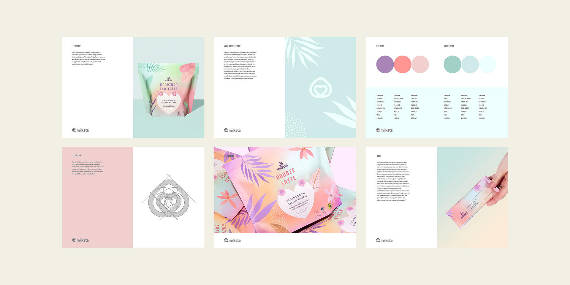
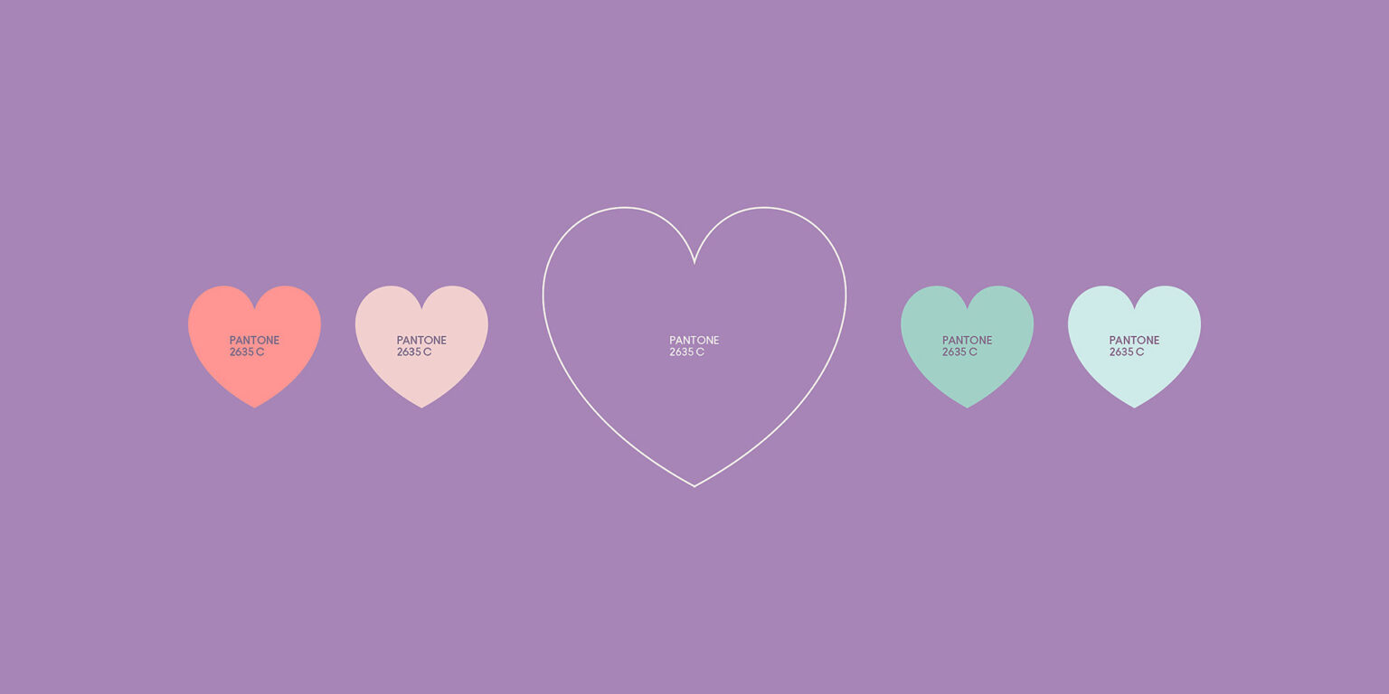
We got inspired by all the sacrifices mothers have to make, and came up with a palette full of soft and vibrant pastel colors. The most loved color by viewers in this palette has become purple, as it has the biggest association with love, softness, and care.
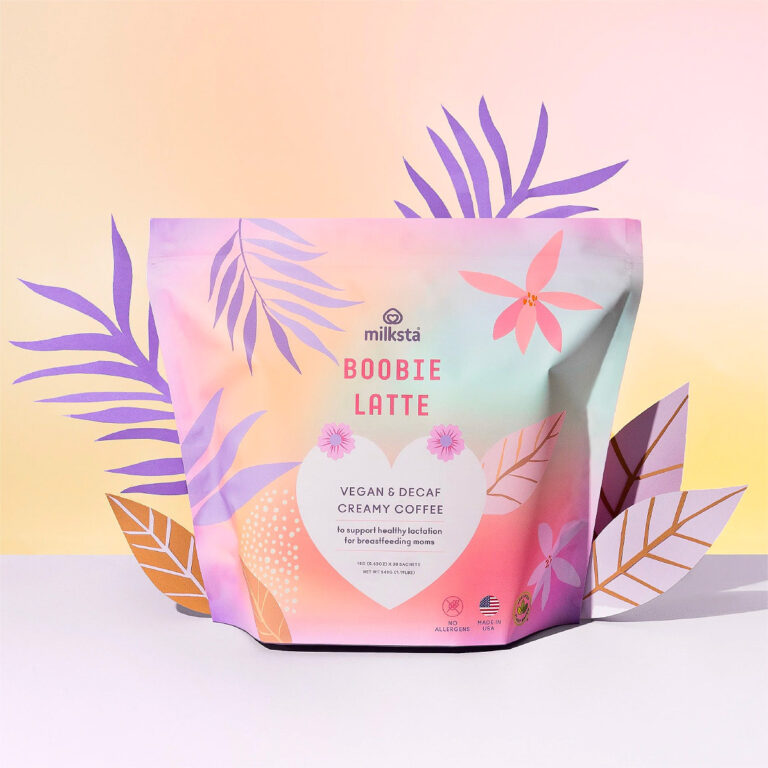
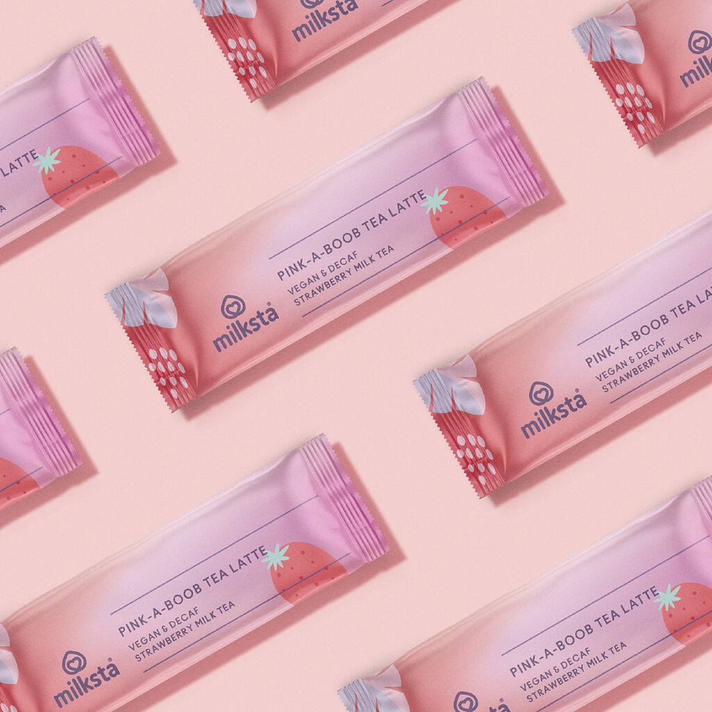
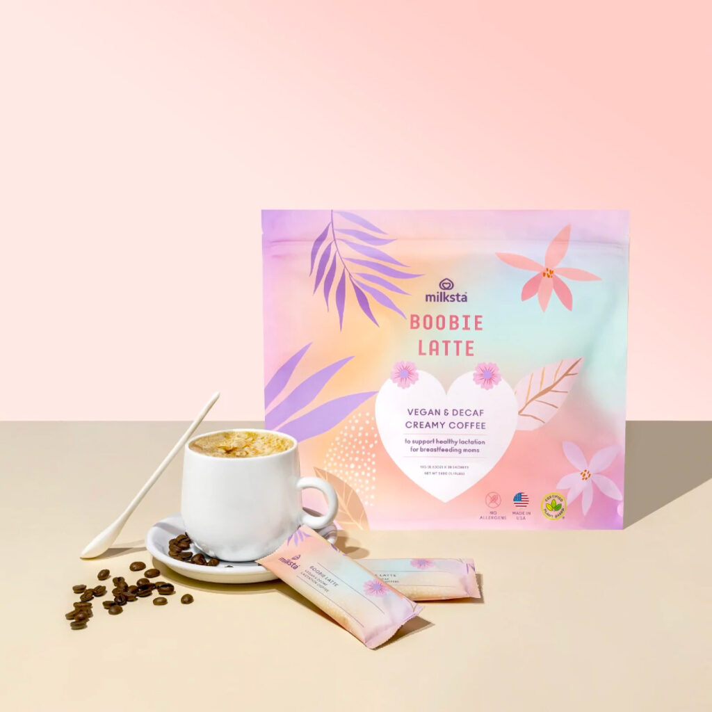
We have created 3 packaging designs for different flavours. Each of the designs includes an ingredient illustration as their background pattern. For the label, we selected the part of the emblem, which is a heart shape with a simple layout, which simply and comprehensibly describes the purpose, flavour, and weight. The sachet design was also made colourfully and simply.