Three packages with gold embossing for a line of healthy chocolate
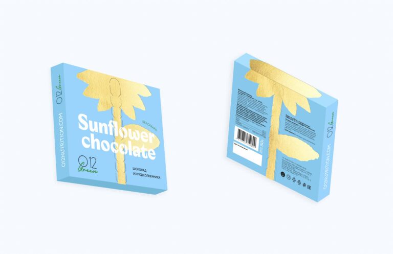
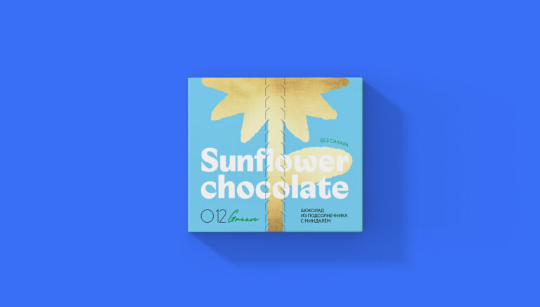
Work on the new O12 line began with sunflower chocolate, the flower of which became the starting point for future design. From associations with bright sunlight and yellow petals, the idea with gold embossing was born.
In the center, there is a perforated sunflower stem to make it convenient to open the package. Inside, the color of the package is different, in this case it is green.
This is another reference to the sunflower, and at the same time to the usefulness and naturalness of the product. The same elements – gold embossing, a perforated tongue in the center and a different color inside – were useful for the other two types of chocolate. Golden peas adorned the packaging for the puffed rice bar, while the “sporty” protein chocolate featured a racing flag-like pattern and the most active colors in the entire line.
At the same time, the design does not scream about “sportiness”, but rather hints at it, which allows reaching a wider range of potential buyers.
It was planned to replace the line of protein chocolate the client already had. After all the design work was completed, the pandemic hit and the client made the difficult decision not to launch the product.