Πλάγιος Λόφος, Lidl.
Our strategy was to launch a Greek PDO Sauvignon that would stand out instead of fit in. So how to disrupt a non-typical market shelve and a landscape cluttered with labels suggesting handmade, natural, and artistic traits & cues? And how to be unique within the “minimalistic” wines that follow a norm of black type on a white label? Our competition includes both PL and branded wines that someone might call traditional and wines that are considered modern and minimal.
To achieve the desired outcome, we aimed for a quite different approach. Looking for a twist that would make a difference, the key elements of this design are the storytelling name, the effortless visual, and the unexpected color palette of the label.
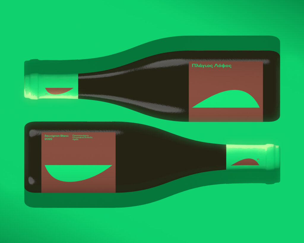
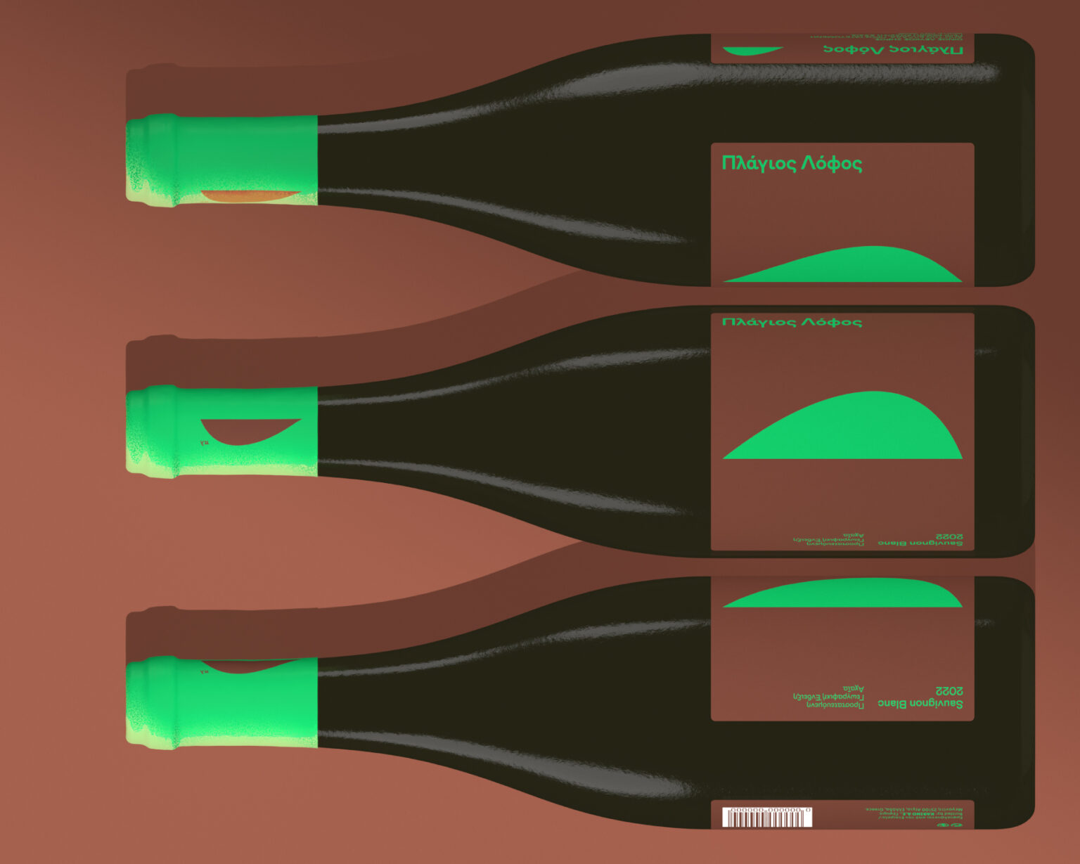
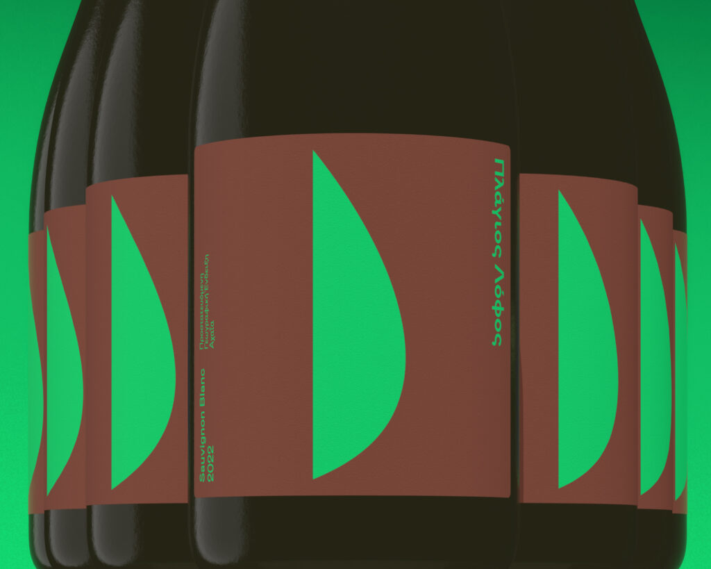
Our design: Brutalist sophistication with a dazzling twist. The vivid Green Pantone expresses life, grape, and taste. The warm brown represents the purity of the soil and earth and evokes a familiar feeling. A minimalistic layout with a single graphic element creates a bold and distinctive identity for the product.
This green-and-pop visual connect the object with the subject. The icon literally illustrates the wine’s name, that is “Πλαγιος Λόφος” (“Plagios Lofos” in Greek), meaning “a hill that is kind of sided and inclines.” The name has a powerful lyricism and creates a connection with the people exclusively in the local context and language. Our second-level inspiration for this form came from the liquid wine’s stylized shape. You can see this twist in the visual portrayed in the layout” being rotated on the cap.
Regardless of the semiotics and the references, the design empowers the name’s storytelling and helps the product win the first-level “impressions” game crucial to the FMCG environment.
—
Launch: 2023
Client: Lidl Hellas
Caparo DC
Yannis Mallis
Maria Kika
Aggelos Gourzis
Kostas Kaparos
Partners
Yorgos Garefalakis / andjuliet (naming)


