The idea of the brand was to match pet parents with pet brands & pet charities.
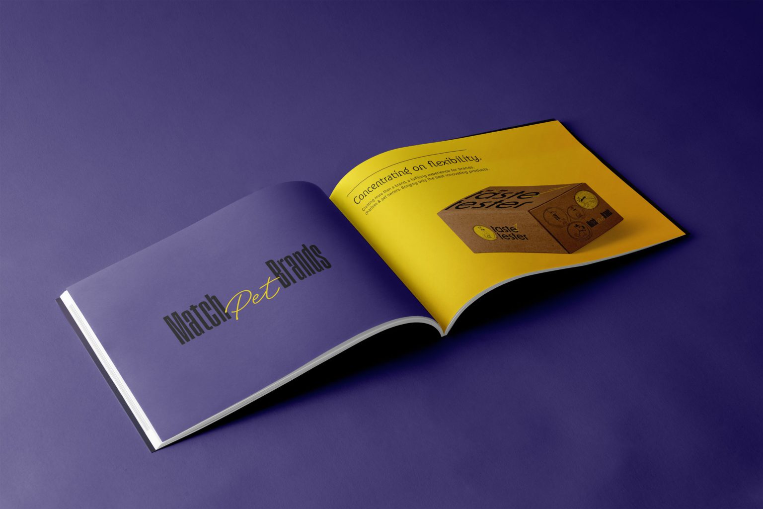
The branding design was created in order to offer a flexible structure that can easily expand in the future while harmoniously accompanying the company in bringing only the best products to the market.
The design takes into consideration important brand messages like “Make it fun” & “Bring joy” while connecting brands, charities, and pet parents to bring unmatchable products that build the bond between pet and human while creating an unmatchable impact.
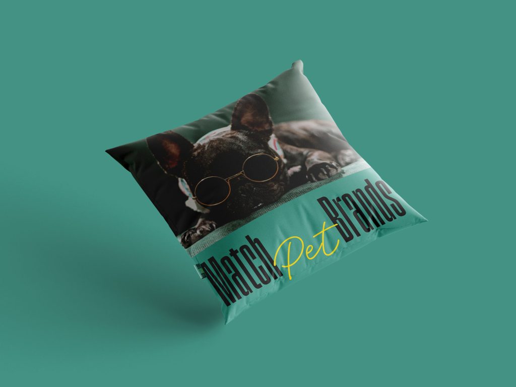
It’s all about adding a new vision to the existing pet market. This creative direction translates into a young color palette, bold lettering & a playful visual style.
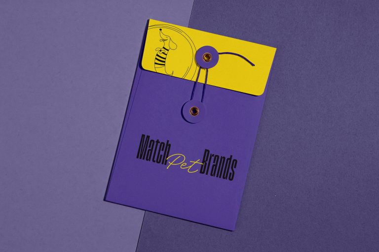
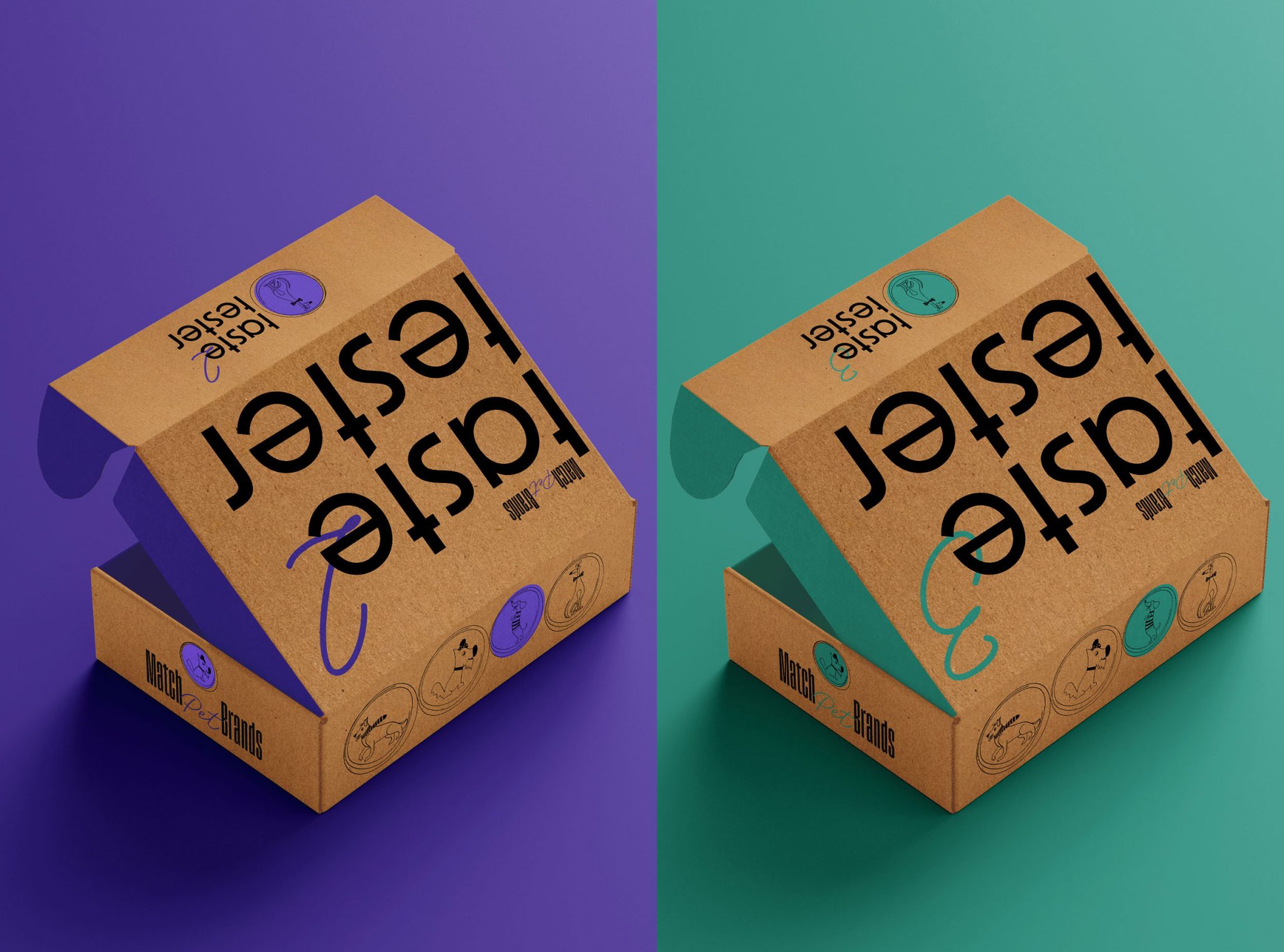
The brand design uses a tall typography for the logo to indicate the visionary, new & modern approach of the brand. The branding was also inspired by fun and colorful photos of pets. The brand color palette is vibrant and bold in order to capture attention and convey the idea of connecting pet brands, charities, and pet parents. The color palette becomes a dynamic matching game to show the flexibility and the complexity of the brand.
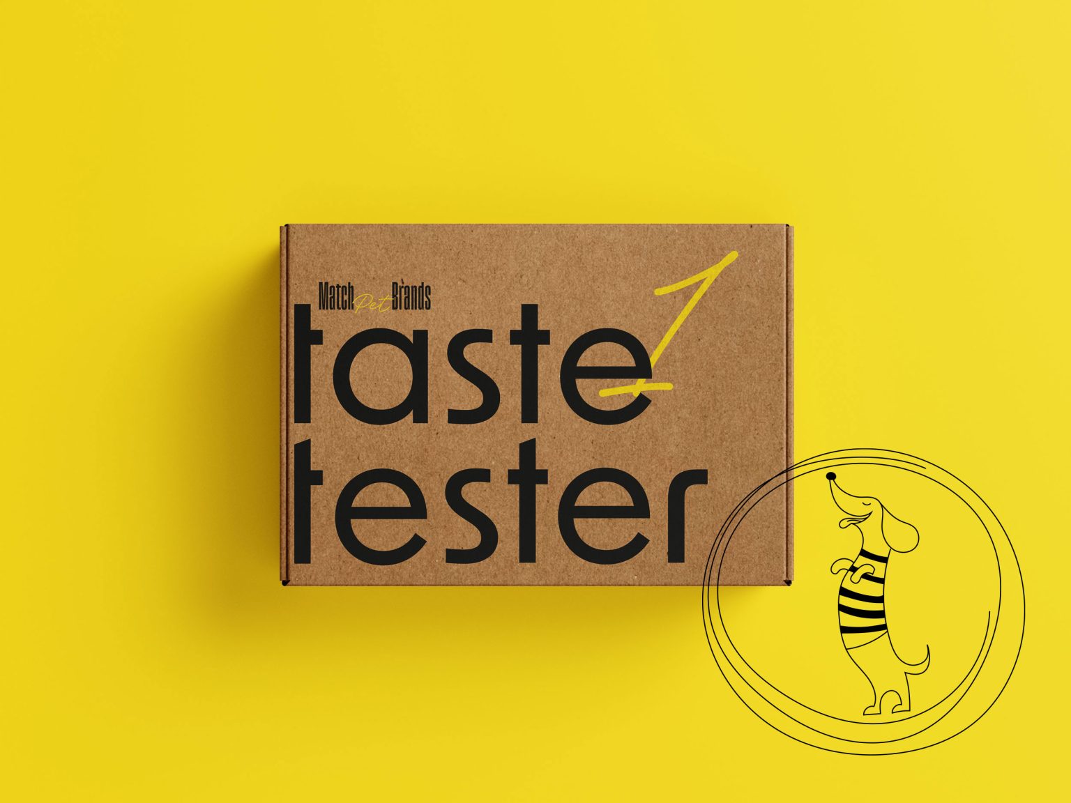
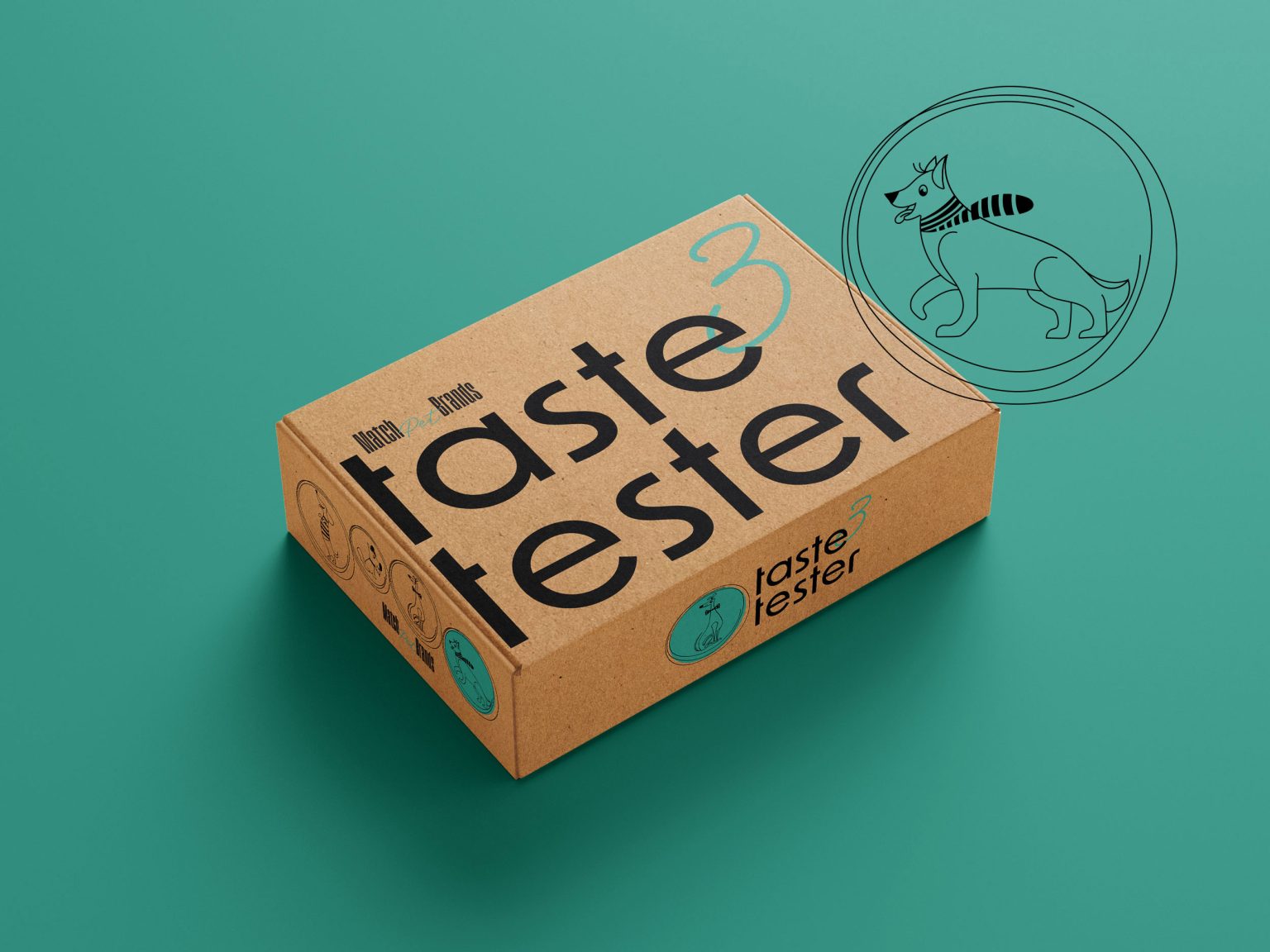
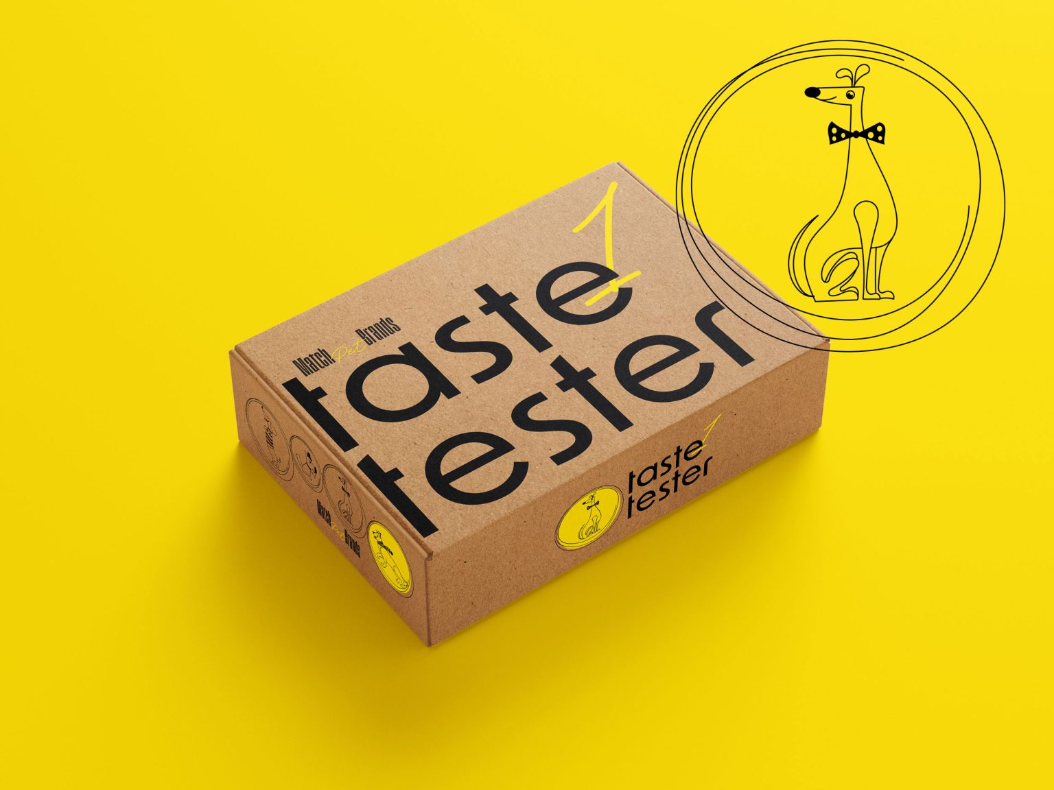
In order to offer flexibility to the brand to grow and follow the pet market in the future, the packaging design occupied an important part of the project. The design had to adapt to the brand mission, so 3 package options were created. The packaging imprint is dynamic and modern and uses hand-drawn minimalistic illustrations of different dog breeds while being easy to adapt to in the future for cats and other brands. The used materials are biodegradable and complement the vibrant colors of the brand and its playful style.

