Stains Fly Detergent was designed to break the monotony in the detergents market and bring a new option for consumers. Washing doesn’t have to be boring! The everyday detergent image is being reinvented in a playful & colorful style.
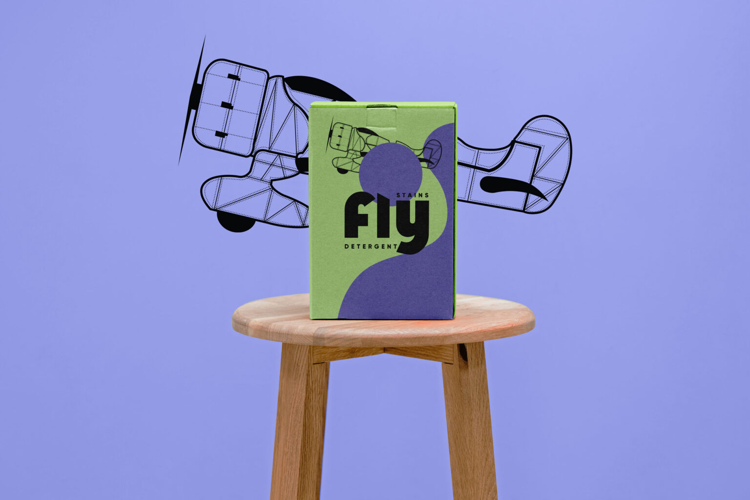
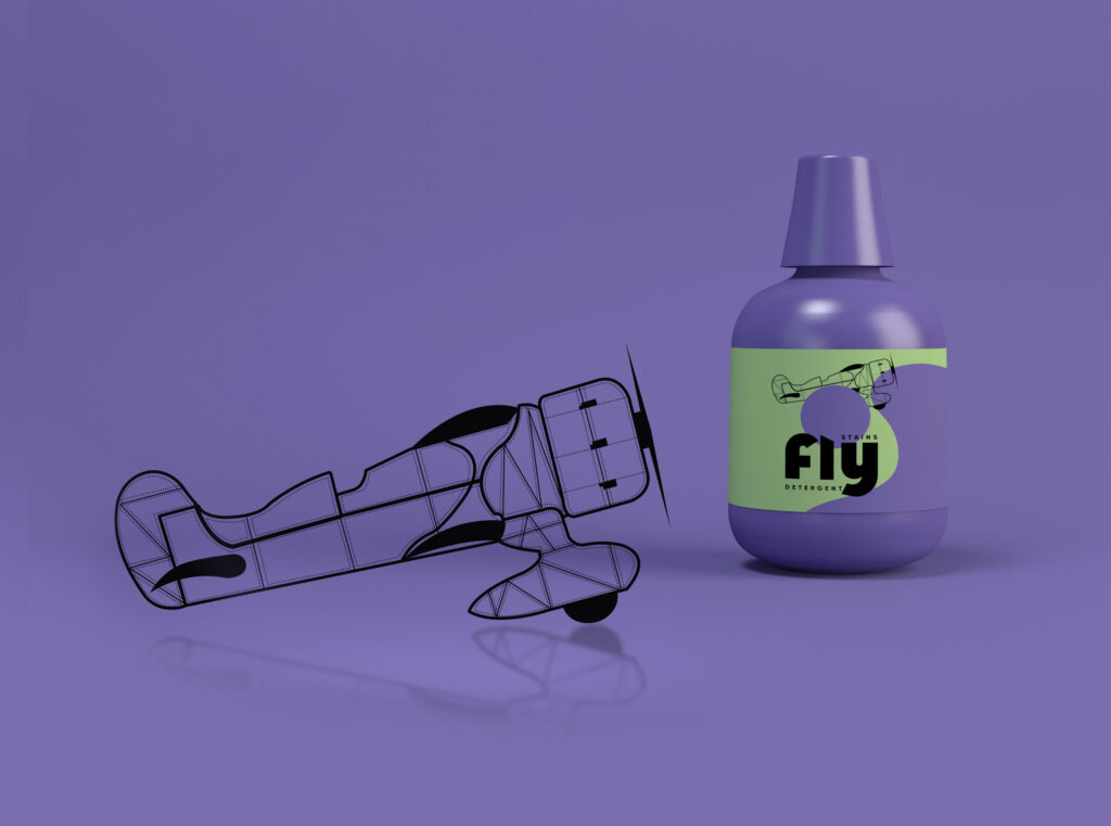
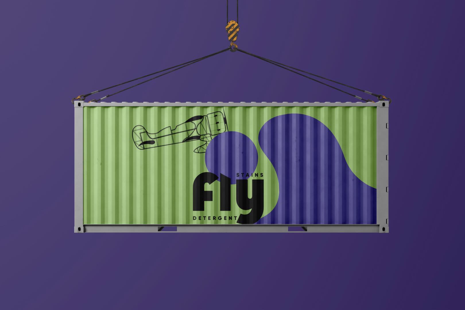
The inspiration came from vintage beautiful aircraft & small-size planes. The detergent packaging uses a modern two colors family in order to simplify the usually crowded image of supermarket detergents.
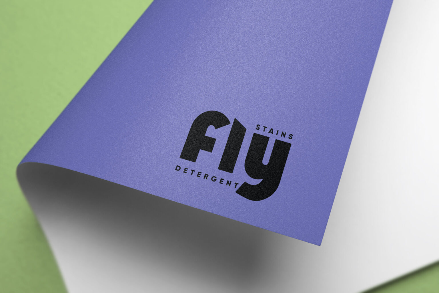
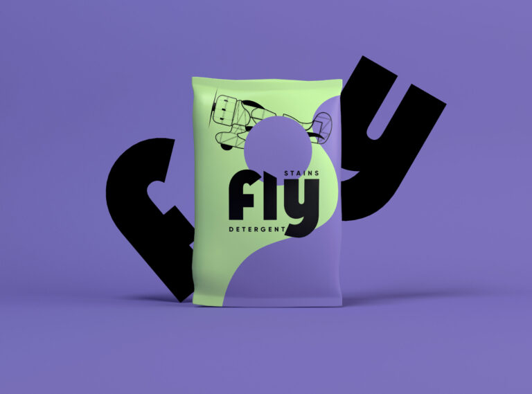
The packaging was created in two formats for both liquid and powder detergent. Both detergent packaging uses the logo as the main focal point in order to become easily recognizable on the shelf or online. The logo combines a Bauhaus typography style with a compact tagline.
The goal was to create an illustration that can be easily adapted to different packaging formats while carrying the visual message of the brand, that stains simply fly away with this new formula detergent. A purple wave symbolizes the washing process together with the vintage airplane that illustrates the idea of flying. The simple lines of the packaging are emphasizing a new clean way to do your laundry.
It was important that the detergent branding & packaging appeal to modern customers, to millennials who are always looking for new products with better results. The packaging is easily recognizable and can help the brand expand in the near future with an extended line of products.
We wanted to set an emotional connection with the customers, transform the daily routine into a fun experience and create a laundry detergent branding with unique attributes.