As a packaging design curator, I’m absolutely thrilled to analyze the creative and unique aspects of Rigo Cold Brew’s packaging design. It’s evident that a tremendous amount of thought and passion went into creating this brand identity and packaging system. Here’s what makes it stand out:
Deep Cultural Connection
What sets Rigo Cold Brew apart is the deep connection to the culture and heritage of its origin. The fact that the design team spent a month in Colombia, immersing themselves in the local culture and coffee-making process, is truly remarkable. This level of immersion allowed them to infuse the packaging with a genuine sense of place, something that cannot be replicated without such firsthand experience.
Personalized Storytelling
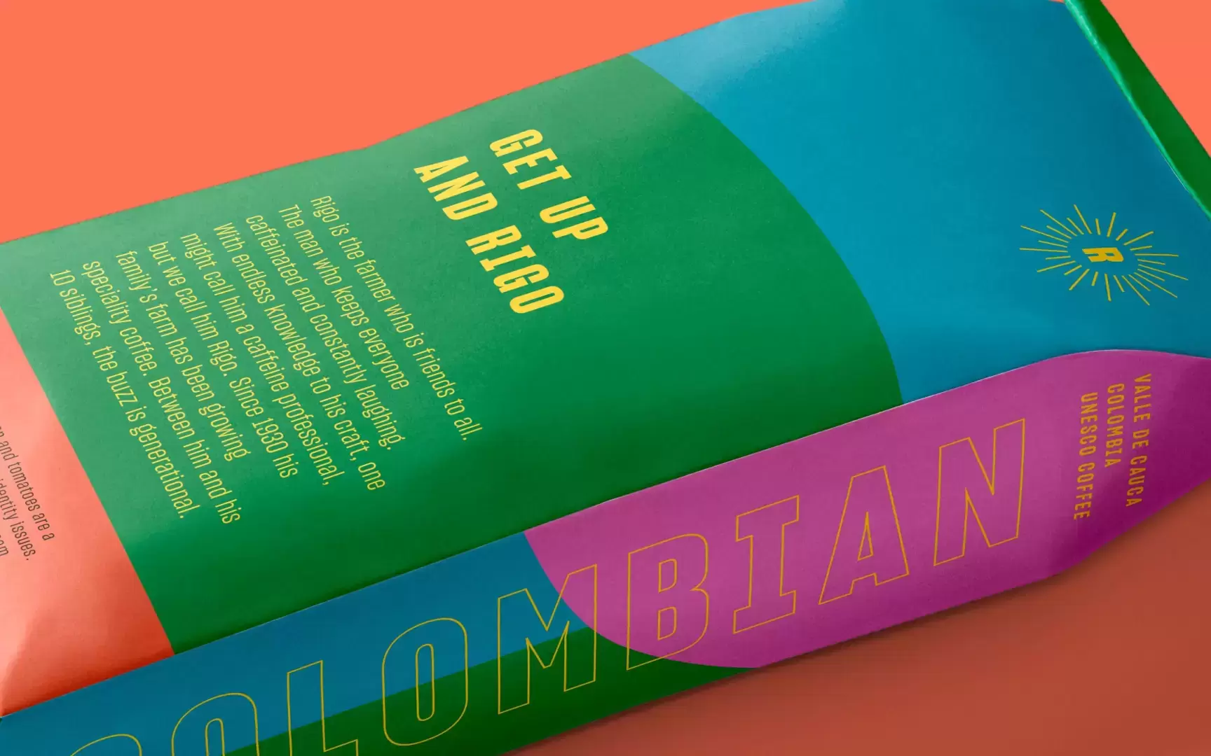
Naming the product after Rigo, the farm owner, adds a personal touch and humanizes the brand. It goes beyond the usual generic branding and creates a story that consumers can connect with on a personal level. This adds an emotional dimension to the product.
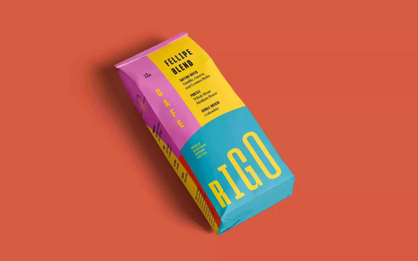
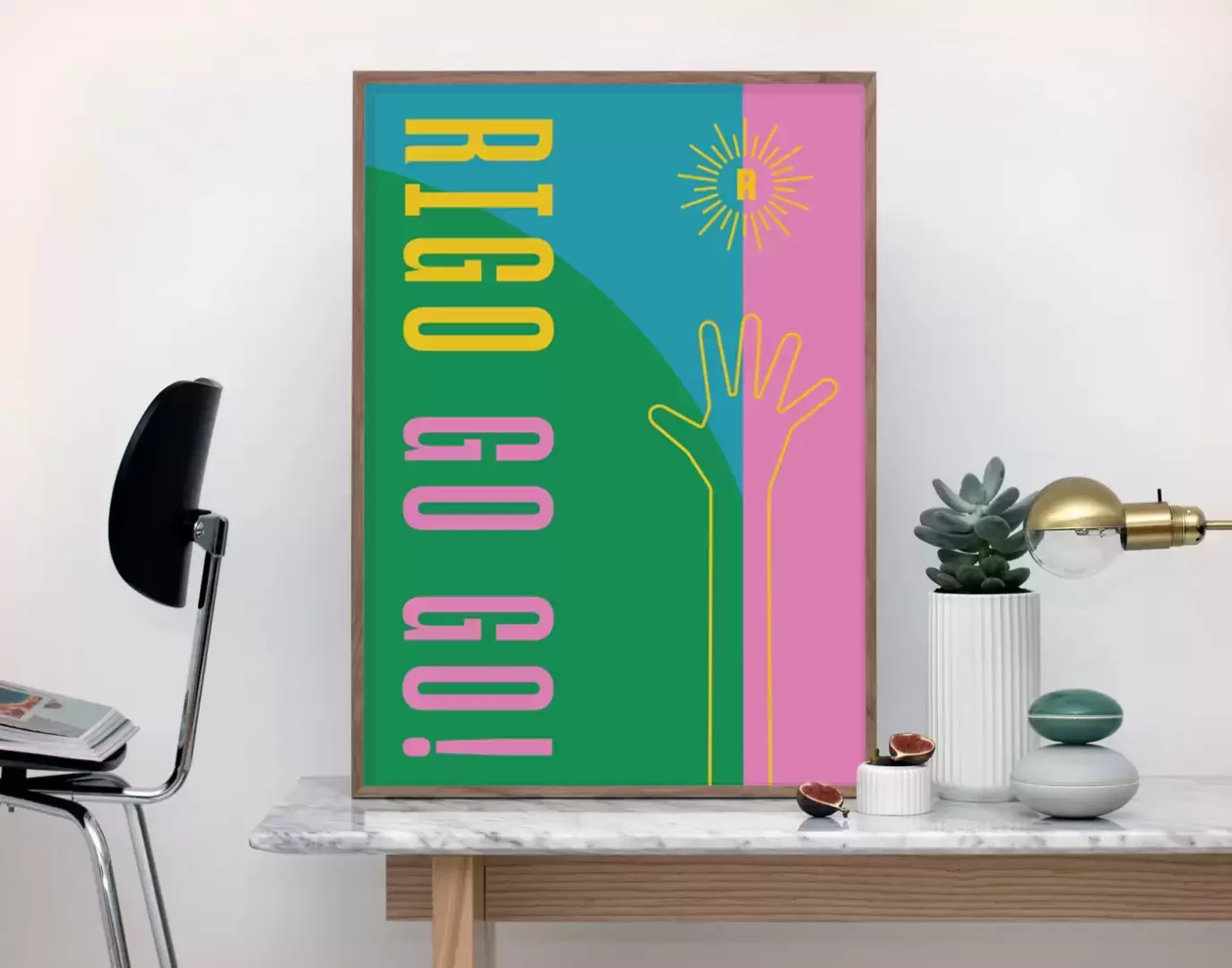
Unique Wordmark
The two-part wordmark that ascends like the journey to the highest coffee elevations is a clever and symbolic design choice. It not only reflects the product’s quality but also suggests a sense of aspiration and striving for excellence. The addition of the sun icon with supporting beams reinforces the idea of community and collaboration, which is often a critical aspect of coffee farming.
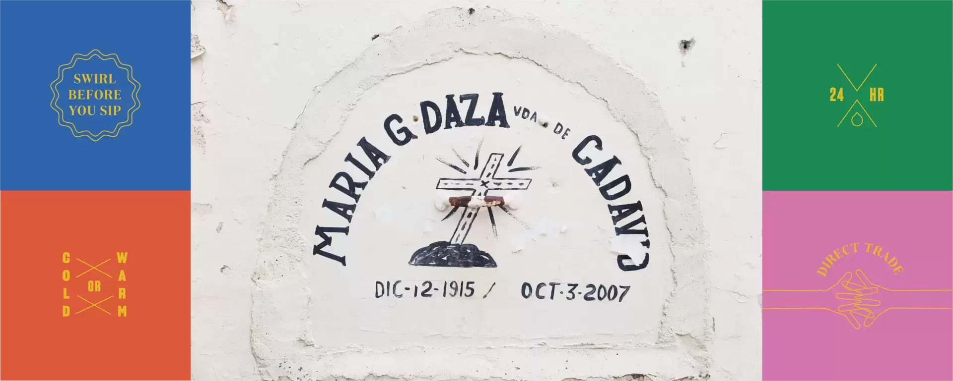
Inspired Color Palette
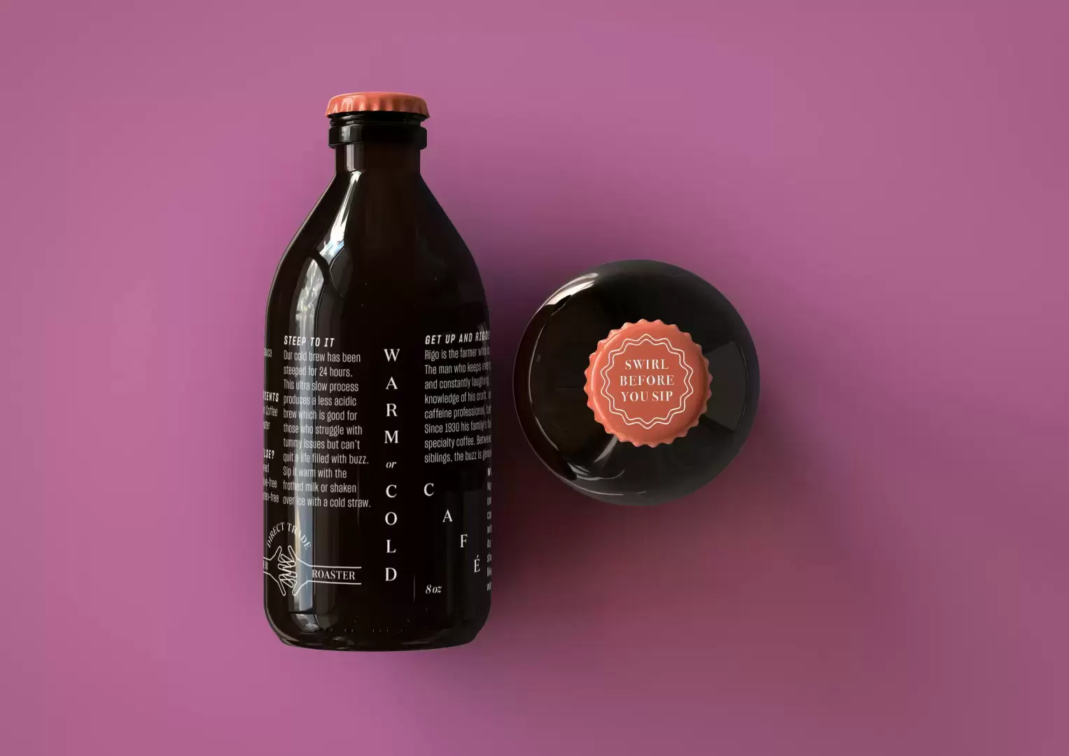
Pink, yellow, blue and green. The choice of colors inspired by the pastel hues of Colombian streets is a brilliant move. It not only creates a visually appealing package but also ties the product back to its cultural roots. This connection to the vibrant and colorful streets adds an element of joy and energy to the brand.
Flexible Typography
The flexible use of typography, especially the arrangement in all directions, is a unique and dynamic aspect of the design. It caters to a youthful audience and reflects the dynamic and multifaceted nature of Colombian culture. It’s a clever way of making typography an integral part of the brand’s identity.
Targeted Audience
The clear targeting of young and energetic millennials who prioritize quality over quantity is a strategic move. It’s not just about the product; it’s about understanding the lifestyle and values of the target audience and aligning the brand with those values.
In summary, Rigo Cold Brew’s packaging design is a masterclass in storytelling and cultural immersion. It takes consumers on a journey to the heart of Colombia’s coffee culture and introduces them to the people and places behind the product. The personalization, symbolism, and attention to cultural details make it a unique and compelling packaging design that stands out in a crowded market.
Design: Vedros Studio | Instagram
Vedros Studio is an award-winning branding studio with offices and collaborators in Berlin, Brooklyn, Los Angeles, Austin, and Toronto. They believe in a world where creatives can collaborate no matter where they are in the world.