4U.am started as an online flower delivery platform and aimed to evolve into the go-to destination for online gift shopping in the country.
The challenge was to create a fresh and innovative brand identity that would facilitate 4U.am’s expansion and firmly establish its reputation in the minds of customers.
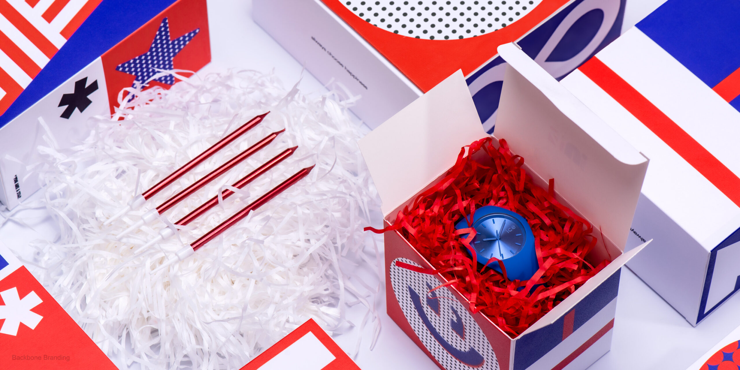
Our solution to this multifaceted challenge commenced with a meticulous redesign of the logo. We ingeniously incorporated the number ‘4’ into a square, skillfully creating the visual impression of a ribbon gracefully adorning a gift box. To further enhance the visual appeal, we opted for bright and bold colors, strategically chosen to elicit joy and elevate the spirits of gift recipients. As an integral part of the rebranding process, a new and resonant slogan was carefully crafted: “Always choose happiness.”
Delving deeper into the essence of the brand name “4U,” which seamlessly combines letters and numbers, we drew inspiration from the prevalent use of acronyms among the youth. This served as the foundation for our approach in designing the gift boxes, where we introduced a unique communication language through the use of simple yet impactful graphical elements. We meticulously curated commonly used expressions for various gift-giving occasions, seamlessly integrating them into the box designs. Phrases such as “I ‘heart’ U” and “U R A ‘star’” found their place on these aesthetically reimagined gift boxes.
The profound objective behind this meticulous redesign was not merely aesthetic; it was a strategic move to add significant value to the gifting experience. The gift boxes were ingeniously transformed into carriers of emotions, allowing people to convey their deepest sentiments through these thoughtful expressions. By incorporating meaningful messages onto the packaging, we succeeded in giving the boxes a voice of their own. This innovative packaging now effortlessly speaks on behalf of the user, facilitating the articulation of important words that one might hesitate to verbalize directly to the recipients of their heartfelt gifts.
In essence, our comprehensive rebranding strategy for 4U.am transcends the surface-level aesthetics. It encapsulates a thoughtful and strategic approach to brand identity, where every element, from the redesigned logo to the carefully curated gift box messages, contributes to an elevated and emotionally resonant user experience.