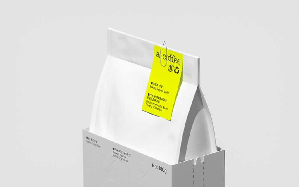
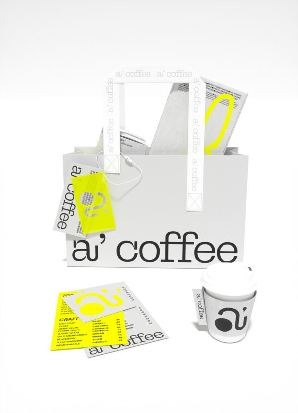
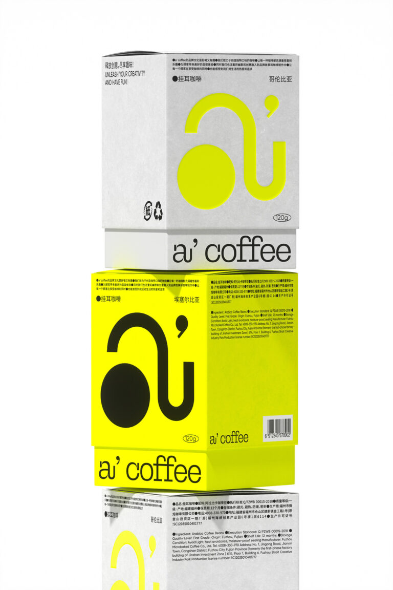
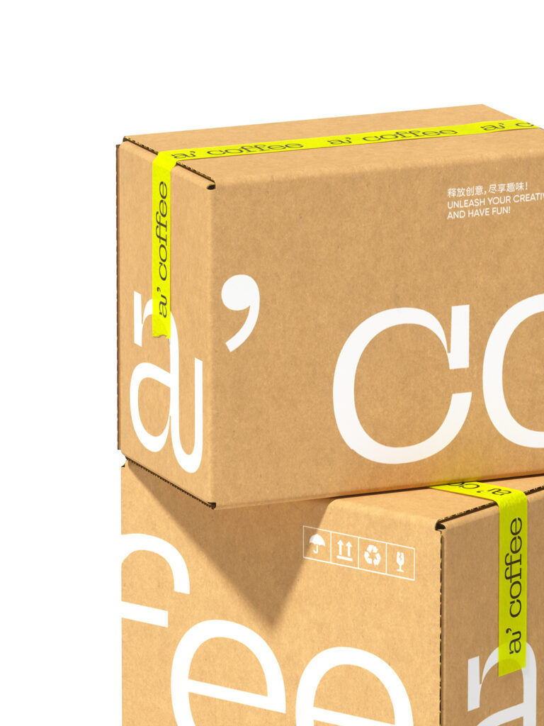
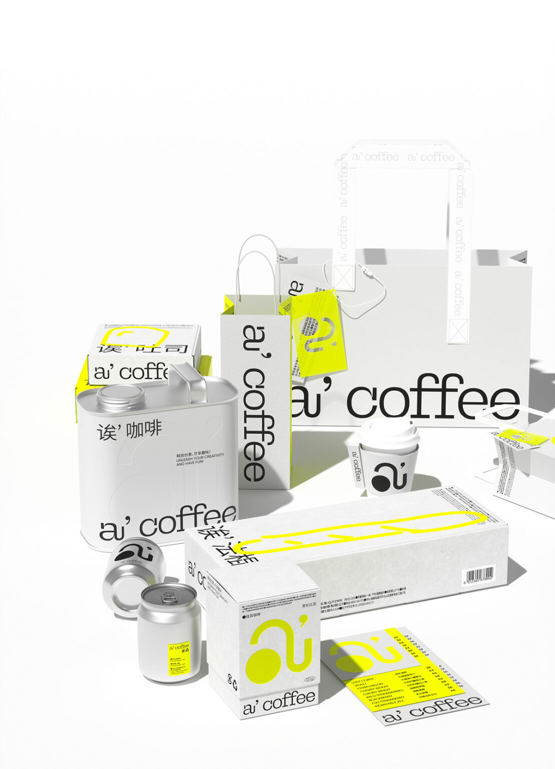
Hey, coffee connoisseurs, for today’s Curator’s Insight, we will take a look at “a’ coffee” (yeah, like the cool kid saying “eh”) designed by NDL Dolin. These guys aren’t your average caffeine slingers, they’re like the Willy Wonka of java, brewing surprises in every cup. Every sip promises a playful punch, a flavor fiesta that’ll leave your taste buds doing the Macarena.
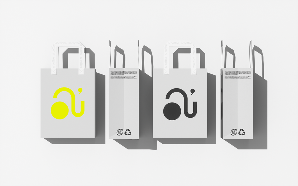
And it all starts with the packaging. Gone are the tired browns and beiges. Instead, we’re greeted by a bold contrast of crisp white and luminous yellow, instantly setting the tone for a vibrant journey. Look closer, and you’ll spot the brand’s secret weapon: a super symbol born from the fusion of the letter “a” (phonetically echoing the Chinese “eh” for coffee) and the brand’s own identity. It’s not just a logo; it’s a passport to a world of unexpected delights, hinting at the creativity and humor woven into every bean.


