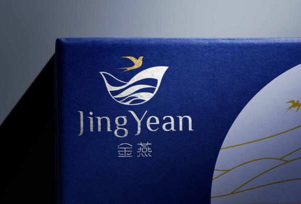
Jing Yean – Bird’s Nest : Branding & Packaging Design
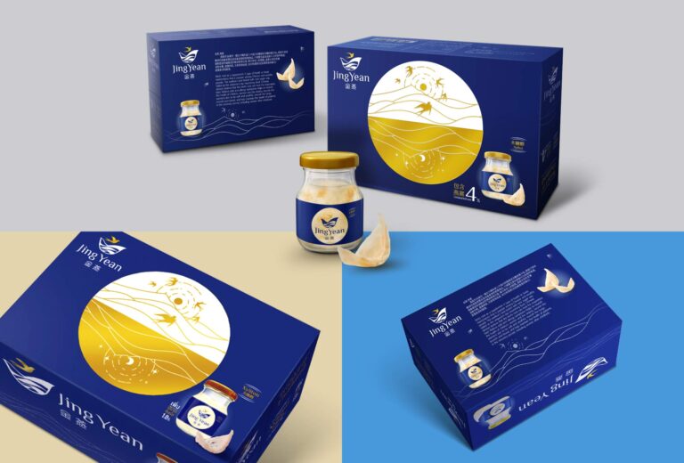
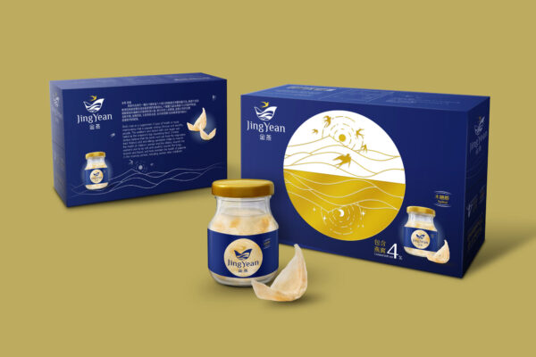
Challenge: Jing Yean (Golden Swallow), an exporting bird’s nest brand, harvesting the nests from the bountiful Khao Luang National Park, offers more concentration of the nests from other brands in the market. The bird’s nest is popular among the Chinese thanks to its body-balancing property and the absence of sugar. Most packaging in the market is golden or red, which, in turn, does not create any differentiation.
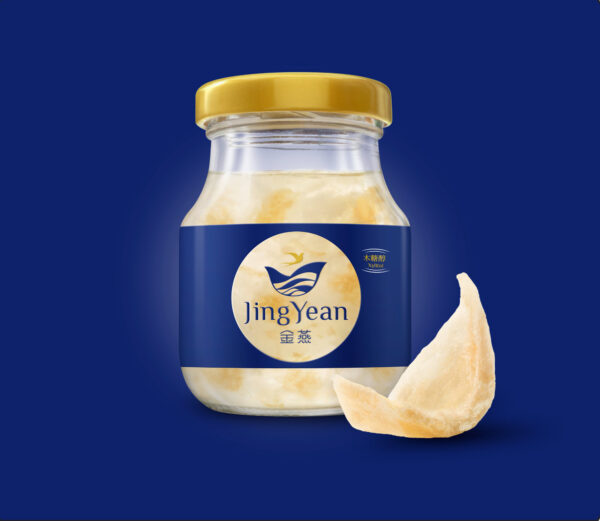
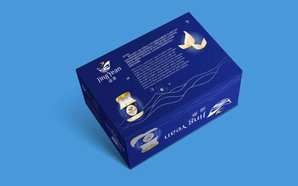
Idea: Leading the name with English, the logo is simplified to create a modern impression. The main colors are blue and golden to make a distinction and offer a premium feel. The key visual of Khao Luang illustration with above as day and below as night conveys the balance of nature. The packaging structure might look simple, yet it can uniquely display the product when open.
