THE SECRET OF GEMS
Branding & Packaging Design
1) About the project
Gemstones symbolize not only prosperity and wealth but also signify authority and inner strength. Beyond the notion of ordinary jewelry, gemstones carry within them energy, messages, and even stories intertwined with the destiny of the wearer. The brand identity and jewelry box design in the TT Gems project we undertook below serve as a mark of the latent power that the brand aims to convey to their customers when owning exquisite jewelry sets crafted by the skilled artisans of TT Gems.
Established in the early 90s with simple products, such as rough diamonds – After over 30 years honed by master jewelers – TT Gems can now proudly assert its position as a “king” in guaranteeing high-quality jewelry. With the desire to bring honesty to customers, each piece created by TT Gems is a labor of passion, so that the pieces sent out not only exhibit high aesthetic values but are also meticulously crafted to personalize according to the requirements and stories of each customer.
2) Challenges
Through a 30-year journey, a new generation inheriting the family gradually brings a desire for dedication and new creativity to the brand that has made a name for itself in the market. TT Gems aims for comprehensive innovation with a more modern image but without compromising the reputation and inherent genes of a long-standing name, hidden within which is sophisticated elegance, unpretentious but present in a seductive way in the minds of customers.
As part of a comprehensive brand redesign project, we and TT Gems agreed to redesign a new shape for the Logo and brand identity system, along with a new jewelry box with high-quality materials and processing techniques, contributing to enhancing the brand experience for TT Gems customers. At the same time, this is also our way of hoping that TT Gems can compete fairly and stand out from domestic and international competitors in the industry.
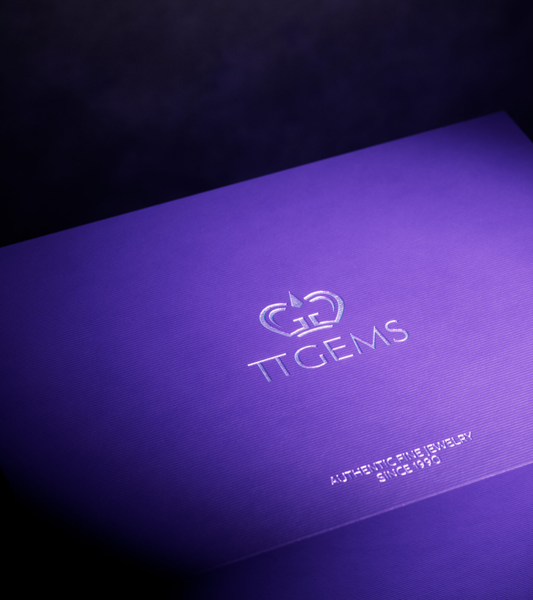
3) The Logo & Colors
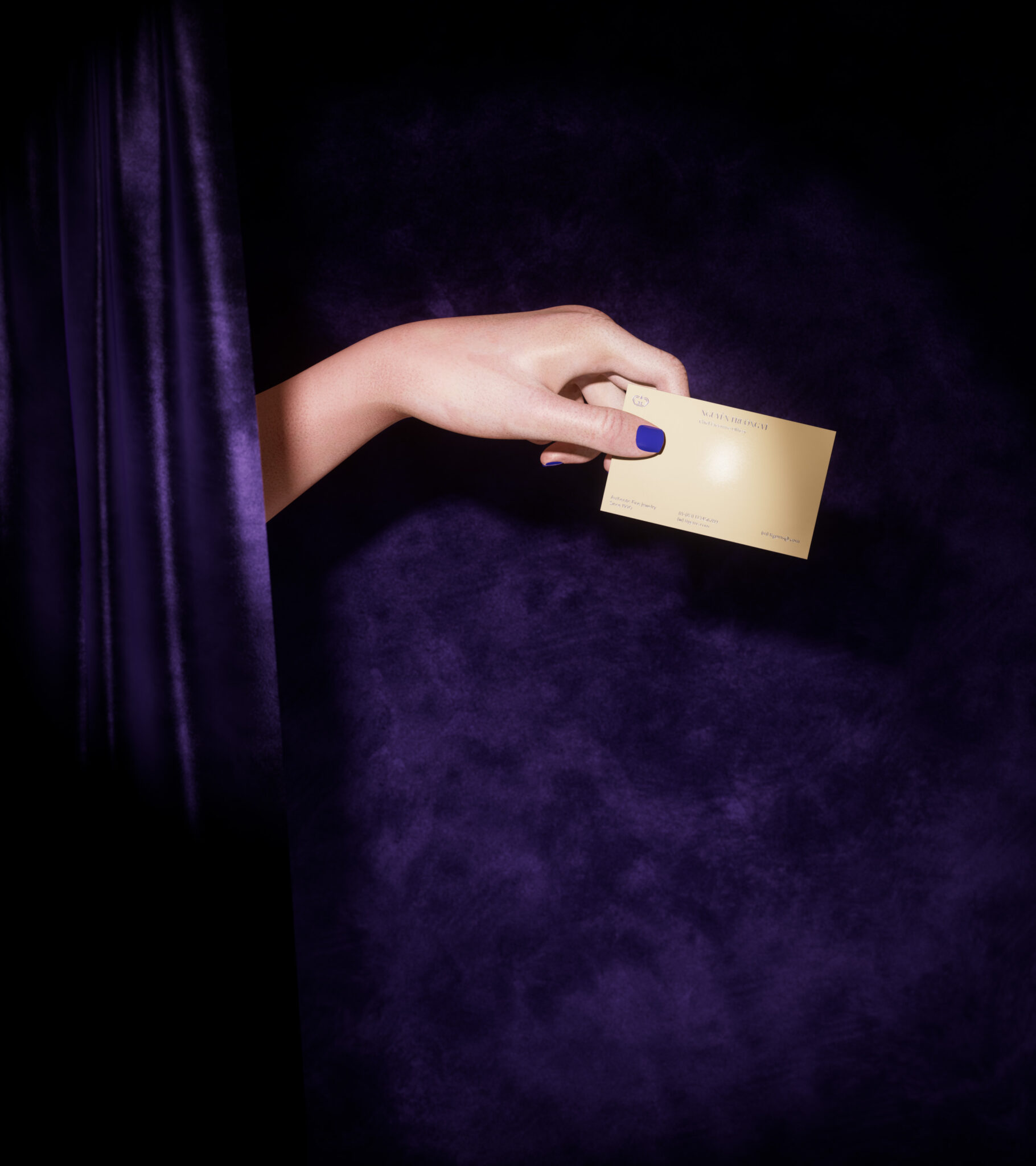
For a brand that takes honesty with customers as its mission, we want the logo design to be approached in a clear, straightforward manner without losing the sophistication of the brand by adding elements that evoke feelings of prosperity and power of a long-standing brand. The logo is shaped from the letters T and G representing the brand name, after careful arrangement has created a majestic and exquisite crown, reminiscent of a high-quality jewelry brand.
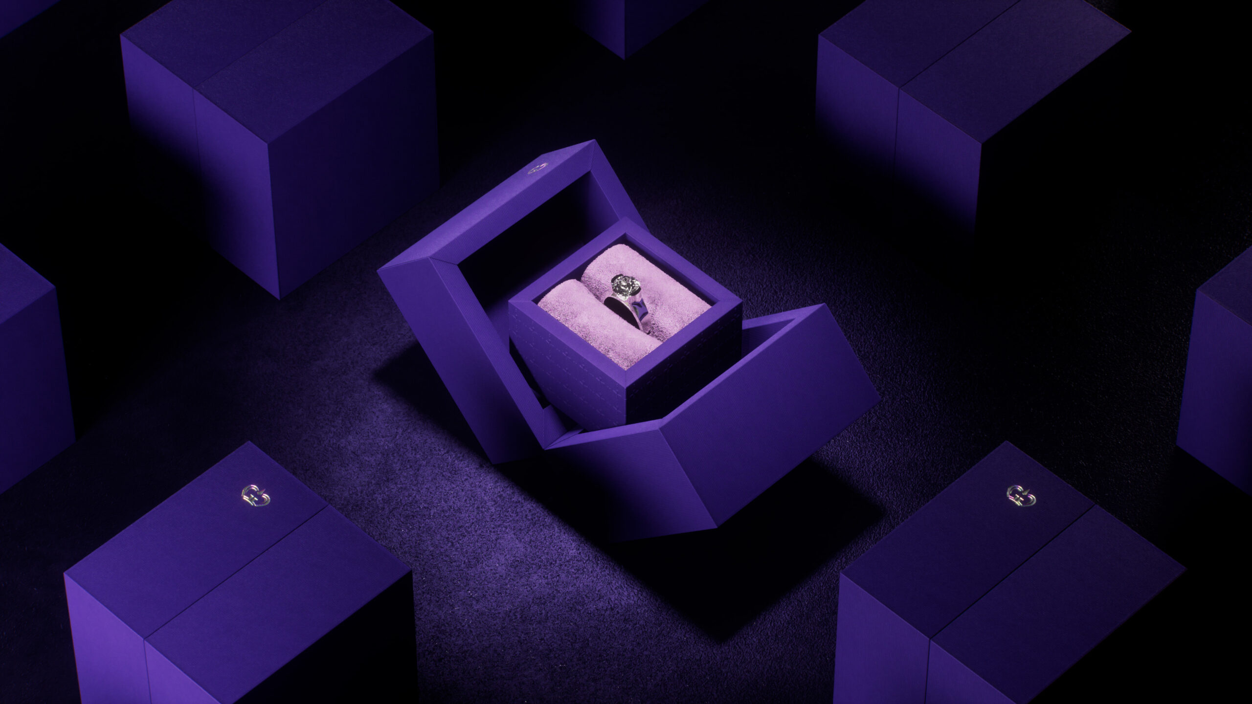
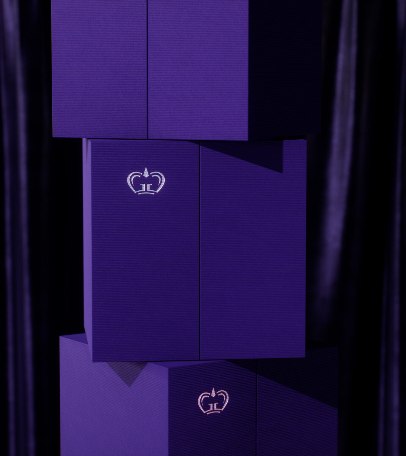
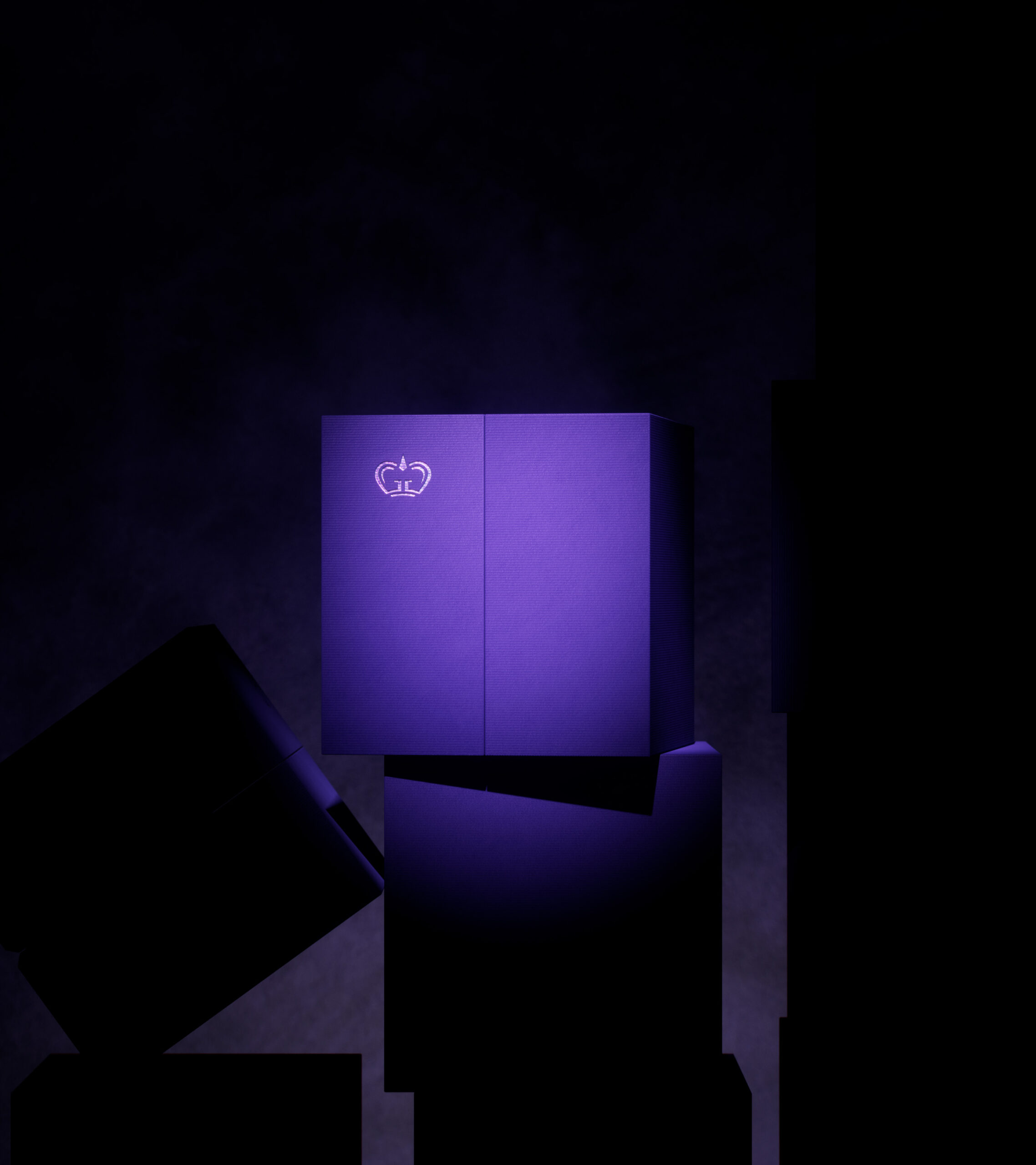
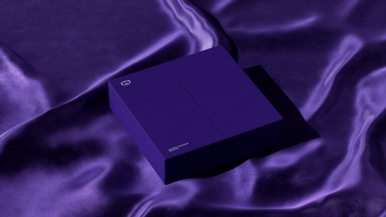
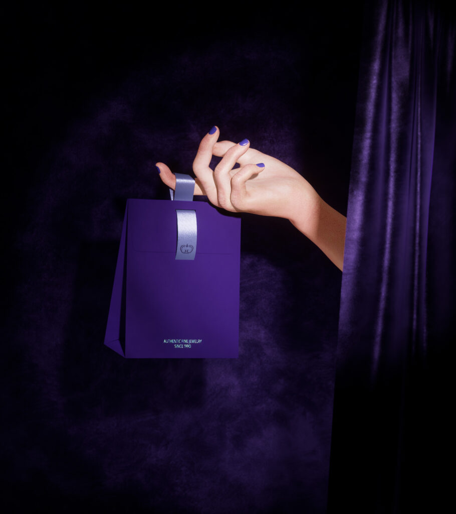
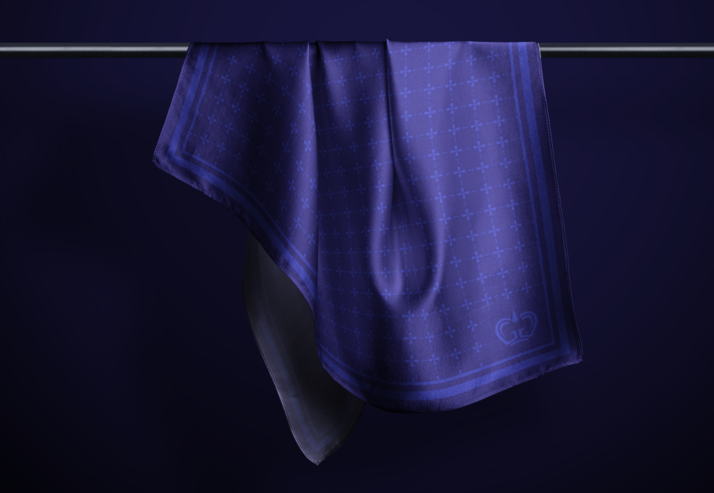
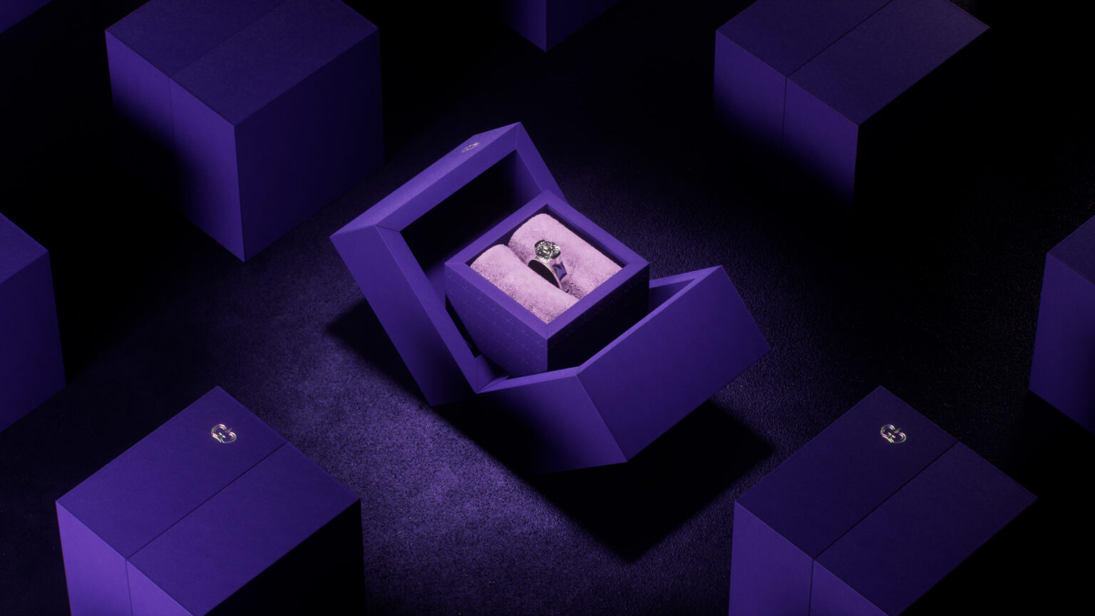
For color, we chose the main royal Purple tone for the brand to be worthy of the position and quality that TT Gems has, is, and will continue to bring to customers. Purple also creates a strong attraction, evoking charming elegance throughout the brand identity design of TT Gems. A magical world seems to appear before the eyes of viewers when they come into contact with the touch points of brand that we built for TT Gems.
4) Visual system
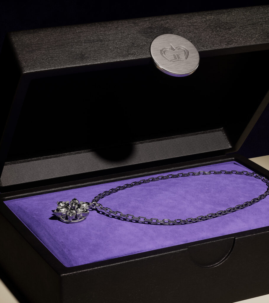
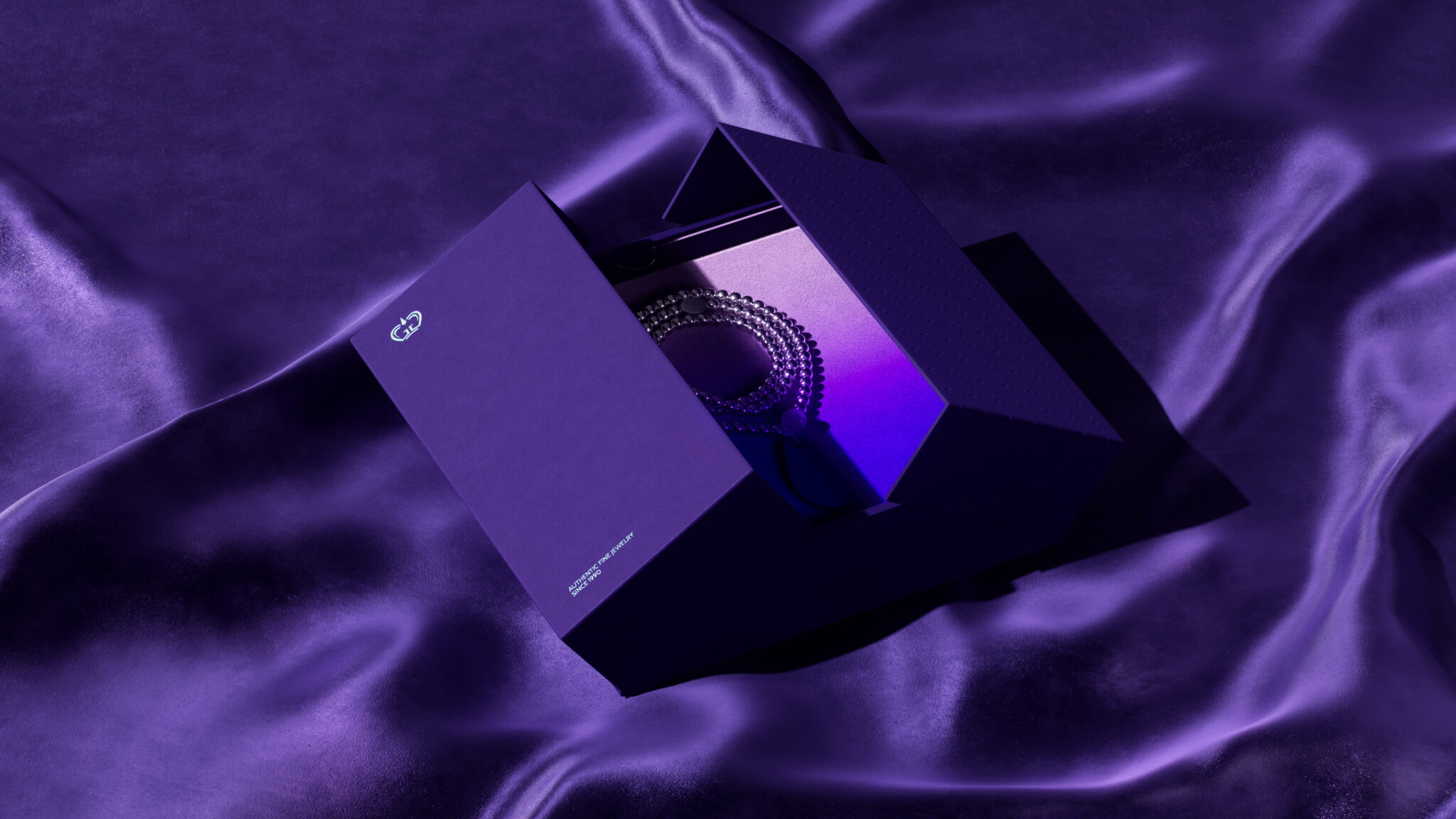
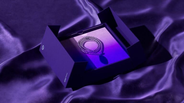
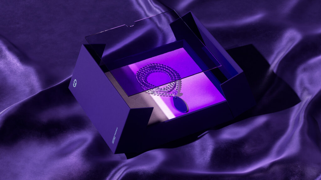
The graphic identity system used in TT Gems’ communication designs is built from many smooth light bands, which look both creative and unintentionally create eye-catching and attractive spaces for content and images. The pattern system is deployed from the stylized gem shapes in the logo, easily seen in luxury and classy brands. Sliced from gemstones, the honest spirit in high-quality products, the harmonious interaction with customers are the inspirational factors that help us develop the Key Visual system for the brand – the gradients blend together with sophistication.
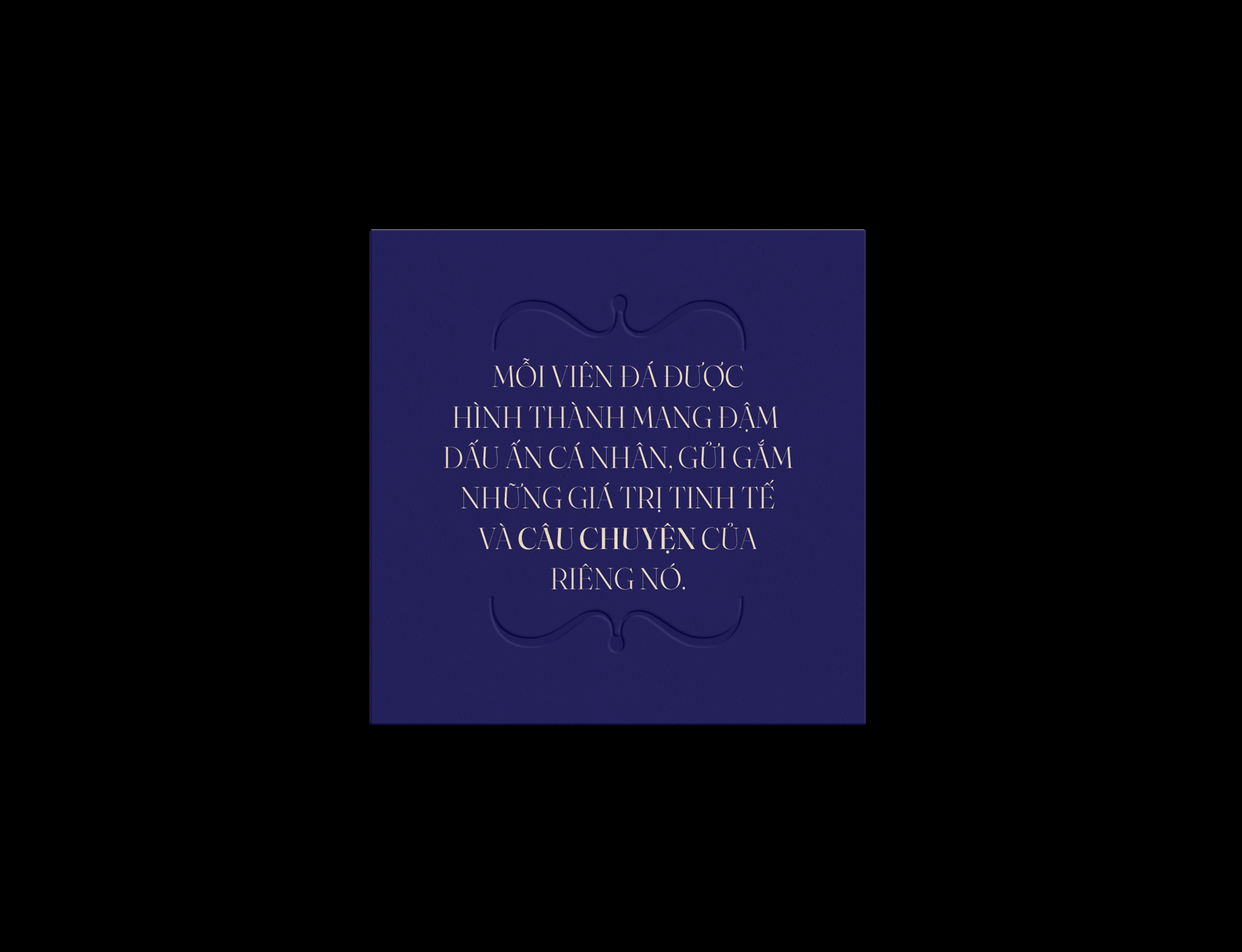
For printed jewelry boxes, we maintain simplicity and luxury throughout the designs. Through printing and embossing details, the sophistication of high-quality jewelry products is breathed through the minimalist yet classy and powerful jewelry boxes crafted by us.