A FINO THAT IS MUCH MORE
The renewal of the label of this white wine, Fino Manolo, is a process that goes beyond simply changing the design, it has tried to make a profound change, and for this, in addition to creating a much more modern image, we have highlighted that it is a white wine very dry without bothering to highlight that the wine itself is a fine wine. We are looking for a broader, younger, and therefore more numerous customer target.
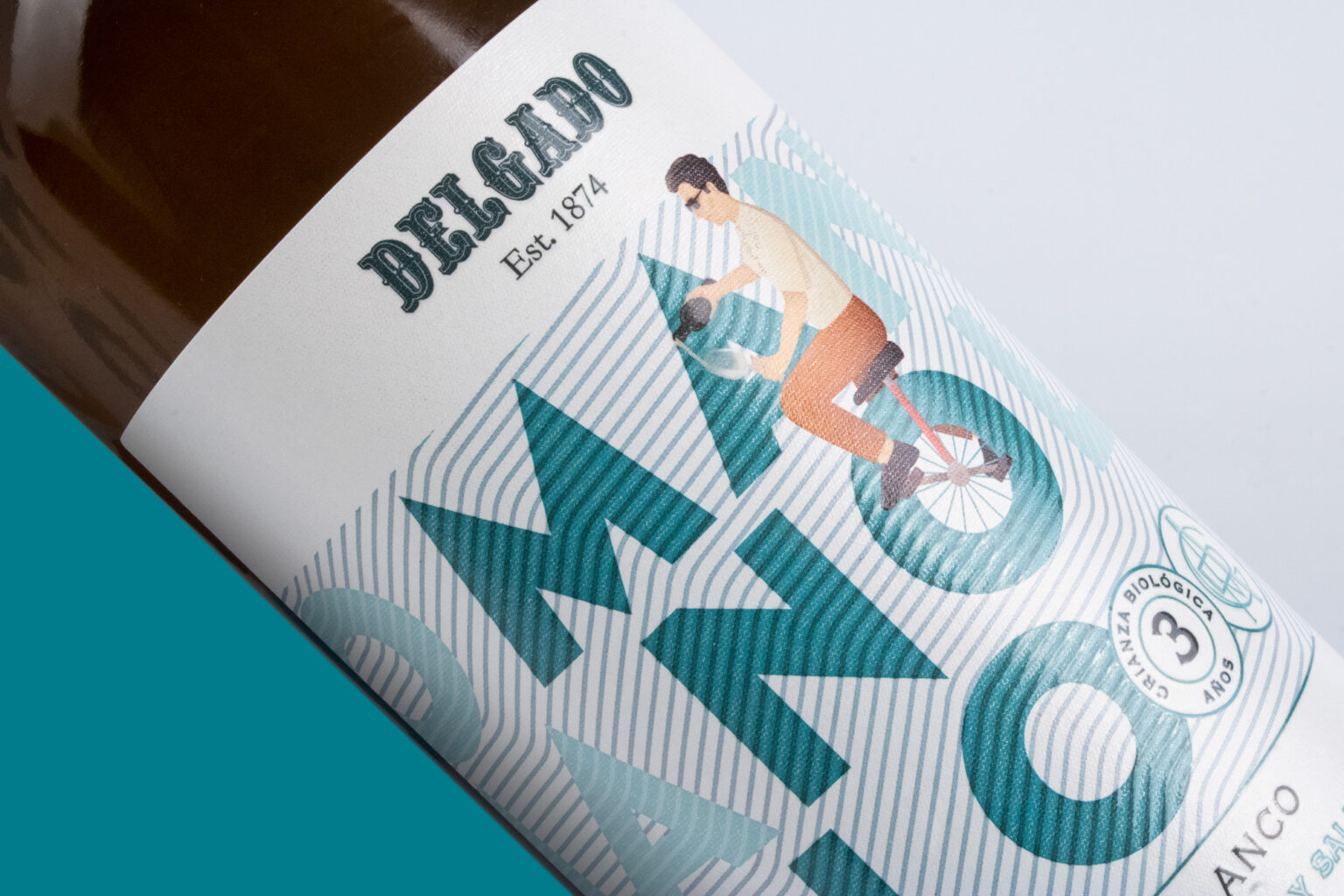
When renewing the label of a Manolo white wine, we first took into account that the design had to be attractive and eye-catching, and to do so we created an illustration in which we see Manolo tasting the wine.
![](https://i0.wp.com/packagingoftheworld.com/wp-content/uploads/2024/06/comparativa_botellas_pow.jpg?fit=2000%2C1333&ssl=1)
![](https://i0.wp.com/packagingoftheworld.com/wp-content/uploads/2024/06/IMG_4131_ret.jpg?fit=2000%2C1333&ssl=1)
![](https://i0.wp.com/packagingoftheworld.com/wp-content/uploads/2024/06/imagen_botella_copa_Manolo_POW.jpg?fit=2000%2C1333&ssl=1)
![](https://i0.wp.com/packagingoftheworld.com/wp-content/uploads/2024/06/comparativa_bib_pow.jpg?fit=2000%2C1333&ssl=1)
![](https://i0.wp.com/packagingoftheworld.com/wp-content/uploads/2024/06/IMG_4124_ret.jpg?fit=2000%2C1333&ssl=1)
![](https://i0.wp.com/packagingoftheworld.com/wp-content/uploads/2024/06/playa_Manolo_pow.jpg?fit=2000%2C1300&ssl=1)