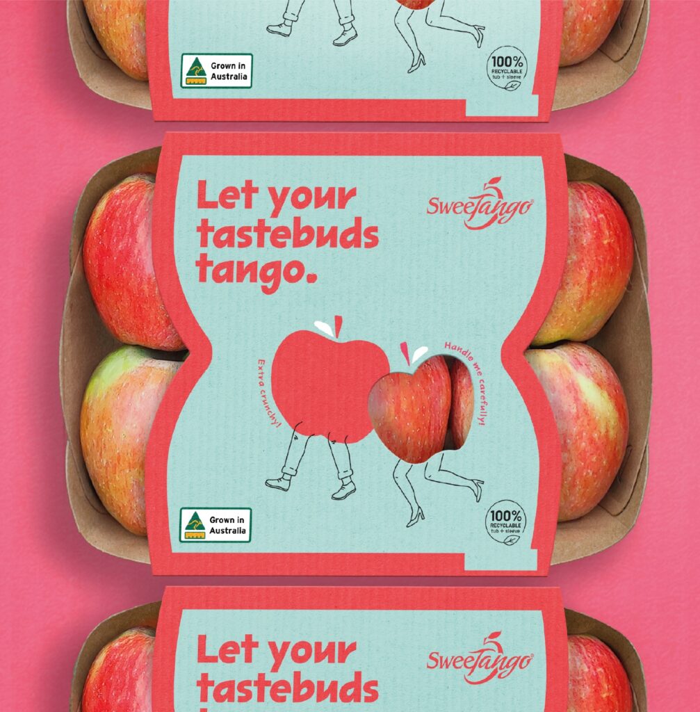
Let your tastebuds tango!
Montague is a proudly Australian owned and operated family business, bringing consumers the best fruit that mother nature has on offer.
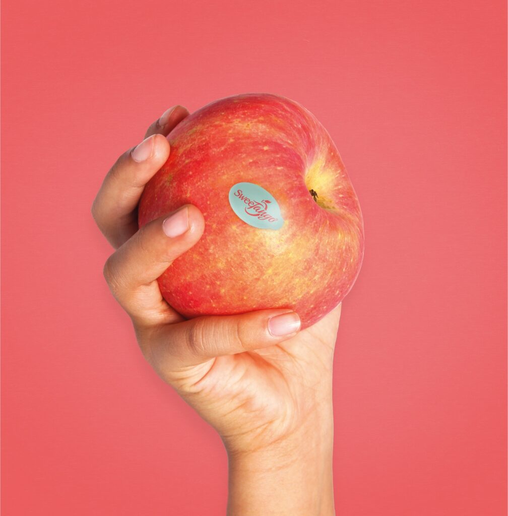
They had recently acquired the license to exclusively grow and distribute the SweeTango™ apple variety. Unlike other varietals, SweeTango is released in Summer, and is crisp and sweet, with a lively touch of citrus, honey and spice.
SweeTango™ already had a copyrighted brandmark, and so the Edison Agency was challenged to build a visual language that worked in unison with this, tying back to its flavour profile and unique seasonality.
The solution needed to feel distinctive, and resonate with Australian consumers, matching its quirky name and clearly communicating its point of difference in a crowded apple bay in supermarkets.
A limited colour palette was also needed, to meet print limitations across various grocery formats.
The result is a minimal-style visual platform that allows for creativity and future growth for SweeTango. Its playful, illustration led identity embodies Australian summer, and cheeky language speaks to its lively tasting notes. The muted pink and red colour palette is a direct reference to the apple’s colouring, while the contrasting light teal speaks to refreshment, and creates stand out.