Development of corporate identity for the company “Agroeco”
Agroeco is the largest pork producer in Russia, which has been ensuring the safety and environmental friendliness of products since 2009.
Task
Develop a corporate identity for the company “Agroeco”.
Solution
We had a difficult task ahead of us. On the one hand, corporate identity should be concise and business-like. On the other hand, it should be projected onto Agroeco products, which will be on the shelves in supermarkets and compete with other brands known and familiar to the buyer. We wanted to develop a one-stop solution that would help the company present itself as a successful, trusted and industry leader to partners, employees and suppliers. All this needed to be reflected in brand communication.
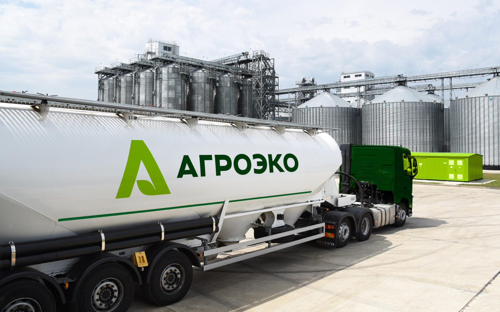
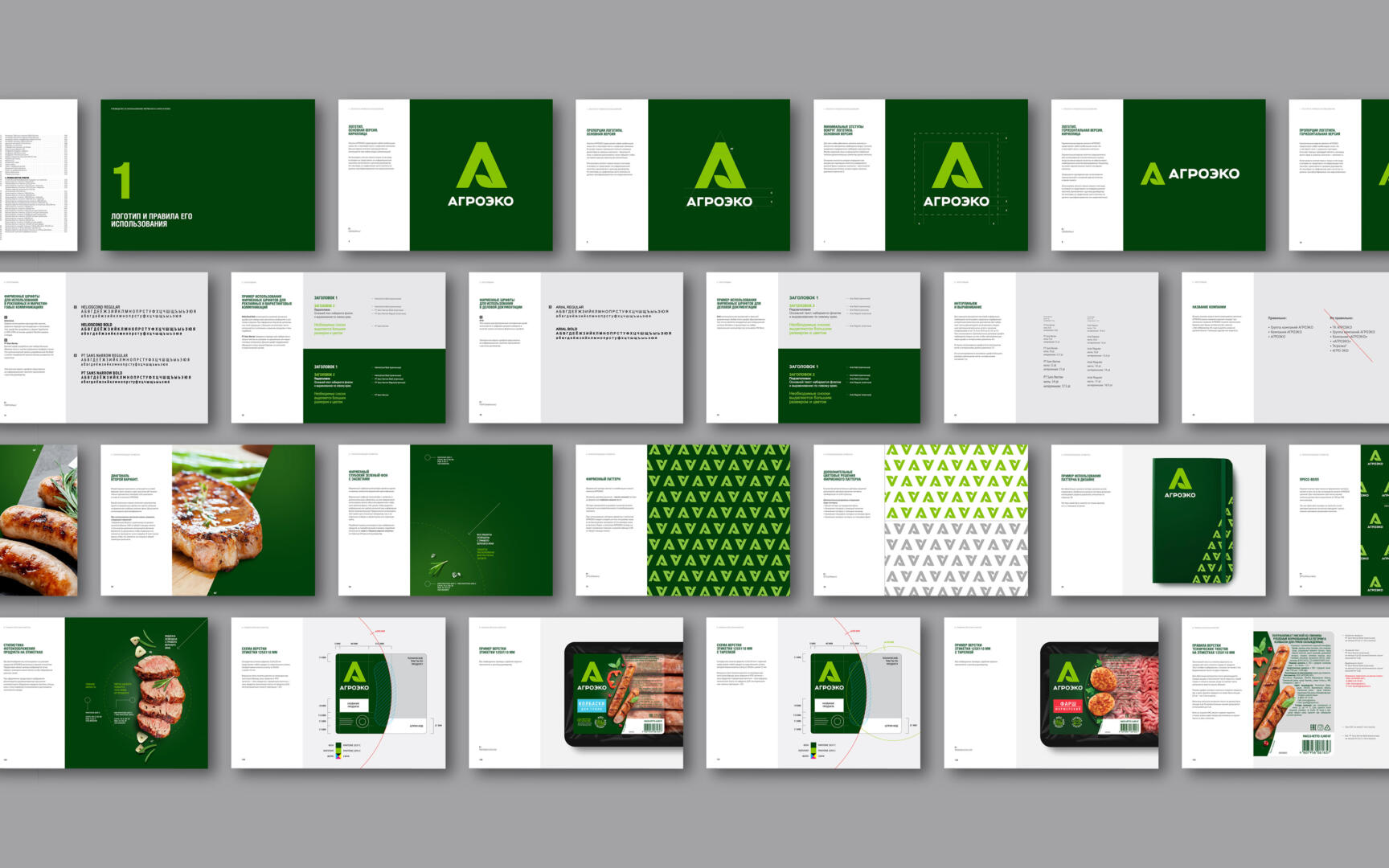
The previously developed logo consisted of an inscription and an image of leaves folding into a shamrock, and was completely unsuitable for use on meat products packaging. We proposed a new logo in the form of a large green letter “A”, which is based on a leaf, as a symbol of the naturalness of products. Such a letter is easy to see and remember, thanks to it, an association with the company itself and its products is easily formed.
We created an identity for various points of contact, patterns and corporate colors – bright green, brown, white and dark green. These colors are associated with the agro-industrial sector and the people who work in it.
It turned out to be an excellent corporate identity, which the company is gradually introducing into life. We hope that it will distinguish the company from other competitors, and products on store shelves.