Zhelen – a family-run meat gastronomy factory!
Meat processing enterprise “Zhelen” was founded in 2003 in the Orenburg region.
Currently, Zhelen produces more than 170 types of sausages: boiled and boiled-smoked sausages, hams and delicacies. Of these, about 70 items are produced for export. The assortment allows to satisfy the most diverse needs of consumers both in terms of price and quality.
Task
It is necessary to redesign, update the packaging in general and update the logo in particular.
The design should be understandable for the consumer, inspire confidence, positive emotions from the anticipation of the joy of loved ones after a delicious breakfast / lunch / dinner and receiving gratitude for it. It is also necessary to broadcast the reliability, freshness and safety of products.
In addition, despite the goal to update the packaging, it is important not to forget about existing customers who should not lose their favorite product on the shelf.
Solution
Initially, it was a family business organized by husband and wife – Zhenya and Lena, hence the name “Zhelen”. During their work, they have won a fairly large audience in the Orenburg region, in Kazakhstan. But then problems arose. Firstly, the competitive pressure of federal manufacturers, and secondly, the appearance of the packaging of their product did not catch the attention of buyers in any way. It took a lot of effort to find them on the store shelf. The packages contain information in several languages, barcodes and, in general, everything is placed there, but there is no place for marketing information – this is very bad.
We conducted a brand audit using our author’s «Three Layers of Efficiency» method and realised design weaknesses in a digitized format.
The first thing was to define the meaning, the philosophy of the brand. “Zhelen” – what is it all about? We flew to Orsk, held a workshop, worked out the positioning of the company, created many interesting ideas for product lines.
What did we get? “Zhelen” ifor the woman who chooses it is the best reward, because her family members thank her for the perfect choice of products, the atmosphere in the house, when everything is very tasty and everyone is happy. In such a state of happiness, a woman can give even more to her family, because she feels strength and energy in herself, she wants to be a mother, a wife, and “Zhelen” supports her in this.
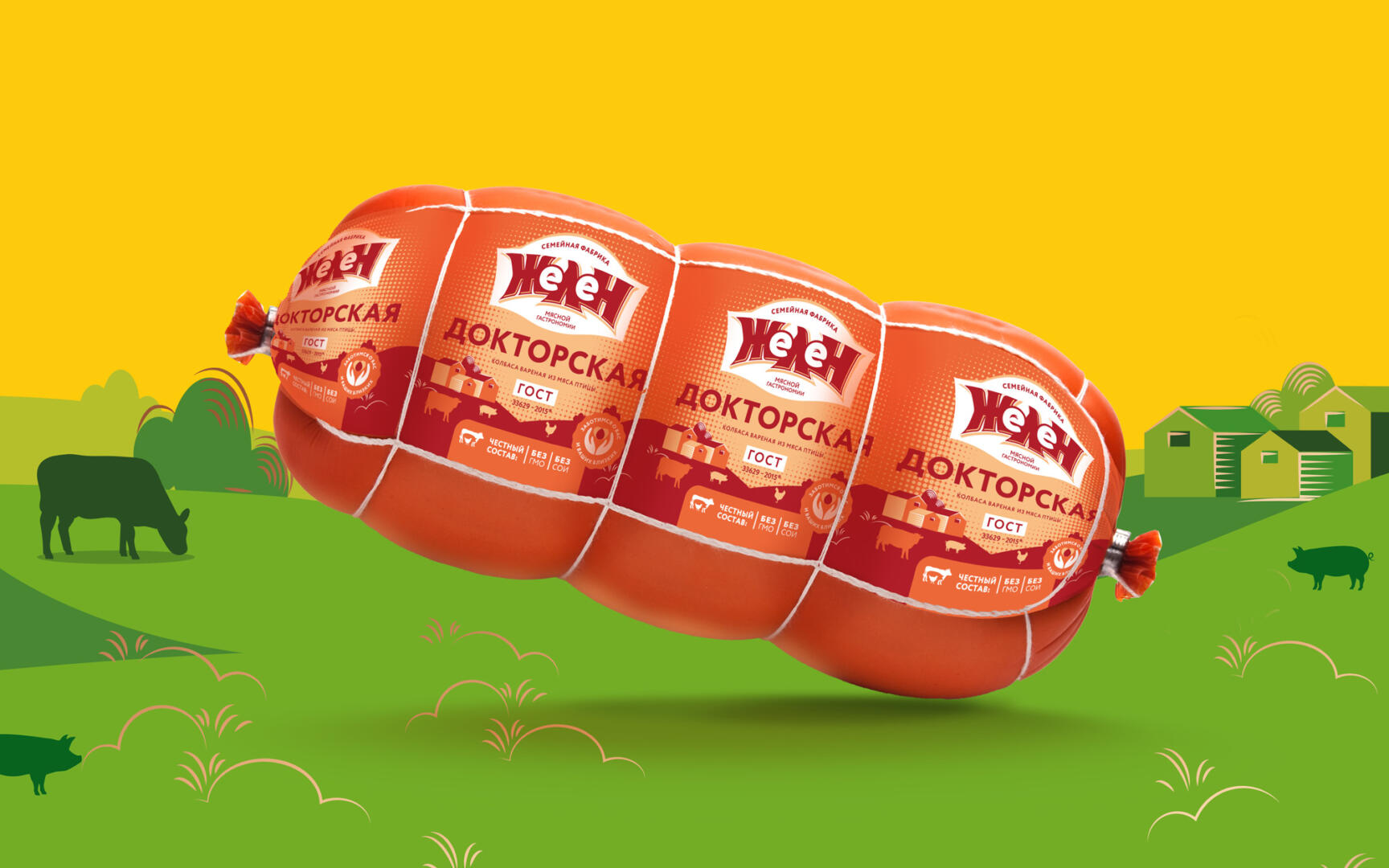
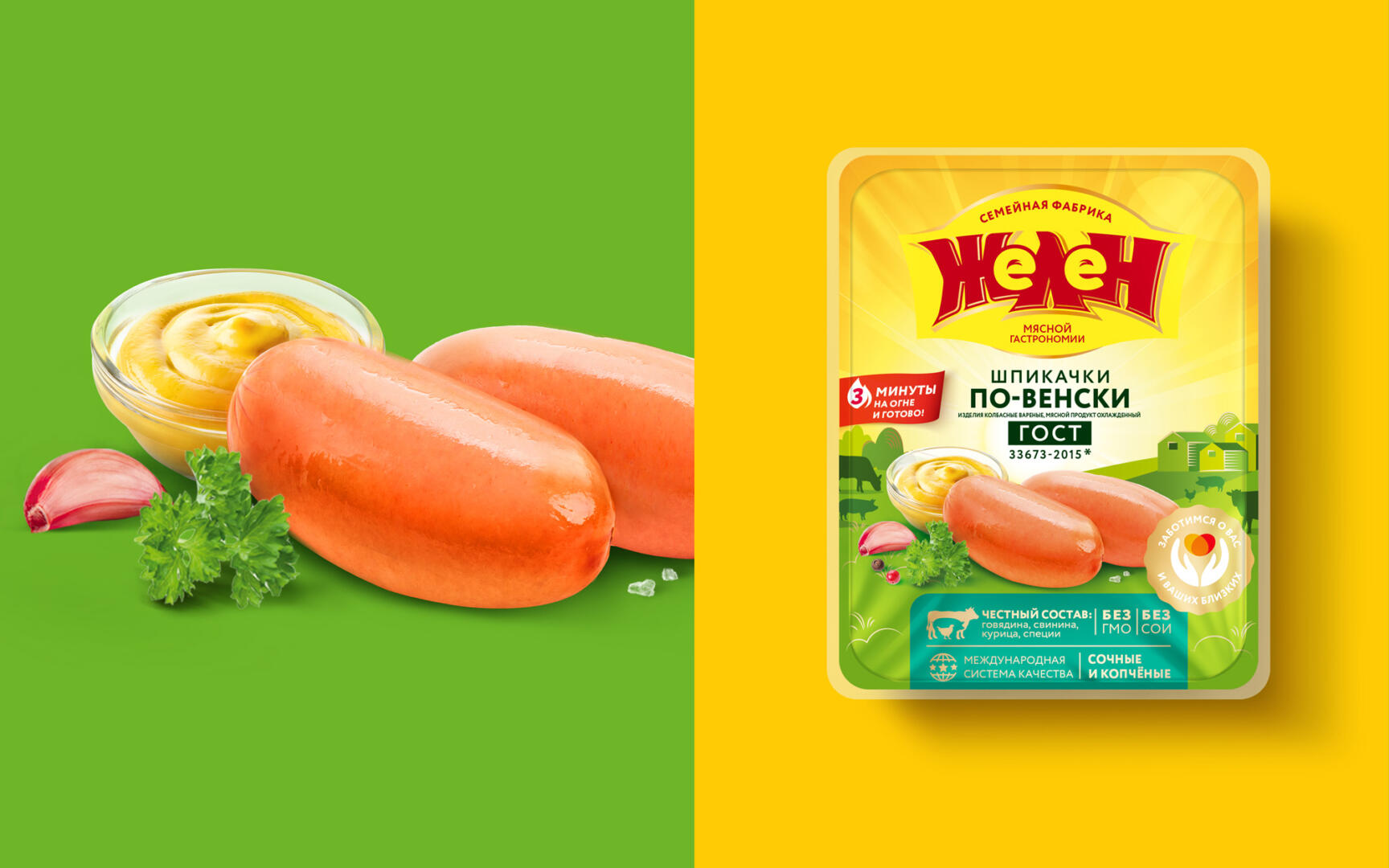
In the logo, we wrote that “Zhelen is a family-owned meat deli factory”, emphasizing the craftiness of the products, that this is not just an impersonal brand, but a product made with love and care.
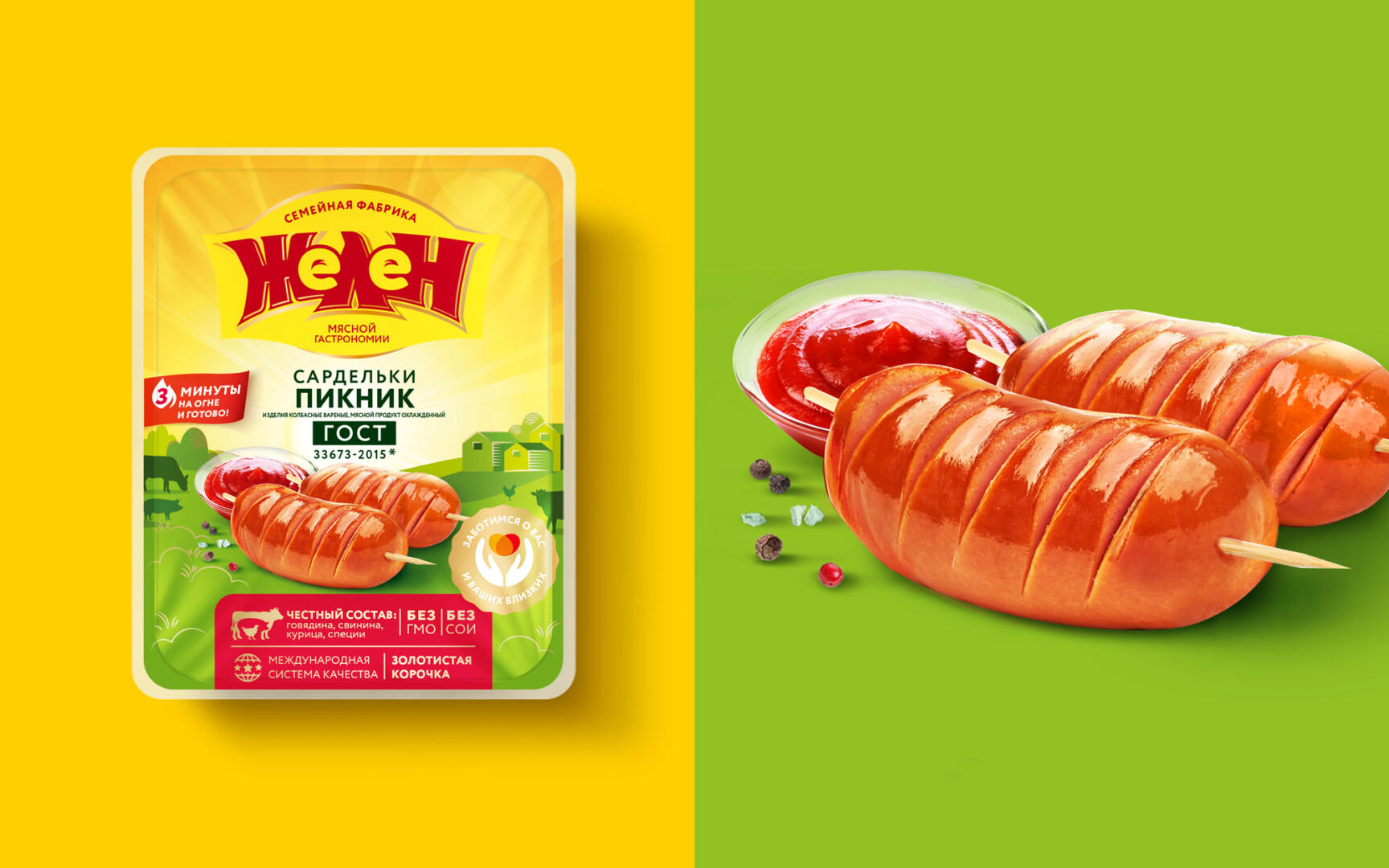
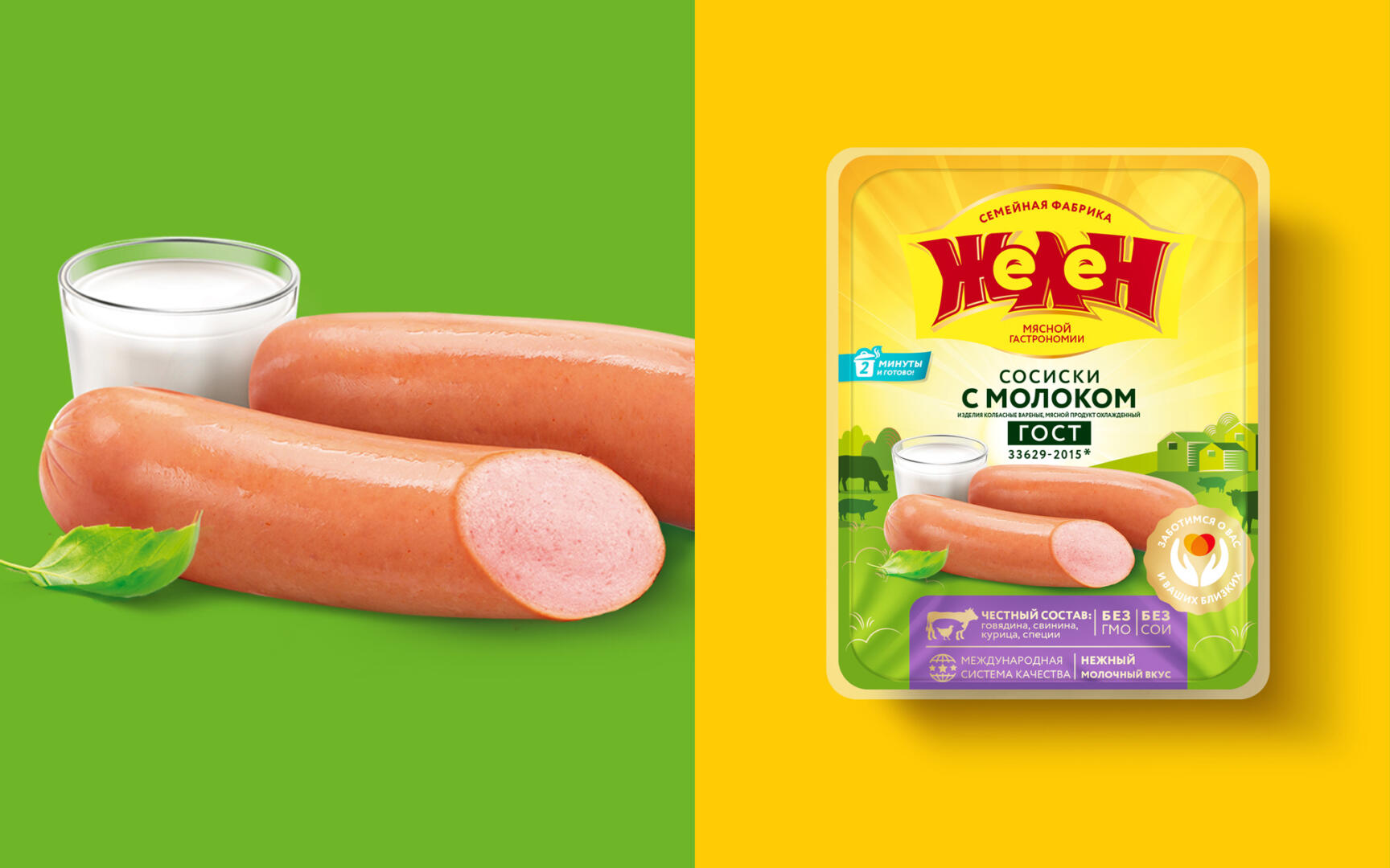
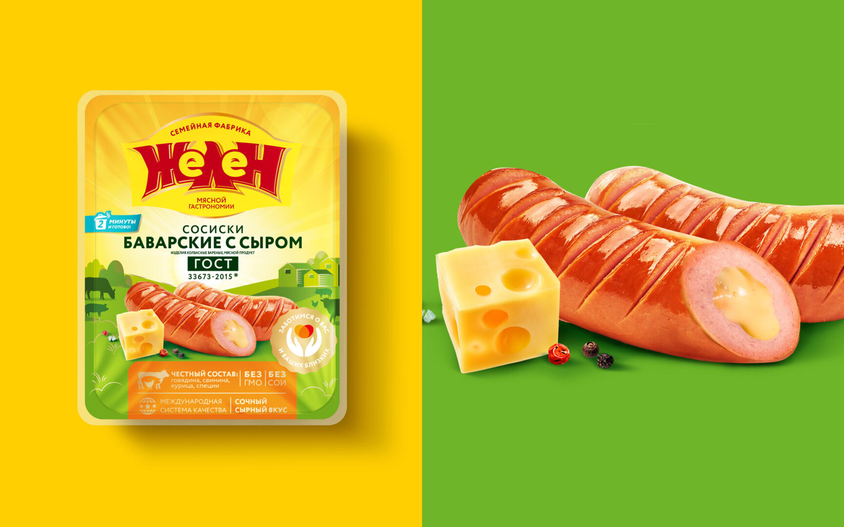
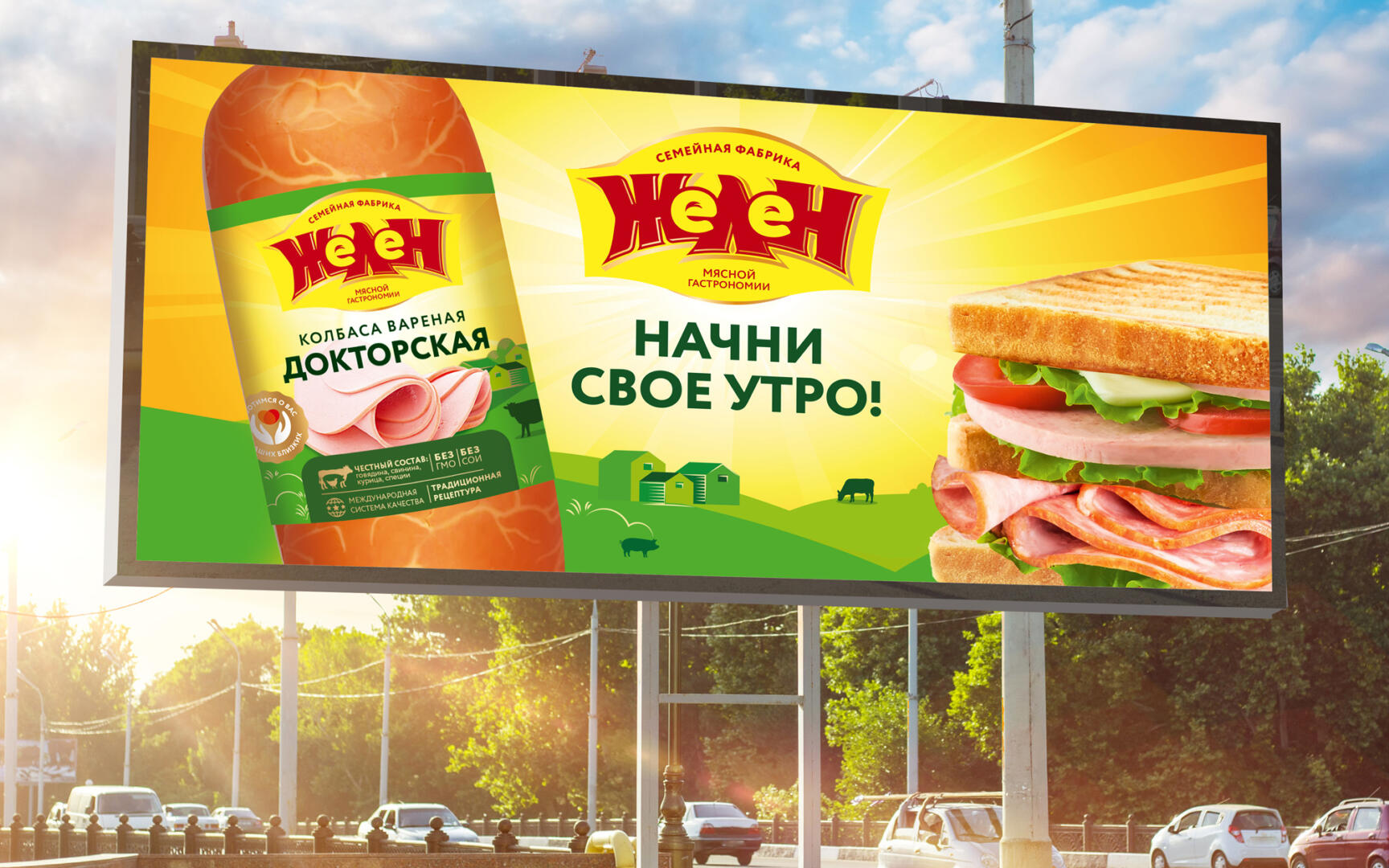
We put on the packaging information about the quality of the product and the author’s recipes of the company’s technologists. Through design, they talked about the serious control of ingredients, meat, production stages and taste. We kept the color of the logo, taking it as a basis, and changed the shape. Yellow is a bright color, we made an association with the morning, when we wake up, we start the day with «Zhelen» – it’s tasty, healthy, satisfying, breakfast is supposed to be for the whole family. Everyone wants warmth, comfort, lightness, quality. «Zhelen» is just about this, about family. It takes care of you, and with his help you take care of your loved ones. This intimacy is attractive. These changes – the territory of the morning, an appetizing food zone, green fields on products will lure the buyer.
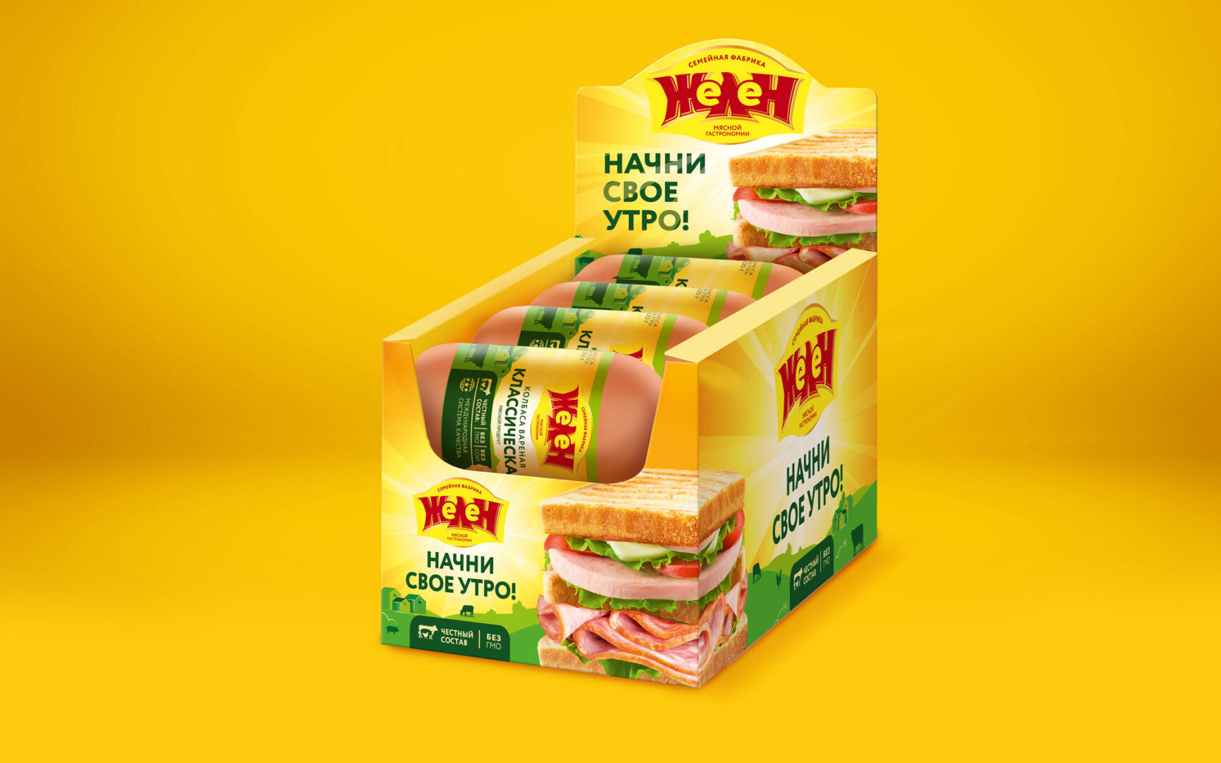
At the workshop, we give the “Parallel Worlds” technique, in which we look at other categories of products, who and how solves the issue of visibility, and what we can take from this for ourselves. The participants turned to the candy bar category and suggested the idea of putting sausage in showboxes to draw attention to the product. For the bar category, display in showboxes is one of the best options to attract attention, avoid chaos on the shelf, and present the product in a smart way. What if we put the sausage in a show box? A sausage label does not always allow you to place both the food zone and all the necessary information. A showbox is a great way to showcase your products in the most vivid and detailed way.
We took this idea and came up with a design for the showbox, placing an appetizing food zone in the form of a sandwich with cuts of various types of sausage on it. In this category, it is difficult to effectively show the food zone due to the small label, the showbox solves this problem, allowing you to draw maximum attention to the products.
The project turned out to be very large-scale, noticeable, and we are glad that all the ideas that were thought up at the workshop came true.
The effectiveness of the new design ranged from 88% to 90% depending on the type of product.