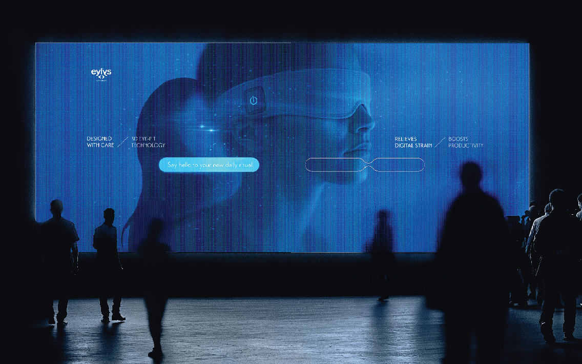
Eylys began with a clear purpose: to bring relief to dry eyes overwhelmed by the digital world. But its original clinical tone felt out of step with how people actually live, work, and recharge today. The task was to reposition Eylys as more than a solution for dry eyes- to elevate it into an everyday ritual for digital well-being. A shift from functional to feeling-first, from remedy to recharge.
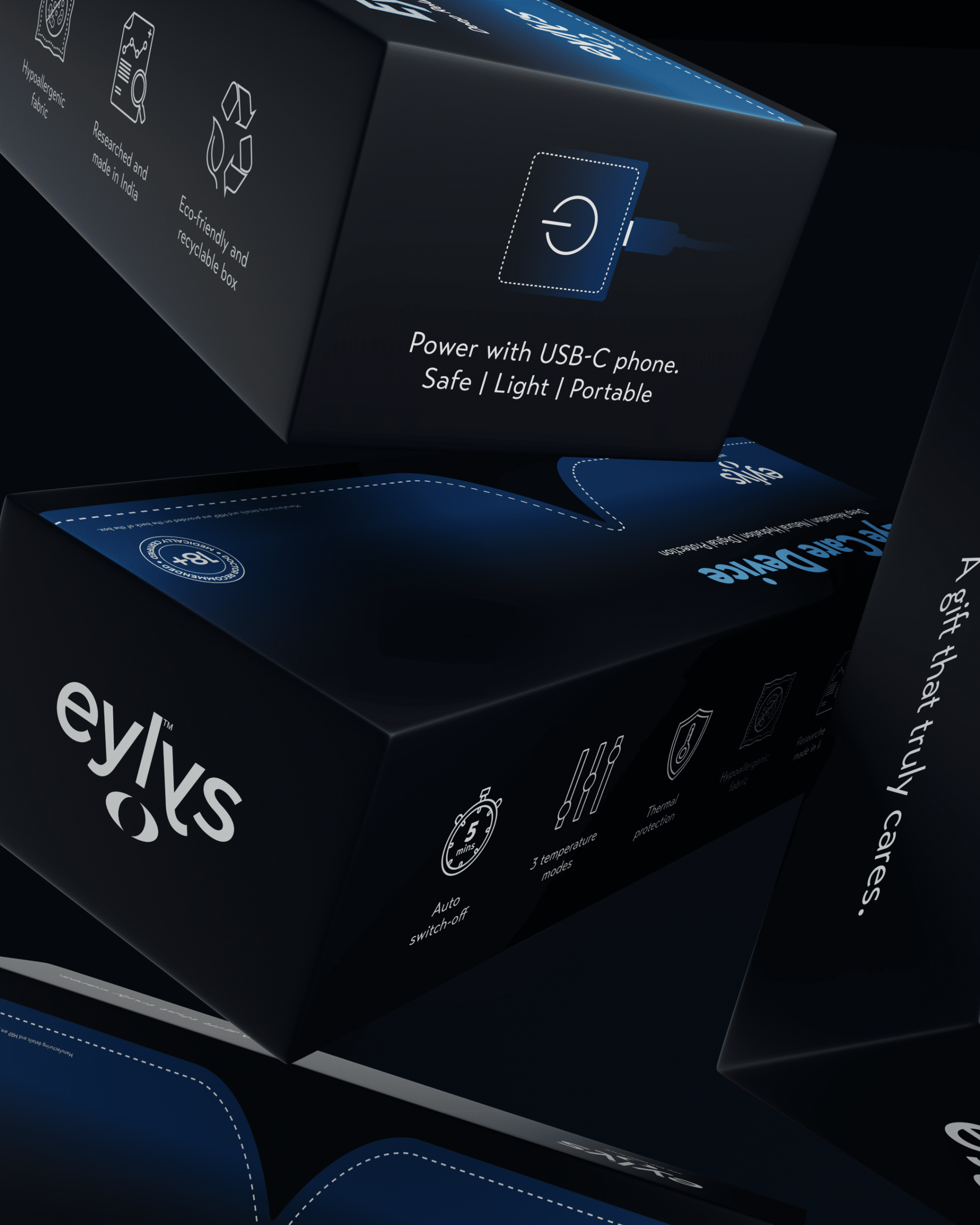
The rebranding and repackaging effort was rooted in the brand’s new ethos: eye care as self-care. The design system was reimagined to reflect this balance of credibility and emotion, creating a product that feels as intuitive and aspirational as the wellness routines it naturally fits into.
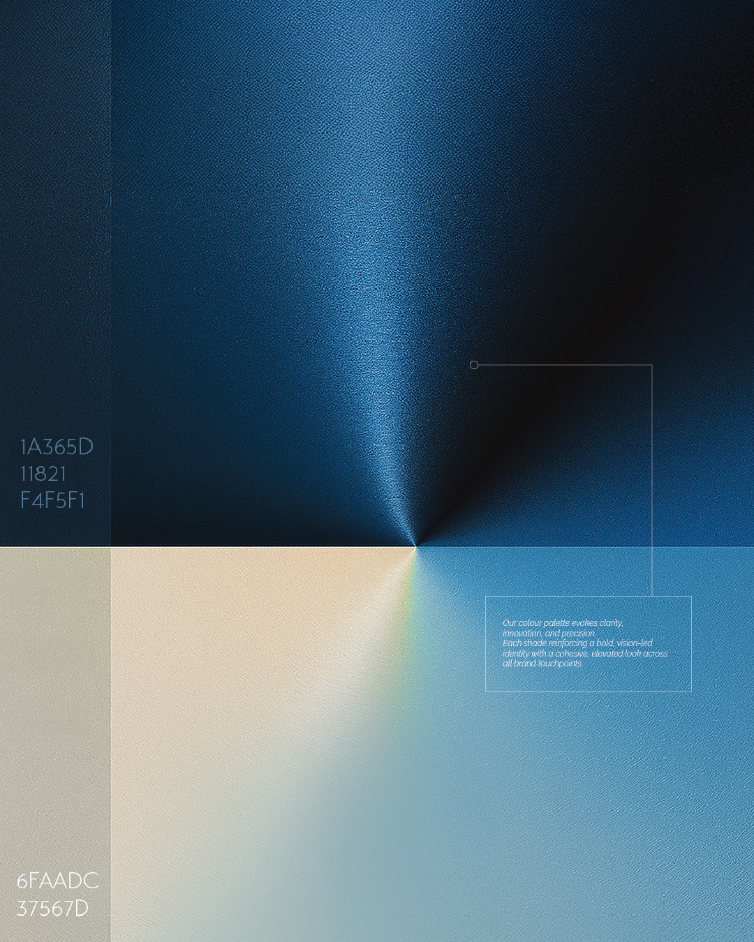
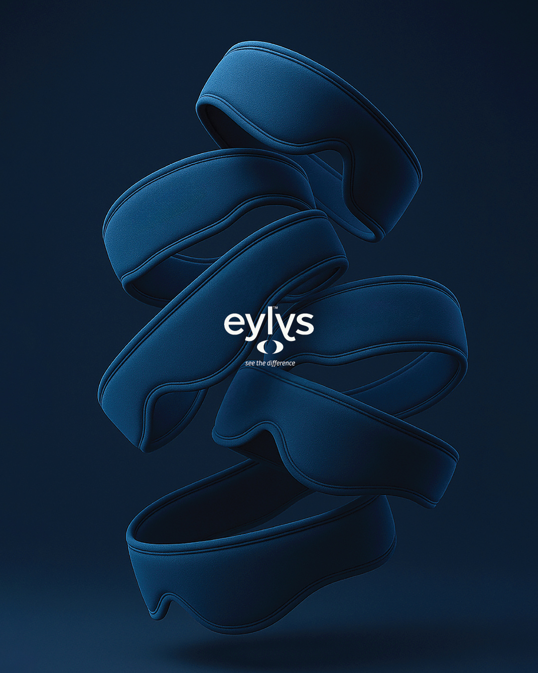
The packaging draws from the brand’s own philosophy of transition and release. Soft blue gradients are more than visual flourishes; they mirror the shift the user experiences- from tension to calm, from overstimulation to focus. The compact and structured form factor makes Eylys feel personal and portable, much like a trusted skincare essential or daily wellness tool.
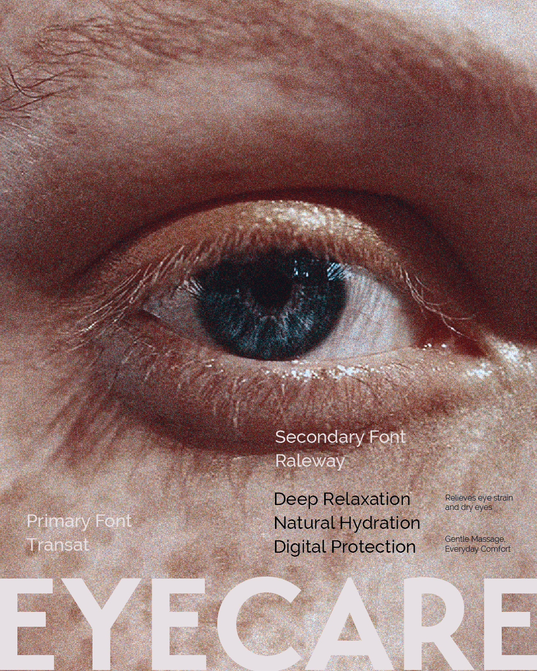
Every element of the packaging was designed to strike the right tone. Clean typography and refined copy create a sense of calm without losing clarity. The visual layout was deliberately stripped of clinical clutter, allowing for more space and a design that invites a moment of pause. Even the language was reframed- informative but warm, inviting rather than instructive, with every word reinforcing Eylys’ core pillars of care, ease, and modern-day ritual.
This was not a cosmetic shift, but a transformation in energy. The new Eylys speaks to a digital generation seeking balance, moments of restoration, and products that make self-care feel both elevated and effortless. Through thoughtful design, the brand now lives at the intersection of science and lifestyle- where credibility meets calm, and wellness fits beautifully into the everyday.