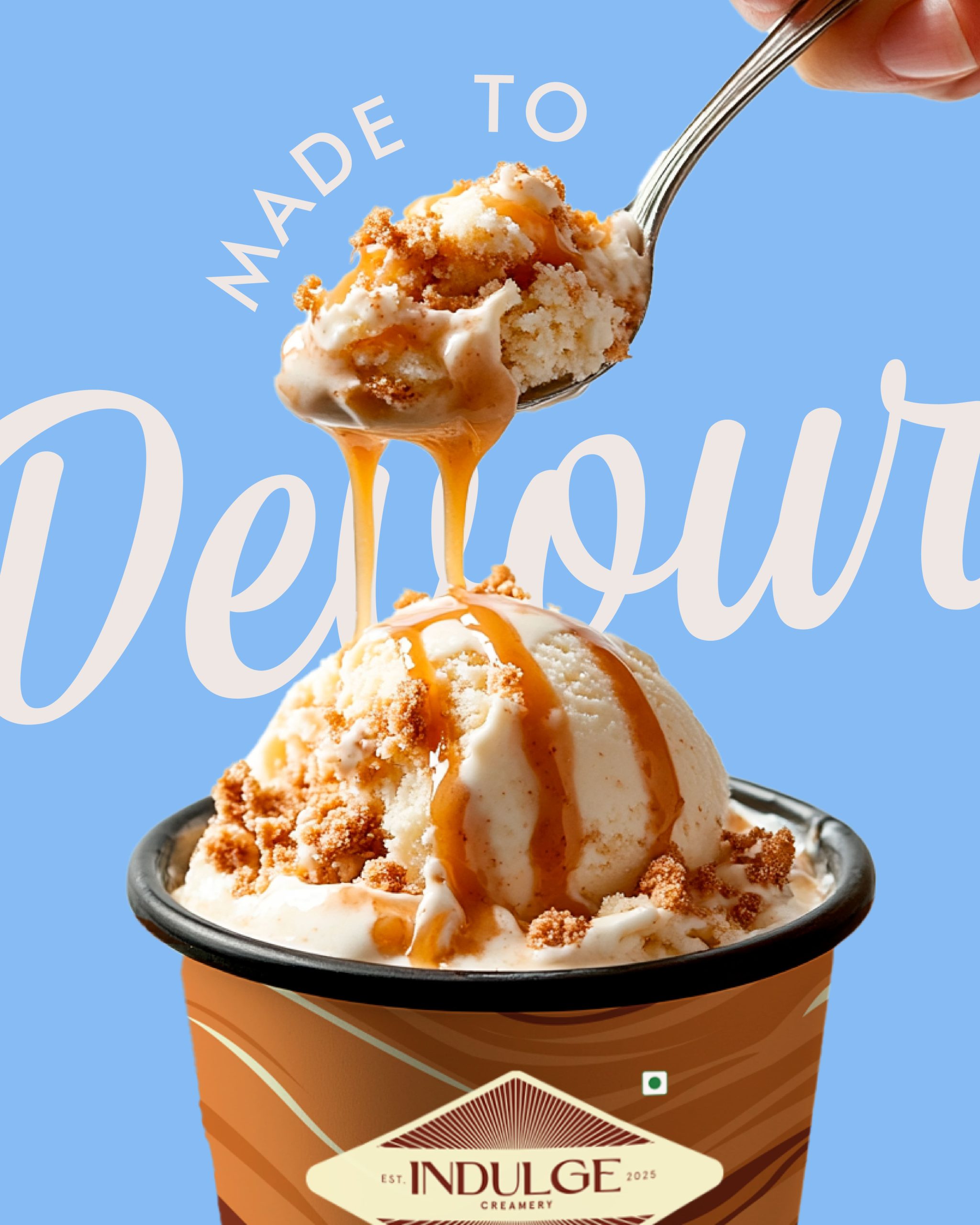
Indulge is a new-age, homegrown artisanal ice cream brand built on craft, warmth, and meaningful indulgence. Rooted in nostalgia and crafting experiences, it turns dessert into a sensory pause/ delight.
The founder, Pawan Saluja, wanted each creation at Indulge to be slow, deliberate, and designed to be savoured. And with this thought, Yellow was brought in to build the brand from the ground up. From the name and logo to the packaging and tone of voice, everything had to be sensorial and refined while still making people feel the pleasure of eating ice cream.
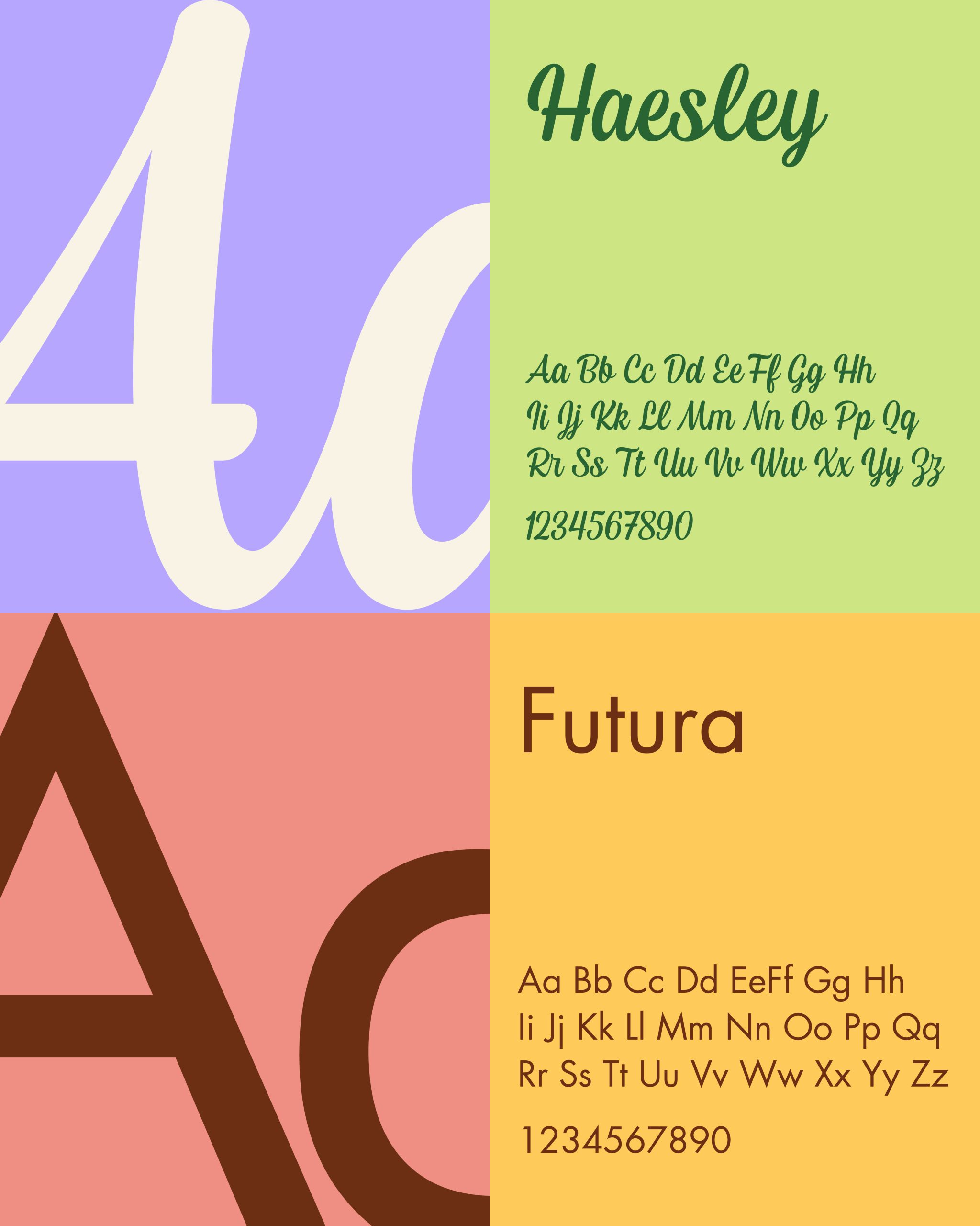
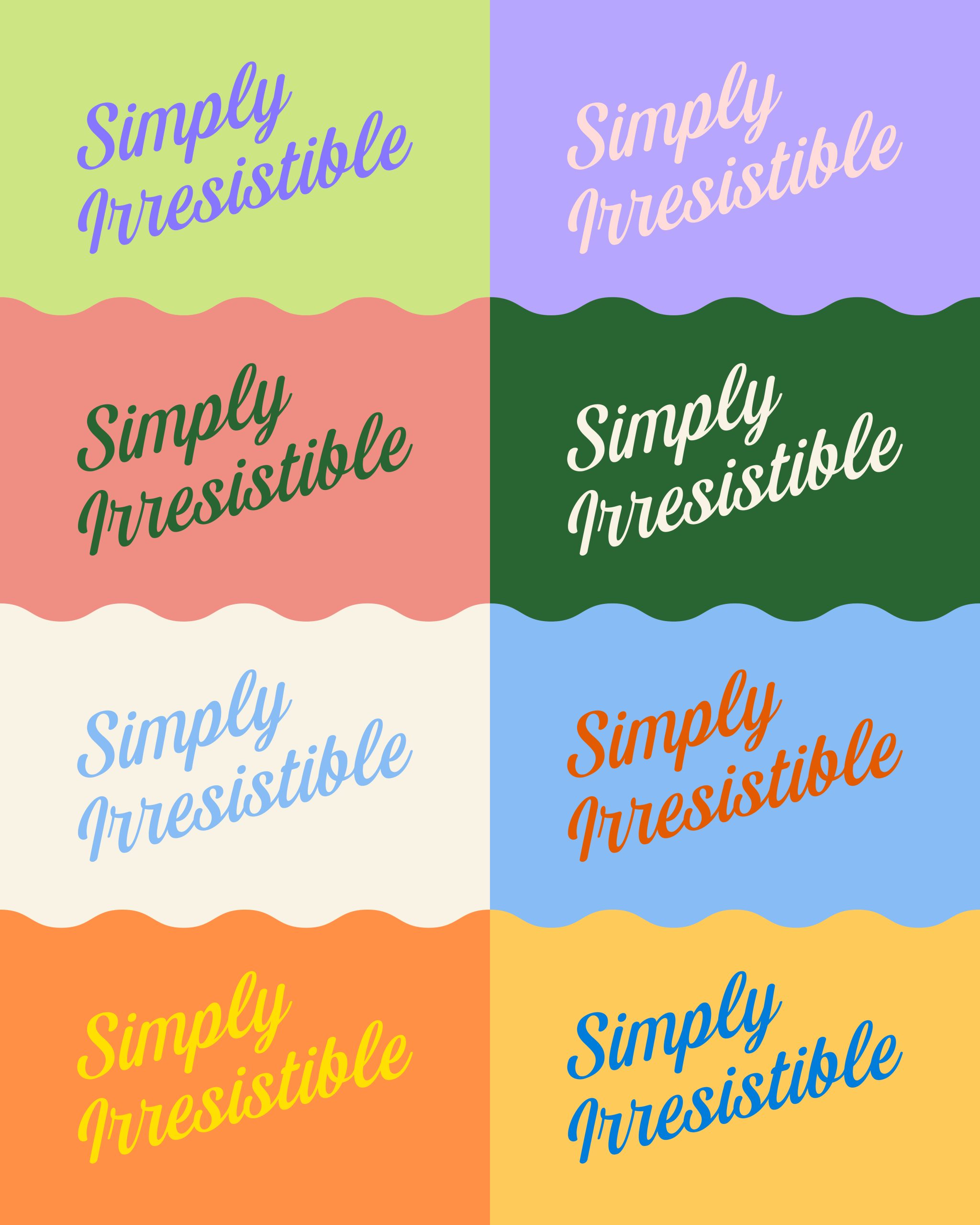
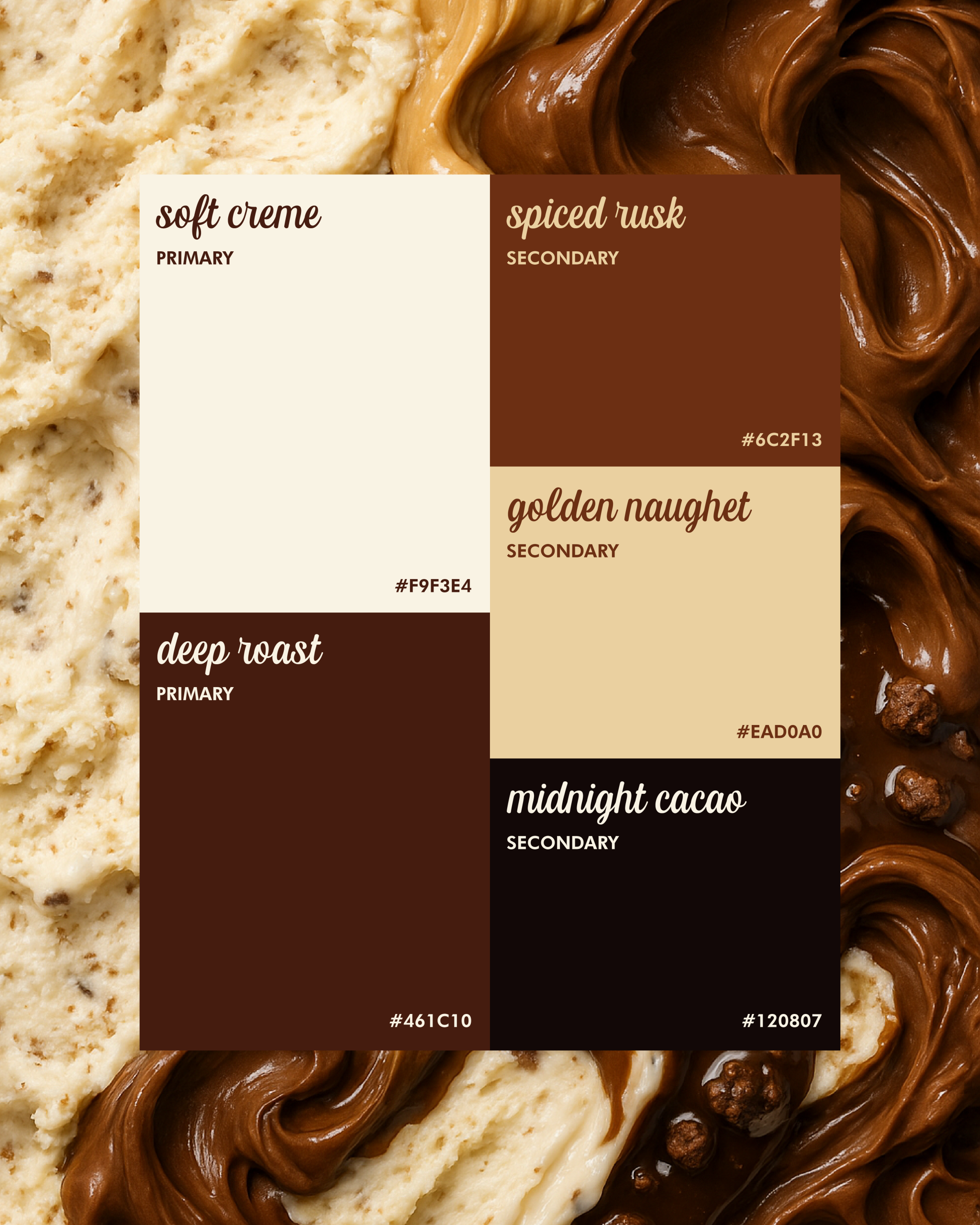
Indulgent moments make you pause, close your eyes and take you back to happy times while also savouring the present. The logo was born with this as the soul. It shows two cones forming a diamond that speaks to richness, rarity, and balance. The typography is unapologetically bold and playful yet timeless. Graphic lines nod to nostalgia, while retro-style illustrations add warmth and quiet confidence, bringing to life the emotional texture.
The voice too is intentional, elegant and just a little indulgent. It honours the craftsmanship with minimal, sensory language that creates the perfect imagery. Rooted in sweet shop memories, Indulge feels warm, human, and crafted to be savoured- just like the ice cream.