Client : Amartex
Design Studio : abbydraw design
Country : India
Packaging Contents : Pulses, Sugar
Packaging Substrate / Materials : Plastic
Printing Process : Screen Printing, Offset
Project Overview:
Amartex, a trusted name in Indian households for decades, steps into a new era of brand storytelling with the launch of its revamped Pulses and Sugar packaging.
Rooted in the brand’s legacy of quality, purity, and trust, the new packaging merges modern design language with cultural depth, making everyday staples feel premium, purposeful, and proudly local.
This redesign is a celebration of Indian kitchens — where pulses simmer slowly, sugar sweetens moments, and ingredients carry memory and meaning.
Design Concept:
“Everyday Essentials, Exceptionally Packaged.”
Informed by minimalism, nature, and nostalgia, the Amartex packaging was reimagined to stand out not by shouting — but by speaking softly with confidence.
It takes cues from grain textures, earthy palettes, and artisanal crafts, placing product purity at the forefront while inviting consumers into a visual experience that feels warm, modern, and rooted.
Packaging Design Elements :
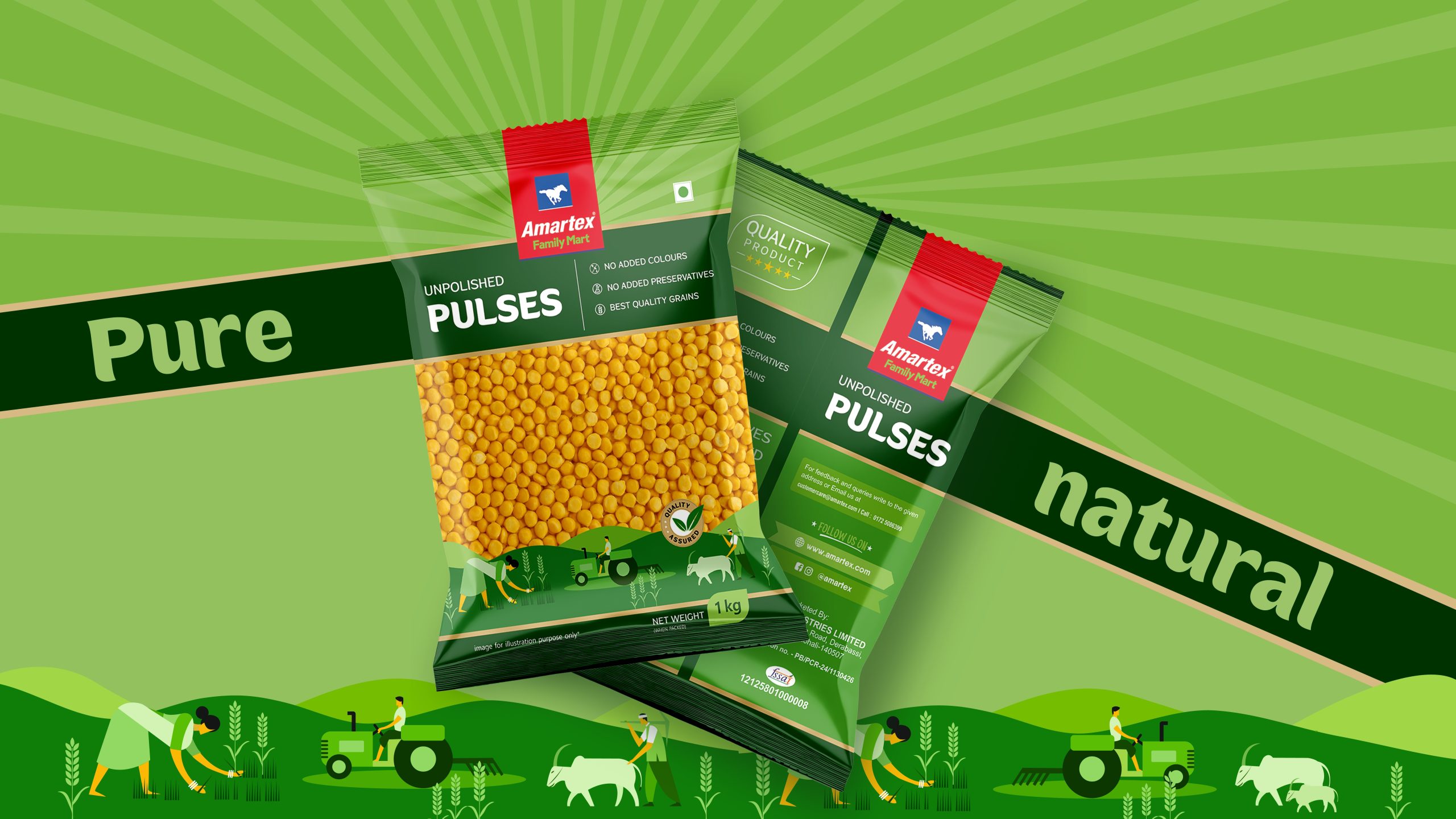
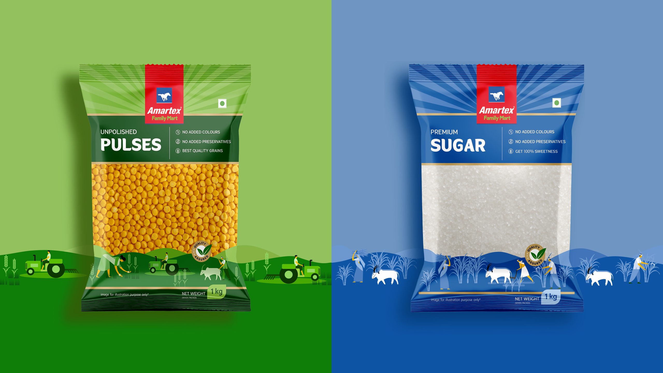
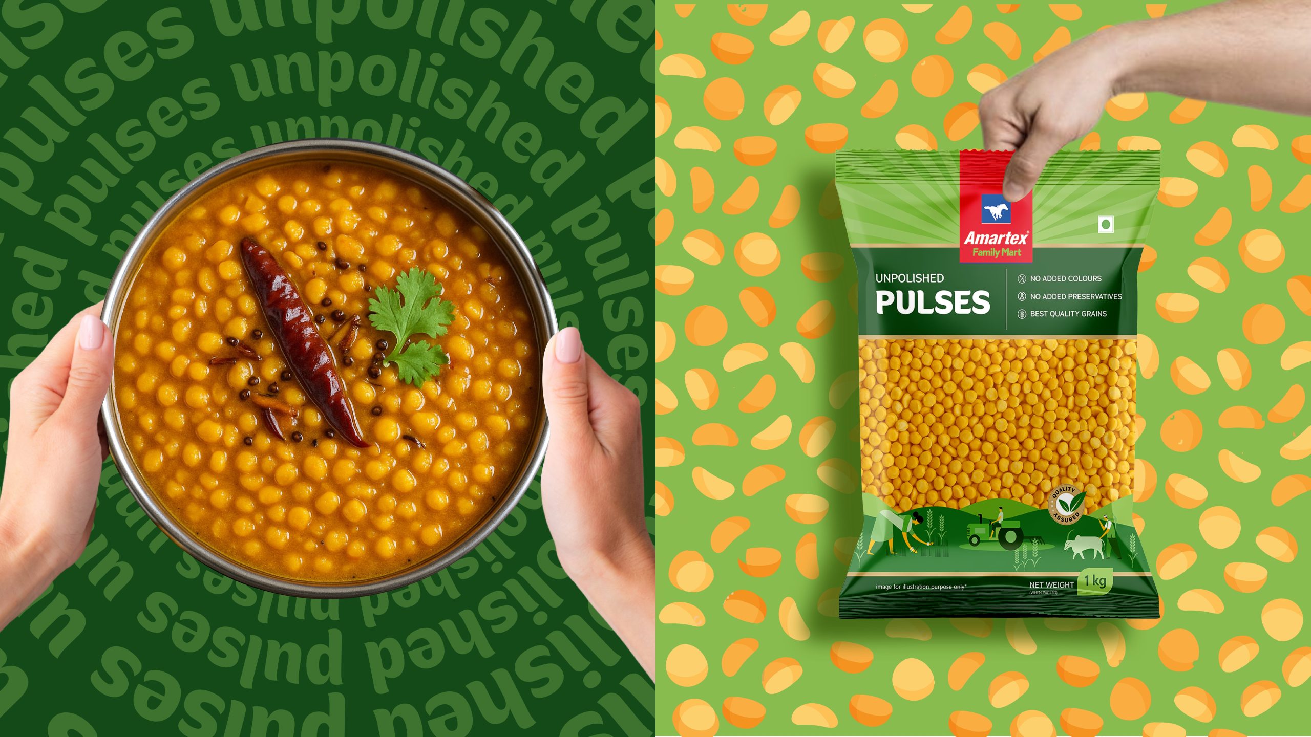
Pulses Packaging :
Material : Kraft-textured, recyclable pouches with a transparent window for product visibility.
Color Palette : A muted gradient system — turmeric yellow for chana, clay red for rajma, olive green for moong — referencing both spices and soil.
Typography : A clean, modern serif paired with handwritten accents to echo farm-to-table authenticity.
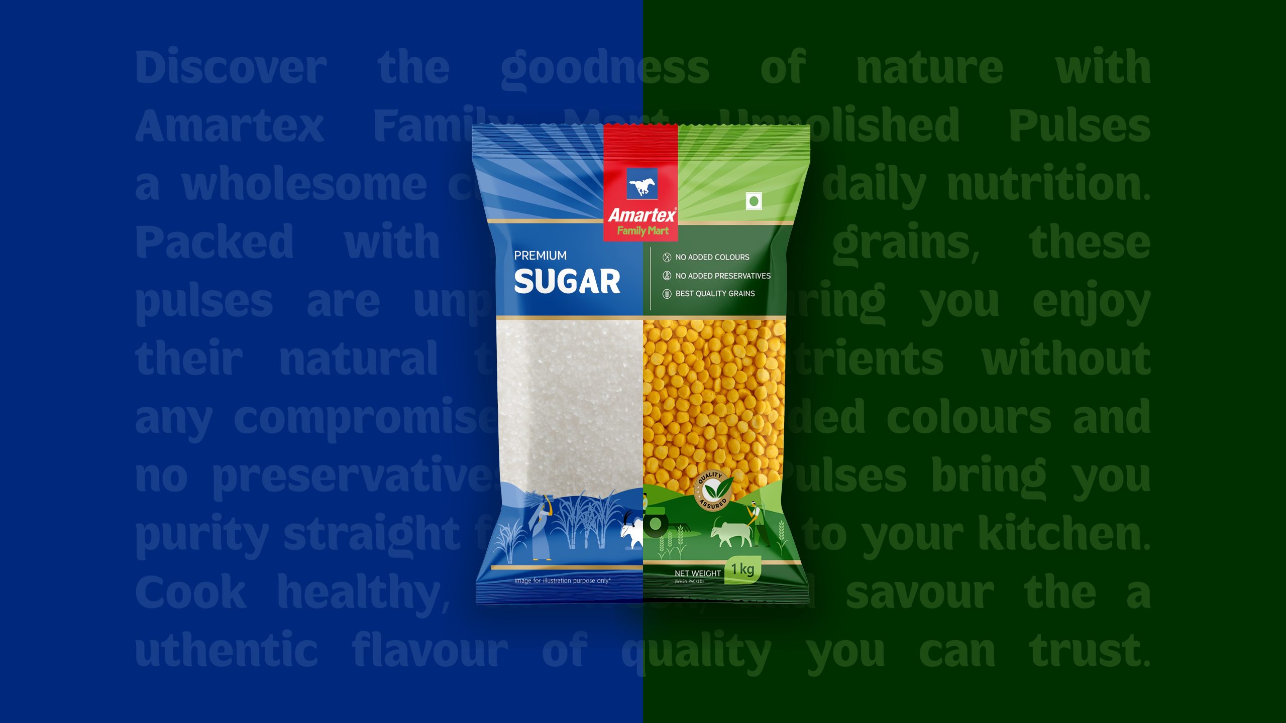
Front Message :
“Unpolished Pulses”
“Premium Sugar.”
Feature Icons :
100% Natural | Protein-Rich | Farm Fresh | Unpolished | Preservative-Free
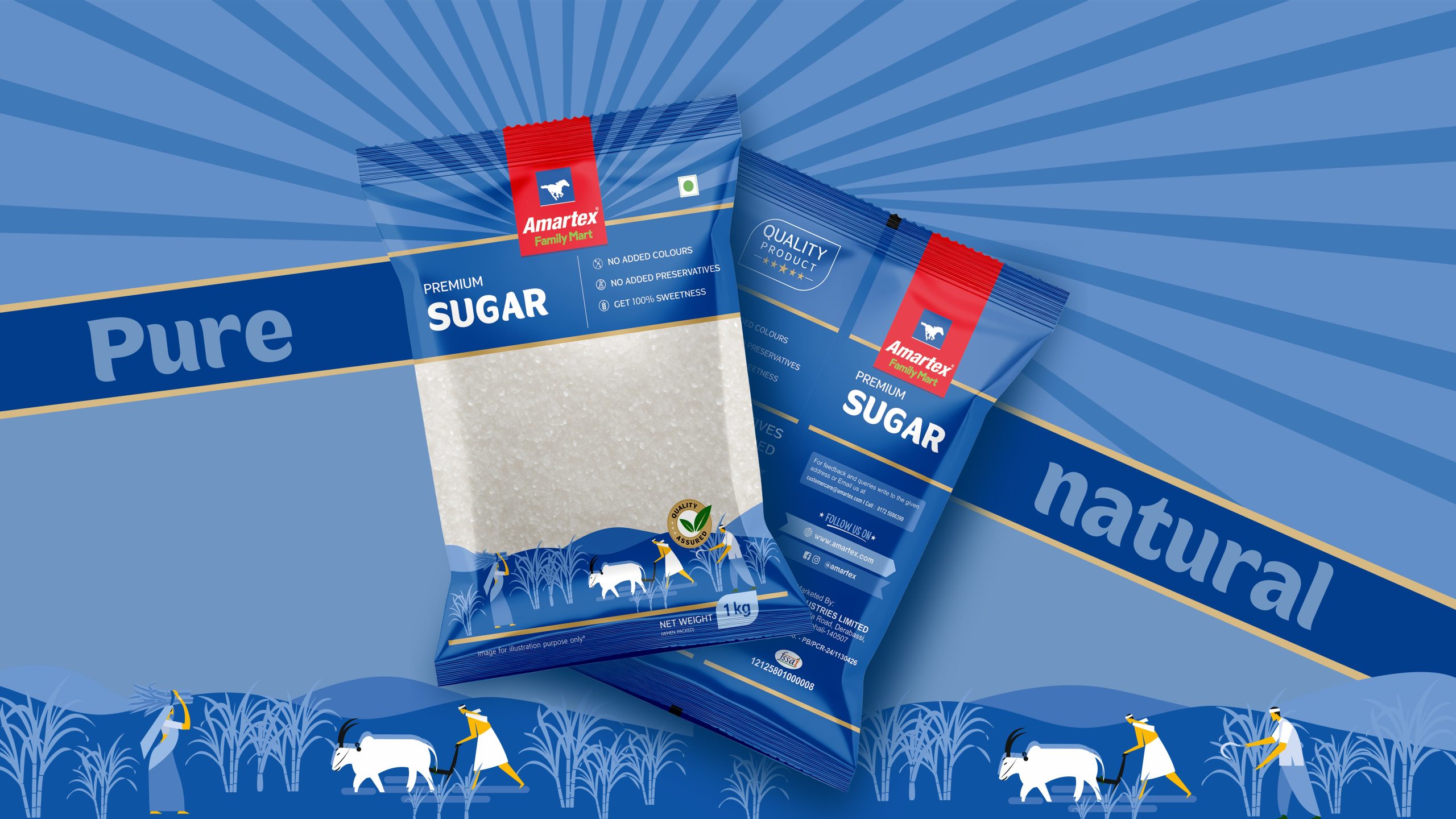
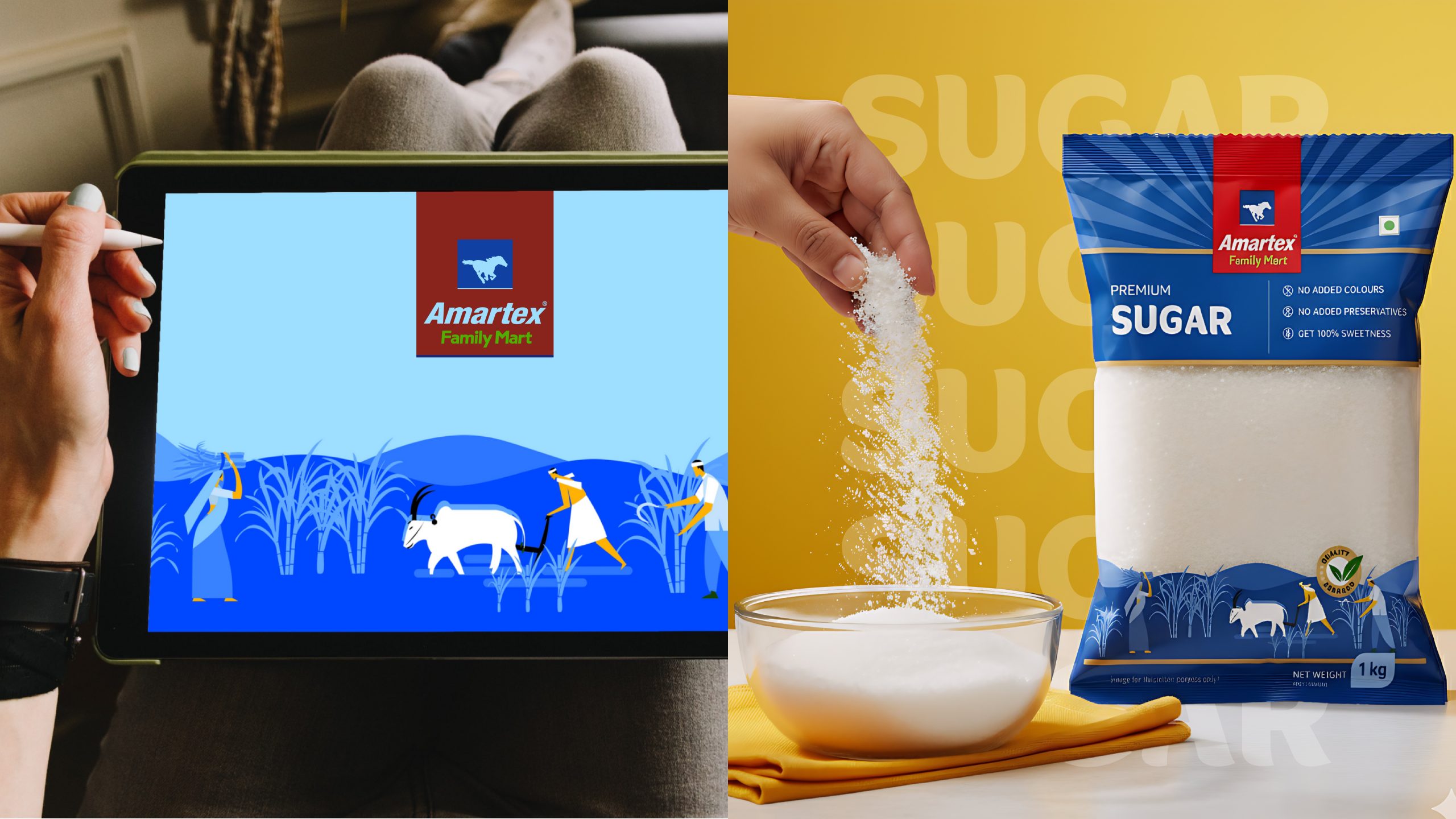
Sugar Packaging :
- Material: Matte finish with gloss accents on the sugar crystals — symbolizing purity and shine.
-
Color Scheme: Soft ivory with golden accents — refined, clean, and light.
-
Front Message:
“Amartex Sulphur-Free Sugar”
“The Sweetness You Deserve.”
- Back-of-Pack Story:
“Crafted with care and free from sulphur or artificial whiteners, Amartex sugar retains its natural sweetness — just as nature intended. From tea to treats, make every moment a little sweeter.”
- Feature Icons:
Sulphur-Free | Crystal Clean | Triple Refined | 100% Pure
✦ Sustainability & Experience:
- Eco-conscious design: Recyclable materials, soy-based inks, and reduced plastic.
- Clear product windows for consumer trust and transparency.
- QR code integration: Scan to explore recipes, farmer stories, or trace product origin.
- Multi-language packaging to connect with regional audiences across India.
✦ Design Philosophy:
Amartex’s new packaging is not just functional — it’s emotional. It reflects the rhythm of Indian homes, the color of our markets, and the trust we place in familiar names. By elevating staples like pulses and sugar into design-driven storytelling, Amartex connects generations of loyalty to a new generation of consumers who seek clarity, quality, and conscience in the products they choose.
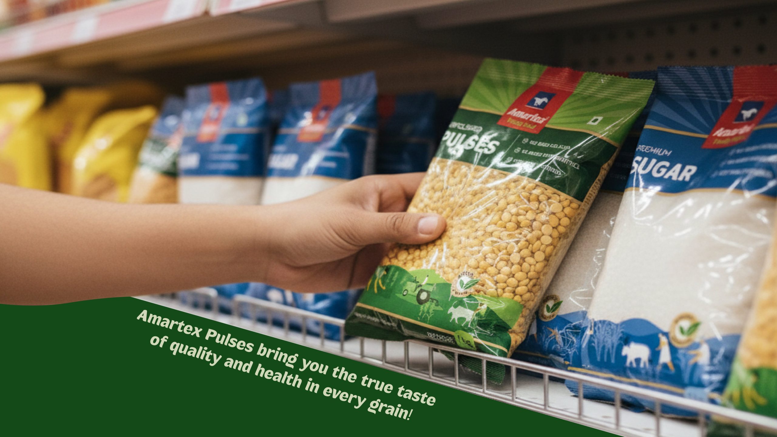
✦ Shelf Impact:
In retail aisles filled with noise, Amartex stands out with intentional quiet — a balance of tradition and freshness, simplicity and soul.
This is not just a packaging refresh. It’s a design-led revival of how everyday essentials are seen, felt, and trusted.
✦ Final Thought:
Amartex’s redesigned Pulses & Sugar packaging proves that even the simplest ingredients can carry the richest design stories — when approached with authenticity, care, and creativity.
Would you like me to help you:
- Design mockup visuals (with DALL·E or based on your actual packaging)?
- Format this into a PDF case study or submission-ready Word doc?
- Translate parts into Hindi or regional languages for broader audience appeal?
Let me know — I can assist with making it fully publication-ready.