Averton is one of the largest Russian factories for the production of snack products. All products of the Averton plant are natural ingredients multiplied by advanced production, the best technologists and the international quality standard – the HACCP system.
Task
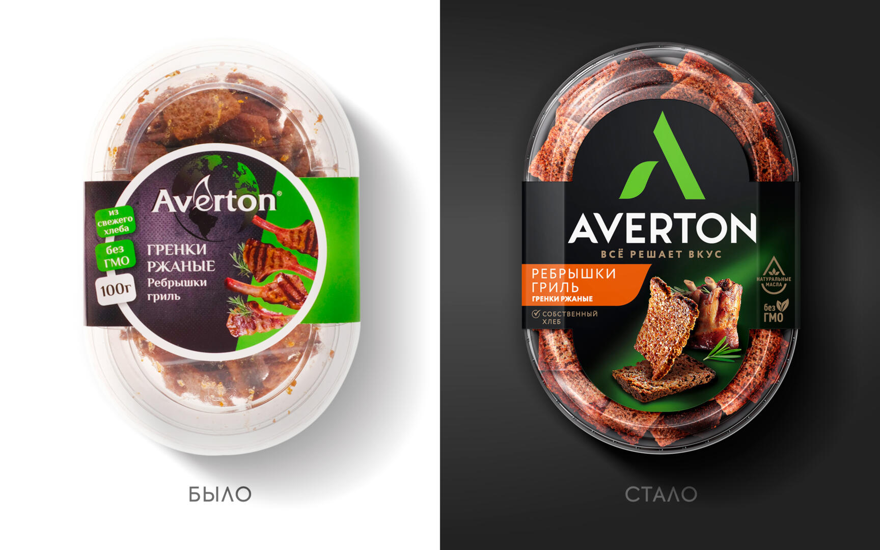
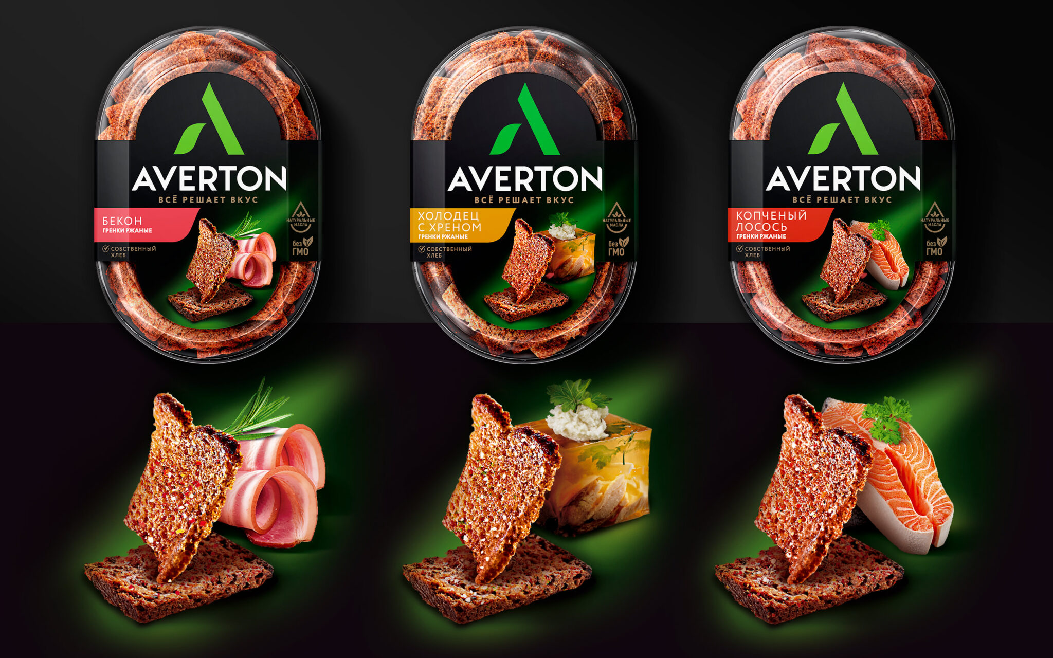
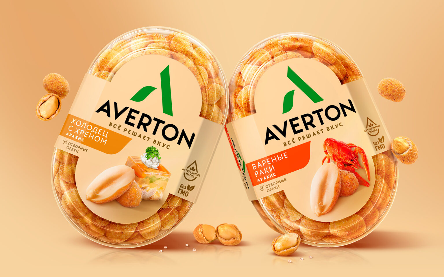
To develop packaging design for the main line of Averton snacks – rye toasts and white bread croutons.
Solution
This is not our first project for Averton. Previously, we developed a strategy, brand platform, design and naming for the new rye bread brand Kranky Times, which is now taking over the shelves of retail chains, replacing the departed Finn Crisp and Fazer.
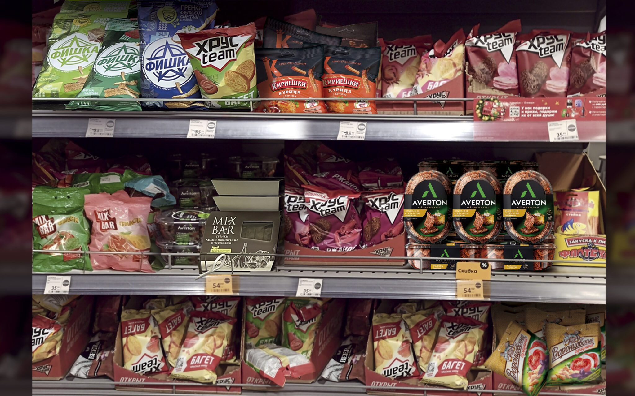
We created a design for a new snack packaging format – in correx. Averton pioneered the category as no other snack company offered this format. As a rule, croutons are presented on the shelves in a flow pack.
A small problem was that the layout in the correx does not allow for a demonstration of the entire lid area, and this is the largest surface where the information and the food zone are located. Therefore, our task was to make the site work to the maximum. We convinced the company to change the logo, make it more visible and iconic, focusing the attention of the buyer. And due to the bright brand element, the side works great, and the brand is clearly visible on the shelf.
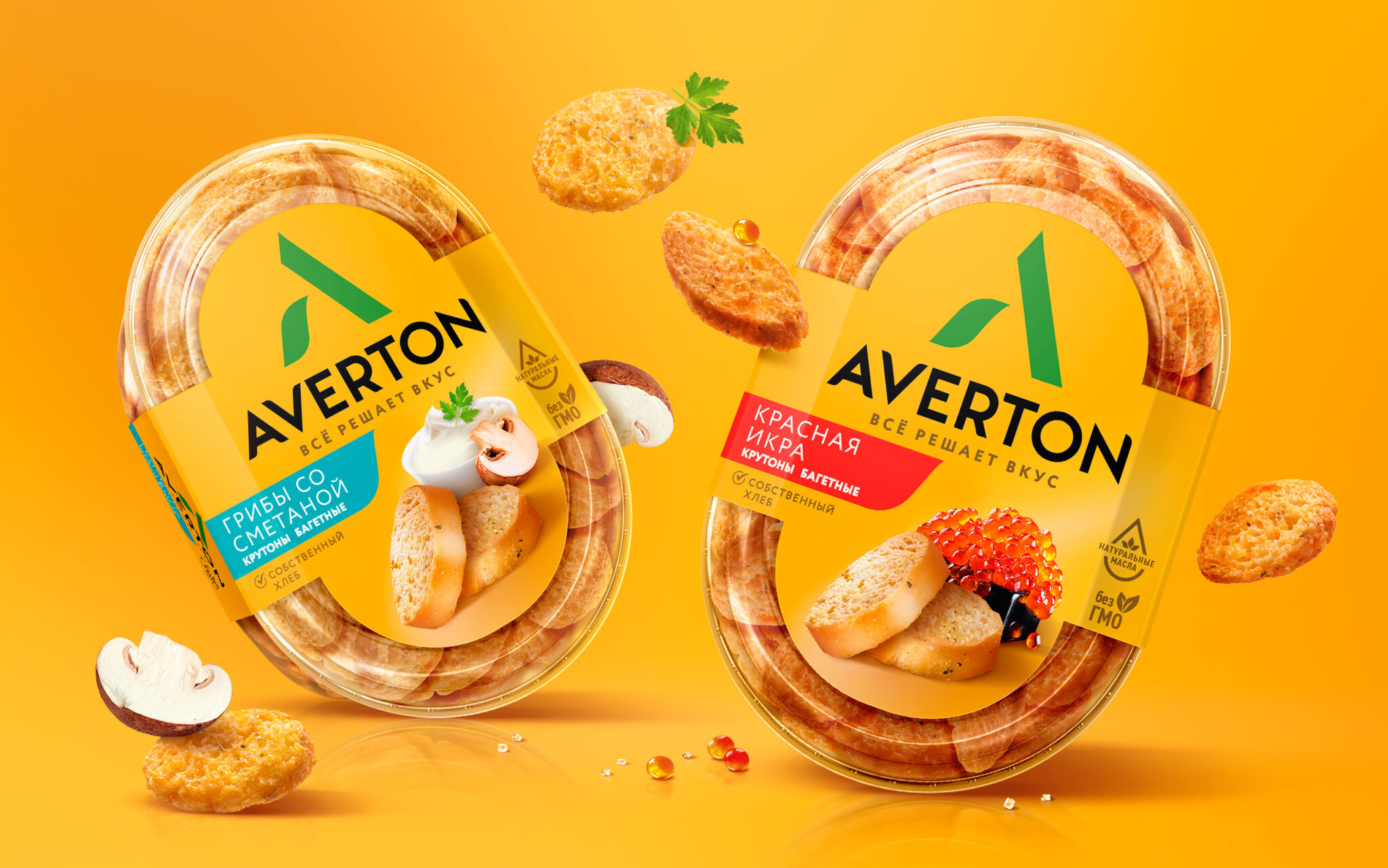
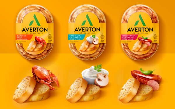
For rye croutons, a dark background color was chosen, for white bread croutons, a bright yellow color. Differentiation by tastes within the lines is carried out due to color plates and food zones. Food zones are additionally highlighted, which helps to visually rebuild them from the logo and focus on them.
