Granny P’s founder Mystery Furtado came to this project with a legacy: her grandmother’s sea moss recipe, passed down through five generations of a St. Lucian family, now ready to reach a Canadian mainstream audience. As a Black-led brand in the wellness category, a space that too often tokenizes heritage foods, the packaging needed to do something most brands in the “ethnic superfood” space fail to do: celebrate the culture authentically rather than reduce it to a surface-level aesthetic gesture.
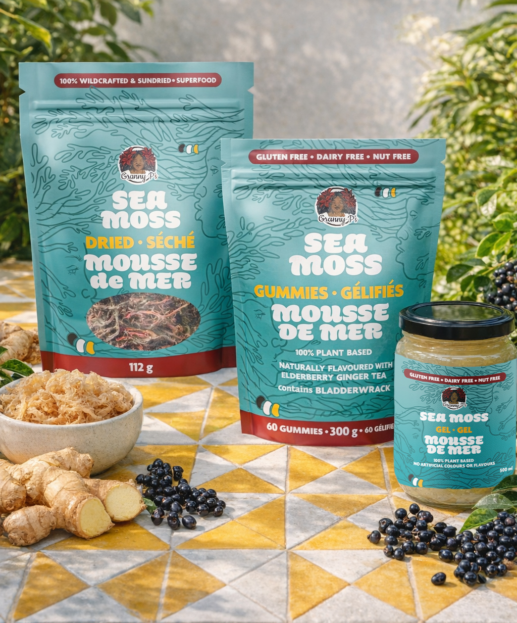
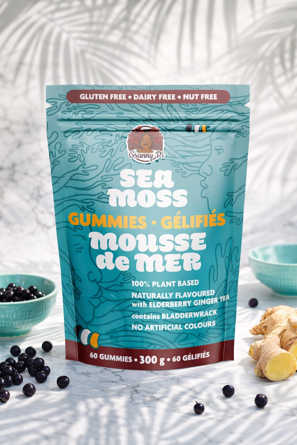
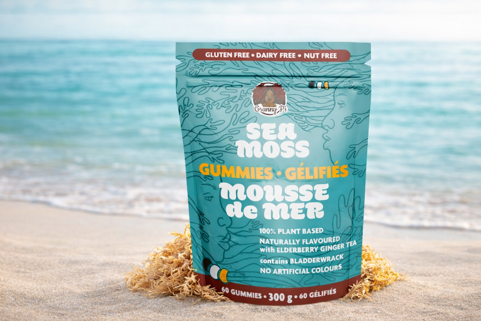
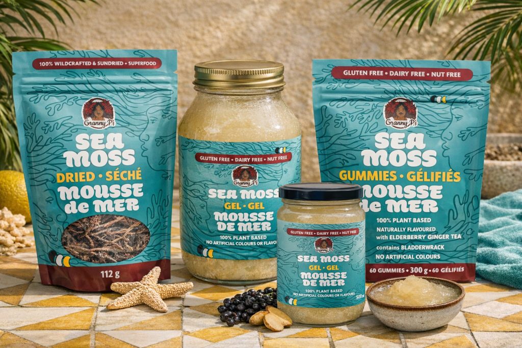
Eye Candy Design grounded the entire visual system in traditional African-Caribbean textile patterns, treating them as structural design elements rather than decorative accents. These motifs carry cultural knowledge, they communicate generational wisdom before a single word is read. Turquoise wave backgrounds connect the product to the hand-harvested St. Lucian sea moss at its core. Bold typography ensures immediate shelf impact, and clear benefit callouts speak to health-conscious consumers unfamiliar with sea moss. Bilingual English and French labelling was integrated throughout. The system was built for three distinct packaging formats: dried sea moss for traditional preparation, gel for daily use, and a genuine first gummies formulated to suppress the product’s characteristic ocean taste, developed in partnership with food scientist True Leaves Consulting.
Within a year of launch, Granny P’s sea moss gummies received the Flourish Award for Best New Product of 2025 at the Southwest Food Innovation Summit, validating both the formulation breakthrough and the design strategy that positioned it as a serious wellness product rather than a niche novelty.