Scandinavian consumer brand agency Everland has unveiled a new brand for plant-based food company La Vie. The design aims to revolutionise the perception of meat alternatives and unite vegans and meat lovers alike. Unlike other brands in the category, La Vie doesn’t see itself as an alternative to meat. They are more like ‘the new meat’, so there really is not much of a compromise here for meat lovers.
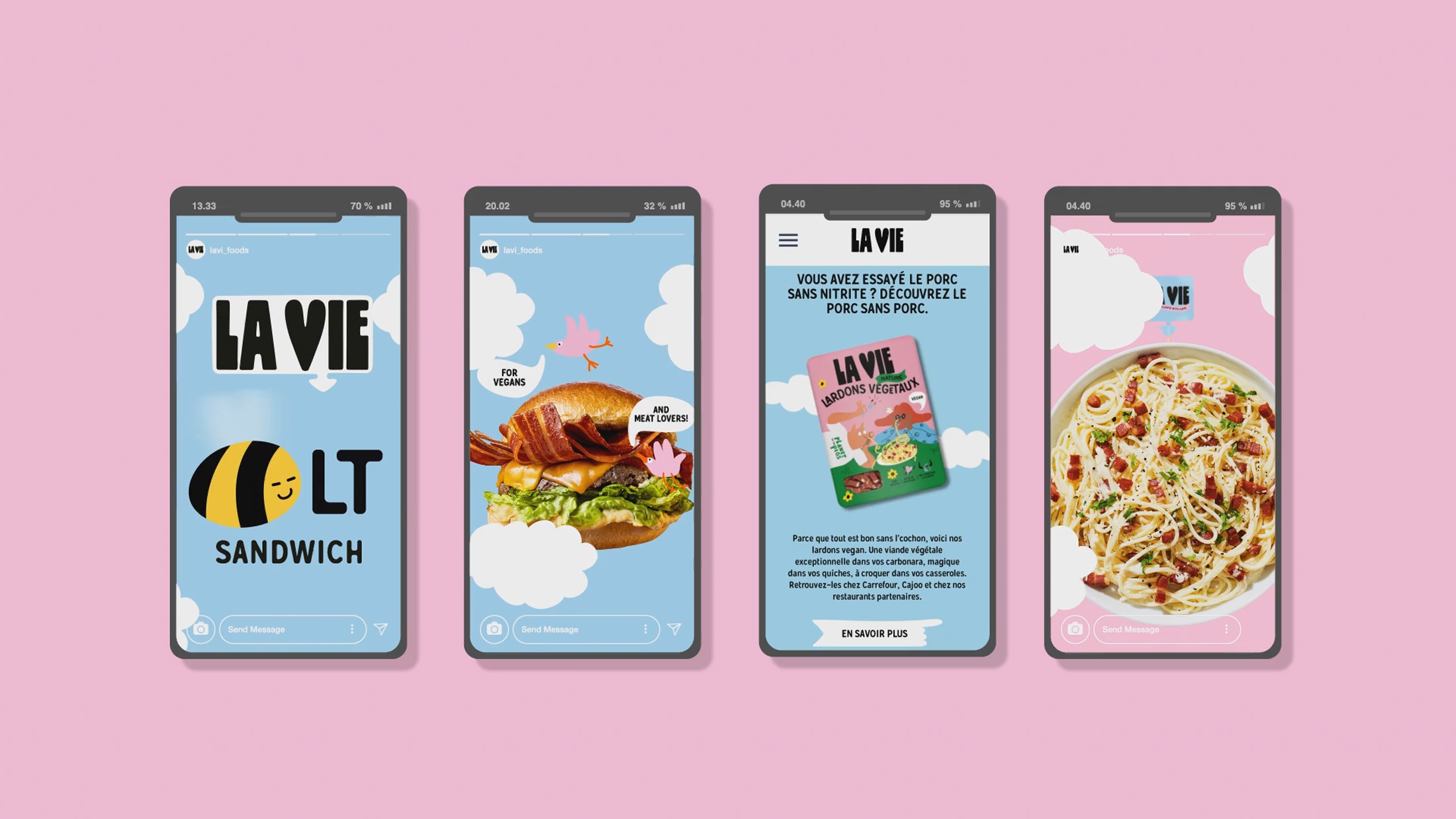
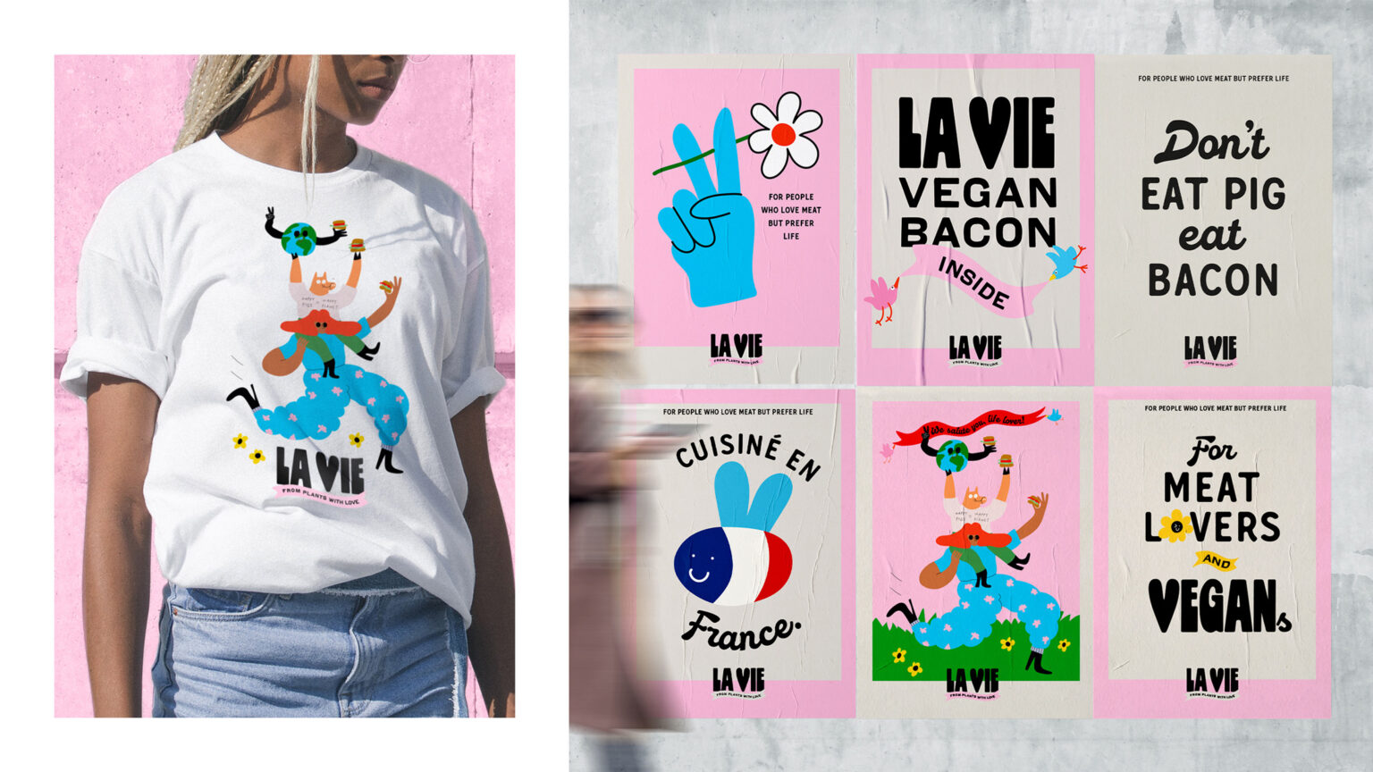
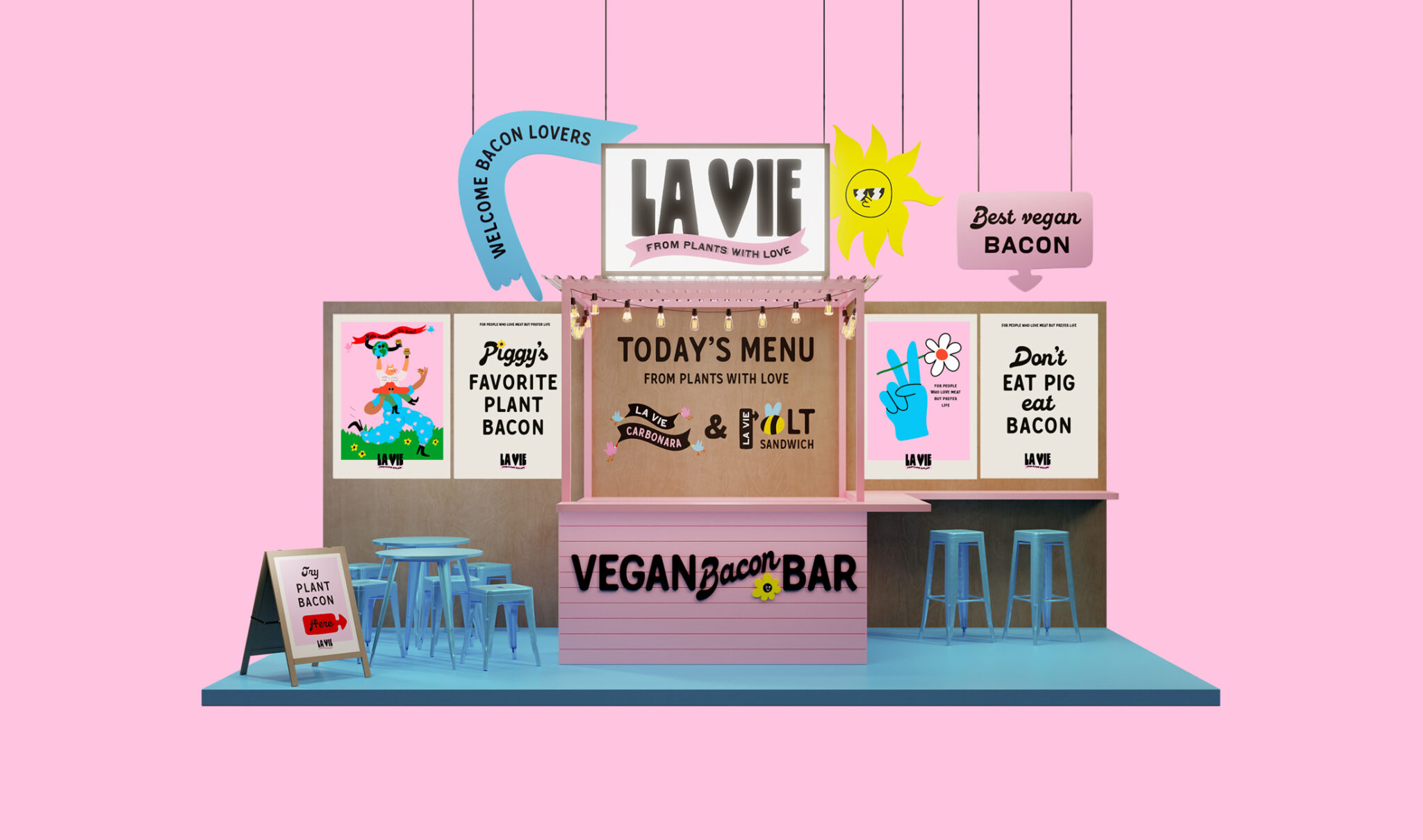
To stand out and seduce beet and beef lovers alike, La Vie wanted a whole brand universe with a brand identity, a cheeky tonality, and packaging that questions the mainstream conventions in the category.
“Meat alternatives are an ocean of sameness, building on traditional FMCG packaging conventions. It’s mostly pale meat patties, happy, yet boring, colours, generic plant icons and then some equally unnoticeable brand name involving butcher, plant, alternative, or meat,” Carl Johan Larsson, Creative Director & Partner in Everland
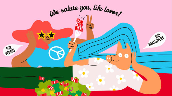
As a bold challenger brand, La Vie needed an illustrative style to match their warm but edgy tonality. To stay original, Everland and La Vie collaborated with the Lithuanian artist and illustrator Egle Zvirblyte. She created a bright, punchy and irreverent work with a strong presence while still being relatable and funny. They also invented an entire universe with animal characters and representatives for each type of meat. The first package introduces Mr Piggy and the everpresent Hooman, lying and chilling over a bacon pasta dish. It’s colourful, positive, and a true celebration of life, as no animals have been slaughtered to make this meal. Harsh? Yet true. And it’s necessary to break with the category – and turn some heads.
“La Vie brings attitude to the game. Packed with emotions and positive vibes, they share smiles and cheers, both essential ingredients when you want to change the world. Because you can still be a rebel and change the world while being a good sport,” adds Christian Halsted, Strategy Director & Founding Partner in Everland.
Every element – from typefaces to colours – adds to La Vie’s aspiration: a celebration of life. The use of two typefaces highlights different aspects of the brand personality. The script typeface is bold and expressive and aligns with the illustration style. Combined with the rounded sans serif typeface, it reflects La Vie’s positive attitude towards life.
“We chose a colour palette that celebrates life. Pink is positive and powerful and the dominant colour, flirting with the bacon colour. Then we add some green and red to support the main colour and differentiate the products. Finally, some black for contrast and boldness. All in all, it makes a cohesive look that makes you smile and feel energised, just like the food itself,” comments Carl Johan Larsson.
La Vie’s go-to-market product is lardon, small strips of fat plant-based bacon. An award-winning and patent product that’ll only make you crave it even more. More products are in the works. Until then, La Vie is fully available in all of France.