About the project
The NMZK Group of Companies is a vertically integrated holding company, which includes two oil and fat processing plants in Nizhny Novgorod and Samara, oil extraction plants in Uryupinsk and Sorochinsk, as well as elevators in the Volgograd, Orenburg, Samara, Saratov regions and in the Republic of Bashkortostan. The Group’s enterprises form a complete production cycle, providing the company’s processing facilities with raw materials, the quality of which is controlled at all stages of production: from sunflower seeds to finished product warehouses and stores.
A task
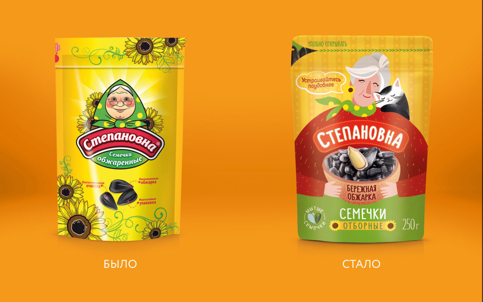
At one time, the brand was created with an eye on the leader in this category at that time – the Babkiny Semechki brand. Hence the traditional design with a grandmother in a headscarf as the central character and a yellow background as a reference to the sunflower.
Solution
After a while, the company’s management decided to change positioning and build a new strategy, updating both visual and semantic codes.
The current design looked outdated, rustic and boring, plus the brand was playing in the same positioning territory as its main competitor.
Together with the company’s marketers, we determined the insight, why do people eat sunflower seeds and what do they experience at this moment.
“I would like to get rid of the feeling of haste and the game of racing against time, just relax and unwind, but the desire to do everything and please everyone does not allow me to enjoy a simple vacation. It seems like there will never be a break.”
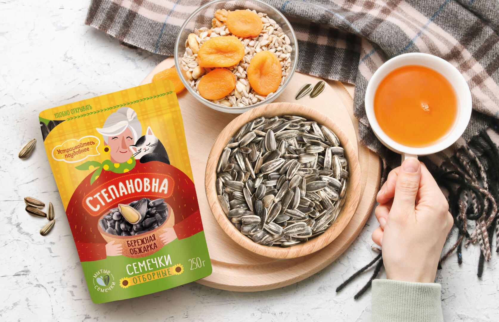
For people, eating sunflower seeds is a kind of meditation, a way to slow down in the exhausting rhythm of the big city. These feelings had to be conveyed in the new design. To do this, we changed the positioning and moved the brand from the territory of Belonging to the territory of Comfort, which is characterized by a feeling of inner calm, relaxation and cosiness, and such attributes as a soft blanket, warm slippers, a bag of seeds that you can crunch and distract from problems for some time.
We retained the yellow color by slightly changing the hue from canary yellow to a warmer orange.
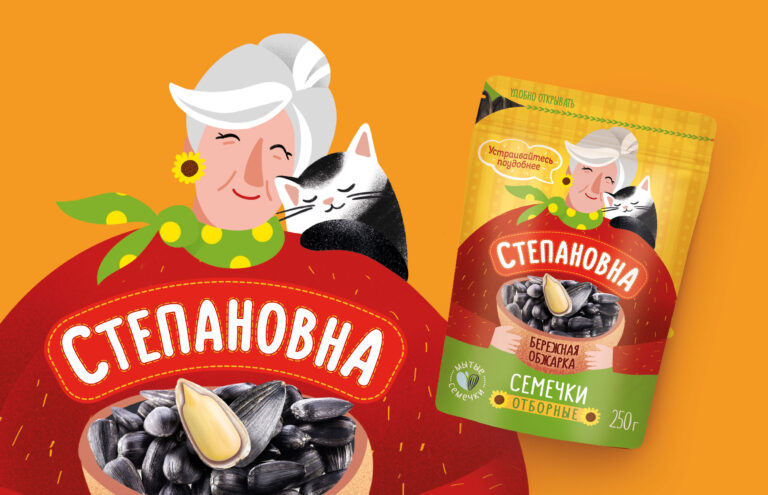
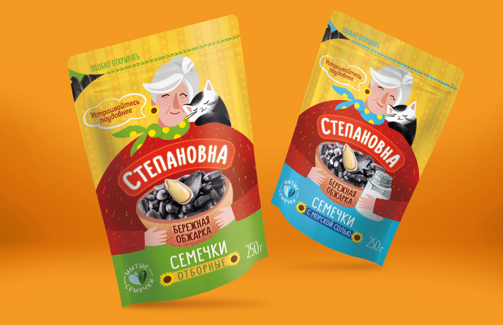
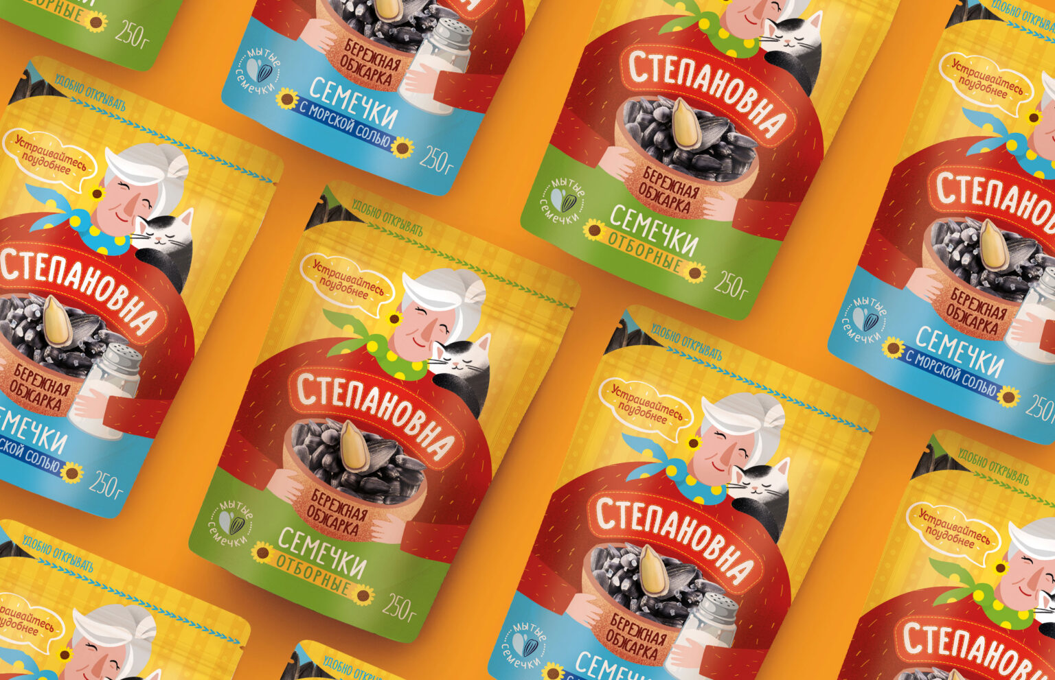
Our grandmother now looks modern and stylish, she is dressed in a warm red sweater, a scarf is tied around her neck, a cat purrs on her shoulder. It exudes calmness and homeliness from her. Sunflower elements are used everywhere on the packaging: in the brand and even in the form of earrings our Stepanovna wearing.
An integral part of design in product branding is to show taste, and this was not shown in the past concept. In the new design, on the front of the package, we see a large bowl of roasted sunflower seeds in the hands of our grandmother. The call to “sit back comfortly” sets you up for a pleasant and relaxing pastime.
In addition to emotional benefits, rational benefits are also presented on the packaging, such as uniform roasting, washed seeds.
There are many seed brands on the market in a variety of designs that were created back in the 90s, and therefore the modern audience often bypasses the product. The design does not attract attention, looks gaudy and bright and does not correspond to the cultural code of youth. Stepanovna is one of the few brands that breaks these stereotypes and fits well into the themes and visual patterns of modern citizens.
“Stepanovna” knows a lot about simple joys and knows how to create a special atmosphere conducive to relaxation. These are natural everyday products that support your comfort zone when you need it most, allowing you to relax and enjoy the leisurely passing of time.