Molochnye istiny – is a fresh and healthy product for the whole
Lyubimy Gorod LLC is a modern production of dairy products under the trademarks “Lubimiy Gorod”, “My Favorite Summer”, “Active Energy” from high quality raw materials with strict control of all technological processes, allowing the production of a line of dairy products that meet international quality standards.
Task
It is necessary to develop a recognizable packaging design for a new brand of traditional dairy products, which will: correspond to the developed positioning of the brand, stand out on the shelf space, have a noticeable logo,have a clear differentiation system between SKUs and product lines,convey the main advantages of the brand and product,be easy to adapt to other product categories.
Solution
Having several successful local brands in its portfolio, the company decided to launch a new brand that could stand on the shelf of federal networks and was aimed at an audience that appreciates the quality of the product and chooses the best for themselves and their families.
Many manufacturers, standing on a wide shelf, begin to save on the manufacture of the product, not paying due attention to quality control. Consumers have a distrust of the manufacturer, which cannot give them any guarantees and be completely transparent.
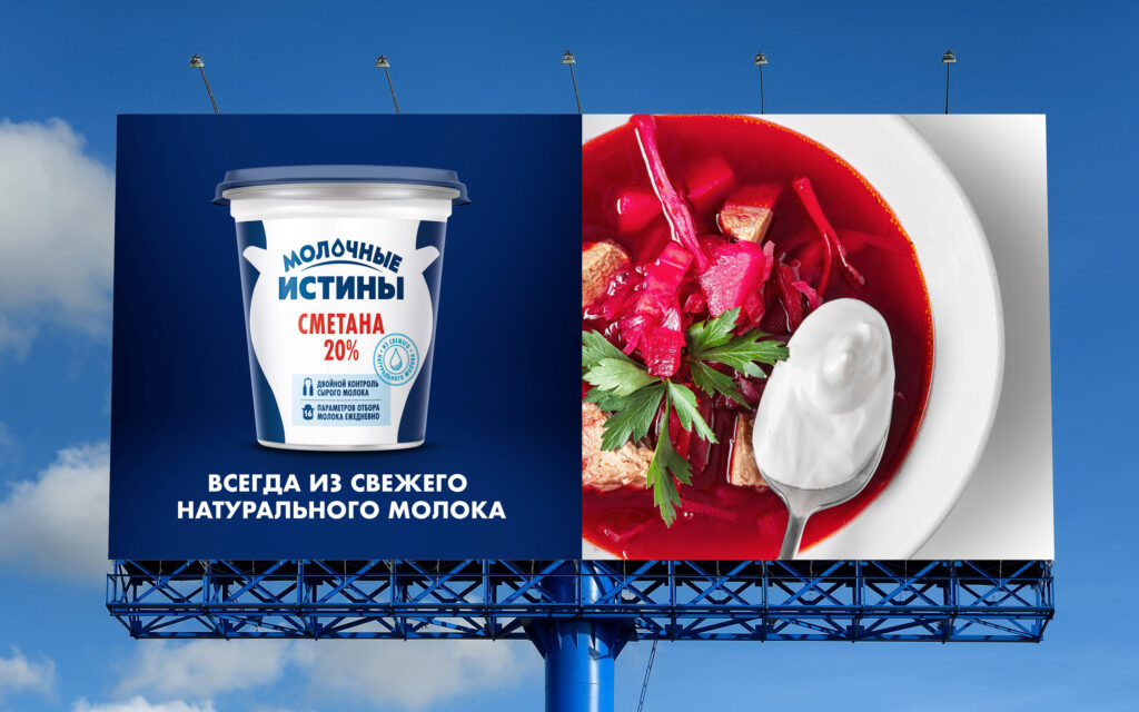
It was important for us to convey to the buyer the positioning of the new brand – an uncompromising attitude to creating products and maintaining freshness for the benefit of families.
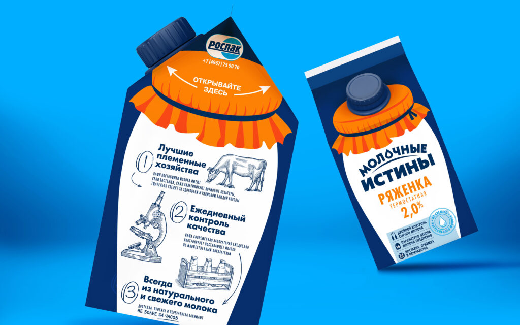
The brand also had to communicate its advantages: its own raw material base, innovative equipment, its own laboratory, and selected milk from the best suppliers.
Stability of quality, care for the consumer – we had to reflect these things in the packaging design and show the transparency of production.
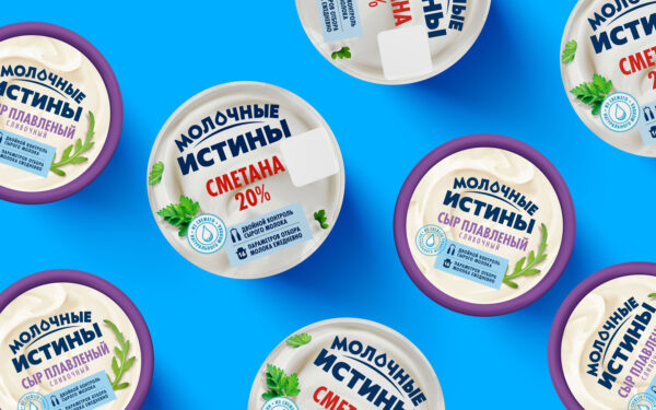
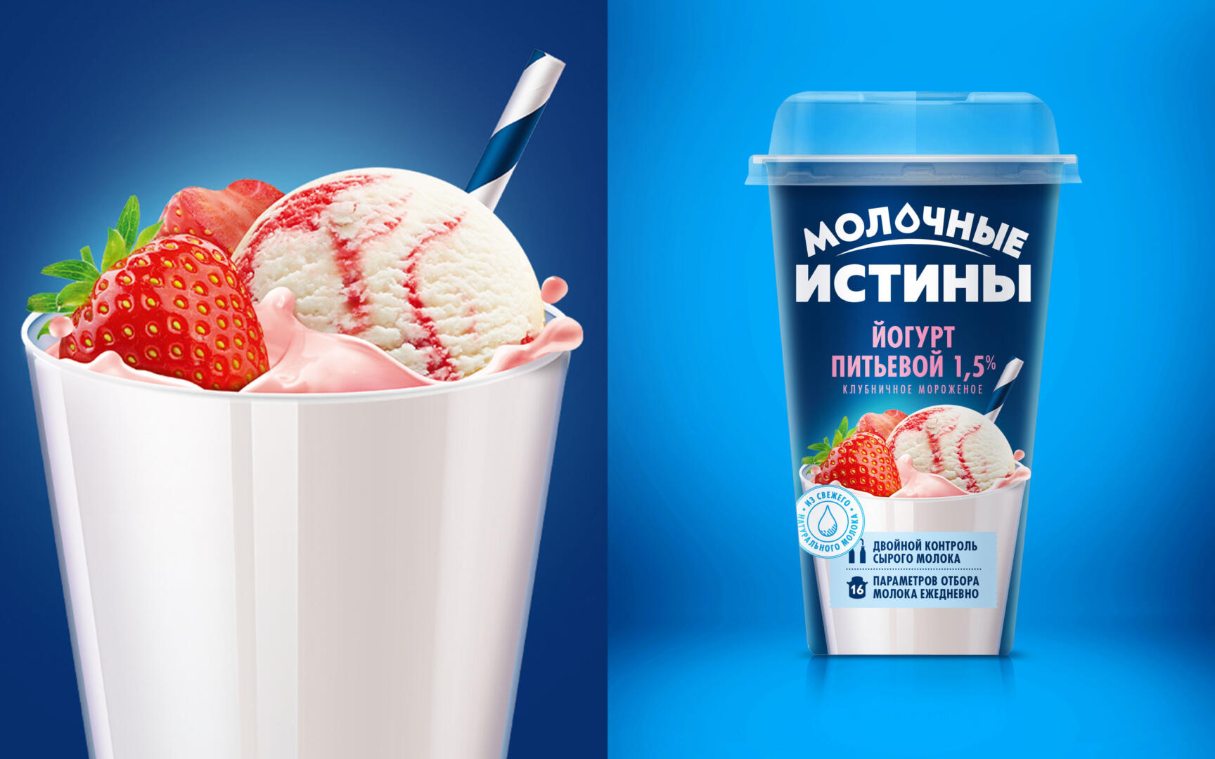
We started with the development of naming, having come up with the name “Molochnye istiny” for the brand. It perfectly reveals the essence of the brand, reflecting the confidence of the manufacturer in its product and convincing the buyer of the correctness of his choice.
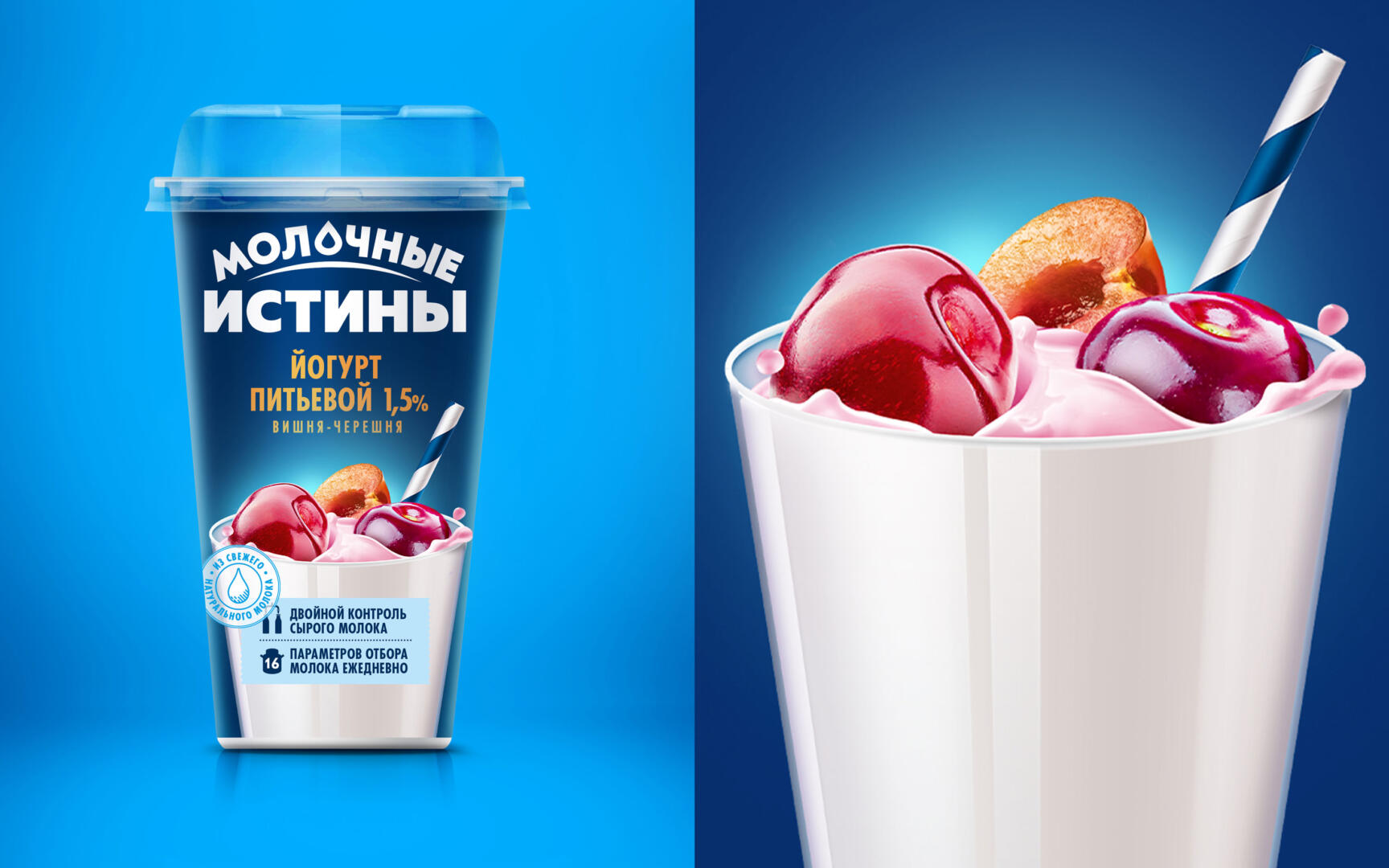
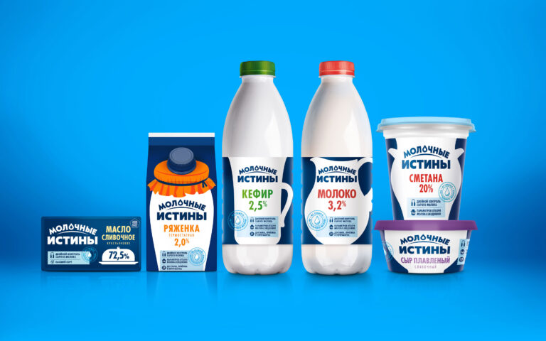
The new design turned out to be concise and understandable, easily adapting to the line of basic dairy products. The logo with a drop of milk in the form of the letter O perfectly reflects the category of the product. The fresh blue color and appetizing illuminated food area make the product stand out on the shelf. The demonstration of the benefits on the front of the package reveals the company’s responsible approach to production, convincing the buyer of the quality and benefits of the product.