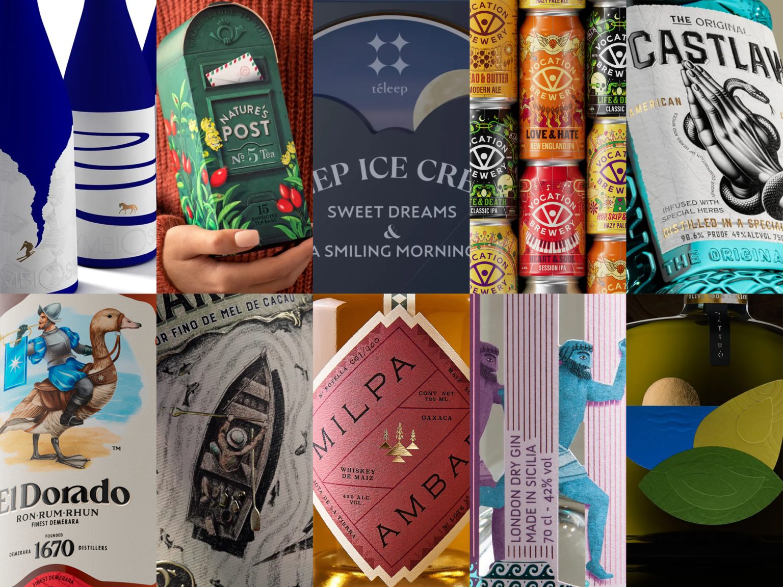
Ready for an amazing journey through the most recent edition of Packaging of the World? Issue #121 has just been released and is jam-packed with inspiration. We’ve handpicked the month’s top ten posts, each with the perfect balance of innovation and interaction that you won’t want to miss.
Not only do these designs have an amazing visual appeal, but they’re also generating buzz on social media sites like Instagram, Facebook, and Pinterest. Talented artists and design enthusiasts from all over the world are drawn to these great packaging design.
Here’s your chance: whether you’re a seasoned contributor or a newcomer, remember to sign in or create an account to share your extraordinary packaging designs with us. Let’s keep the creative energy flowing!

TÉLEEP designed by KAZUAKI KAWAHARA LATONA MARKETING INC.
A unique sleeve inspired by the moon phase complication on high-end watches. This creates a visual connection to nighttime and adds a touch of luxury. A window shaped like a crescent moon on the top of the sleeve offers a peek at the ice cream and strengthens the nighttime theme.

Gin.nasium designed by ADPOSITIVE
The concept behind the design is a “gym of gin design,” which plays on the word “gymnasium” and refers to the project’s focus on pushing the boundaries of gin design. The designer avoided traditional Sicilian imagery and instead drew inspiration from the island’s history and culture.

EL DORADO RUM designed by DEMIRQAYA
This project presents a challenge in cultural understanding and artistic interpretation. The rum label’s unusual concept require a designer to bridge stylistic gaps and cater to a wide range of visual preferences.

Symbiosis white wine designed by BXL PACKAGING DESIGN
“Symbiosis” presents an interesting challenge. The brief combines the concept of interconnectedness with capturing fleeting moments in nature. This means translating a complex message (“all things coexist”) with a series of evocative visuals (forest, mountains) while maintaining a high-end feel (blue, white, gold).

NATURE’S POST designed by BACKBONE BRANDING
This tea brand prioritizes capturing the essence of nature in both aesthetics and storytelling. The design goes beyond a box, utilizing illustrations and a postbox theme to connect the customer to the natural world. Even the tea bags resemble envelopes, with details like postage stamps and handwritten messages further personalizing the experience.

CASTLAW GIN designed by REYNOLDS AND REYNER
The Castlaw gin bottle design emphasizes the brand’s story of heritage and mystique through a snake pattern that embodies the connection to nature and cycles of life. The practical design considers production constraints and stability, ensuring a user-friendly experience while maintaining the brand’s message. This duality of practical design and symbolic storytelling creates a product that’s both beautiful and meaningful.

MILPA designed by MONOGRAF
Milpa’s branding cleverly bridges the gap between its ancient Mexican heritage and its contemporary spirit. The color palette references natural elements and the product itself (corn), while the label’s shape and wordmark evoke a sense of tradition and cultural significance. This design insight creates a product that feels both authentic and timeless.

TERRE DI CLETA designed by NUMEROQUATTRO
This olive oil label tells a story of cultural fusion through classic and geometric representations. By using simple shapes and overlapping textures, NUMEROQUATTRO can create a visually engaging label that evokes the beauty of the Calabrian landscape while hinting at the rich history between Greece and Italy. This approach emphasizes the product’s origin and quality through a design that’s both beautiful and informative.

ROYAL CHARLOTTE designed by ESTUDIO ARGO
The Royal Charlotte liqueur’s name and description evoke a sense of hidden treasure and exoticism. The design create a sense of discovery, enticing the customer to explore the unique flavor of the liqueur.

VOCATION BREWERY designed by TURNER DUCKWORTH
The key takeaway from this branding refresh is the importance of leveraging existing brand assets with strong customer recognition. Vocation Brewery’s “eye” symbol was loved by customers but underutilized. By making it the centerpiece of the new packaging design, the designers achieved shelf standout while maintaining a connection to the brand’s heritage. This highlights the power of re-interpreting familiar elements to create a fresh and effective design.