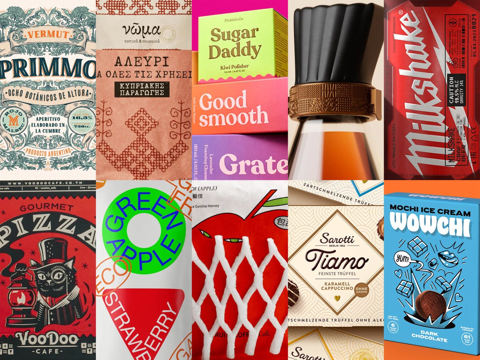
We are delighted to present you the top 10 posts for monthly issue #110 from Packaging of the World, your online destination for the latest and greatest in packaging design. As the industry keeps changing and growing, we are always on the hunt for innovative projects and original concepts that showcase the power and potential of packaging. This month, we have carefully selected the most impressive designs and influential ideas from our website and our social media platforms, including Instagram, Facebook, and Pinterest, to inspire you and spark your creativity.
PINKLAB.CO REBRANDING by WIDARTO IMPACT
To expand its market internationally, Pinklab.Co needed a stronger and simpler identity that could connect with customers and enhance its brand image. Widarto Impact helped Pinklab.Co redesign its logo, packaging, and social media visuals based on its brand personality: feminine, natural, simple, youthful, and premium.
The new identity is dynamic, familiar, fresh, and modern. It showcases Pinklab.Co as a quality, natural, and attractive brand for its target audience.
FRUITY COFFEE COLL. by LUNG-HAO CHIANG
LUNG-HAO CHIANG created a series of coffee projects for the summer season that capture the natural fruity flavors of coffee and display them with a fun and colorful visual style. Our pouches feature fruits with personality and juicy, sweet appeal, making them a tempting part of the taste experience.
In the “FRUITY COFFEE Coll.” project, LUNG-HAO CHIANG used “fruit pouches” as the packaging material to convey fruit imagery more intuitively. He also added catchy slogans inspired by fruit stands and crates to evoke everyday memories.
SAROTTI TIAMO by HAJOK DESIGN
Sarotti TIAMO is a premium truffle range from the traditional Sarotti brand, Germany’s market leader. The new packaging design is more emotional, high-quality and contemporary, making the chocolates more appealing and giftable.
The HAJOK design team created a modern brand world for Sarotti TIAMO, with exquisite photos of the truffles on-pack. The elegant sub-brand logo and the golden heart symbol convey the quality and range recognition. The heart-shape also appears in the graphic background pattern. The striking Sarotti logo on the coloured side panels adds modernity.
ΝΩ͂ΜΑ (NOMA) – CYPRUS FLOURS, LIDL by CAPARO
Inspired by Mother Earth, Noma flours are a mass-market Greek brand by Lidl that offer quality food and beverage products made from local ingredients, regional flavors, and traditional recipes. The brand values authenticity, tradition, honest locality, and nostalgia (“νώμα” means memory in ancient Greek). CAPARO designed the packaging for two flour product lines from Cyprus.
CAPARO were inspired by the handmade folk art and ornamented Paphos textiles from Cyprus’ rich tradition. CAPARO created a vector illustration based on traditional embroidery techniques from the 19th Century. Then they collaborated with the artist Porfyria Moschopoulou to make an analog prototype embroidery. CAPARO photographed and digitally processed it to use it as the pack’s key visual.
MARMÉLA by ANASTASIA MENYAKINA
MARMÉLA is a healthy sugar-free marmalade brand, a vegan eco-product. The project creates a useful and bright product image.
MTV + Memphis = stickers – a mix of styles and patterns. Stickers have the logo, flavors, and information. The concept links a useful product with sports or active activities, like dancing. The product is bright, inspired by the MTV era with patterns and shapes from the Memphis style. A pattern was drawn to create the forms. Stickers overlap and form a system on each pack.
AQL MEDICINAL LIQUOR by RIVERSIDE DESIGN STUDIO
The packaging design is simple and modern, but also reflects the oriental tradition and culture. It uses graphics that represent the product features and cultural symbols such as traditional Chinese medicine. It creates a sense of authority and value for the product.
WOWCHI ICE CREAM MOCHI by AG DESIGN AGENCY
AG DESIGN AGENCY created a vibrant and delicious ice cream mochi brand. They used color, illustration, moving image and digital presence to make an expressive brand that makes you go WOW!
Wowchi is a mochi that opens a gate of pleasure. A firework of fruits, feelings & flavors explodes on the pack. Wowchi celebrates colors and becomes an everyday delight.
PRIMMO VERMUT MALBEC by EMI RENZI
The design is Italian-inspired with native flora of the place. Primmo Vermut is made in a natural environment with rivers, forests and mountains.
This Vermouth mixes Malbec and Moscatel de Mendoza wine with botanicals, herbs and flowers from Córdoba mountains.
TOOL CRAFT BEER by BOLIMOND
BOLIMOND thinks that great tool makers can also make great beer.
A Milkshake IPA is a new style that fulfills an old dream: milkshakes and beer!
VOODOO CAFE by SEALBURGER
Voodoo Cafe is a hidden gem in Bangkok’s Nong Chok district, where you can enjoy delicious food and drinks at reasonable prices while admiring the lush greenery and vintage decor. The restaurant has a spacious area with many photo opportunities to wow your friends.
SEALBURGER helped Voodoo Cafe create a new brand identity that reflects its charm and mystery. They designed an etched logo of a fountain in an oasis, symbolizing the restaurant’s location and appeal. SEALBURGER also gave the packaging, uniforms, and other items a classy and stylish look with graphic styles and fonts that match the character of the place. And they added some fun and personality with bright colors and a mascot based on the owner’s fat black cat.


