In today’s Curator’s Insight, we take a close look at BRSG Brand Identity & Package Design by HuskyFox.
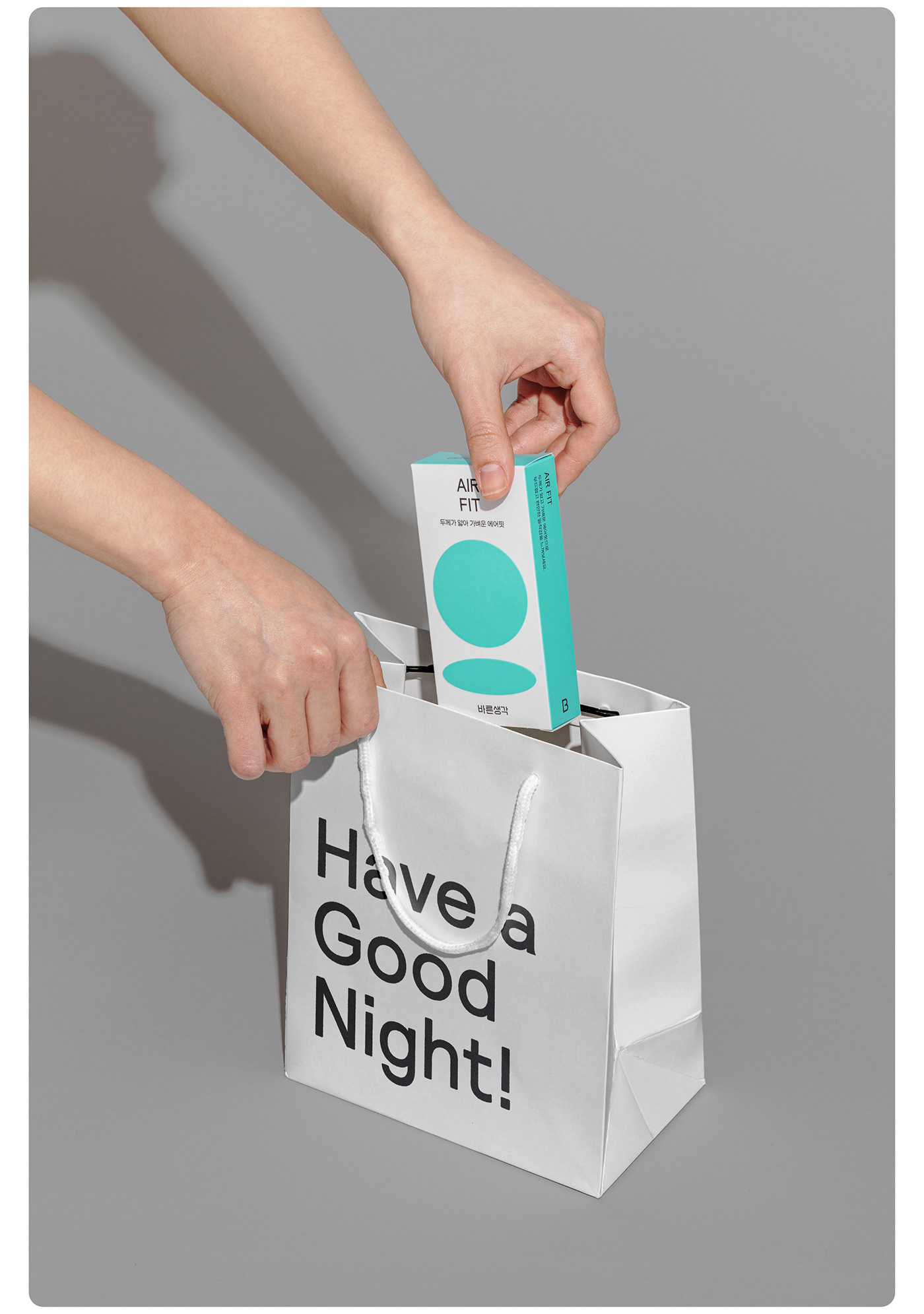
Barunsaeng-gak (BRSG) has taken a bold step in reimagining the way we perceive and discuss sexual health. Their packaging design is a testament to their commitment to creating a positive and inclusive culture around sexuality.
The brand’s name, “Barunsaeng-gak (Right Thinking),” immediately conveys a sense of openness and acceptance. This is reflected in their design language, which is anything but taboo. Bright colors, playful illustrations, and a friendly aesthetic create a welcoming atmosphere that invites conversation.
The design system is a masterclass in accessibility. The use of relaxed shapes and witty characters makes the products feel less intimidating and more approachable. This is especially important for a topic that can often be shrouded in stigma and shame. The graphics are not just informative; they’re empowering, celebrating sexuality in a way that’s both fun and respectful.
What I love most about BRSG’s packaging is its ability to break down barriers. By making sexual health products feel less like a guilty secret and more like a part of everyday life, they’re encouraging open dialogue and promoting a healthier attitude towards sexuality. It’s a refreshing departure from the often-sterile and conservative approach taken by many brands in this category.